Gent Stickman Vs Evil Meat Hand: Ante Vitam (Post Mortem Sucks)

1.- PREFACE:

Once upon a time there was a child that made a game.

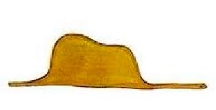
1_ElPrincipitoSombreroSerpiente

That’s the story. Any further “how”, “why”, and other boring details is what this text is all about, and you probably have read enough. Seriously, life is short, so choose wisely how to spend it: The oldest child alive is telling you.

I’m not too wise and some weeks ago I decided that it would be a good idea to make a game for ParserComp 2022. The game was going be “Syd Fox: Scotland Yard Detective From Outer Xpace”, but for some strange reason my wisdom turned out to be a little smaller than how wise I am, and I realized that I had run out of time.

I was wisely advised that it would be better not to send an unfinished and unpolished game to the comp, so ten days before the deadline I throw in Syd Fox’s towel, and saved it for a better day, because I was falling in love with that game, and you only have a single chance to give a first impression.

So, I started singing to the roads to take me home to the place where I belong, and that place turned out not to be in West Virginia, but in a European Indian reservation where once upon a time the words of our wisest men like Ende or Rodari brought fabulous manitous to life.

My words are not as full of knowledge and beauty as the ones of our elders, so all that my wisdom has been able to create is some long and prosaic text explaining the decisions I took to bring this “Gent Stickman vs Evil Meat Hand” game to live.

Please, don’t see this as an attempt to defend Gent Stickman’s quality. Gent Stickman is now my friend, and I defend my friends regardless of their qualities or whether they are wrong. But this text is not about that. It is just a kind of diary about how the ideas were coming to my mind, and how and why I choose some roads instead of others. I love to read this kind of things from other developers, so I’m trying to explain here how my creative process goes, as far as I can.

Beyond this point are inhospitable waters full of spoilers and some technical stuff, so enter them at your own risk.

6 Likes

TABLE OF CONTENTS

1.- PREFACE

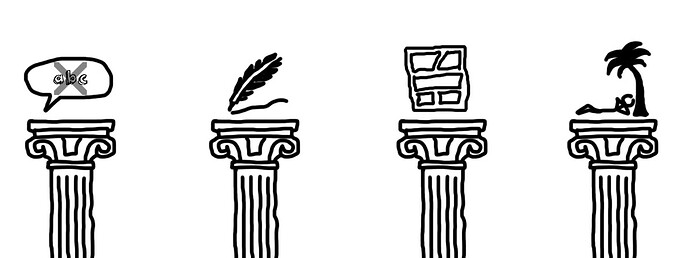
2.- THE DESIGN PILLARS

3.- THE THEME

4.- THE STORY

5.- THE PUZZLES AND THE MAP

6.- THE HELP SYSTEM

7.- COMIC VS VIDEO ANIMATIONS

8.- MUSIC AND DIEGETIC

9.- GENT STICKMAN AS A SECOND PERSON PUPPET

10.- THE THEATER ON THIS

11.- GRAPHICAL AND VISUAL STUFF

12.- TECHNICAL DEVELOPMENT AND TOOLS

FINAL THOUGHTS

BIBLIOGRAPHY AND RELATED WRITINGS

English text proudly revised by:

— AmandaB —

Posible English errors on this text could happen due to further content added after this.

1 Like

2.- THE DESIGN PILLARS

So, there I was, with a game to do and only ten days to go.

I had already read about using self-imposed constraints as a prolific game design criterion, and restrictions were what I had, being the biggest one the lack of time for beta testers, especially if they needed to spellcheck the texts of the game, as I am not an English native speaker.

So, the main concept of the game was born out of necessity: Not having output text.

Well, no text means use something instead, and graphics come to the rescue. Users would see a graphical world, and they would type the actions in the usual way, with the responses as a graphics output.

This decision showed me two new problems to solve related to the lack of time:

  1. Graphics are more time consuming to create than text.

  2. Animated sprites moving through the screen as the usual video games require not only time but also a classical video game “sprite engine” to set up.

The first problem was quickly solved by thinking: make a game with cartoon line drawings, so graphics would be a bit slow to create but not so much, and the time to spend was fully on my side not depending on others to check texts. So the results and the fact of having a game on time would depend only on my effort. Related to this I also decided to use a minimalistic visual approach for the game, that I feel included this pillar.

The second problem was also quick to solve and fully related with the graphical style to be adopted: Not to make a “sprite” video game with animations like “cinema”, but change the communication mode to another medium, the comic.

At that moment I thought the idea was becoming perhaps too “innovative”, as I don’t know about other games that were made that way (this does not mean they do not exist), so I didn’t know how that would work, especially the communication with the player through comic vignettes without using text. I will talk more about this later.

But here I set another pillar for the design of this game: It should just be a funny light thing to do to send something to the comp, without stress or high expectations for the result. I can get a bit obsessive and perfectionist sometimes, and this is an enemy of fun and tends to cause “analysis paralysis” situations. So this pillar, which seems a silly one, was in fact the most important for me, turning to read it again from time to time to stay in the line.

2 Likes

3.- THE THEME

I’m good at graphic design, but not so much at illustration, so I could have asked someone else to do the illustrator job, but that would lead again to depending on someone else to finish the game, so the idea was discarded.

A person with a creative profile very close to me told me about the possibility of making the graphics on real paper using ink, which could then be quickly scanned. Although the option initially seduced me due to the superior graphic quality that would result, each small link in the production chain that involved extra coordination or processing time that was unaffordable if I wanted to arrive on time.

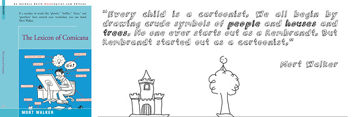
My best option for the available time was to make graphics in the childish stickman style. And this brings me to my idols in “children literature” that I was talking about at the beginning of this text.

The game would have childish graphics again because of a restriction of time, but instead of fighting against it I thought that the design should embrace that, and the game should be built around that.

It would not be a “game for children”, but just a game, as I remembered from a Michel Ende writing:

So, at that moment I thought that a Michel Ende quotation at the beginning of the game was mandatory.

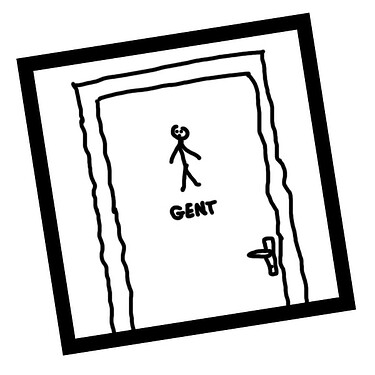
Thinking a little about how the main character would be, made of stick drawings, I arrived at the idea of the stick drawings in the doors of public toilets. This drawing is usually accompanied by the text “gents” below and searching on the internet I saw that “Gent” was a real existing male name for people. I also saw that Stickman could be a plausible surname, as the Steckmann surname really exists. That was the birth of “Gent Stickman”.

3 Likes

4.- THE STORY

With the main barebones of the game concept, I would need a story. It needed to be a very short one, as the time available was very short, and needed to be explained very quickly.

In real life I sometimes make stupid “puppet” movements with my hand. Yep, I’m that kind of person, and Jim Henson is also one of my inspirations. It was just a matter of chance, or perhaps fate, that just in those days my wife told me– probably joking– “You should make a game with that hand as a puppet”.

And that was the spark: I was carried there by the winds of restrictions, but just at that moment I REALLY WANTED to make a game mixing hand drawing childish graphics with real images from my puppet hand.

My mind started to boil with ideas about that, and I had to look back to the pillar of “send something funny and light to the comp” and stick to it, or the game would never come to life.

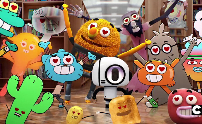
I have seen lovely things mixing cartoons and real images, such as the “The Amazing World of Gumball” TV show (yep, I’m also the kind of big boy still watching cartoons), and they work very well in that medium.

I started to see in my game something that perhaps needs some psychological therapy I can’t afford: The childish drawings fighting against the real adult world. The hand made drawings fighting against the real hand that creates them. The fight of the son against the father.

Then, my “puppet” hand had to be the antagonist. That’s how “The Evil Meat Hand” born, and that’s how I get the title: “Gent Stickman vs Evil Meat Hand”.

Some of those things are skeleton parts that are not visible in a game or a story, but they help make things coherent while building things around an idea, no matter if the final player will not know about them.

At this moment I had a protagonist and an antagonist, but still needed the story itself. Needing to be short and easily and universally understood, I resorted to the classical archetypes: A knight going to the rescue of a princess to free her from the evil “dragon like” silhouette of my puppet hand. And the princess could not be other than the “Lady” hand drawing in the toilet’s door. That was how “Lady” was born.

The story can seem a bit surrealist, but is an archetypical one (in its basis, not its details of course), and I was sure it would work. The cartoonish look and feel would fill any gap in the “plausible” side.

2 Likes

4.1- The end

And then a vision of how the end of the game should be comes to my mind. I like to write short stories, and what I like most about them is working on trying to give them a final twist. The ends I remember the most from other people’s works are those that are weird or unhappy, like in the film (not the book) “The Myst”, or in the book (not the film) “The Princess Bride”.

For me this story was asking for an end with a twist that needed to be the counterpoint to the naive graphics and general light feelings of the game, and what came to my mind matched with that: After defeating the Evil Meat Hand, a final scene would show how there was another hand (they usually come in pairs, you know), and being ready to fight again for the Lady, Gent Stickman would discover that she in fact was in love with it. Broken heart. Loss of innocence.

And again, some words of great Mr. Ende came to my mind:

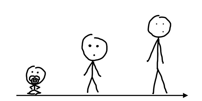
Oh, poor Gent Stickman, so many fights to end in that unpleasant and sudden growing up.

So, at this moment I have the main lines with which to frame the story of the game (in Spanish the terms for these categories are “Tema”, “Motivo”, and “Tópico Literario”, but I’m not sure how to translate them, so I left my homemade translation and the original in Spanish):

  • Theme (Tema): Live (not “love”, as it could seem)

  • Motif (Motivo): Growth in Life

  • Topic (Tópico literario): The transition from childhood to adulthood

2 Likes

5.- THE PUZZLES AND THE MAP

Now I needed a plot, some events, and difficulties that Gent Stickman must confront to achieve his goal. This is mainly what stories are.

Due to the lack of time available to implement that part, I could only have a few scenes, and they needed to be very easy to create from the side of development.

With more time available I would love to create the full set of things, an epic story in the line of the Princess Bride: A revenge, a miracle, a giant, and true love.

But once proven that this story was going to lack the last one of those things, I decided to stick to simpler ones.

First, I was going to need several locations. I thought about the kind of things children usually draw, and a tree and a house come to mind (you can search in google images and it will probably show you drawings with houses, trees, sun, and family members, if for any reason you didn’t have your own childhood).

From my point of view, locations needed to stay as simple as possible (for technical and aesthetic reasons), so those were going to be two different locations.

As the Evil Meat Hand had kidnapped the princess, the house quickly became a castle that Gent Stickman needed to reach. That would be the first difficulty that the players were going to have to overcome.

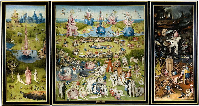
A moat would be the obstacle that would split the world in two parts in an allegorical way: The first side where all should remain childish and innocent, and the second side where the adult world would be, with the real images of the “Evil Meat Hand”, the long-awaited goal of finding the Lady, and the disappointments of growing up. Once the pit was crossed, it would not be possible to get back to that land of innocence, that lost Eden with the tree.

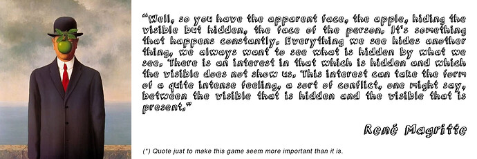
If it was going to be an Eden, it was also going to need an apple, so I started to think about getting it and then giving it some use. It should be the medium to leave Eden.

I had some obvious ideas and solutions to cross the pit, but they were mainly a two-way road, and I liked the idea of non-return, not only for this metaphorical approach that probably nobody was going to see nor care about, but also to make it clear to players that once they reached the other side, they were not going to need more things from the initial one.

Some of these ideas for crossing the pit were things like: chop the tree and drag it to the moat, fill the moat with water to go swimming to the other side, stab “something” in the spikes to walk over them without dying, and those kinds of things.

Making a catapult bending the tree some way to throw Gent Stickman to the other side was one of the possible puzzles to create, but I finally thought that the best option was to use the apple for this to create a new tree just beside the pit. The player would jump from the top of it to reach the other side.

The best of this puzzle was that it was taking advantage of the cartoon style reality of the game, making possible and plausible approaches and solutions to problems like this one.

This approach has a clear drawback, that was also pointed by one of the beta testers: In a crazy world as the cartoon one, it’s difficult for the player to understand what is possible and what is not, so the game should give some help to the player to know what they are supposed to do.

Doing it without text was for me the greatest challenge of this game, I think, and I will talk about it later.

But let’s continue with the puzzles.

2 Likes

5.1.- The apple

In the first place I needed to make the player know the availability of an apple in the tree. This is something that can seem obvious for some people but not for everyone. In fact, my transcripts show that people were trying to climb the tree as one of the first actions (some ancestral behavior here?), so I decided to show them the existence of an apple when they climbed, making it fall. I didn’t want it to be an easy gift to obtain with a simple “get the apple, so a “Deus ex machina” rat appears to take it and run.

It was expected that people would probably try to find the rat, searching it or trying to follow it to another location, or at least they would understand that the rat has gone elsewhere. So, this was also an invitation for players to explore other possible rooms because nothing in the game (beyond how other text adventures works) hints that multiple locations can exist here.

And this game was not made only for text adventure experienced players, but it is also a humble try for new people testing this genre, that perhaps didn’t want to try a usual game, thinking, “oh, that stuff of boring reading…

There is another medium to make the player know of the existence of the apple, for if you try to use the classical verb “take” with the only thing in the screen– “take tree”-- that will show you that there’s an apple in the tree in a weird funny deadly way.

So, the apple exists, and the player would probably know about it and would try to get it, no matter if he did not know yet what can be done once he gets it. I wouldn’t like to make it so easy and immediate as “take the apple” or “search for fruits”, so the little puzzle here was shaking the tree, a usual way to get fruits from trees in real life, in fact. When you climb the tree and the apple falls, some little lines at both sides of the tree try to give a hint about the fact that the apple falls because of the tree being shaken during the climbing process.

2 Likes

5.2.- Exploration

At that point, having or not having the apple, the player would be probably trying to move to another side to explore. I love the usual way to move using cardinal points, like north, and east. But I mainly only love it for places like caves, where it makes sense. In any other games I hate this standard. If you try to use this in this game, Gent Stickman will tell you that he doesn’t have a compass, and if you try to simply “go out”, “move away”, and so, the system will guide the player showing hands pointing left and right with a question mark, inviting them to use these commands.

One of the beta testers told me about including alternative east and west movements available, as he always typed them automatically instead of left and right and he told me about not making a puzzle about basic movements.

This is a good point (my beta testers were the best ones), but I decided not to follow his advice. On principle I am against the use of the cardinal points to execute the movements as a standard (are you fighting against standards? Are you crazy?), especially because that is only known by people that already have played text adventures and have been told about how to move in them. People that have never played this kind of games don’t try to type cardinal points, and the left and right movements in this case are the most natural for them.

Another standard I don’t like is the “take all” command. If you want to know what my response to that is in the game, you will need to try it.

At this point, once the player had decided to go and explore, he would reach either “the pit” location or “the signs” one.

2 Likes

5.3.- The signs

This location shows you two possibilities for moving, to the Lady, or to Death; that does not seem a very difficult decision. But we’re human, and once we’ve put our exploration instincts to work, it’s not that easy for a simple death warning to stop us. Good Boy Scouts players will probably go to “the death” location and try to interact with it until they decide they have died enough.

At this point I thought that perhaps the starting location could be the one with signs, so the player will start with the most elemental “puzzle” of moving, but I thought that the starting image of the player and the tree was very powerful, so I decided to start there.

During the development time I had an idea for this location that would give some interaction with sense, but I didn’t have time to implement that. That was change or “turn signs” to make them point to the other side. This would change the world and the navigation, so the castle will be to the right and the dead to the left. It could also be an optional easy way to arrive at the castle without the need of jumping the pit, making the castle accessible just walking right. I finally decided not to implement this last one, as it would break the idea of the “two worlds”, the childish and the adult one. I decided that if I had time, I would allow the signs to turn as a way to make a silly joke to change the world’s directions right to left. Too much time required for just a stupid joke that I had no time to complete.

2 Likes

5.4.- The Death

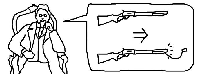
“The Death” is a way to limit the world’s movement in that direction, but many other things could have done the same job, like a wall. I had two main reasons for thinking about death here. The first one is to help the player to understand that whatever he tries here, he will die. The second one, is that it will be useful at the end of the game. It is in fact the real “Chekhov’s gun” of the game: “If in the first act you have hung a pistol on the wall, then in the following one it should be fired. Otherwise don’t put it there.

So, this was the limit-the-world solution that allowed me to create the final puzzle, in the “Evil Meat Hand fighting” location where the game can be only won by “that one” that wins everything.

After releasing the game, some people complained that if the Death was going to be invocable at the end of the game, it should also give some response when invoked from other locations, for example when called from the tree location to chop the tree with its scythe.

This would be a dangerous approach from my point of view. The death can’t be used to help in another task, or it will lose its power as “Chekhov’s gun” (once fired, there’s no need to fire it again). Perhaps the game would allow the player to invoke it and show its destructive power in each location, but it also has the risk of making the player think that the role of Death in the game is finished, so this will be carefully thought about but probably will not be included in the definitive edition of the game.

The change I will probably do in this screen is related to a comment from one of my beta testers:

Having been proven by beta testers that the final one is a difficult puzzle to solve, it would be a good idea to give some more clues to solve it. Not too much, as I want the game to stay somewhat difficult.

The change will be in the image sequence shown when you try something different to go to the death location. At this moment, Gent Stickman looks at it, then it looks at him, and then Gent Stickman dies.

The change will be subtle: Gent stickman will look the death, it will look Gent stickman, then death will point him with its HAND in some kind of invitation for a handshake. Gent Stickman will smile and handshake death, and then he will die.

This will relate in some vague way that the way to combat Evil Meat Hand is by shaking hands with Death, and will be a way to show that in fact the death is not so evil but only, well, deadly.

2 Likes

5.5.- The evil meat hand

Let’s make a jump to this puzzle although it is the last one in the game, and I will return later to the other ones. I was sure that this would be a difficult puzzle (after all it is the last one of the game), but I also believed that people perhaps would stop at that point to think, checking all the available “items” in the game (scarce amount of them) and finally would ask Death for help.

As Iñigo Montoya says in the Princess Bride film, when searching for an intelligent man to help him in his mission: “I don’t need Visini! I need the man that defeated Visini!

Those were the kind of thoughts that I believe were probably a good starting point to solve that final puzzle without further help. I talk more about how difficult the puzzles are and how many people were able to solve them later.

One of the reasons to maintain the environment as simple as possible was the graphical minimalism I decided for the game, but there were also technical reasons to minimize the number of elements in them:

  • To avoid creating too many commands due to time limitations (examine, …)

  • To avoid many interactions with many objects , to avoid having to create commands for them, and to avoid nonsense complexity for the player (use A with B in N possible ways)

  • To avoid drawing them in many different situations, because the player having many possible actions could cause technical difficulties.

  • To simplify the available options to the player, as the puzzles seem to be hard enough.

This location is graphically more complex than the others: it has many more lines, has perspective, and has a lot of objects in it (it’s a tribute to a classical non-parser videogame, do you know which one?). The reason is that no matter what you type, you are going to be punched by the Evil Meat Hand, so the objects and the scenery are a kind of a big red herring.

As I said before, the only way to defeat the Evil Meat Hand is to call death, in the different ways the game allows from this location.

Adding the slight modification to the image sequence in the “death” location, as I already told, would probably increase the probability of people finishing the game without further help when they reach this “Evil Meat Hand fight location”.

At this point I must say that as far as I know, nobody passes this screen without using the help system. Some people reached this point without it, as I will explain later, but nobody solved this without help.

However, I have seen a person physically playing this game in front of me. I could see the frustration in her face, trying to do all kinds of funny, clever, and desperate actions. The deal was for me to remain silent without giving additional clues, but at one point it was really hard for me, when she started to talk alone about possible ways of actions without typing them, thinking aloud, and one of them was “don’t know… call death to kill the hand…or jump over it… or…” and never tried the “call death command. All the frustration at that point moved to me X.X

So, with this in mind I think that although difficult, this puzzle can be solved.

2 Likes

5.6.- The Pit

This is the main puzzle I would say, not only as the metaphor of the two worlds I talked about before but also as a puzzle that needs interaction with other locations and items to be solved.

People trying to cross it in a usual way like jumping, will die, no matter if they try to run first, or if they decide to go down carefully, and no support will be given from the castle inhabitants if you ask for it.

This is a physical puzzle, as it involves some “spatial” thinking: If you can’t arrive to the other side jumping from the same level, perhaps you can do it jumping from a higher point. To do this, you need that higher point, and the tree is the most obvious solution, but if you try to take the tree, as we saw before, you die.

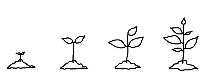
How can I get a tree? Well trees come from apples, so the logic here is I would say “real logic”, being the “cartoonish crazy logic” only in that a tree needs time to grow. But as long as you try to plant the apple you will see you can do something with it.

It is also possible that the player was not going to understand the concept of gaining height to try the jump, and he just ends up with a tree there after trying the most common things you can make with an apple: eat, give to someone, throw, stab, or finally, plant it.

Following the “cartoonish crazy logic”, it was perfectly possible to get a tree immediately after the apple is planted, but I wanted to make the puzzle a little longer, and the small plant that appeared needed to be watered. After all, all this game goes about growing. Where can the player get water? The easy way was using one of the little things in the “lore” of the game: a drawing of you at the toilets.

I wanted to use that resource somewhere in the game, and I couldn’t think of a better place than that, so this part of the puzzle came without too much thinking. But once it was here, it came to my mind again the metaphorical reason for the pit, separating the childhood world from the adult one, and it made me think about the fact that to cross that line it was necessary for Gent Stickman to use some hidden parts of his body. Please, is there a doctor (of psychiatry) in the room?

The transcripts showed me that there are some very creative players, trying to do some “rain dance” for watering. Good for you!

Once you get the new tree, climbing to it and saying “Jump to the castle” was something pretty easy to do. And after all that work, and with its high level of meaning, the moment was an important one, and required special attention to the “animations”.

When one of the beta testers arrived at that point the first time, the game was not fully finished, and that jump was working but without any “story” message yet. That beta tester very wisely noticed that this was an important moment that needed it, and told me to do it.

I thought that the best option was to bring some suffering to the player, making him believe for a moment that the jump would be unsuccessful. As far as I know from players talking about this, the trick makes its magic as they remember this as a special moment in the game.

In fact, one of the players I saw playing the game in front of me in real life, told me after the “Nadia Comăneci” moment jumping the pit from the tree, when it seems you will die again but finally Gent Stickman makes a very professional twist on air and is finally acclaimed, that this was one of the best moments of his life.

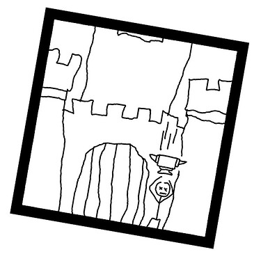
Just after that, he knocked on the castle door and was killed by an anvil thrown on his head, and told me that this was also the worst moment of his life. I really, really hope none of this be true, and is just hyperbole : D

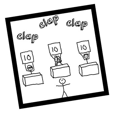
Cartoon language was very well understood by the players in that gymnastic jump moment, where some cartoon people appear in the last vignette to evaluate the jump and give the perfect score, as after that no player tried to search for these people with commands, understanding perfectly that they were not part of the game, but only a stylistic resource to make the story more epic and funny.

1 Like

5.7.- The door

This puzzle is different from the rest of the game for many reasons that I’m going to explain.

This is the only place where I use text to communicate with the player instead of graphics.

Other places in the game use words as onomatopoeias (clap, splash, …), initials (R.I.P.), a single word such as “censored”, or the final “The End”. I think that all these make the game more understandable without moving away from the “only graphics” cartoon concept.

The main door sign however is a plain English long message that you need to read and understand if you want to continue the game. It’s the only part of the visible output text that would need a mandatory translation if the game is ported to other languages.

This text in some way “breaks” the way the game world is working, and it also “breaks the 4th wall” asking the player to do things himself instead of Gent Stickman, requesting them to type something in a location of the game where there’s no keyboard, as the keyboard the game is talking about is your physical device. So here, that fourth wall is broken not only in the standard way you can see in a film when the characters look at the spectator and talk directly to them, but in a deeper way.

This situation is also the only one requiring the exact word (in fact two variations are allowed as the sign could be interpreted in two ways) as the password it is. Here I use strict parsing instead of loose one, being this the only point of the game where I do that.

I was trying to achieve two things with this location:

  1. The tricky one was to have some visible output text somewhere so I could always use it like a life belt if at any moment during the comp I was being told that the game was not a valid one for this reason.

  2. The deep one was to show that some kinds of “puzzles” or dialogs need to show text to the user, and this is one of them, in fact because it is mainly a text puzzle.

I thought that although this puzzle was violating one of the pillars of the game, “not using output text to be shown to the user”, it was interesting enough to take the risk, and that after all it was going to be in the “adult literate” side of the world.

This kind of puzzle is heated by many people, as I was told by one of the beta testers. If you don’t catch the language trick soon, you can get stuck for a long time trying to solve it. For other people that was an immediate solution, as this kind of puzzles can be seen in other games, and a similar one is in “The Lord Of The Rings”.

In fact, the first “help” image in this location is an image trying to represent this situation of the book/movie, specially thought to give immediate help to people that already know the book or the film:

This led to a funny situation I saw with a person playing that game in front of me, that asked for help and after watching the image for a while said: “So… I need a sword… and a hat…” X D

Many people tried to solve this puzzle using the kind of magical words like, abracadabra, or xyzzy. This last one has the same effect in all the adventure: It teleports you to the beginning, so basically you die, no matter if you use it here or elsewhere.

Another usual word used here was “friend” or “say friend”, perhaps after remembering Lord of the Rings enigma or misunderstanding the help image, the same word used in that book. It did not work, obviously.

The third set of words were words related to the enigma, like “Right”, or “Say Right”, but not exactly the ones required by the enigma that could be “type the right word” or “the right word”.

1 Like

5.8.- Difficulties of Puzzles

At that point I must say that as far as I know, only one person, one of the beta testers, was able to arrive at the final puzzle screen without asking for help.

As he told me, it was because he thought that the only help available was the standard replies of Gent Stickman to your actions and didn’t know about the specific “help” command. I was really impressed by that because I thought the puzzles were not easy at all, and that fact made me think that perhaps the game was too easy.

Other testers had difficulties in different points. As I already said one of them asked for help in the “Main Door” puzzle, as although he had read Lord of the Rings, he didn’t remember about that kind of door riddle. This also shows me that things that are obvious for some people or at some moment, are impossible for others to solve without help.

From here is where I understood the need of a solid help system, that I will discuss later. After the game released, some users talked about very high difficulty (even “Darksoulish” one), while others talked about the game being too easy. I think that difficulty is a subjective question (and in fact something not measurable with just a scalar value), and in this game depends also on how much you are ready to use the help system.

My general and personal evaluation about this after seeing people play is that the game is difficult but not too much. Many people use the help system perhaps too soon as what they were trying was mainly very near to the solution, and perhaps investing some little more time on each puzzle would lead them to find the solution.

So, I think that the difficulty of this game is not something that needs to be fixed, at least in a general way. You can like or not this kind of game, of course. Some academics (Jesper Juul and Marleigh Norton, 2009) see videogames and poetry as being related, as expressive forms that have part of their aesthetic value in the effort required to advance in their structure. The same way, there are people that like or don’t like poetry and cryptic language and meanings in for example songs.

Under a more pragmatic point of view, I tried moving away the puzzles different from the kind of ones recognizable for me as bad or boring (localized instead of universal, show clues only once without a way to check again, essay and error without a further logic, requirement of an specific physical interface, and of course trying to avoid pixel hunting/guess the verb).

While I created each puzzle I tried to adhere to these five main principles:

  1. Have clear objectives: The puzzles must be there for a narrative reason that the player must understand, so he has something to solve.

  2. Process signposted with feedback: The player should not be required to read the designer’s mind. Information in the game should set the basis of what is required, and failed interactions and unfocused actions from players should generate output trying to lead him in the right direction.

  3. Solving things has consequences: Puzzles must be there to advance in the story. That’s a specific application of a more general rule for narrative: Things happen to advance the story in some way.

  4. Avoid repetitive or boring things: I personally hate the kind of games where you are a mighty warrior but have to act as a errand boy bringing stupid things from point A to B, or collecting things. That’s my point of view for this rule, but the rule should work for other people with their own vision of what is cool and what is not.

  5. Check player`s feelings after resolving: Try to get myself into the player’s shoes and try to understand how he will feel after resolving the puzzle. If I can imagine him saying things like “Are you kidding me?” instead of “Wow! How clever I am!”, the shot was missed with that puzzle. Obviously not everybody will feel the same, but I think that unfair puzzles are more easily discovered with this rule.

While creating the puzzles as a set, I tried to make them different from each other, each one falling into a different category to avoid being boring or repetitive:

1 Apple:

Get something from somewhere that the player knows (or can suppose through basic interaction).

2 Pit:

Go though some physical barrier (mainly using elements in the scenery, perhaps in an uncommon way).

3 Door:

Classical word enigma question.

4 Final Boss.

Use all that I have or have seen to solve the situation, sometimes in a trial and error way, as in many graphic adventures with combinations of “use A with B”.

I think that the puzzles in this game can be more or less difficult, but they are not unfair. Some possible solutions to them would be unfair I think, such as allowing Gent Stickman to fly over the pit, if nothing in the game says he can fly (some people tried, and this try has its own answer).

Some people could see as unfair the “pee situation” but after all, the guy doing it is Gent Stickman and we all know where he comes from. Perhaps I will fine tune the final puzzle, but I’m pretty satisfied with the result, and I think that no other puzzles could match better with the story and the motivations I have for each one. I will not implement any additional ones in the new version of the game, but if you have some ideas for puzzles and want to share them with me, I would love to hear them.

1 Like

6.- THE HELP SYSTEM

I spent a lot of time on the help system, as I understood that it could be necessary for many people to end the game, or at least to move forward on it without being too frustrated.

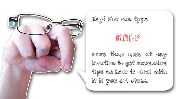
I decided to make it “less integrated” with the game as a design criterion: The help must be specifically requested by the player typing “help” and is different from the hints of information you can get from the responses to the actions you are taking. This is because this help system is in fact a list of clues that are given to the player when he is stuck somewhere. This is to prevent the player from leaving the game without reaching the end. And the system is incremental, so you get more clues each time you request them.

As it was on my mind, the help system should have the following:

  • Different help in each location, telling you what to do there

  • Different levels of help, from almost obvious answers, to very clear solutions, without solving it for you.

This last one could lead to tedious situations when you already ask for the previous one, but they are easily skippable when pressing “space”. One of the beta testers told me about telling the player this possibility, as it was not as obvious as I thought, and the text “press space to skip” is a good, good idea from his side. Thanks man! : D

I also thought about the possibility of adding an additional key to skip all the previous help images but the new last one the player was requesting, but I decide not to do that although it was technically very easy for two reasons:

  1. Adding more keys would lead to adding more texts, and options for the player, and I wanted to keep all as minimalistic as possible.

  2. I liked the idea of the player seeing all the images again as a last chance to rethink them, no matter if he skips them quickly. Perhaps the player can solve the puzzle without using that last hint, in a brilliant last time Sherlockholmesian blow (I think I have invented my first English word here).

Visually the help system image clues are still as minimalist as the other images in the game, but I wanted to make them a bit different to set a difference between what is happening in the game, and what is a result of a kind of “metagame” help command, things that are information for the player, but not things that are happening in the story. Those images are more iconic in the sense of “windows icon” and less hand drawing. They also add a red color to try to lead the eye to the important stuff of the clue.

The main difficulty is communicating to the player without words what is happening in the game. In the help images ,I also had this problem. It needed to avoid giving too much information on each image, and still be universal enough to make them understandable worldwide. It was in fact a very funny part of the game development.

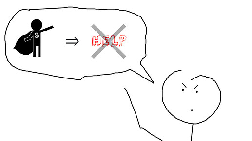
Things like the “big fish eating the little one chain” were the kind of help I like the most, being more metaphoric, but in some places, I needed to use mathematical symbols like “a man = a watering can” that is not a purely graphical language but a mathematical one, a more symbolic one that needs previous knowledge of English. Some of that symbols used are mainly recognizable like “=” or “+” (“1 hand + 1 hand = 2 hands!!!”) but others like the “implication/then” one “=>” can be less universally known by everybody.

Not everybody would be in the same level of disorientation, not everybody has the same clever mind, and not everybody comes from the same cultural context, so a help system like that seemed very difficult to do successfully. Anyway, regarding the help system, I like the resulting game very much.

There is, however, one point that leads me to consider some changes in the help system, and this is the fact that allowing players to obtain hints so easily, even if it is by requiring them to type again the “help” command, seems to lead players to put their arms down more easily, to give up and not take the risk of typing other options or put their brains to work with the epic mode on.

I don’t think it is necessarily worse to finish the game having asked for help, but I have the feeling that more people could have finished it without that, and that somehow they have been deprived of that pleasant feeling of “Hey, I solved it by myself alone!”.

That’s why in the game’s page at Itch.io I put the image with the graphical message of “superstickmanheros don’t use help” under the image telling about the availability of the “help” command, as an invitation for not to use it too much, that has not worked too well.

So, thinking of a way to limit access to help, I came up with the possibility of giving help on a timer, so it will require the pass of a certain amount of time (let’s say a minute) before a new “help” command returns a new help image for that location. In this way, the player will be able to have that “mandatory” time to think about the help received so far, try to digest it, and type commands, even if desperately.

We’ll see if Gent Stickman ends up implementing this variation in the help system, but any feedback on this will be very welcome, even if I end up doing whatever I want : D

Looking at people playing, I must say that some of them reached the last location without need of help, but once in this place, all of them asked for it. The system help I mean, not the death : )

1 Like

7.- COMIC VS VIDEO ANIMATIONS

As I told before, this game embraces the paradigm of using comic vignettes instead of the usual videogame sprites animations, and the idea is doing it as the main system to communicate with the player and doing it without using text.

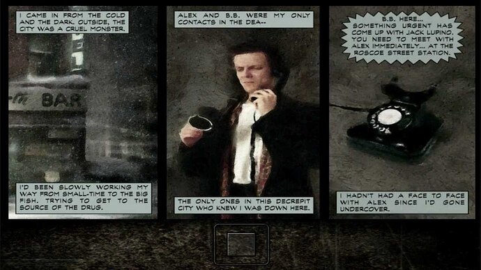
I can think in other mainstream video games using a comic medium as a substitute for the classic video cinematics for cutscenes, like Max Payne:

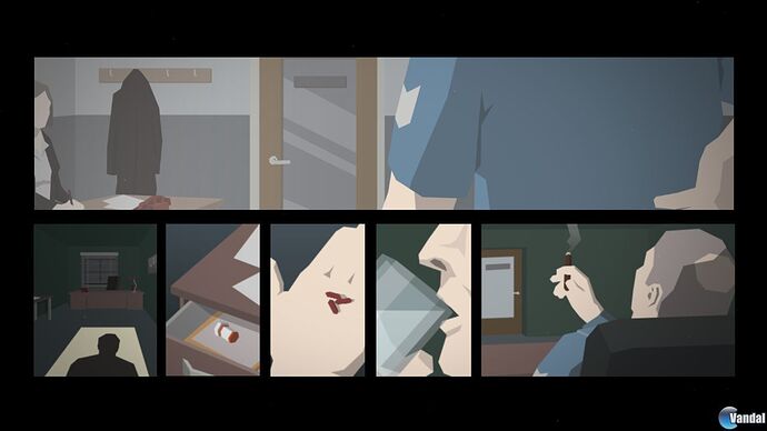
I can also think of another video game that goes further and uses comic also as the gameplay mechanic: “This is the police”, where sometimes there is a crime you must investigate, and you have “pictures” of the possible facts, and you must choose which ones were the real facts and the order in which all that happened. So, the comic is used there as an input to the system, in a very interesting way:

The vignettes for crime solving in “This is the police” don’t have text in them, although some text is added outside them to give context, like witness testimony of what they saw or heard.

The way “Gent Stickman vs Evil Meat Hand” uses comics is different, not using text at all, and being that it is the only way to communicate with the player. I think that was the hardest part of this game development.

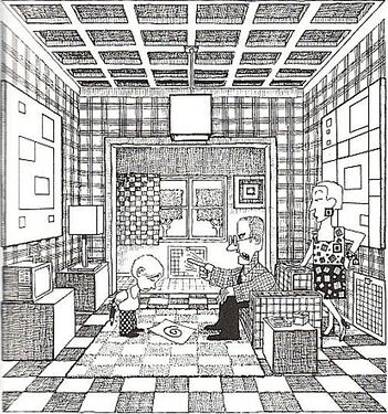
One of the greatest artists doing this kind of communication, and a great inspiration for me, is the Argentinian comic creator “Quino”. His most known work is the “Mafalda” comic strip, but although I love it, his works I like the most are the one-page comics without text, some of them with only one vignette, like the one I use on itch.io comments to tell Dorian Passer how I felt about his game being disqualified from ParserComp 2022:

This talk about that kind of one-vignette “comic” style gives me the opportunity to make some clarifications about comic communication in “Gent Stickman vs Evil Meat Hand”.

Some authors, one of them with an excellent book about comics being a comic itself (Scott McCloud, “Understanding Comics”, 1993), consider that graphical works having only one vignette does not constitute a comic, because the comic works in the “gutter”, the “space” between vignettes, being the juxtaposition between them in the space that makes the brain work to build the story through “closure”.

This game has two kinds of comic communication:

The first one is in the locations themselves, each one being a vignette, without the frame around them to maximize the feeling of possible movements. They are side to side with other locations, left and right. But this is only true in the player’s mind. There’s no physical connection between them as they never appear side by side on the screen. This assumption (a right one) is made by the player that is taken to another location when he types left or right. So here, that gap between vignettes in a classic comic is filled with the player’s interaction. Of course, locations are virtually and logically connected, but they are not visually or physically connected as vignettes.

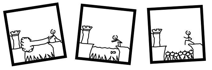
The second kind of vignettes are more recognizable as such, because they have a black frame around the drawings. Those are the images shown as a response to the player. The initial idea for the game was to put them one after another horizontally, keeping the older ones on the screen moving at the left side to make space for new ones as they appear, and losing older ones through the border of the screen when there are not enough spaces to show all of them at a time.

But I thought that this was visually less elegant, and that changing them to the final “slides” mode would still keep the comic concept, changing the classical space by time juxtaposition, without trying to be a “video” attempting to fool the eye with the retinal persistence of images, but just a kind of comic with “double page size vignettes” where you can only see one after you flip the page (or if you prefer, as one of those new “webcomics” ready to be read in a smartphone, with each vignette having the size of your screen).

And this removal of the classic interaction needed to move through vignettes or flip page is the other change from a standard comic, as here the vignettes are replaced in an automatic way and the only possible way to read them is to speed up their “slide”.

Using “comics” that way loses some of the narrative features of their language although we win some others:

  • We lose the ability of arranging vignettes in space the way we want as an expressive resource.

  • We can’t (or we decide not to) use different vignette sizes to change the narration rhythm, although some comics also do that because of the media they are in, like some newspaper comic strips.

  • We have control over the order in which vignettes are viewed and how long they are seen (we set the same time for everyone, but this could be something variable). We lose however the “peripheral vision” of the reader over the surrounding vignettes (and so, the surrounding “time” and facts), but we win the surprise effect when showing each new vignette (this one works especially well, I think, in the “Nadia Comăneci” moment jumping the pit). In a classic comic this surprise effect could be achieved by positioning the “surprise” vignette after a page flip, for example.

  • In the locations, the player can move through the “vignettes” (locations) of the comic depending on his decisions, inside the limits imposed by the game, making it in fact an “interactive” comic.

I’m not an expert in comics. I like them and have read some typical comic theory books (Eisner, McCloud, …), but I’m not an avid comic book reader but a casual one.

I like the idea of experimenting with the media, although perhaps I’m doing horrible things to it with this. I would love to know the opinion of people in this sector and know more about the use of Comic language in video games, especially “no words ones”. Superhero comics are not the kind I like, but I know that in the last times there some Marvel comics created under the collection title “'nuff said” (enough said), being a comic series without text. Perhaps this kind of communication without words is fashionable @.@

1 Like

8.- MUSIC

Music and ambient sound

The main title music and the final scene music were made by me. I’m so sorry : D

In that line of having fun with making the game in a relaxed attitude, I thought that it would be great to do the music myself. I had a professional and good musician working with me in the other original project “Syd Fox: Scotland Yard Detective From Outer Xpace”, but as this was projected as a quick and “stupid” game, I preferred to give it my personal touch also with music, no matter if it was bad.

The intro music was made by recording my voice and making some tune changes in the “Audacity” sound edit tool. I use only voices, hand claps and mouth whistles, because I thought it was more in line with the naive look and feel of the game.

The final flute music (tin whistle music in fact) was recorded in an improvised single shot, some few hours before the deadline, trying to give the final scene some epic and sad feel. The sound was edited by adding a bit of echo. I like to play tin whistle to relax and think, but I have no idea how to read music and don’t know many songs; I like to just improvise and enjoy the sound.

Tin whistle is a little metal flute typical from Celtic regions, like Ireland, UK, France, and the north of Spain, where I am. People starting to play bagpipe use them to learn the basics, at least in my little village.

It was in fact a very funny process. Although I was really, really getting out of time to finish the game, I decided that I wanted it there as an important element to set the feeling of the game.

The music was only for the intro and end, as for playing people sometimes find music annoying. For that part the option I like is very subtle music, or some ambient sounds, like the one I finally used.

Types of music and sounds

In cinema music can be classified in diegetic and extradiegetic categories, difficult words to just distinguish between the music that is played for the spectator and that the characters in that fiction world are not listening to (the extradiegetic one, like the music that is played when the woman and the man fall in love and kiss), and the music that is part of that fiction world which the characters are listening to (the diegetic one, for example a man hearing music in the bathroom where he is shaving, that could even lead him to start to hum the tune).

This is also valid for general sounds, for example with a tick-tock clock sound, depending on a real clock in the scene being the source of the sound, or just an effect added in edition as a background sound for some shots where the creators want to emphasize the passing of time and a situation against the clock.

This game has an intro and end tune that are extradiegetic sounds, but during gameplay it has some sounds that fall in the diegetic category: Some birds tweeting in the outside scenes, and some fireplace sounds in the inner ones.

This music is diegetic not only because it is related to what you are seeing, but also because you can type commands searching for those birds. The response of the game will be,“those birds can’t be seen”, but the fact that the game gives responses to that makes the sounds part of the game. At some point I thought about adding an extra alternative puzzle involving birds, but finally I preferred not to do it due to available time and to avoid confusing players thinking they could cross the moat using birds to fly. However, I still feel that the bird concept could fit well somehow with all the background concepts, in the line of representing freedom, and that perhaps I misused it.

Let’s come back to the music. Seeing the music from the perspective of this game using comic language, one can ask if a comic can still be a comic if it has music.

MORE ABOUT DIEGETICS

But all this stuff about diegetic and extradiegetic things is not only a matter of music, of course. In literature, you can talk about a text having a diegetic or extradiegetic narrator. What is that voice so common in parser games that says “You are in X place. You can see A and B here”?

What Gent Stickman proposes as an “output text” is a reality without a narrator. What you see is what is there.

A discourse exists between Gent Stickman and you: He shows you what he has with him when you ask for the inventory, he looks at you with some anger when you ask him to drop the apple, and looks at you with the pride of child thinking, “you will not eat it” when he is eating the apple.

We could think that Gent Stickman is breaking the fourth wall when he does this kind of thing, but did really that wall exist at all here?

Its reality is not a “box” where something is taking place.

He is not acting, like a film is a representation of things that could be real. In Gent Stickman what you see is the reality.

1 Like

9.- GENT STICKMAN AS A SECOND PERSON PUPPET

In books that talk about cinema techniques you are usually advised against breaking the fourth wall, the invisible one that keeps the spectator separated from the scene, that is “broken” when an actor looks to you directly (or talks to you).

Another thing you are also advised in those books is try to avoid making the spectator become conscious of the square screen they are looking at, avoid splitting the screen or showing different scenes at a time in different frames.

Both of those techniques are used in some films wisely, but are not supposed to be the main language of cinema.

Gent Stickman uses these “Square” images over the main location image to show you the results of the actions you typed, mainly as a consequence of the “comic” medium adopted. The suspension of disbelief that this could bring is, I believe, accepted by the players, without feeling that they are being taken out from the game, as that’s the game language and reality.

Also, from the very first location we can already see Gent Stickman looking at us through the screen, waiting for us to tell him what to do.

This kind of direct communication from Gent Stickman to the player happens more than once during the game, for example when you check the inventory, or when you ask him to drop the apple or to eat it, or simply when he doesn’t know what to do with the command typed.

While this kind of communication could break the suspension of disbelief in a story, I think that this is not happening here.

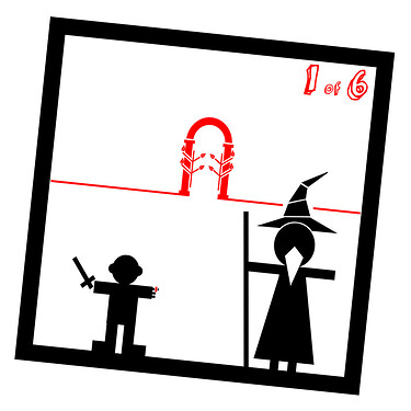
You are not a reader that is being narrated to, you are not looking at the story from the top, but you are in front of it, being the public for the story happening in front of you, as in a theater. As in a puppet theater in fact, with all the children screaming advice to the hero because the evil witch is approaching him over his shoulder. So, the communication of this game is I think more in the line of drama than novel.

Gent Stickman is not you.

I have liked gamebooks very much since I was a child, but I remember I strongly hated when they used a sales strategy like “The story where YOU are the protagonist!”.

No, man, I’m a poor Spanish boy that likes reading adventure stories. You can read that people usually get more engaged with the story when they feel some kind of identification with the character, but if you are telling me to do this, forcing me to feel that way, you are breaking the magic.

Those gamebooks usually use the second person present (“you are in this place, and you can see these things”) the same way than many parser games do.

I don’t think this is necessarily bad, but differs from the usual novels I read where I really feel in the story. I don’t think that this kind of language helps to enforce identification with the character.

The concept of psychological identification is very complex, but I think that what you are trying to achieve in a work of fiction is not that the viewer comes to believe that he is the character. Identifying with someone like that in real life would be considered pathological, feeling the same as another person because of what has happened to him. The usual thing is to feel empathy, understand those feelings, even suffer or rejoice for them, living our own feelings, but not feeling those feelings as our own.

I’m talking here about empathy vs identification: Understand the feelings of the other, instead of feeling them yourself. That’s something that I think works with Gent Stickman’s character.

So you are not Gent Stickman, although you are telling him what to do. You are not feeling what he feels nor can you have absolute control over his reactions. And the game tries to state it clearly. He is a poor puppet that does what you type, but not a robot. In fact sometimes he refuses to do what you are asking him to do (drop the apple he loves, fly, …).

Language to talk with the game

You may be wondering why I have referenced the type of language used in narration in a game that has no output text. This is because the game has input text, and although in English the usual way in which you address the game is through commands I think does not have great implications in this type of game, I think it does in other languages ​​such as Spanish.

In Spanish like in other languages, the way to use verbs is different from English. The second person use of verbs is different from the first person or the infinitive.

So second person:

  • (you) take(2nd) the apple

  • (tú) coge(2nd) la manzana

Uses a different word for “take” than first person:

  • (I) take(1st) the apple

  • (yo) cojo(1st) la manzana

And a different one than infinitive:

  • (to) take(inf) the apple

  • (-) coger(inf) la manzana

After all these free Spanish lessons, you will see that while in English you type the same words no matter the person you are talking to, in Spanish it is different, and for parser games that means that developers have to choose what kind of commands they will allow.

We are surely also more accustomed to reading novels, where the verb tense used is not the present but the past. In English, the verbs used are effectively different in this case, but in the case of Spanish, due to the variety that I mentioned before, the options you have to take into account skyrocket.

Thus, the development of parser adventures in Spanish has always been linked to the debate on what is the best way to proceed, with some games only admitting commands conjugated in the second person, although the general standard I think has ended up being the use of the infinitive, which is the most “aseptic” form but also the furthest from normal speech in Spanish (it is the way in which they made the Indians speak in the translations of westerns), being more forced, and with a greater flavor of operating system shell command than natural speech.

As a curiosity, for my previous Spanish game Celephais I accept the three modes in present tense, although the most commonly used to play was infinitive: coger la manzana / (to) take the apple.

Since I plan to translate Gent Stickman into Spanish, this point will be something to keep in mind.

Texts shown to the user in interactive fiction also use a specific person and tense (past or present):

  • “You can see an apple in the desk”

  • “He saw an apple in the desk”

In this game you don’t have output text, so the only way I can imagine to state what person is narrating would be through that trick of breaking the 4th wall. He is the puppet, you are the player, and you are talking directly to him.

The tense in this case is the present, as what you have in front of you is the real world for Gent Stickman. Again, all that pointing to “theater”.
1 Like

10.- THE THEATER ON THIS

The comic creator Alan Moore (Watchmen, V for Vendetta, …) made in an interview some time ago some derogatory comments about the search for respectability by some sectors of the comic world wanting to present this as a Graphic Novel, a term that has been mainly accepted. Again that ghost of the indigenous reservation that they want to drag to the desert of civilization.

When we get brainy we move the weight towards the brain but at the cost of taking it off the heart. Even at the risk of this happening, I will say that opposite to the approach of the Graphic Novel, with Gent Stickman I humbly propose a way of approaching comics as “Graphic Theater”, in this case in its more or less silent pantomime version (and also interactive).

I sincerely believe that I am not the one to assess the solidity with which certain concepts have been linked in my head during the creation and subsequent analysis of the game, but thinking about that I find both the chain and the result curious: Interactive fiction > substitution of text for silent drawings > replacement of narration by staging as a comic > inclusion of the “puppet” element of my hand that behaves like this in the real world > and finally see how all that puppetry leads us to the concept of theater.

Continuing with statements by Alan Moore (source of the quote (Spanish)):

“Today I think that the strongest means of communication is prose. Only with language can you describe everything, what you see and what you feel. A writer can transport your consciousness anywhere. It’s like virtual reality.” .- Alan Moore

An example of how even geniuses can’t always be right : D

Mr. Moore forgets things here, and the most important I think is poetry.

I’m not talking about poetry expressed in words, which I love. I love words. I even love verbiage sometimes.

When I was a child I discovered The Marx Brothers’s films on public television, which for a time were broadcast periodically. In my house we didn’t have a VCR with which to record them, so I would bring a radio cassette close to the television and record them on some tape that I found around the house, crushing the fashionable music that one of my older sisters had recorded before the radio, to her dismay.

Then I listened to them over and over again, and I laughed a lot, amazed at the wit and verbiage of Groucho and Chico, making me a great fan of theirs, to the point that at some point I was gifted for a birthday with a book containing the dialogues that this pair had on a radio show in the 1930s.

Impossible without words.

Yet there was another Marx Brother. There were more, but you know which one I mean, because in front of these three, the “handsome” one had nothing to do. The great Marx brother I’m talking about is precisely the one who wasn’t talking, Harpo, the perfect counterpoint to the other two.

He spoke by sounding the horn that he always carried (and that in his biography he said he had stolen from a taxi), he also played the harp that gave him his stage name, or with his look that was a mixture of crazy and childish, or with his mime of raised fists and grimace, always ready for a brawl.

All that silent magic was not reflected in my recordings of his films, nor was it possible to include it in the radio program of his other brothers. Maybe that’s why it took me longer to understand its greatness, or maybe because it was more subtle.

Impossible with words. Impossible without poetry.

I hope I don’t seem pretentious, but I see a bit of this Harpo in Gent Stickman, sometimes quarrelsome, communicating without words, a worthy man, a good man, who endures the pull as best he can in the face of misfortunes that rain down on him. Just a child after all.

Beyond Shakespeare

From the title itself and the concept of its story and characters, I think there is an effect of estrangement.

Bertolt Brecht sought a distancing effect in the theater, trying to prevent the public from identifying with the performance, preferring them rather to be aware of the fiction all the time.

This breaks with the usually sought after concepts of suspension of disbelief, of not breaking the fourth wall.

Shklovski argued that everyday life caused us to “lose the freshness of our perception of objects”, making everything automated and, this is my addition, less poetic and magical.

That led me back to the graphical elements in the game. There is a fact about cartoon drawings, stick figures: They have different properties from the most elaborate and realistic representations:

  • They are more general/universal and therefore are able to represent more people.

  • They make one identify more easily with the character, as opposed to the distance from “the other” more realistically drawn, or in some cases from the backgrounds, as in the Tintin comics (Hergé).

  • They are more subjective than photorealistic objectivity, leaving more room for interpretation.

This is not my opinion about them, but the clever insights on the topic written by other authors and scholars of the subject.

According to McCloud, the simpler and more direct the text, the closer it is to “drawings”, they are grasped faster, requiring less perception and more reception.

Now here comes my opinion about which classic adventures with less elaborate and more functional language would be closer to Gent Stickman than other, more literary ones.

And without going into personal preferences or trying to pontificate, I would say that the old dichotomy between more elaborate and serious language (very suitable for leisurely and mature lovers of literature) and more functional and less literary language (very suitable for the video game genre and a younger audience that wants to interact at all costs) is a matter of the player’s taste, but also a matter of what is intended to be achieved with the game. In any case, both approaches are totally essential to achieve the author’s goal and, always in my opinion, without one being objectively more desirable than the other. Of course, you are perfectly allowed to love one and hate the other : )

What I try to show with this is that graphical communication instead of text is also a designing choice, as it is using stick figures instead of more cool photorealistic graphics, and as it is using digital same-with strokes instead of more dynamic indian ink hand drawn strokes over traditional paper.

1 Like