3.- THE THEME
I’m good at graphic design, but not so much at illustration, so I could have asked someone else to do the illustrator job, but that would lead again to depending on someone else to finish the game, so the idea was discarded.
A person with a creative profile very close to me told me about the possibility of making the graphics on real paper using ink, which could then be quickly scanned. Although the option initially seduced me due to the superior graphic quality that would result, each small link in the production chain that involved extra coordination or processing time that was unaffordable if I wanted to arrive on time.
My best option for the available time was to make graphics in the childish stickman style. And this brings me to my idols in “children literature” that I was talking about at the beginning of this text.
The game would have childish graphics again because of a restriction of time, but instead of fighting against it I thought that the design should embrace that, and the game should be built around that.
It would not be a “game for children”, but just a game, as I remembered from a Michel Ende writing:
So, at that moment I thought that a Michel Ende quotation at the beginning of the game was mandatory.
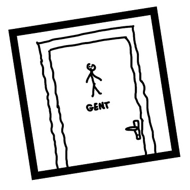
Thinking a little about how the main character would be, made of stick drawings, I arrived at the idea of the stick drawings in the doors of public toilets. This drawing is usually accompanied by the text “gents” below and searching on the internet I saw that “Gent” was a real existing male name for people. I also saw that Stickman could be a plausible surname, as the Steckmann surname really exists. That was the birth of “Gent Stickman”.
