I’ve been steadily refining my Dialog automap extension, and I’m broadly happy with how its maps look. I think they do a good job with what’s available in ASCII: rooms are ( ), connections are - | / \, arrows are --> <-- ^ v, and so on.
But I’ve been considering a Unicode version, which would use proper box-drawing characters instead of plain ASCII. I’ve experimented with a few options, but none of them have really satisfied me yet.
So I’m curious. What are memorable ASCII-art maps people have seen in games? How were they structured? (Other character sets are fine too, it doesn’t have to be ASCII specifically.)
I’ve also considered sticking to ASCII but making a custom font where each character is shaped exactly to my liking. The main reason I haven’t yet is because font design is hard…
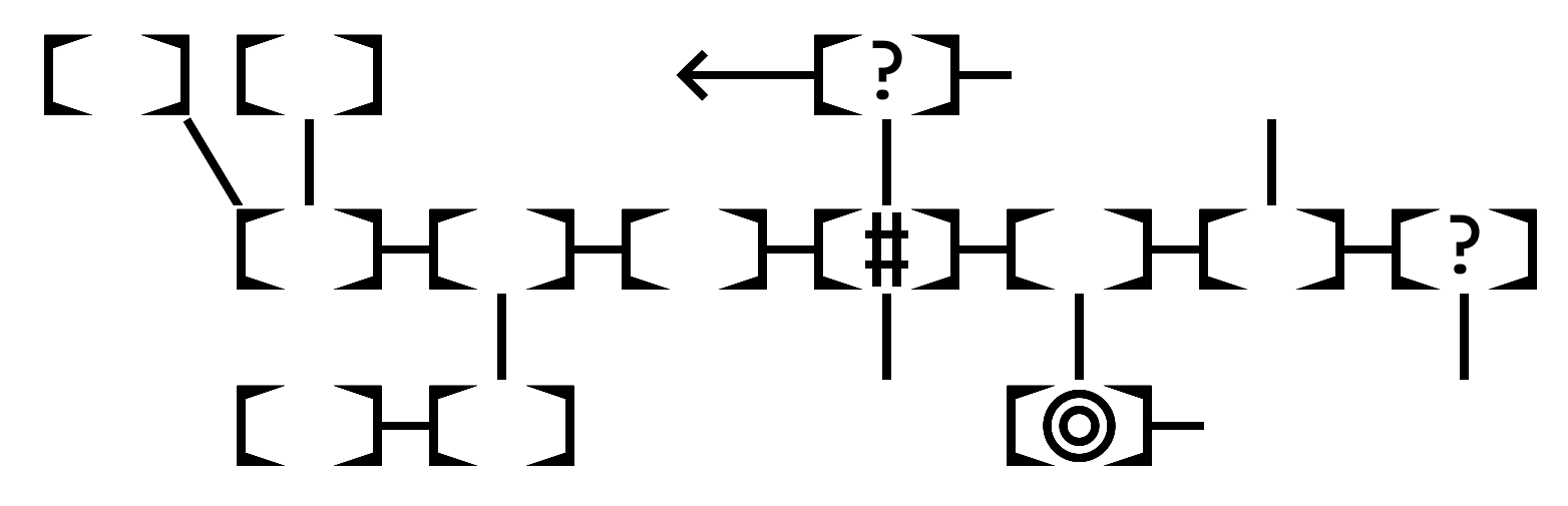
Here’s an example of the sort of thing I was remembering:
The boxed .'s are rooms; the #s are corridors between them. Obviously much more complicated than you need for IF room connections, but you could have the #'s turn a corner, for example, if you went north from one room and entered the next from the east, so you return by going east.
…but Roguelike grid maps are probably of limited interest for inspiration 'cause you’re considering a different problem domain.
I don’t think box-drawing characters would offer much of an improvement if you want something at that scale. If each room were a 3x3 grid (so you could have something inside), sure, but that would obviously take much more real estate, but could look fairly nice. Its usability sure would be enhanced if one could mouseover it and get popup descriptions/annotations, though.
Sometimes, even when it’s not a full-blown map, a mini-map showing only your immediate surroundings can be surprisingly useful and pretty. I didn’t find that A New Life was particularly enjoyable, but I did really like its status line exit listing which was reminiscent of roguelikes (check it online here).
Descriptions when you hover over a room are actually possible in Dialog, though it’s a setting you have to enable in the interpreter (it’s off by default). 3×3 is definitely better for how the box-drawing characters were meant to be used, but it takes up so much space vertically, I worry about usability…especially on Z-machine where I can’t squish down the line height to make them square.
I’ve never actually played Beyond Zork; what’s its map like?
Oh, I do like that one. Maybe I’d call that an “ASCII-art compass rose”?
That’s why I’d have the custom font replace the ASCII characters specifically: someone playing online would see the custom font bundled with the release, but someone playing on an offline Z-machine interpreter would see ASCII instead. Less pretty, but still usable.
Yup. Also, with 3x3 there’d be weird vertical stretching unless you used a very boxy font. So you’d want 4x3. But then a single character couldn’t be centered within! Augh!
Yeah, this cool old game called Scroll Thief had something a little like that…
Here’s a screenshot from some random spot on the web. The mini-map is on the upper right and used either the graphical font 3 or IBM box drawing characters from code page 437 depending on what was available. You could click on a room to go to it.
No specification, currently, just leaving it up to the browser (or other interpreter). If I use a custom font, I’ll probably still let the browser control the size, but set the CSS line-height to remove any space between the rows.
Interesting! It looks like the Z-machine font 3 characters were designed so that each room could be 2×2, with characters like “lines northwest, east, and southeast” that don’t have 437 equivalents to get those diagonal connections. That’s a neat approach. (437 is sadly very lacking in diagonals.)
This is still my favorite type of map, although it has to be hand-drawn.
                        Bridge Street
  ._________________________________________________________. L
  |                                    |           /~~/     | a
C |      A Staircase  Chapel    Chapel |          /~~/  N   | d
h |       ._________.  Tower ._________|         |~~|   |   | y
a |Porters|         |        |         . Gardens |~~| W-+-E |
p | Lodge |         |        |         .         |~~|   |   | M
e |       |         |Master's|         .         |~~|   S   | a
l |_______|  First  |Lodgings| Second  .________. \~~\      | r
  |          Court  |________|  Court  |        |  \~~\     | g
S | Great                    .         |   C    |  Biblioll | a
t |  Gate            Archway .         | Stair- |    Drain  | r
r |_______.    ._______________________|  Case  |     \~~\  | e
e |       |Arch|                                |     |~~|  | t
e |       |_way|               Great     Senior |     /~~/  |
t |              B Staircase    Hall     Common |    /~~/   | G
  |   Library                & Kitchens   Room  |   |~~|    | r
  |_____________________________________________|___|~~|____| e
                                                              e
                        Biblioll Street                       n
@Draconis With CSS, I’ve found that you have to work in px units. Any other unit may round up or down unexpectedly and intermittently causing overlaps or gaps at random. Maybe overlapping slightly is want you need though.
There’s also a thing with Clear Type on Windows and many other devices that try to enhance fonts. It goes beyond anti-aliasing and with some undesirable results. Though it seems to only affect the horizontal rendering of pixels. There’s no way to turn this off. In one experiment, I resorted to using text in SVG tags with it’s native vector rendering filters to disable it, but I felt so dirty afterwards.
Keep us in the loop with a screenshot of your masterpiece.
On a prototype I made long ago I used the Unicode circled characters and other various circles to denote rooms. That could replace the parentheses in your first post. I think I used a dotted one to denote unvisited rooms the player knew about (because they found a map item or something).
There are also some combining circling characters but I don’t know how well they render depending on the font.
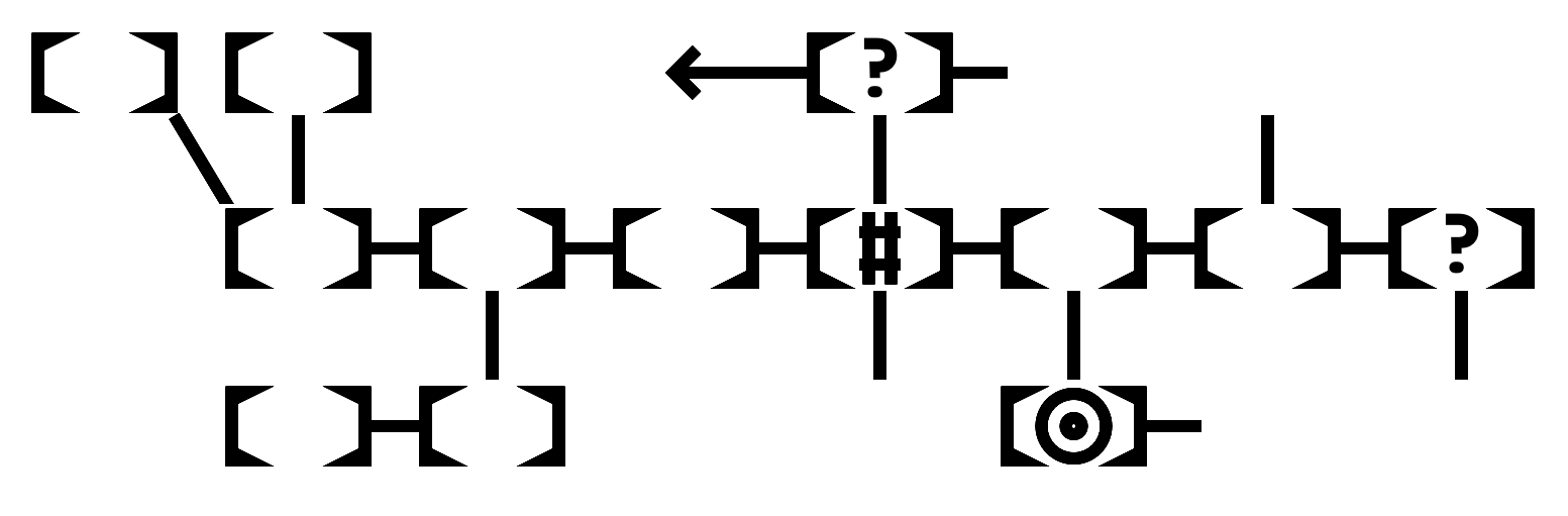
I’m not sure what’s going on with the diagonal lines not quite connecting. They extend a bit beyond the bounding box of the glyph, and that works fine horizontally, but apparently not vertically?
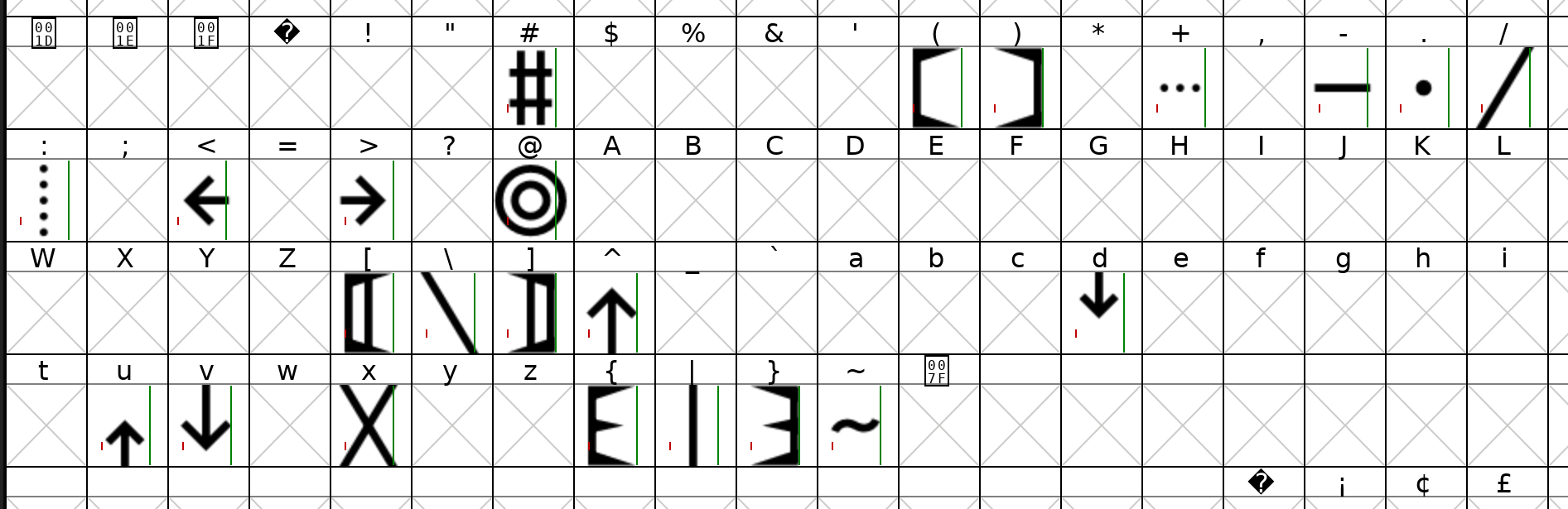
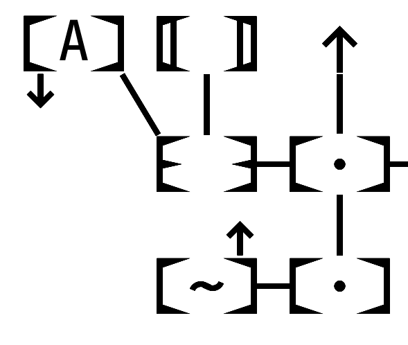
Anyway, the font has three types of bounding boxes on ()[]{}, solid connection lines on -|/\, dotted connection lines on +:, arrows on <>^vud, a small central dot on ., and icons on @#~. Everything else is taken from JetBrains Mono.
I’ve considered making the bars run all the way across the top and bottom of each room, but if there’s always a thin gap between each row of characters, that won’t help.
…oh, allright, if you simply must have feedback… the open spaces at the top and bottom of the rooms look a bit strange on the eyes, but it’s nothing that one wouldn’t get used to, I’m sure. The bold version works better in that it seems to “close” the rooms better, but apart from that, the “bold” seems slightly harder to parse - slightly! - because there is so much less space between the room edges and whatever is in the room.
But this is an “issue” that’s already there with the regular (). I only bring it up now because these cartographic parenthesis look so cool it actually makes me wish it went the extra step. You know, when it was just the regular type we go like “yeah, that’s what we’ve got to work with, so it’ll do.” When we get past that, we naturally start wanting more.