nice! But as a longtime Nethack player, I’m nostalgiac about the @-sign and part of me feels sad that it’s no longer recognizable as such.
2 Likes
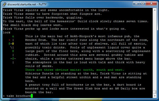
I assume it’s an intentional decision to use the brackets to space it out width-wise to mess with the aspect ratio? Because you could get away without them for less visual clutter if not, e.g. that 2022 PC Gamer article about the Discworld MUD has a screenshot showing their default minimap which is just single characters connected by the bar and hyphen and slashes.
3 Likes
I’ve played a decent amount of nethack, although I never got very far - probably because I always insist on playing a human archeologist.
I’m curious about how this works. Is it dead reckoning based on the assumption of a grid layout, or does the author provide any kind of information to help the layout?
The author provides coordinates for whichever subset of the rooms they want, then the game does a floodfill to spread coordinates from those. So the author has to be careful to keep everything aligned to the grid, or manually add an inaccessible room that displays as --- (for example) to lengthen a hallway.
1 Like
That’s a good point! My logic is that the Z-machine (and thus Å-machine) makes it easy to split off a separate window at the top of the screen, but very hard to split off a separate window on the side, so I want my maps to be wider than they are tall (they’ll be occupying a horizontal space by default).
And since practically all monospace fonts are taller than they are wide, I need to use multiple characters horizontally per room to change that. If I used an even number, it would be hard to align the | above and below a room for N/S exits. Thus, three was the best option.
1 Like
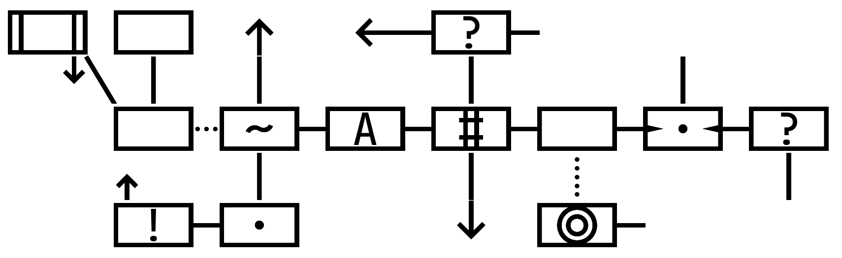
Here’s how it looks with the rooms enclosed:
I’m going to look into how to get rid of those little white gaps in the vertical lines. My own symbols are centered in the boxes, but anything in the default font is offset slightly upward. I have an idea for how to fix that part.
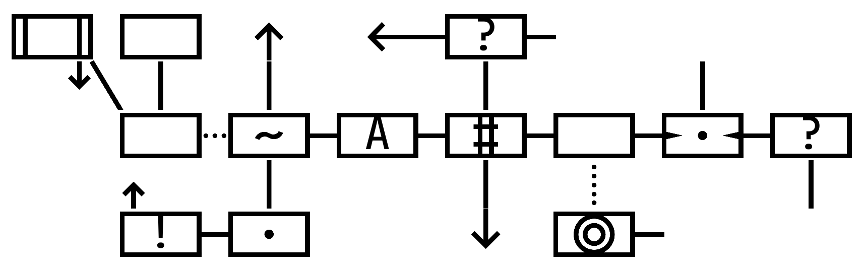
Here’s how that map looks in normal ASCII:
              [ ] ( )  ^   <--(?)-
                d\ |   |       |       |
                  ( )+(~)-(A)-(#)-( )-{.}-(?)
                  u    |       |   :       |
                  (!)-(.)      v  (@)-
2 Likes
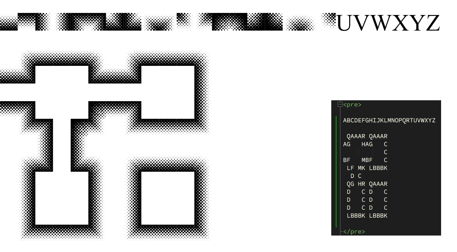
@Draconis You mentioned about gaps and such. I grabbed a square tile monospaced font and started typing out a map (screenshot from Chrome):
I’m not sure what the intent of your map is and how simple you want it, but it seems like the sky is the limit if you make your own font. (There still might be cases where micro gaps can appear, but if you make your glyphs full-sized squares and set the line-height to be the font-size, it should work seamlessly – pun intended.) This font was downloaded from FontStruct and it looks like it takes the difficulty out of making fonts that are geometric in nature. (I’ve never used it though, but I stared long and hard at the splash animation on the website.)
Honestly though, I really like what you came up with. I like concise and minimal, but if you need to make custom symbols and paths, FontStruct might be worth a boo. You can make square character glyphs and have a true 1:1 grid ratio too. You’ll have to think up how you want your tiles to look. Combinations of tiled elements into one glyph can reduce the authoring clutter.
Software → https://fontstruct.com/
Sample Font → https://fontstruct.com/fontstructions/show/161624/texture
CSS
:root {
	font-size: 16px;
}

body {
	margin: 0;
	background: white;
}

pre {
	color: black;
	font-family: 'texture';
	font-size: 4rem;
	line-height: 3rem;
}
I recommend playing around with FontStruct and see if it’s as easy as they advertise.
5 Likes
Oh, that looks very nice! I would definitely use that for something meant to be printed, but the plain-ASCII version is just too big for someone using a traditional Z-machine interpreter (without custom fonts).
Now when it imports all the other glyphs from an existing font, it also adjusts them so each letter is vertically centered in the space. Which looks great for the map:
And absolutely terrible for text:
But since this font is already sacrificing its lowercase v, x, u, and d, you shouldn’t be printing normal text in it anyway.
4 Likes
I’ve been enjoying the Dialog map updates and all the ASCII art maps posted in this thread — plus the mention of Cogmind, a roguelike I’ve spent far too much time playing — but any discussion of ASCII art maps would be remiss without a mention of Brogue, another somewhat popular roguelike.
I don’t know how useful it would be as a reference. The map in Brogue mainly works by using constantly changing colors and light/darkness effects, which I don’t think would play well with parser mapping systems. It doesn’t generate discrete rooms and hallways, but a single interconnected map for each floor where rooms can blend into each other. It’s extremely atmospheric, though, and in some places it can be gorgeous.
Here’s an image from Brogue: appetite for destruction - Quarter to Three
Brogue also has the benefit of being open source and free-to-play online. Yes, I may be shilling a little. But I have fond memories of hanging out on WebBrogue chat and being guided through the deepest levels of the dungeon by other adventuring veterans.
3 Likes
As a side note, the little u and d for up and down exits are not very pretty in standard ASCII. You’ll notice they never appear in any of my released Dialog games—Familiar Problems avoids vertical exits entirely, Wise-Woman’s Dog maps up/down to nw/se on the map, Stage Fright has every up/down exit also have a corresponding horizontal exit that’s used for the map instead.
There’s a spot for them on the map—they appear in the empty spaces next to the | for a north/south exit, u above the room and d below it—but u and d aren’t really a great choice of symbol. Anyone have better ideas for what they should be? I could go with ^ and v, which are my current “north arrow” and “south arrow” symbols, but I worry that they’d point too clearly to the room north/south of the current one, rather than leading off the map.
Several roguelikes use < and > for up and down stairs.
1 Like
And several roguelikes always confuse me which is “up” and which is “down”. I much prefer the arrows on the latest beautiful closed-rooms screenshot, personally. ![]()
1 Like
That would be a good choice, but I already used > and < for between-map connections. (Which I suppose up and down staircases also are, in roguelikes.)
If you’re constructing your own font, you could just innately include a box around the characters representing things in rooms, e.g., @ Admittedly, you’d end up obliged to up the font-size some 30-50% to ensure the @ at the center is big enough to be legible, but each room would be one character, not 3. So, potentially a dramatic savings on horizontal space with a significant, but possibly tolerable, cost in vertical space. (If you plan to use the font for displaying other, general text and want the retain the unboxed versions, you’d have to be thoughtful about what glyphs the boxed versions will be clobbering…)
That’s also an option, but one of my goals is to have the ASCII art be readable on a normal Z-machine interpreter as well, which limits my character choices a lot. I could just make each room a single character, like Josh suggested above, but I also want the map to be wider than it is tall (because it’s going in a horizontal Z-machine upper window), which is why my rectangles are so wide now.
2 Likes
(That said, it’s also not a bad idea to squish this font a bit horizontally, since I’m not constrained to a specific character aspect ratio. Maybe I can make the boxes a bit more square.)
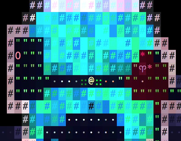
Great thread, now I feel obligated to present the map system I used for my own I7 project! ![]()
You see the map on the top right: I used unicode characters, and rooms appear when they are explored. As opposed to most of the maps seen in this thread, this system aims to reproduce the size of the rooms. Since there’s free space, it could in theory display other things present in the room, like characters or objects (but only the main character is displayed in my game) (Edit: stairs too, see the arrow).
However, I could not think of a real automap system: they are all drawn by hand. Since some rooms can be explored in any order, I had to draw 10+ variants of some map screens. This was fun.
You’ll find the map system at line 36’345 of the source code, if you’re interested.
6 Likes
I was thinking the way to do an automap with a hand-drawn map would be to give each room a list of indices or coordinates corresponding to the character positions on the hand-drawn map to be revealed when that room is entered.