UI in General and Playability on Mobile Devices

I could use some creative input on my modest attempts to develop a good UI for IF.
First off: What I’m showing here wasn’t made with Inform or similar tools, but is based on a solution I developed myself. One of the ideas behind my UI experiments is to let the user choose how they want to interact with the game—whether with a parser, multiple choice, or even voice input. At the same time, I want the IF to be playable not only on a PC, but also on a tablet or even a smartphone.
My attempts so far have been rather imperfect in that regard. But I’ve made some progress, which has encouraged me, and maybe your feedback will lead to a breakthrough or two.
The screenshots are from “Caribbean Nightmare,” my IFComp entry for 2026.
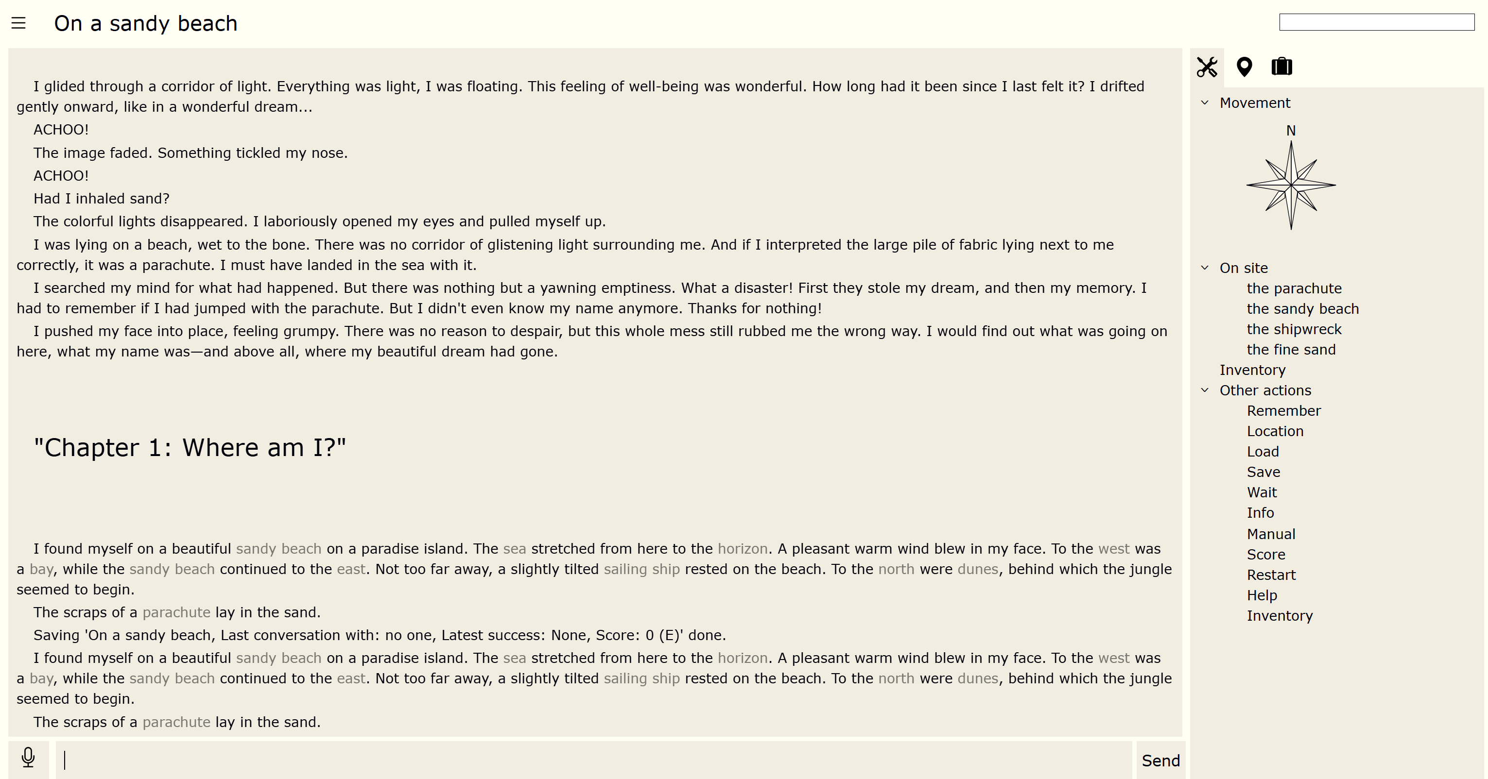
Here’s what CN looks like on a PC, for example:

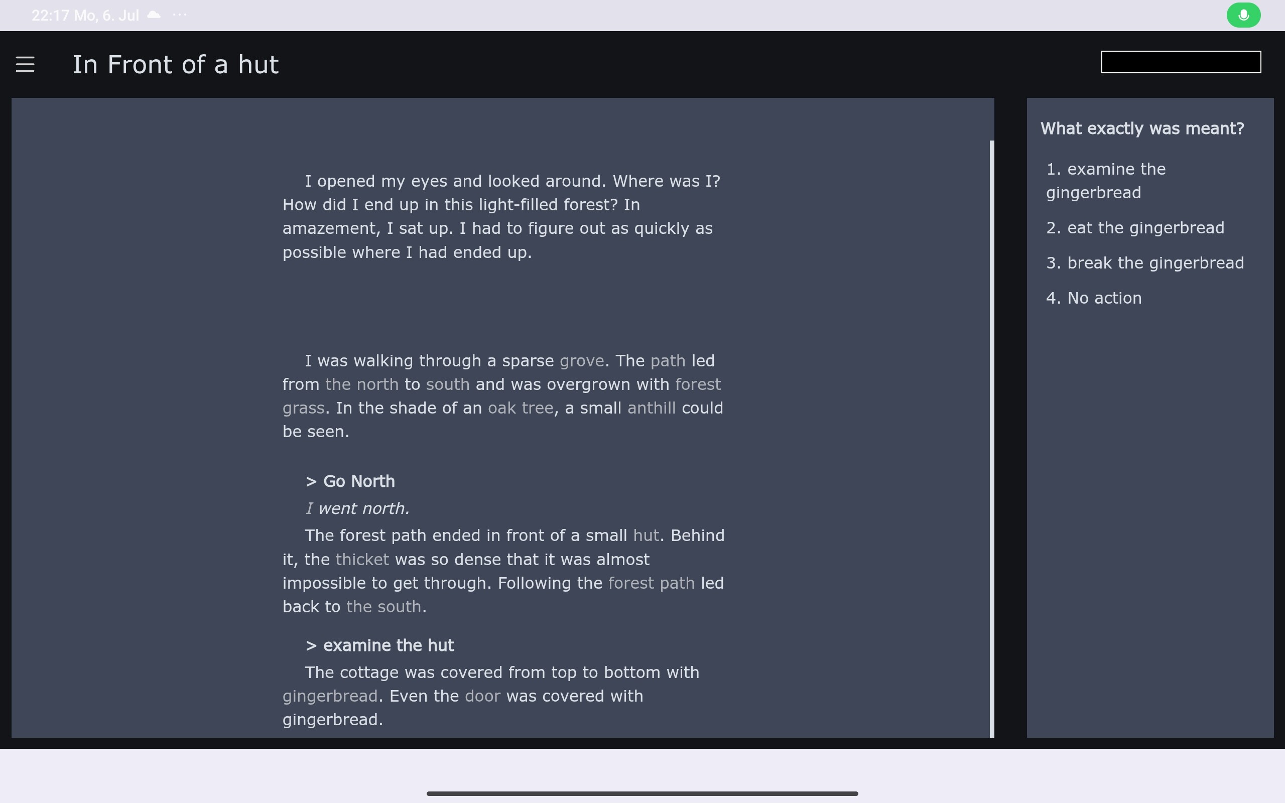
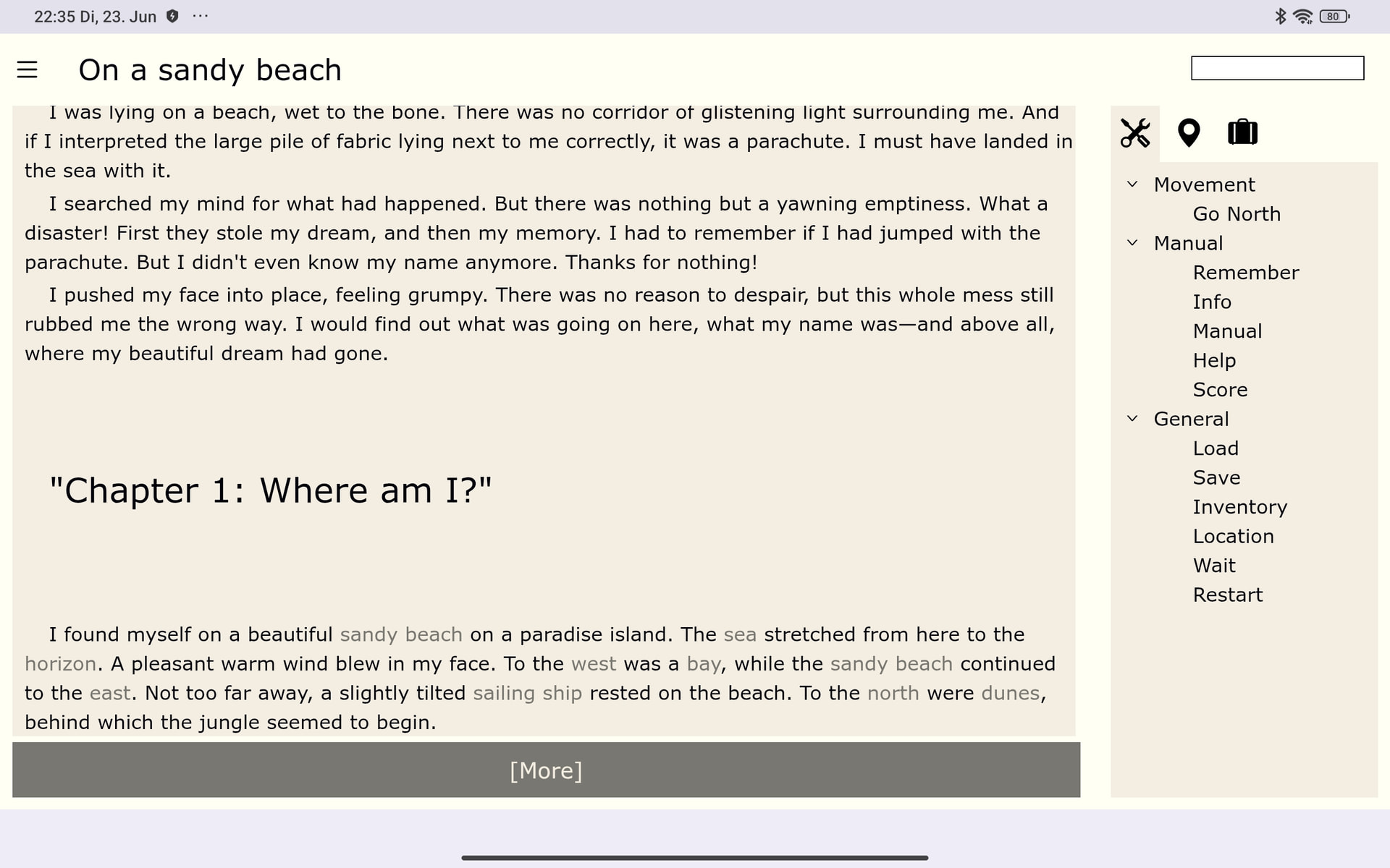
Like this on the tablet:
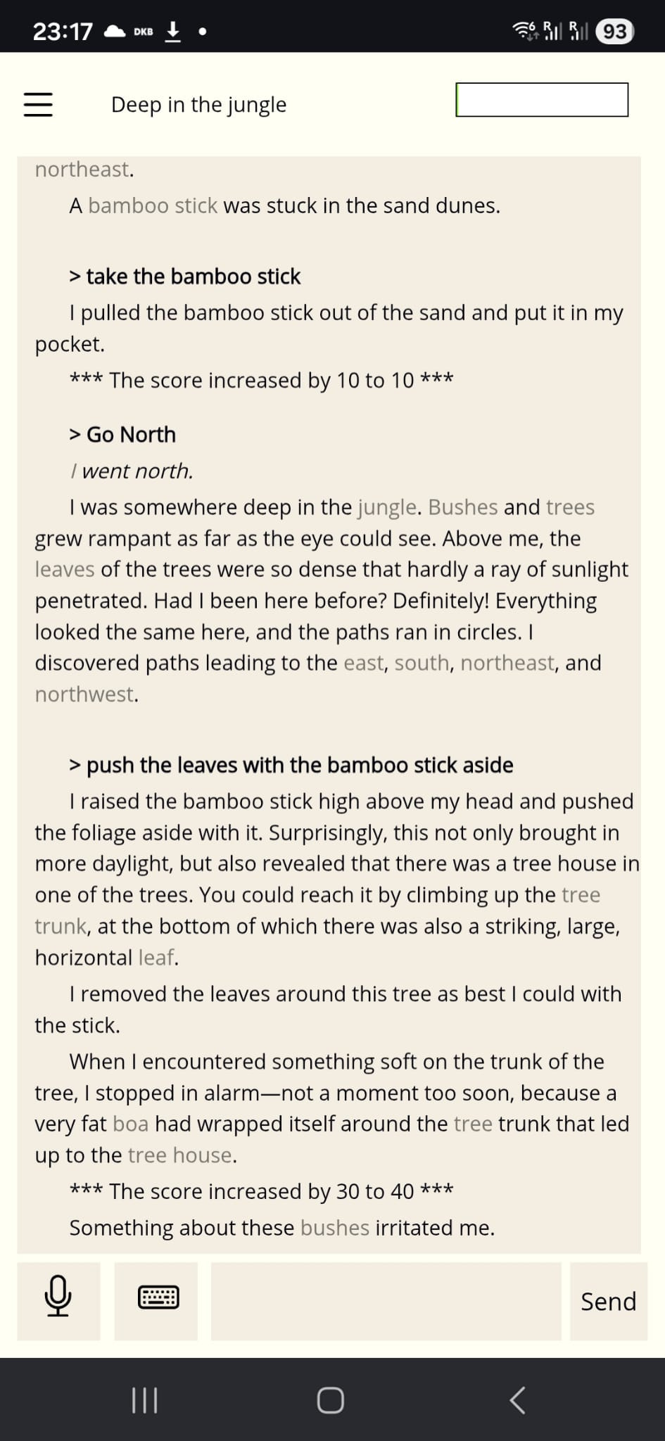
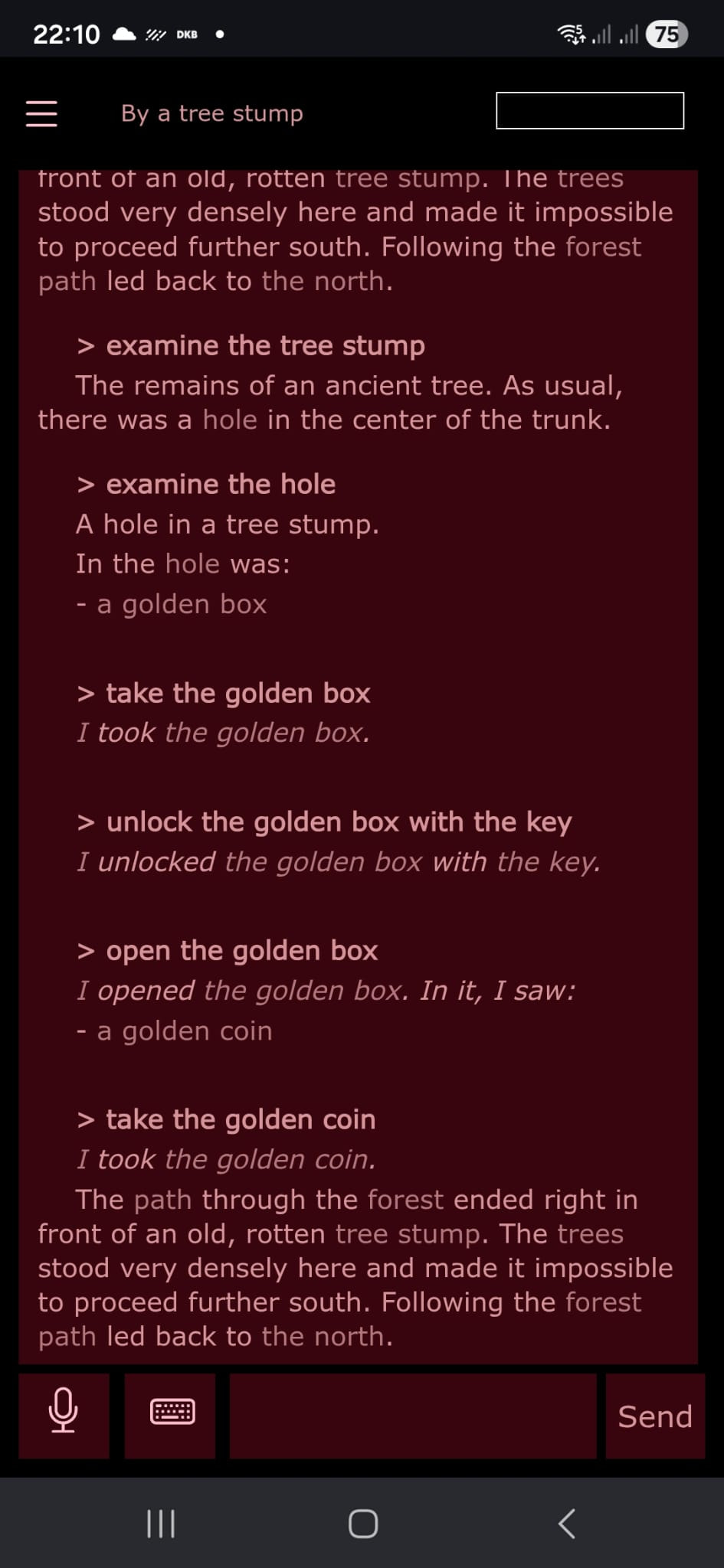
Like this on a phone:
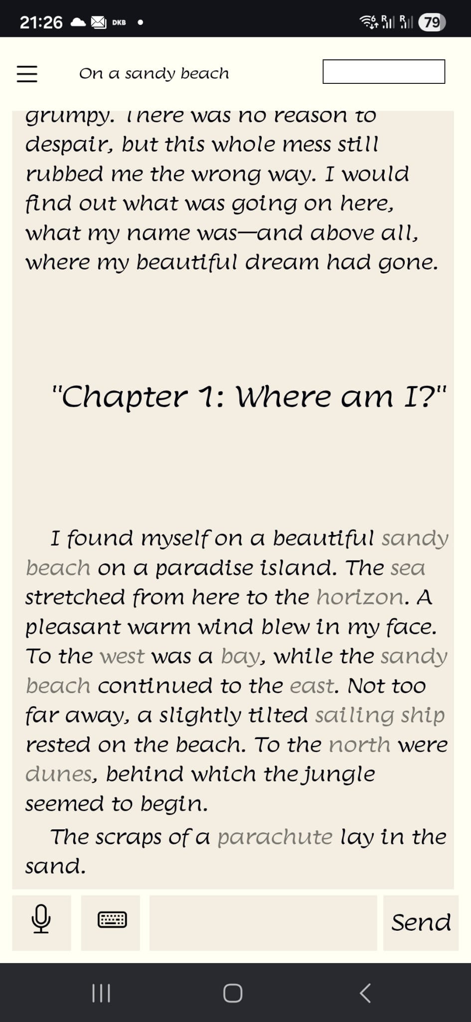
There’s also a demo version available: https://interactive-onions.io:5466 [currently not avaible for some safety reasons]

(This is a browser version that should run on all devices. The version is available in English and German. It defaults to the browser’s language settings but can be changed at any time in the settings. The game is limited to 3 locations, which means, it’s not really playable, but it’s enough included for UI testing )

The system is essentially parser-based (except for the dialogs, but I’ll leave those out of the discussion here); for multiple-choice questions and voice input, text input is generated.

The screen layout can be configured in the settings. If you turn everything off, the screen doesn’t look much different from Infocom in 1985. The elements optimized for multiple-choice questions list every conceivable object and command on the side and highlight clickable words in the running text.

The layouts optimized for PC seem to me to be quite well-developed by now. Still, I wonder: How does this feel to you? Does anything interfere with your personal playstyle? Would you like to see something different? I’m definitely interested in experimenting some more, but right now I’m lacking promising ideas.

The situation on smartphones is different. I find it incredibly interesting to make the game playable there, because the younger generation mainly plays on smartphones. But of course, on a smartphone screen, the battle for every pixel begins immediately, since space is extremely limited. Big menus on the side are a total nuisance. Keyboard inputs are a nightmare.

The current version is the first one where I’ve actually seen any progress in terms of playability on a smartphone. The big difference is that tapping the title bar opens a command menu containing all the standard commands:
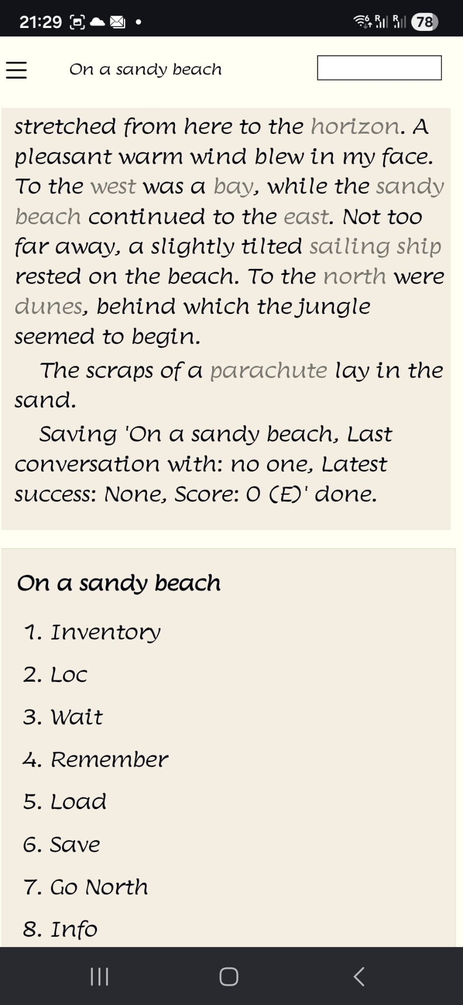
The rest works through highlights in the text and playing in multiple-choice mode. For my personal playstyle, this works pretty well so far, though there’s room for improvement.

And now it’s your turn. If you’re interested and would like to check out the IF, please feel free to give me some feedback! How does it feel for you on a smartphone? Can you navigate it easily? Are you able to strike a good balance between usability and font size? Can you click on the links? Is playing on a smartphone even fun? What do you think is missing? And what do you think is just completely off?

I’m grateful for all feedback (specially if you give it a try on your phone)! If I come across with an improvement idea promising and feasible, I’ll be happy to try it out and share it here. Maybe that will bring me a little closer to my goal of covering as many playstyles as possible with the user interface design.
You might be interested in the link feature that Dialog (and, specifically, the Å-machine on HTML) has, which turns on-screen text into clickable/touchable links. It was specifically aimed at mobile, but it also works just fine on a regular computer’s browser.

1 Like

Thanks for the warnings that I have to check if my tiny demo launch already interferes with the IFComp rules. Version is offline now, will probably come back soon.

This is why I made a native Android and IOS player. I have yet to see it run on any Apple hardware but in theory it does. I haven’t paid any of the Apple taxes yet and have no hardware nor is there an emulator. I have a browser version but the native player is superior. I’d be glad to compare notes if you are interested in how to make a native version.

1 Like

Hi Susan, in my implementation links are created manually, but I use them quite heavily. Playing on mobile without these links would be quite far from being fun.

Yes, I’m interested here, but currently I have some doubts about a native version.
(Non-programmers, please look away for a moment)
The technology I use is Asp.net Blazor, which is a C# based web technology. I also can build an app with that, but that’s more or less an app that opens a browser windows and starts the code (same thing a lot of actual software does). So in my case, the app is not really much superior to a browser version, That might be different in your case, so let me know.

You are halfway there. I use C# for my native Android application. You are much closer to it than you think. If you look into the .NET MAUI framework, you’ll be 100% there. edit - my browser version shares the same code as the Android and Windows version. The real trick you will want to do at the very least is to put your backend into a C# class library. Then use that in your front end. The browser bonus happens because there is a web assembly project that can consume class libraries and compile them for the browser. You can then write a bridge between C# and JavaScript. This is why you’d want to put your whole backend into a class library and separate it from the UI. You then get to have JavaScript bridge functions that can reach across and into your back end. Before you know it you have a true write once run anywhere. In theory .NET MAUI deploys to IOS. There is always a tiny bit of platform specific stuff but it is more or less < 1%, if that, to the project.

1 Like

One thing that strikes me about the screenshots of the PC version is that the sidebar with the command links feels quite far away from the text/command line; I think as a player I would find the constant looking back and forth distracting.

Hello Tabitha, good point!
I tend not to have a problem with long lines on the screen.
Of course, you can reduce the window width. Then it looks like this:


Or like this:

In any case, it does seem like a useful option to me to be able to set the total width of the active area within the browser window. I’d love to give that a try—thank you very much!

2 Likes

I think that’s a bit of a different discussion, so I’d put it in a PM.

In any case: The whole UI stuff is HTML based, For now that seems a good technical choice, as long as I don’t have to mess too much with JS.

1 Like

I have a few suggestions.

the desktop version has lines that are too long. There should be about 80 characters per line and the margins adjusted accordingly. Due to smaller screen size, the tablet version gets this about right. Obviously the phone version will be less anyway.

Whereas i allow players to select different fonts, the mobile version always gets droid sans. This is deliberate. So far, that’s been the most readable font on mobile I’ve found. and it uses pixels better.

your mobile example wastes a lot of space with headers. you can squeeze a few more pixels off the margins.

you indent your paragraph starts. Is this an option?

consider losing 1 pixel between lines. I have found many fonts have a far too generous line height.

ensure kerning is working in your fonts. It helps readability and saves pixels on mobile.

edit: sorry brain failure. i mean roboto not droid sans.

2 Likes

Hello jkj yuio, thanks for your suggestions!

the desktop version has lines that are too long. There should be about 80 characters per line and the margins adjusted accordingly.

I would agree that it should be easier to switch to shorter lines, but why does it need a restriction here?

Whereas i allow players to select different fonts, the mobile version always gets droid sans. This is deliberate.

Same here. To add roboto is a great idea, but why take the opportunity from the player to change that?

you indent your paragraph starts. Is this an option?

Currently it’s a general feature. But it’s easy to make an option from it.

ensure kerning is working in your fonts. It helps readability and saves pixels on mobile.

Probably not perfect with all fonts. Lumanosimo is, I have to admit, really not a perfect example for a mobile font.

Sounds like I have a few ideas for the next few days that I should definitely try out.

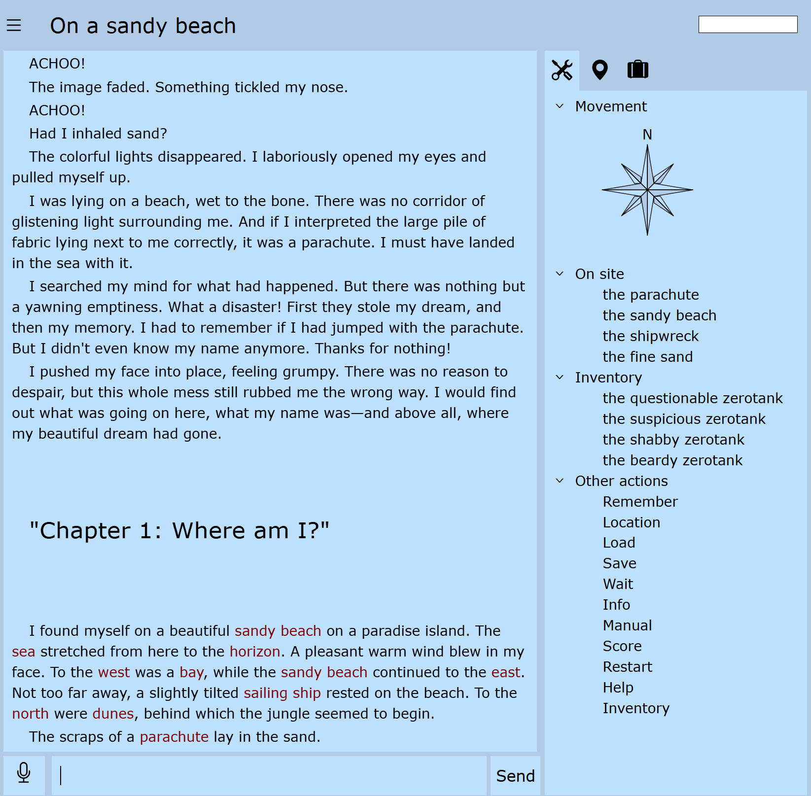
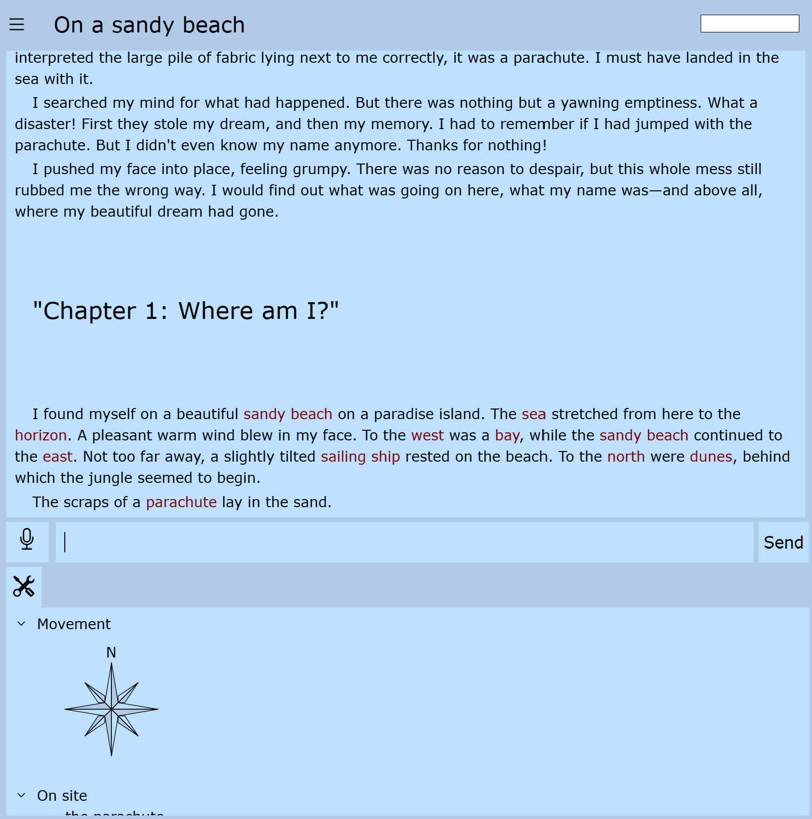
P.S.: Maybe a more typical shot of the current state:

This refers to UI design best practices around text column widths. For developers, it’s long been common to set a limit of 80 columns (I think going all the way back to the days of punch cards). For front-end UI, I think it’s more like 50 to 75 columns, depending on font size. The point is to keep the page no wider than what you’d see on a piece of paper with standard margins, because that’s about the width that human eyes are comfortable scanning (this is well documented, not just opinion). To be fair, it seems like this often isn’t taken into consideration by web-based parsers, which seem typically to default to window width, but it’s a good rule of thumb to consider when developing modern tools.

5 Likes

Yes exactly. Sorry, i didn’t explain it properly. Most guidelines say it should be 55-75 characters, but I’ve found ~80 more suitable for IF. Perhaps because of screen sizes and perhaps the former was from paperbacks or traditional print material. You can get away with more sometimes, eg ~100 when absolutely necessary. For example, when you have limited vertical space like landscape mode.

1 Like

I always set Roboto the default on mobiles. Players can change it. Whereas different games will select different fonts for desktop.

edit: I’d have to try it on mobile, but your “current page” text looks probably too small to comfortably read. I put about 40 chars on a line for mobile. You have maybe 50% more than that. I guess it depends on preference.

1 Like

I would agree that’s a good rule of thumb and will take care of it, but if people like to make use of the full windows size, I think there’s no reason to forbid that.

The shot shows the smallest possible font size. I’d agree that’s too small on most devices.

I let you know when you can try it on mobile. Currently I have to invest a bit extra work to make the UI demo available again.

I’ve now replaced the demo game with a mini-game I created specifically for this purpose. Please don’t read too much into it—it’s pretty silly—but it’s perfectly adequate for the UI demonstrations.

The demo game can be accessed via the following link:
https://interactive-onions.io:5499

I’ve already implemented the following suggestions from the posts above:

  • The Roboto font is now available
  • You can now set text indentation from ‘none’ to ‘big’
  • You can also set line spacing from ‘very small’ to ‘very big’
    (These 3 options are available in the settings menu)

What’s still missing are useful default options for the various device types. Currently, it’s certainly possible to make settings that don’t make much sense or that result in a broken layout.

My main concern is playability on mobile devices, especially smartphones. However, general UI suggestions are still very welcome.

A small addition: The maximum line width is now also adjustable.

The smartphone screenshot shows a reduced line height (any lower than this looks terrible):

The tablet screenshot shows a significantly shorter line length, which will hopefully be easier to read:

1 Like

Is the site down? It’s not loading on mobile currently

1 Like