"release along with an interpreter" for future generations + question

Preface
I am attempting to do something, and it hasn’t gone well so far. I think that there must be many philosophical and technical reasons why that might be (including my own lack of understanding), but I probably don’t know enough to comprehend such things. I just want to have my game ready for Spring Thing, and the submission deadline for that is Sunday.

So if someone says, “oh, that’s the frob, it just doesn’t work with fram, you need to update the schlam before you can guncho the fweep,” I probably won’t know what that means. I learned Inform for its natural language features and that’s been great! Better than expected, even, but that hasn’t taught me to gaspar or cleesh.

I say all this because: I probably won’t understand discussions regarding Inform’s architecture, general principles of website design, and so forth unless they are sufficiently dummied down to my level.

Narrative for users finding this thread in a search
Last night, I thought I’d get a jump on the process for sending my content for Spring Thing. It looks like I have a couple of things to consider: online and offline play. Offline is pretty straightforward, it’s just files that I already have.

Online play has proven to be more challenging. I know my discoveries won’t be news to a lot of you, but I’ll briefly talk about them for anyone finding this thread in a search. In order to provide a game to Spring Thing that is playable online, it has been suggested that I read 25.11, “a playable web page.” It’s very straightforward! I just need to add the line Release along with an interpreter to my source.

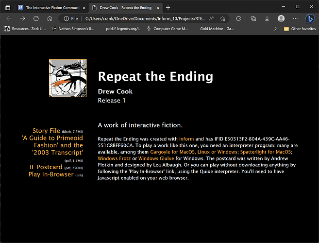
So I do. The website looks pretty bad; the cover art is splashed across the entire page. I see that, among the release files, a “small cover.jpg” file has appeared. I can find different pieces of advice about “small cover.jpg.” The v10 documentation only mentions “small cover” once, in section 25.10 (“a website”). There, it says that:

(“Release/Small Cover.jpg” is a form of the cover image intended for display at a smaller size. In earlier versions of Inform, the author had to provide this: there is now no need.)

Elsewhere, (forum threads, etc) I read that my “small cover” file is too large. So I make a resize of “cover,” name it appropriately, and place it where “cover.jpg” is supposed to reside. The ideal size appears to be 120 x 120 pixels. I rerelease, but the problem isn’t fixed. It seems that the release process has created a renamed version of “cover.jpg” rather than pulling in my file. Ok, so then I drop my file in, post-compile, and things are much better.

However, it appears that images have been stripped from my game. OK, I search the forum and it seems like this is widely known (maybe undocumented) behavior. I find myself downloading python in order to execute “blorbtool.py” on my GBLORB, in hopes of dumping the newly generated files in my “interpreter” folder.

Whew, oh boy. Then I run my game with play.html and… it worked!

So, if somebody stumbles across this, that’s what I did. If you’re like me, and don’t even know what python is… I created a new directory in the root of c:\ (windows talk here) just to make the command shorter and simpler. Hope that helps!

My question
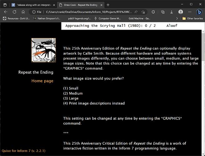
The appearance of the status line is… not what I want. It’s a lighter, grayish/sepia color over a white screen, which probably poses visibility problems for some people. Its text is monospace, which is a mismatch. I don’t know how to read CSS, but I think I see places to set background color, font colors, and the like.

Is there a place to configure the status line’s text color, font, and (window/background) color?

Sorry if this should be obvious, but I have no idea what I’m doing. I’m open to fiddling with it myself (it’s probably not harder than configuring Gargoyle), but I must not be looking in the right place.
relevant:
Release Along With an Interpreter - Authoring / Inform 7 - The Interactive Fiction Community Forum (intfiction.org)

9 Likes

Congratulations for reaching that point, it’s not easy.

You can indeed change the appearance of the web interpreter (named Quixe) by adding some CSS.
The easiest way to do it is to modify the generated files but your changes will be overwritten when you release again. Let see how that goes, then we’ll see a better way of doing it.


*EDIT: I started with this method because it was simpler than the “clean method” but I found another way which is both simple and clean, so you can just read the part about the CSS code then skip to the section named “The undocumented way” *


The quick & dirty way

There are several places where you could add CSS but the simplest is to add a <style> tag in play.html.
So open play.html, and add this just before the closing </head> tag:

<style>
.GridWindow {
  background: #FF9800;
  color: #FFFFFF;
  font-family: arial;
  font-size: 16px;
}
</style>

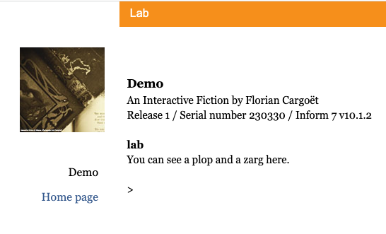
And voilà, you have a white on orange status bar, with the Arial font and a slightly bigger font size (default is 14 pixels).

image

You can change the values of background, color, font-family and font-size.
There are many color formats but for simplicity, you can stick to hexadecimal.
For the font-family, it needs to be installed on the player’s computer (we can include a font if needed but let’s start simple) so I recommend using a well known font. You can specify several fonts, the browser will use the first that is installed:

font-family: Arial, Courier, "Times New Roman";

Multi-words font names require quotes.

Since the status line is a grid window, it’s recommended to use a monospace font (a font where all characters have the same width). But if your game doesn’t need perfect text positioning: ¯\_(ツ)_/¯

The .GridWindow part of the CSS we added means our custom style applies to HTML elements which are marked with “GridWindow”. That’s all grid windows in your game so if you have several grid windows, you’ll need another way to target the status line specifically. If you don’t know what’s a grid window, you probably don’t have to worry.


The clean way

I was going to talk about website templates and how to create one with just the extra CSS (the rest of the template being inherited from the standard template) but I remembered a simpler method. So, let’s skip directly to the next section.


The undocumented way

I can’t find it in the IDE documentation but it might be “documented” in the source code of Inform itself, I’ll have to check.


EDIT: it’s mentioned in the changelog for 6L02


If you have read the chapter about releasing, you know you can Release along with cover art or Release along with the introductory postcard. Well, you can also Release along with the style sheet "foo.css"

So all you have to do:

  • create a CSS file in MyStory.materials/, for example MyStory.materials/extra-style.css
  • in that file, put the CSS (without the <style></style> tags, so that’s only .GridWindow {...}
  • add Release along with the style sheet "extra-style.css"
  • Release & enjoy

Pro: your extra CSS will be included every time you release.
Con (minor): you need to release to include your changes (just changing the content of extra-style.css won’t change the website because it’s copied by Inform into MyStory.materials/Release/extra-style.css when releasing.)


Going further

Here are the topics I’ve not explained in this “short” tutorial. Don’t hesitate to ask if you want to explore them.

  • how to include a font which is not installed on the player’s computer
  • how to deal with multiple grid windows
  • what’s an hexadecimal color format
  • other CSS properties you might want to change
  • how to create a custom template and why
8 Likes

The problem with images not appearing will surely be fixed in a future Inform release.

What happened is that when 6M62 came out (2015), the web interpreter didn’t support images – or it had only barely gotten image support, I guess – so that release of Inform didn’t hook up the images properly in the “along with an interpreter” code.

And then the next release of Inform was eight years later and was entirely focused on code cleanup, rather than adding new features. So the image stuff just hasn’t made it in yet.

The blorbtool trick was a “temporary” workaround. Sorry…

1 Like

This is so helpful! Thanks for explaining it in a way I can understand. I’ll experiment with the monospace/proportional options and see how things look on different window sizes.

At least there’s a way! I would never release a version of my game without images, which would probably be a hassle for people.

2 Likes

I’ve updated my post.
I was supposed to write about website templates but I remembered a much simpler (but undocumented) method.

2 Likes

Great! I’ll experiment. I only have the one grid window (at least I didn’t create any myself), so this should be fairly straightforward. I’ll update the thread with my results.

Thanks again for taking the time to write clear, detailed instructions. Much appreciated!

1 Like

My BONES rattled in agreement with this preface.

2 Likes

Do not hesitate to ask if some parts are unclear.

I’ve found mention of “release with a style sheet” in the changelog for 6L02 (v9.1) so it’s an old feature. Too bad it never reached the manuals.

2 Likes

Glkote’s default of #000 on #D0D0C0 has a contrast ratio of 13.4:1, easily complying with WCAG 2.x Level AA, meeting which is what’s generally considered accessible. It’s even much higher than the requirements for the much more stringent Level AAA.

…but it’s also generally accepted that WCAG 2.x’s scheme for measuring contrast isn’t great, which is why it’s slated to be replaced by APCA in WCAG 3.0. By APCA, it’s Lc 78. The 14px normal weight text doesn’t comply with APCA. If it were either 18px or bold, it would.

The status line is a grid window and is meant to work with a fixed-width font. But so long as you’re not using the right-hand side or otherwise trying to write to a particular place, I think you could just follow @CrocMiam’s advice to change the font without regrettable results.

3 Likes

I think it’s pretty hard to look at, but I’m no authority.

As a last (I hope) question, I would prefer a dark screen with a sans serif font (both frames). I’ve been digging around in the settings, but I can’t figure it out. There seem to be many places to configure fonts. I think some have to do with features I’m not using. After a few hours, I’m not sure I can figure it out.

If I understand correctly, you also want to change the text color and the background color of the main window?
If that the case, here’s some CSS to help:

/* This targets all buffer windows (like the main window) */
.BufferWindow {
    background-color: black;
    color: white;
    font-family: sans-serif;
}
/* This targets the command that is echoed */
.Style_input {
    color: white;
}
/* This targets the actual input being typed */
.Input {
    color: white;
}

As you play, you’ll find some elements are not readable and you might want to adjust them too.
I think of the “More” text which is displayed when there’s a wall of text (CSS selector: .MorePrompt), the previous reading indicator (.PreviousMark).

2 Likes

There are several places to specify the font, but the primary ones are these stanzas:

.BufferWindow {
  overflow: scroll;   /* vertical scrollbar is mandatory */
  overflow-x: hidden; /* but horizontal scrollbar is forbidden */
  font-family: Palatino, Georgia, "Times New Roman", Times, serif;
  font-size: 15px;
  line-height: 1.4;
  padding: 6px 10px 6px 10px;
}

.GridWindow {
  background: #FFD0A0;
  overflow: hidden;
  font-family: monaco, andale mono, lucidatypewriter, courier, courier new, monospace; /* necessary! */
  font-size: 14px;
  padding: 6px 10px 6px 10px;
}

BufferWindow is the story window; GridWindow is the status window.

The stanzas .BufferWindow .Input and .GridWindow .Input are a special case for the input line. .Style_preformatted is a special case for fixed-width output in the story window.

2 Likes

Thanks, both of you! I’ll give it another shot.

oh. my. goodness. it’s done! In case anyone stumbles across this, I had to do more to format “index.html” as well as the left-hand frame thingy. & change the links, too.

These were further additions to my included CSS file, along with the areas identified by @CrocMiam and @zarf

Thanks for the help, sincerely.

body
{
	font-family: Lucida Sans, Helvetica, Arial, Calibri, sans-serif;
	font-size: 20px;
	-webkit-text-size-adjust: none;
	background-color: black;
	color: white;
}

The links. These might have not all been necessary, but I just bombed it all

a
{
	text-decoration: none;
	color: #ffa31a;
}

a:visited
{
	text-decoration: none;
	color: #ffa31a;
}

a:hover
{
	text-decoration: none;
	color: #ffa31a;
}

Edit: one last thing!

/* this seems to effect text as it is being input */

.BufferWindow .Input {
  font-family: Lucida Sans, Helvetica, Arial, Calibri, sans-serif;
  font-size: 15px;
}

I also found a nice sans serif monospace to complement the main text of the game.


5 Likes

That looks great :smiley:

1 Like