New Inform authors: are you planning to enter Spring Thing? Have you made your website yet?
It was nearly two years ago today. I had waited until the last minute to make a website for my game. The documentation made it sound so easy! But files were out of date, the images weren’t displaying, and I had different ideas about the layout/font/colors.
I was in a panic!
If you, like me, don’t understand CSS or HTML at all but want to have a basic, styled website, don’t panic! This thread is for you. It’s going to involve some fiddling with files and folders, but don’t worry! We can get through this.
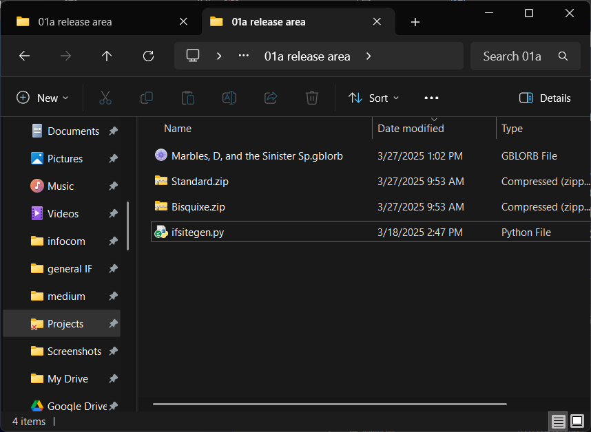
First, download “bisquixe.zip”. That contains an interpreter (software required to play Inform games).
Next, get the extension for your compiler version (this is not the same as the version installed on your computer!). Not sure about this? Have a look at the title banner for your game. For instance:
Marbles, D, and the Sinister Spotlight
A new What-Do-I-Do-Now story by Drew Cook
Release 0 / Serial number 250327 / Inform 7 v10.1.2 / D
See that stuff at lower left? “Inform 7 v10.1.2 / D”? That’s the compiler information.
If your game has a v10.1.2 compiler, download “Simple.Multimedia.Effects.for.v10.i7x”.
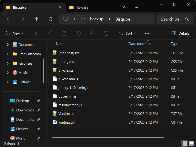
Let’s get everything in the right place. You might want to make a special “staging area” folder in your projects directory, just so you have a place to keep everything straight. Starting with “bisquixe.zip”, unzip it. Note that Windows will add a “bonus” folder by default. What you are looking for is a folder called “bisquixe” that contains files. No folders within folders. Something like this, in other words:
This might take a little digging. First, copy your new folder. We need to place a copy where Inform expects to look for it. In newer installations, this is usually (in Windows that’s …\Documents\Inform\Templates. Just drop the folder in the templates directory! Again, the folder, not the zip file. Hang on to that zip, though, just in case.
Next, the extension. Start by extracting the zip for “Simple Multimedia Effects” either version. This time, we just want the file inside. Once it’s extracted, you can install it from within the IDE. Just click “file>install extension” from the top-left drop-down.
Browse to the newly-unzipped file. That’s it! Now, we add it to our project. Just paste one of these near the top of your project:
for v10: include simple multimedia effects for v10 by mathbrush.
otherwise: include simple multimedia effects by mathbrush
Still with me? Ok. Let’s add some styling to our website.
(continued)
CSS is a technolgy and standard for styling content. One problem I had (see above post) is that it’s hard for a beginner to tell what entries do what. The approach in this thread uses CSS, but instead of wrestling with two separate files, we can zero in on just the settings we need.
Basic Styling with Bisquixe
Bisquixe changes styling during action processing. That means we can change a font color after jumping: for instace. Since we’re talking about a whole game right now, we’ll set everything when play begins.
In terms of organization, I recommend having multiple rules, one for each type of setting. That way, we can keep track of what we’re doing and edit/troubleshoot with less fuss. Here’s a start:
first when play begins:
	follow the font download rule;
	follow the buffer window rule;
	follow the play rule;
	follow the grid window rule;
	follow the input rule;
Note that I chose these names myself. You can call them whatever you want! They can serve as a kind of checklist. We can look at them one at a time.
follow the font download rule:
You can customize your project with Google fonts. Like the other settings in this thread, changing fonts is not required. But it isn’t so hard! Have a look here. For the simple styling we’re doing here, you’ll need two: one for the main window (called the .BufferWindow) and one for the status line (called .GridWindow).
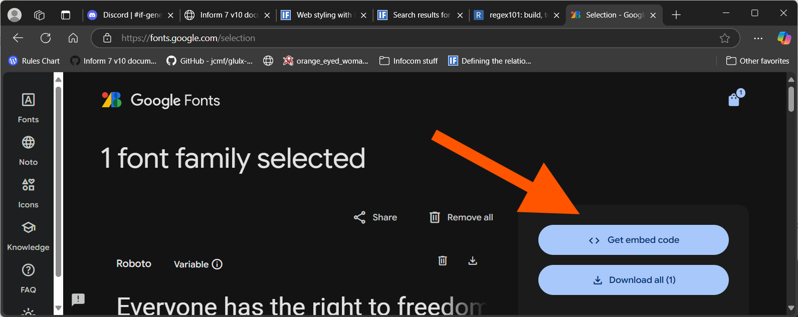
If you find some fonts you like, you’ll need a name you can use to refer to them. On the fonts website, add the fonts you want to your shopping bag. Just click the “get font” button at upper right.
Once you have some items bagged, click the bag icon at top right. That will open your bag contents. Click the “get embed code” button (pictured).
OK, there’s a lot of text here. We don’t need to understand it all! We’re just looking for the name Google uses for the font under the hood. These come from the topmost Embed code in the <head> of your html section of the page. Here’s the format we’re looking for (two examples): family=Open+Sans family=Roboto
Note that there are no spaces! Spaces in font names are filled with the “+” symbol.
Suggestion for finding what you’re looking for: do a “find” (ctrl-F in Windows) for family=
Don’t be confused by all of the extra information about italics, etc. You just need the name formatted as above.
In our code, we can download these fonts to our project:
this is the font download rule:
	import-google-fonts "Open+Sans&family=Roboto+Mono";
All fonts are listed on one line, separated by the & symbol.
You may have noted that one font is prefaced with family= and one isn’t. The first one is assumed or built in, so we only need to add it for subsequent added fonts.
That’s it! Provided we have no typos, our fonts are available for use.
the buffer window (.BufferWindow)
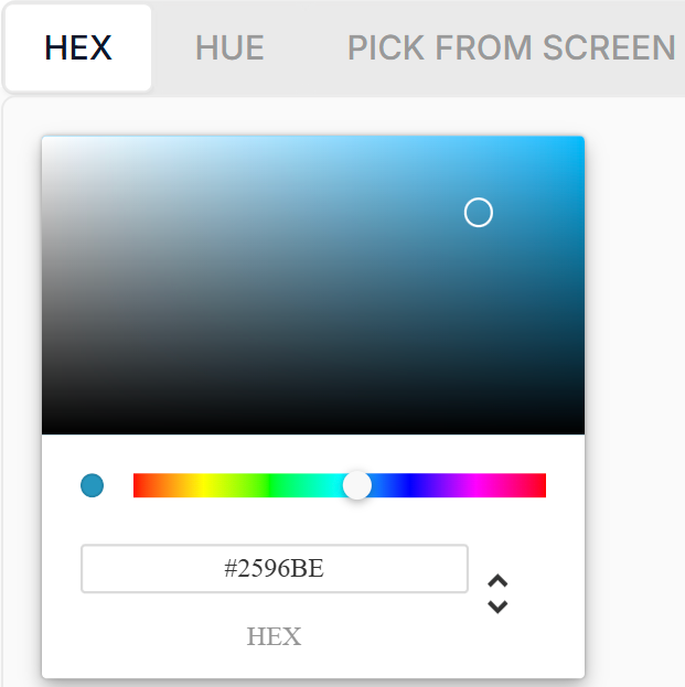
The BufferWindow is the area that contains gameplay: printed output, input. We can use this area to configure colors and fonts for gameplay. We’ll need some colors! I recommend a hex color picker. There are a lot of them out there. This is the one I use. The goal is to get hexadecimal codes for our colors of choice. This sounds scary, but a color picker will automatically give you one for the colors you pick. Example:
The code at bottom, #2596BE, is a hex code for the color above it.
At minimum, I suggest a background color for the window and a font color. That will look like this. We can take those (and our font, too) and roll them into the rule we’re working on.
this is the initial buffer window rule:
	css-set-fast ".BufferWindow; font-family; Open Sans, sans-serif";
	css-set-fast ".BufferWindow; background; #020213";
	css-set-fast ".BufferWindow; color; #dadaf6";
Some notes:
See the “sans-serif” designation after Open Sans? This is a “fallback” setting. If the game can’t find our font, it will try to use whatever sans-serif font it can find. A best practice.
```css-set-fast`` is the definition we use to configure css items (like colors) in our game. It really is fast! We can change these settings mid-game if we like.
Note that “color” refers to font color, not window color!
Consider verifying that your color combination is accessible. Just web search “accessibility contrast checker” and provide your color codes.
What else can we do with the .BufferWindow? We probably want to add a small amount of space left over on the sides (optional), just to avoid letters pushing against the edge. B.J. Best recommended 20px (20 pixels) and that looks like a good number to me.
css-set-fast ".BufferWindow; padding; 20px";
Experiment with this number a bit if you like!
What else? Font size. I believe most web templates start at 14, but I prefer 15 personally.
css-set-fast ".BufferWindow; font-size; 15px";
Finally: the scrollbar! I like to use the colors I’ve already downloaded. In this example below, I use the window color first and the font color second (the scrollbar is configured with one line of code).
Moving along: we won’t be covering a lot of new ground here. Colors and fonts:
this is the grid window rule:
	css-set-fast ".GridWindow; font-family; Roboto Mono, monospace";
	css-set-fast ".GridWindow; background; #dadaf6";
	css-set-fast ".GridWindow; color; #020213";
	css-set-fast ".GridWindow; font-size; 15px";
It’s customary to use monospace fonts for the .GridWindow.
Input
This one is surprisingly elaborate. That’s because what most of us (me, anyway) would consider “input” is more than one thing, and we need to configure them both. One important thing to understand is the input field is its own separate thing. It has its own background and fonts. Unless you’re trying to do something dramatic, this is a good way to begin:
this is the initial input rule:
	css-set-fast ".Input; background; transparent";
In other words, we’re going to tell the input background to look like the window behind it. This is what we are used to seeing in nearly every parser game out there. Next, font and color. Stick with me, this gets a little weird.
One of these dictates the cursor color, while the other dictates the color of the text as it is typed in. You need both, in other words. I usually double down on size, too:
Note that I’m using 16px here instead of 15px. That’s because iOS Safari (iPhones) will zoom in on the input field if it is set to less than 16. This creates a side-scrolling bar and makes the interface genuinely unpleasant. In my opinion! I always set input to 16 px.
The play area
Our last bit of simple styling involves the play area. What’s that? The play area is whatever lies outside of the main game area (.BufferWindow and .GridArea). It isn’t visible by default. The screen is covered by game and a left frame with cover art. Let’s imagine that you don’t want that content. In that case, you can unleash the play area. First, we have to get rid of the default website’s built-in links and image.
this is the play rule:
	css-set-fast ".coverimage; display; none";
	css-set-fast ".links; display; none";
OK! Now we have the whole play area for ourselves. How much space should it occupy? A common idea is 20% of window size on each side of the game area. That looks like this:
These numbers reflect the amount of real estate occupied. It scales according to window size. As always, experiment if you like! We can finish things off with a background color. css-set-fast ".play; background; #4E4E72";
What else? There’s the “more” prompt at the bottom right.
this is the more rule:
	css-set-fast ".MorePrompt; font-weight; bold";
	css-set-fast ".MorePrompt; background; #dadaf6";
	css-set-fast ".MorePrompt; color; #020213";
	css-set-fast ".MorePrompt; opacity; .85";
Note that we can set our own fonts, and font sizes. That opacity is just what it sounds like. By default a bit of play text is visible underneath the prompt.
OK, this leave us with a window that looks like this:
Mobile play via browser is a different matter. There is less screen to work with, and that has a cascading effect. Our gameport setting above will take up too much screen. We might want different margins or buffers.
You need a way to figure out whether the player is using a mobile device or not. If we were using full CSS, we could add entries specific to device screen dimensions. But we aren’t! Chances are, if you know how to deal with that, you don’t need this guide.
My method is to ask at the beginning of play after I’ve already set CSS for general use. Then, I can change what I need to (it’s fast, remember? we can make changes on the fly).
We’re just walking back some of our settings. I’ve also added a truth state (mobile) so that I can keep track of the setting.
let mobile be a truth state that varies;

after jumping:
	now mobile is true;
	css-set-fast "#gameport; left; 0%";
	css-set-fast "#gameport; right; 0%";
	css-set-fast "#gameport; top; 0%";
	css-set-fast "#gameport; bottom; 0%";
	css-set-fast "#gameport; width; 100vw";
	css-set-fast "#gameport; height; 100vh";
	css-set-fast ".BufferWindow; padding; 10px";
Essentially, we can make these changes at any time with a rule. Note that “vw” and “vh” mean “viewable width” and “viewable height” respectively.
As a reminder, any input under 16px will cause some zooming effects with iPhones. If you have a smaller font configured, you probably want to add a separate line for a moble font setting. This isn’t required, of course. Experiment with viewing on mobile and see what you think.
images
Don’t get overwhelmed here, OK? This can seem like a lot. You may have already discovered that following the release process in the documentation will yield up a website that contains no images. Yikes! Well, let’s see what we can do about that!
Set up a folder as a staging area where you can work on this. It doesn’t matter where, but you’ll want to keep everything in one place.
Put that “bisquixe.zip” file you downloaded a long time ago into your staging folder.
Find the “standard” website template. On my Windows installation, it’s here: C:\Program Files\Inform\Internal\Templates.
Make a ZIP file called “Standard” and put the Standard folder in it. Put that ZIP file in your staging area.
OK! Just one more push to the summit! Get a terminal open. On Windows, you can just right-click on any empty space and select “open in terminal.” From here, you should be able to use this as a template:
python ifsitegen.py -w standard.zip -i bisquixe.zip --title="Marbles, D, and the Sinister Spotlight" --author="Drew Cook" "marbles, d, and the sinister sp.gblorb"
recopied as a quote for readability
python ifsitegen.py -w standard.zip -i bisquixe.zip --title=“Marbles, D, and the Sinister Spotlight” --author=“Drew Cook” “marbles, d, and the sinister sp.gblorb”
-w points to Inform’s built-in web template “standard.zip” and - i points to the “bisquixe.zip” interpreter that we’ve used to perform our web styling. You can look at all of the switches by typing just python ifsitegen.py by itself.
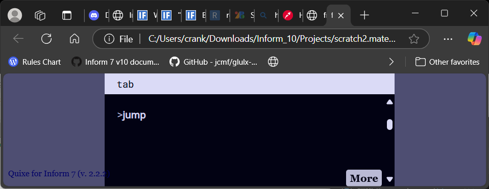
Note that the script expects quotation marks around anything with spaces. Ideally, a success message will follow:
Glulx file (Blorb): marbles, d, and the sinister sp.gblorb
Interpreter: Quixe for Inform 7 (v. 2.2.2)
Website: standard.zip
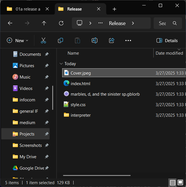
Wrote playable game to: Release
A new “release” folder should have appeared in our staging area. Let’s check it out.
The index.html should present our website, fully styled, with images. We did it! You may want to experiment a bit over at itch.io, especially if you want to see how everything looks on mobile. You’ll need everything in a zip file. Create a new one, then copy the following into it:
cover.jpg
index.html
styles.css
interpreter directory
Head over to itch.io, put it in a draft project, and see how everything looks! Sometimes things take a bit of tweaking.
Hopefully this helps someone get their game out on time!
I may do a follow-up reply on handling images sizes, too.
Bisquixe can do a lot more than this, of course, but this is a pretty good start. Things have come a long way from my first Spring Thing, that’s for sure!
If this is your first project, you may have also discovered that your images seem too large for your IDE or a local interpreter. You fix them, but they look rather terrible and grainy in your web project. Or a combination of both.
Some interpreters scale images well, and some don’t. I hear Spatterlight handles it well. Winglulxe does, too. Interpreters that use CSS (Parchment, Lectrote/Quixe) can be configured to use it.
Does that help you, the author? Not right out of the gate, no. The last thing you want to do is provide lengthy instructions to players regarding configurations and interpreter choices. Players expect for things to just work, and why shouldn’t they in 2025? We can’t put the responsibility on them.
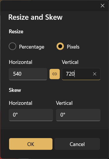
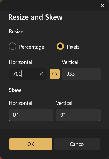
Let’s think about image sizes for local interpreters, first. Unless you took some pictures with a very old camera, you will want to resize them. Keep your originals, though! I use MS Paint, but any tool that will let you do resizes based on pixels will do.
For a image that is wider than it is tall, I suggest a maximum width of 720 pixels.
For an image that is taller than it is wide, I suggest a maximum height of 700 pixels.
These should scale, that is, adjust the other dimension automatically.
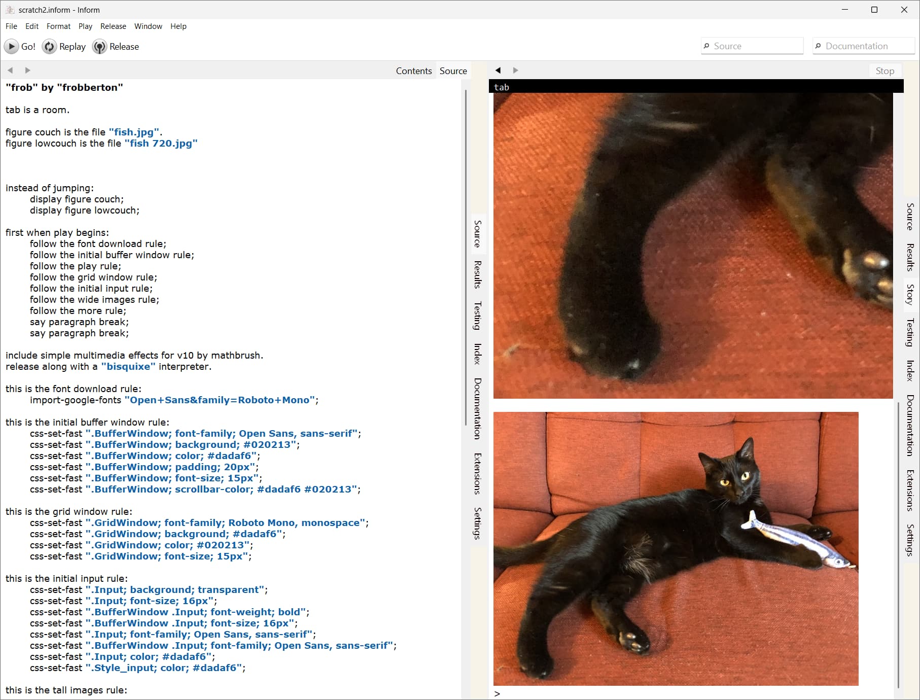
Keeping these names separate from our original names is worthwhile. I usually just append 720 to the name. fish 720.jpg for instance. For illustrative purposes, I’ll put our resize and the original in a single project. Here’s the code, and here’s the screenshot:
lab is a room.

figure couch is the file "fish.jpg".
figure lowcouch is the file "fish 720.jpg"

instead of jumping:
	display figure couch;
	display figure lowcouch;
Alright, we have some images that look OK. But what about the quality of our images? We have fancy, high-resolution images we’d like to show off!
We can handle that in-browser using bisquixe. Here’s a tweak to our existing code. First, let’s set up something easy to remember that we can use and re-use.
this is the wide images rule:
	css-set-fast ".BufferLine img.ImageInlineCenter; width; 100% !important";
	css-set-fast ".BufferLine img.ImageInlineCenter; height; auto !important";

this is the tall images rule:
	css-set-fast ".BufferLine img.ImageInlineCenter; width; auto !important";
	css-set-fast ".BufferLine img.ImageInlineCenter; height; 75vh !important";
Note that the wide images rule is specifically for layouts that do not have the extra frames or links. If you have chosen a design with frames, you will likely need to tweak your percentage.
These rules establish a way for telling the browser how to scale our images. Wide images will scale one way, tall images another. For tall images, the tall images rule will set height to 75% of viewable height, and width will scale based on that. Wide images similarly scale based on width.
We might have both types of image in our game!
This being so, we tell the game what type of image we are dealing with. Let’s scale our large image in bisquixe:
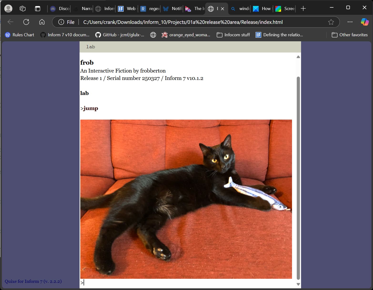
instead of jumping:
	follow the wide images rule;
	display figure couch;
There! We have a scaled image. This one is 2k pixels wide, but looks fine in a small window:
But wait; there’s a problem, potentially. These large images won’t look good in a local interpreter program (at least, not in some of them)! What to do? This was recently discussed elsewhere. One option is to include both resolutions in your project. We’ve already done that in our sample code, but we haven’t told our project when to print what. Fortunately, this can be done automatically. Let’s add this bit of code:
To decide whether bisquixe is active:
	(-(glk_gestalt(5376, 0) )-)
OK, now we can use the condition if bisquixe is active in our code. Let’s create a simple definition that we can use in our rules:
to show the couch picture:
	if bisquixe is active:
		follow the wide images rule;
		display figure couch;
	otherwise:
		display figure lowcouch;
There! If bisquixe is running (in a browser), the large image will display. Otherwise, the lower resolution one will.
instead of jumping:
	show the couch picture;
Is there a downside? Yes, one thing to consider is the overall size of the project. Since this approach effectively doubles the number of images in-project, you will want to be vigilant about file sizes. Using jpg files instead of png is a good start. You may also want to consider maximum resolutions for your larger files. A lot depends on the number you have in your project. Doubling the size of the low resolution ones (1440 wide or 1400 high) is one idea. Experiment to find the sweet spot.
It’s always possible to cut size by maintaining versions with just the files needed, but that can quickly become unwanted extra work.
I think that’s all I have right now! Perhaps I will have something new to share next Spring Thing. Good luck to all new authors!
other miscellany
Did you know that by default, Bisquixe does not honor white space (spaces, etc) after line breaks? Preserve your spacing with
I thought I’d add a few thoughts here about hyperlinks. Because of current conflicts with a Story Mode prerequisite, I can only use them in specific cases. But they’re neat!
Hyperlinks don’t change anything about the usual play cycle. Instead, they can be used to insert a command into the prompt and press enter. The formulation is straightforward:
hyperlink "a sinister pathway leads east" with "east"
this functions as a sort of fancy “to say” construction. The text on the left (“a sinister pathway leads east”) will be printed as a hyperlink. If the player clicks it, the text on the right (“east”) will be entered as a command.
If we wanted to use it as a text substitution:
the sinister passage is a room.
the description of the sinister passage is "[sinister].".

to say sinister:
	hyperlink "a sinister pathway leads east" as "east";
Uses: if you’ve played Portrait with Wolf, you might recognize this layout.
I’ve been working on a template beginning authors could use to make their own content simply by editing a few tables. I thought: why not a mouse-only version? This is a stripped down version that can be completed in six turns without typing a command. Even the final questions can be configured this way:
to say linked restart:
	hyperlink "RESTART" as "restart".
The general idea is that any printed text can be made into a link. I’m sure there’s an exception, but typical usages seem trouble-free. For instance, links can be made while listing contents, using table lookups, printing multiple substitutions, etc.
Another application: clickable valid directions in the status bar. This one was constructed using the “fancy status” feature of Basic Screen Effects:
table of fancy status
left	central	right
"[g-nw]  [g-n]  [g-ne]"	""	""
""	""	""
"[g-w]   [unicode 9734]  [g-e]"
""	""	""
"[g-sw]  [g-s]  [g-se]"	""	""

definition: a direction (called thataway) is valid if the room thataway from the location is a room;

to say g-n:
	if north is valid:
		hyperlink "N" as "go north";
	otherwise:
		say " ";
And so forth.
A consideration: for a true keyboard-free experience, wait for any key and if the player consents both need to be handled as commands. Hyperlinks are always typed commands!
This means that, yes, some text is going to populate the command prompt. While I have seen mention of “zzxvm” as a toggle for displaying commands, I have never been able to toggle it. This might be a hitch for players using an interpreter, but web authors can simply make the input text the same color as the input field.
So far as I can tell, link colors and hover colors can be set, but active and visited cannot. Since nothing is being visited, that makes sense. To customize or style individual texts, see BJ Best’s guide linked at the top of the thread!
this is the link styling rule: [configure the appearance of links.]
	css-set-fast "a:link; color; #006600";
	css-set-fast "a:hover; color; #0000cc";
It’s possible to make images links as well, though I’d restrict this to web publishing. I haven’t had consistent results across all local interpreters.
figure test is the file "test.jpg".

to say t:
	display figure test.

after looking:
	hyperlink "[t]" as "jump".
It really does seem possible to turn any sort of text (or substitution) into a literal command to be entered with a click. Static windows could open up a lot of interface opportunities (I believe previous versions of Inform can handle this), but even without them there’s a lot to do with printed names, the status line, etc.
As you may have seen, I’ve been exploring the hyperlinks feature of Bisquixe. Don’t get the wrong idea, yes, I’ve been asking for help, but it’s a great tool for authors.
Parser fans are likely familiar with Dialog’s hyperlink feature. Try for yourself:
I don’t think anyone would disagree if I asserted that Famliar Problems is the current high-water mark for parser hyperlinks, both in terms of presentation and interface. Try and see for yourself. Could Bisquixe recreate this experience? Hm… not in my hands, no. It’s a good target to aim for, though!
Let’s start at a simpler level. A hyperlink–in Dialog or Bisquixe–is essentially a shortcut that enters a command at the prompt. Links aren’t “smart”; they don’t access actions or data. They inject text into the input field. We as authors can decide what that text is, and how it should appear as a link.
the description of lab is "A curious [statue] towers above."

the statue is scenery in lab.

to say statue:
	hyperlink "statue" as "examine statue".
To hyperlink something is to declare a special kind of text. Above, we state that a hyperlink will appear as the word “statue”, and that the command “examine statue” will be executed when the hyperlink is clicked. The text on the left is what’s printed, and the text on the right is the verbatim command to be entered at the prompt.
We can use this as a text substitution, and we do so above in our description of the lab.
Perhaps we’d like to streamline insertion of links in our descriptions. Can it be done without so much typing? Yes! We can lay out a rule for printing the names of things.
rule for printing the name of a thing (called the item in question):
	Let H be "[printed name of the item in question]" in upper case;
	hyperlink "[H]" as "EXAMINE [H]";
This will cause thing names to print as links automatically if we do something like
The description of the orchard is "You stand near a laden [apple tree]."
Provided there is a thing called an “apple tree” in the orchard, the player can examine it by clicking the link. Names printed automatically (“which do you mean”, inventory lists, etc.) will also generate links according to this rule.
That’s a “big” rule, though, so it might make sense to break things up. Perhaps you would prefer different rules for different occasions:
rule for printing the name of a thing (called T) while listing nondescript items:
	hyperlink "[printed name of T]" as "examine [printed name of T]".
And so forth. Links are in many ways like other forms of text, so we have a lot of flexibility when deciding how, when, and where to print them.
Formatting Links
While styles allow us to format individual passages differently, links are less flexible. At least, they are to my untrained eye. In the wider world, links have a general default designation that covers every link on a page. We can tap into this if we want to set presentation details for links in our game.
when play begins:
	css-set-fast "a:link; color; #190A1B";
	css-set-fast "a:link; font-weight; bold";
	css-set-fast "a:link; font-size; 14.5px";
This isn’t so different from formatting tasks we’ve already performed. Configuring color in the .BufferWindow relies on the same principles that govern link color. I have yet to discover a way to configure different links within a game differently, and I suspect that it isn’t possible. That’s OK! There remain many styling options.
We can still use styles to format things like background, padding, and so forth. The link is like an island within the styling we set out. First, let’s make a style. We can apply it the way we apply built-in styles like [italic type] or ``[fixed letter support]‘’. We start by giving our style a name. I’m using links for verbs, so we can just call it “verb”.
to say verb type:
	set-any-class "verb".
Once we have a name, we’ll want to load it into CSS. We can’t use it until we do, so when play begins is a good time. I’ll say that I want a background color:
when play begins:
	css-set-fast ".Style_verb;background-color; #03112A";
note the construction .Style_verb; Yes, that’s our name! Note that the capital S in “Style” is important; the CSS won’t work without it.
Once it’s set up, we can use [verb] just as we would [bold type], fitting it into our texts. This works, for instance:
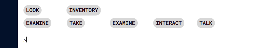
hyperlink "[verb]LOOK" as "LOOK"
We can do better, I think. Let’s pad the edges, increase the line height, and give the backgrounds a rounded, button-like appearance:
Some notes: you can add a hyperlink to a list, or even to a table. You can perform regular expression matching to the text of a hyperlink, in case you need to find one in a list or table. Because they are treated as text, Inform has a powerful toolset for manipulating, storing, and retrieving them.
Note that, in terms of formatting, A link is a block of contiguous text. In the photo above, I could put multiple links in a sentence and format them together, but I can’t take separate links (ie, repeating through a list or table) and then group them for formatting. They will likely wind up as buttons or entries on individual lines. Which isn’t bad! For the most part, the dialog games operate either as sentences or separate, lineated entries. Quality games can be made in this way.
What else? If you are really committing to a “mouse only” game, situations once dealt with via “if the player consents” (and the like) will require a bit of creativity or elbow grease. But not too much, I don’t think.
My plan is to make an “all mouse” version of my next large game, so I’m sure I’ll be picking up more tricks along the way. I’d like a navigation aid of some sort, for instance. We’ll see!