@RobertSzacki
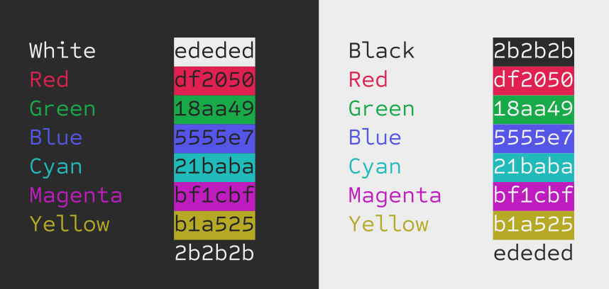
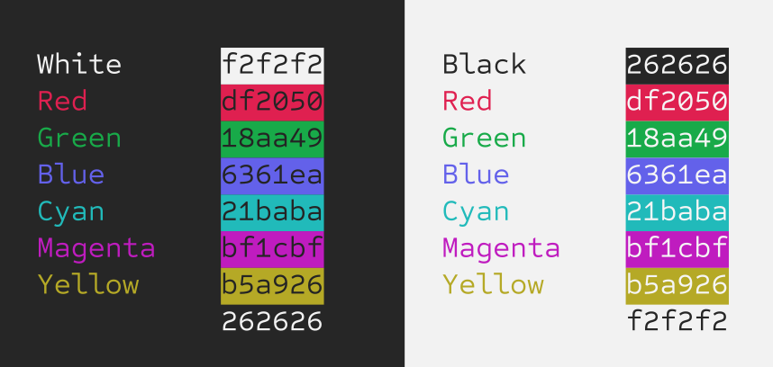
I know what you mean. Bringing the white and black together will blend better with the colours that sit in the middle ground that are already compromised by matching across both light and dark. Essentially compressing things to lessen contrast. I don’t want to go too far because it brings less contrast to those colours, but here’s a slight tweak… and a greater one below it.
Not lessen contrast. I disprefer Red 100% saturation for example. It’s very inconvenient to use with text-editor or programmer’s editor. The eyes can’t focus on such colored text IMO.
Contrast and Saturation are two different color parameters. Note the Monitor’s potentiometer settings.
The Saturation is a “strength” of a color. Contrast is a difference between colors.
I would like to add that I use such scheme like Yours in the Windows Terminal with these colors. Even in standard appearances the Black is not 0, 0, 0but 15, 15, 15 for example. These are more “soft” colors as well.
NOTE: I should double check the values. I typed that image out by hand and with the many iterations, I might have not put the right colour values. I’ll double check and get back to you right away.
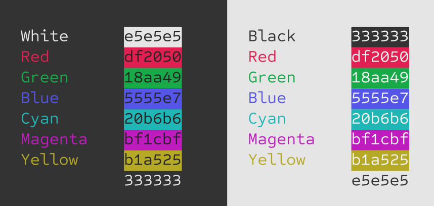
@Draconis Not sure it would have made a noticeable difference, but the yellow value is actually #B5A926. Like I said, I was making so many micro adjustments at that time. Anyway, all the other colour values are correctly listed in that image. Just the yellow is incorrectly labelled.
I thought I’d posted this at the time but my only worry with that one is that the blue doesn’t show up well against the black. Can it be any lighter without impacting how good it looks on white?
My goal here is to defer to people with working color vision as much as possible, so if the new colors are better in jwalrus’s eyes, I’ll go with those!
My plan is to have a big array of color values that I can tweak easily later, so it’s not set in stone either.
To my eyes the difference between that and the previous version is pretty slim, but it’s definitely not worse in day mode and possibly better in night mode so I’d say it’s an improvement!