Is it better to use [30m colors or [90m colors?

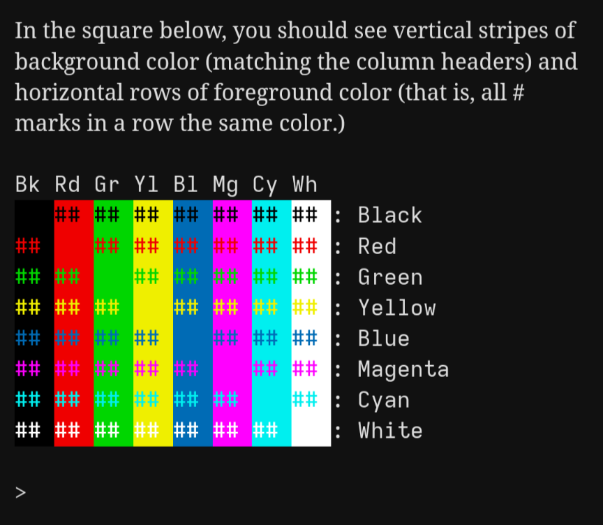
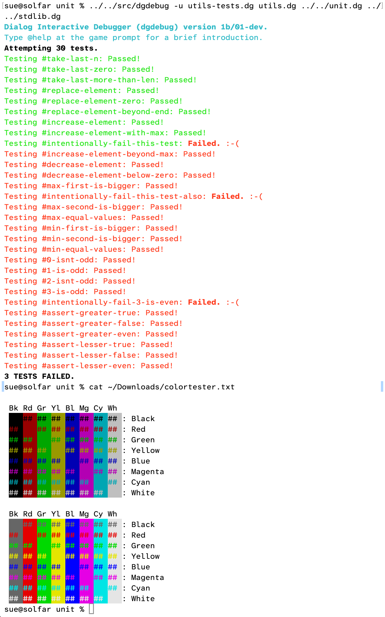
I’ve been working on adding color support to the Dialog debugger, a command-line program that only supports very basic styling via ANSI escape sequences (no curses or anything fancy like that). The Dialog compiler already recognizes the eight basic color names (“black”, “red”, “green”, “yellow”, “blue”, “magenta”, “cyan”, “white”) for Z-machine purposes, and those are also the eight basic colors that ANSI escape sequences support, to that was the obvious place to start.

But, ANSI[1] actually supports sixteen basic colors: “dark” versions of those eight, with codes [3Xm and [4Xm, and “bright” versions of those eight, with codes [9Xm and [10Xm.

Since the goal is compatibility with the Z-machine implementation, I want to stick to those eight color names, rather than adding eight more. So—are the [3Xm or the [9Xm colors better to use for this?


  1. Technically not the ANSI standard itself, but an extension implemented by most terminals. ↩︎

1 Like

The Z-machine’s colours are in the specification: The Z-Machine Standards Document section 8.3.1.

They’re closest to the ANSI bright colours, but not exactly the same (most notably the blue is even brighter). But if you’re just using the basic ANSI colours go for the bright set.

3 Likes

Duly noted! In that case, unless someone provides strong reasons to the contrary, I’ll use dark colors for black specifically (light black is gray) and bright colors for everything else. If that ends up looking garish, then, well…reconfigure your terminal!

The debugger also uses dark cyan for its own purposes, so that’ll keep it nicely distinct from user colors.

I prefer standard colors rather than the high intensity ones.

1 Like

Let’s poll the audience, then!

If you’re familiar with ANSI colors in the terminal, which do you prefer?

  • Bright colors
  • Dim colors
0 voters

Bright colors it is! (I normally try to leave these polls open for longer, but the [90m colors are winning more than 2 to 1.)

Yeah, I actually knee-jerk voted “dim/dark” at first because these days my eyes beg me for some rest, but when I actually thought back to my days of playing games with those colours - and refreshed my memory by googling them up again - I realised that those colours are not so much “bright” as “light”. They don’t hurt my eyes as much as I thought, whereas the dark/dim colours sometimes were not as easy to dinstinguish. Go figure.

1 Like

I like working with PC when there’s a sun-light behind window, and use white-theme, as a piece of paper is white, not black. I can’t get used to black-theme, which many people use. Thus also the colors I like to look at, are not so intense.

Well, would using the bright colors on a black background but the dim colors on a white background be a possibility?

Also, is there some “standard” for these colors somewhere? I’m most familiar with the EGA palette but that one is a little odd, e.g., “dim yellow” is more of a brown.

Like I said, the “dim” I mean with less saturation (intensity).

Here’s an example of syntax-highlighting for C language. I chose this colors (made own scheme).

Unfortunately, I don’t know of a way to do this in dgdebug. Even if we pulled in ncurses as an additional dependency (massive overkill for this), I don’t see any way to test what the default background color is. For non-default backgrounds, I could look at what background color the story has set, but what to choose for options other than black and white?

I think this will have to happen on the user’s side. Modern terminal emulators should provide a way to customize the ANSI colors to your liking. (Though I could special-case that it uses the dim colors if the game has explicitly requested a white background.)

Unfortunately also no. I’ve been looking at the table here to see how common terminals do it, and assuming most people are either using Terminal.app, xterm, or Ubuntu Terminal.

I’m old enough to be confortable with green/amber on black, and indeed my terminal emulator (this is a Linux box) is green on black; but in every X app I kept the light theme (white on black) so in the end, dark theme = direct handling of filesystem (I never use the various file->delete in apps, deleting is always at shell level)

Unfortunately, all the X terminal emulators I have around isn’t su(1) aware, so albeit very nice & useful, I can’t trust setting a literal “amber alert” (that is, amber on black = root, think thrice prior of pressing return…) for the poor little files & directories :frowning:

(yes, I know about Xterm’s tektronix 4151 mode, but I never managed to coax it into large enough font size (at my age, I use 20 height fonts…)

Best regards from Italy,
dott. Piergiorgio.

Since this is a debugger, is the primary use here text color? If so, is the background a fixed color, or configurable? I’m just looking at this from an accessibility POV

Color support here is specifically due to two user requests:

  • The Z-machine supports color, but the dfrotz interpreter used by Dialog-Tool doesn’t, which makes it hard to check if color support is working. Since Dialog-Tool’s Skein uses the debugger, color support in the debugger means the Skein can keep track of foreground and background colors and flag it if something changes.
  • The unit testing tool runs in the debugger, and color is a convenient way to flag the moment when a test fails. You can skim through the list and see where it abruptly turns from green to red (or something along those lines) to see where things went wrong.

I don’t expect it to be used for much else, and if the terminal doesn’t support color, it won’t even try—which means you can disable color by piping to cat or such. (I can also add a command-line switch for that.) But for the moment, it tries to mimic the Z-machine implementation, which means style classes can set both color and background-color if they want.

1 Like

Got it. I think that in most cases, contrast-wise, the bright colors will favor dark screens and dim colors will favor lighter ones (which is what Amber is getting at).

Recognizing that players will likely be able to do what they like with their terminals, this isn’t a huge deal, but it is interesting to think about what might be a “default” environment for the debugger.

I’m a dark mode user myself, so my own tastes tilt in that direction.

I’m really surprised to see how many people prefer the dark colours. Now there’s some diversity in how they’re displayed, but you can see a lot of them here: ANSI escape code - Wikipedia The dark colours are just very dull. They’re also really inconsistent. The dark colours in xterm are actually really nice, but those for Windows Console are terrible. The bright colours are more consistent.

Whereas here are the Z-machine’s colours, which largely align with the bright ANSI colours. Are they really too bright, even in dark mode?

1 Like

The plot thickens! People using the prerelease build have reported that the [90m colors are unpleasantly pale. I’ve been pointed toward Git as a command-line program that uses color nicely, and I’ve confirmed it uses the [30m ones.

Let me generate a little color swatch like that for each one. Here’s how they look on my terminal:

That is…distinctly less readable, in both forms, than the Z-machine ones Dannii posted. We’ll definitely need to use dim colors for black and bright colors for white, but the rest are either dull or pale; either way the saturation isn’t great.

So I’m not sure how to proceed here. One option is to use the 15-bit colors from the Z-machine spec, and have Dialog output a full RGB value. That way it would match the Z-machine (or a close approximation of it), as shown in Dannii’s post.

What do you all think? Please weigh in here!

(If you want to test it on your own terminals, cat this file:)

colortester.txt (1.7 KB)

(Or run this script:)

#!/usr/bin/python

SHORTNAMES = ['Bk ', 'Rd ', 'Gr ', 'Yl ', 'Bl ', 'Mg ', 'Cy ', 'Wh ']
LONGNAMES = ['Black', 'Red', 'Green', 'Yellow', 'Blue', 'Magenta', 'Cyan', 'White']
SWATCH = '## '

for which in [3, 9]:
	print()
	print(' ' + ''.join(SHORTNAMES))
	for fg, rowname in enumerate(LONGNAMES):
		print(' ', end='')
		for bg, colname in enumerate(SHORTNAMES): # colname not actually used
			print(f'\033[{which}{fg};{which+1}{bg}m' + SWATCH, end='')
		print('\033[0m' + ': ' + rowname)

(And please share the results!)

1 Like

I’d go with the dim colours. My terminal background (and the background for all three interpreters that I use) is white on my Mac, and black on my Chromebook; git’s output is readable on both of them. The bright ones look nicer on the black background, but become illegible on white.

1 Like

Yeah, I’ll give others some time to weigh in before changing anything, but I’m willing to override the will of the people if it becomes an accessibility (readability) concern. I’ve also tried using bright colors for the foreground and dim colors for the background, and that doesn’t help much either.

You can clearly read the red failing test output, but not the green passing test stuff. I could see using dim for the text, and bright for most backgrounds except black. (And maybe blue and red?) Black needs to be dim, and white needs to be bright, in any event.

Dim white could almost be a ninth colour of its own, “gray.”

(Or have 16 colours, and use “dark” and “bright” to distinguish between them?)

1 Like