How Words Look [font, layout, color, contrast]

Continuing the discussion from What are your IF Hot Takes and Unpopular Opinions?:

You have opinions, I have questions.

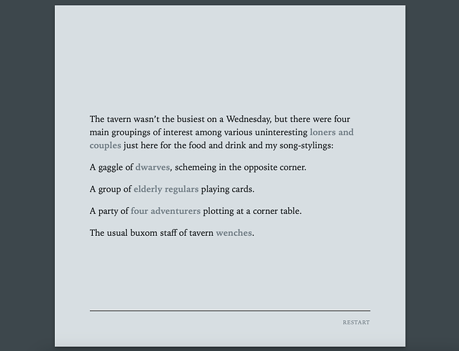
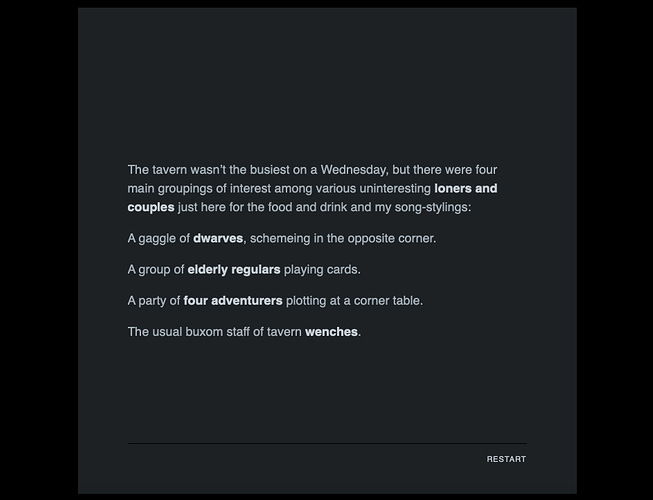
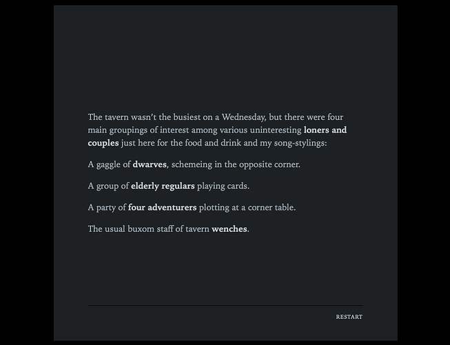
This is the look of the thing I’m working on - light text on dark. I am also giving options at the beginning for inverted scheme, and also a sans-serif font.

Bad, good - is this a light-on-dark color scheme that irks you?

5 Likes

Just a stream of thoughts. I’ve described some implementation methods, but they are just suggestions…

I like slightly larger fonts sizes. I find these screenshot fonts to be as small as my comfort levels allow, when viewed at actual size. Small fonts are good for larger amounts of text reading (pages) at a time, but IF should be presented in bite-sized chunks so I think it’s okay to bump it up a bit. Each passage is something to behold in its own right.

The dark serif text on the light background is the easiest to read. This is because most fonts are designed with that presentation in mind and are weighted for printing as well.

The light serif text on a dark background has the right shades for reading comfort. Very nice. The font should be slightly thinner, but it’s not bad.

The light sans-serif on a dark background is not good; it’s very thick and bulky.

Sometimes, you can save these situations by adding a bit of inter-character spacing (kerning). (Try it with the serif text on the dark background too.) For example, letter-spacing and word-spacing css properties can do wonders in most cases (use sub pixel values, like 0.1px). However, nothing beats using a variable weight font with either the font-variation-settings: "wght" or font-weight properties. You’ll find that the preset amounts divisible by 100) work okay… but I’ve found that sweet spot can be 350 or 325 depending on the font.

400 is considered to be the normal default weight of a font, you’ll find that lower weights will look better on dark backgrounds, which explains where I’m coming from. 700 is the standard bold weight. Again, way too thick for dark backgrounds and can be changed in CSS.

line-height is another property that can help legibility. Play with it if you feel the lines are bunched up. Normally, the default setting is fine though.

You’ll have to have one CSS font style for the light theme and another for the dark theme. There’s really no one-size-fits-all for the two, unfortunately. I hope the new Chapbook version recognizes this need and has different CSS selectors for light and dark themes available to use in the main Style Sheet.

In CSS, you can import a base64 encoded font in a separate style sheet that’s stored locally with the HTML file, like a graphic file might be. The user doesn’t even have to have the font installed. And, alternatively, you can link directly to Google font files on their servers without having to convert them to base64 yourself.

I went into some detail about this for Harlowe, but it works the same for Chapbook.
https://intfiction.org/t/harlowe-thinking-outside-the-box/61328/6

This is a link to browse Google’s variable weight fonts.
https://fonts.google.com/?categoryFilters=Technology:%2FTechnology%2FVariable

I hope this helps.
5 Likes

I prefer what can be termed an “intermediate” color scheme (yellow on blue) in playing IF (note to QTads mantainers: setting things around can be simpler if there’s an “undo” button in the preferences…)

Best regards from Italy,
dott. Piergiorgio.

Tastes apart, what @HAL9000 has said is exact.
For your information, the same rule is reversed when printing: fonts should be thicker when light on dark background, because of how ink works on paper.

4 Likes

This explains so much about why I dislike dark modes! I have an astigmatism which means that light text on a dark background will “halo” – all the factors you’ve described here contribute to whether the halo’d text turns into an unreadable blob instead of distinct letters.

I’ll have to investigate to see how much these tweaks help. Generally when I encounter a dark mode game of any significant length I either have to play in small chunks or manually invert the colors, so I’m curious to see if a game that follows your guidelines would be more comfortable.

4 Likes

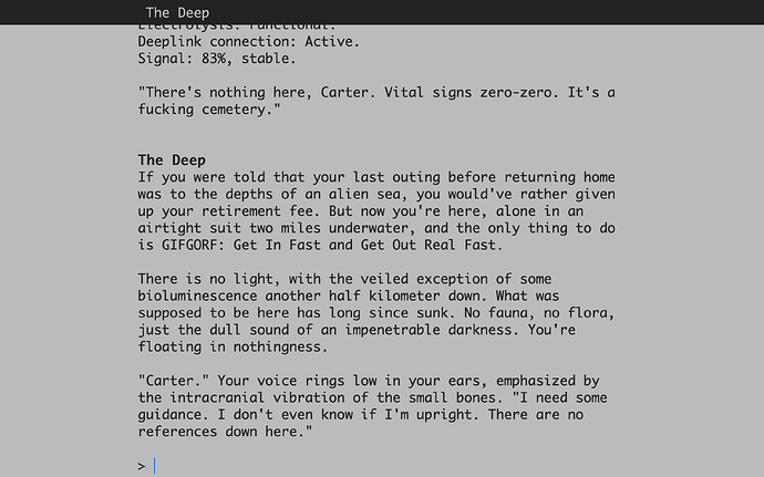
Out of curiosity, how do you feel about Ink games (with the default styling)? Ink by default uses a very lightweight font, which is great for dark mode but sometimes too light for light mode.

1 Like

If it ideally can’t be as bolded as current for ease of reading, I would really suggest an underline or something…(honestly in both modes)

1 Like

From what I remember I think I struggle with Ink’s dark mode because the text is fairly small. I can’t find a reference right now so I’m going off memory. :upside_down_face: Later perhaps I’ll see what I can find and play around with. (Simply zooming in might help, which I’ve never tried for some silly reason).

I agree that the default light mode layout in Ink doesn’t have nearly enough contrast for my liking.

Oh and another very important matter is font size (and shape, but let’s forget about it for now).
It seems that the IF community is unaware of the proportional measuring. Proportional sizes are way better than fixed (in pixels/typographic points) because they resize depending on the screen size. Many–too many, probably 99%–of games run in Parchment use a very small font that turns out too small and with lines too wide in a screen that is larger than 13".
This is (somewhat) solved by Lectrote, the only interpreter I know of that lets you easily play full screen and decide on font size and margins on the go.

ETA. I’ve tried something with my online versions of teh latest games, but time run out and I forgot to test it better. Btw, check what happens on a 13" screen (screenshot), and then try the link on a bigger monitor. I know, the margins are not wide enuf on 24", but I guess the size is proper, what you think?

The link (unintended advertising for my work).

Of course, this means playing with CSS and it’s not for everybody. Not even for me: I asked my lead programmer in my Studio :slight_smile:

3 Likes

For some shameless self-promotion, my entry to the Educational Jam uses Ink default styling. Launch it, click “begin”, then zoom in and let me know how the text feels?

2 Likes

I definitely find the super light line weight in Ink hard to read, especially combined with the default light-mode color scheme being grey-on-white instead of black-on-white (why???).

@HanonO, about your color schemes—the default light-on-dark looks good to me, but I think the link text in the inverted color scheme could stand to be higher contrast.

4 Likes

Yeah, Ink’s default style really feels like it was designed for dark mode, with light mode being an afterthought. Which is a refreshing change, when it’s usually the other way around! But making the text darker and heavier in light mode shouldn’t be too difficult.

1 Like

Honestly the light font weight isn’t great for me in dark mode either even though the contrast is better there, but that could just be me.

2 Likes

@Encorm
If the IF projects you’re reading are in the browser, CTRL + and CTRL - will increase and decrease the entire rendering size of the window. CTRL 0 will reset it back to the default size.

There is an excellent Add-On/Extension for all browsers called Dark Reader.

https://darkreader.org/

Edit: Dark Reader is free. The payment option is for supporting the team.

You can tweak things with surprising nuance.


My dream IF engine would support (out of the box for the user) adjusting font size, style and weight, dark/light mode, fullscreen toggle, column/page width and brightness settings for text and background independently; all with live feedback. This is trivial with CSS in browsers these days. It’s a shame it doesn’t get more attention.

4 Likes

I really like the dark theme you’ve made, but the light theme is irking to me. I think it’s the blue-tinted background, which feels “corporate”. Maybe having a pure gray or orange-tint would help.

2 Likes

@Hidnook
Your comment about tint is very astute. “Temperature” can play into reading comfort levels too; which is why sepia tones are popular.

2 Likes

I find the dark scheme in this case. It is much easier to read than the light scheme; the light font is too thin for comfortable reading and there isn’t enough contrast between the background and the emphasised words.

I’m starting to think I might have to offer multiple thicknesses of font, not just different font sizes.

1 Like

I’ve only looked at it on my phone but I think it’s that the dark mode font is ALSO grey? Possibly even the same grey as light mode.

It’s a tough balance, because the brighter the text is in dark mode the more it’ll halo so I’m not sure a pure white font would be better, but combined with the low font width I don’t think this choice works particularly well.

(I don’t have the exact color code for the Ink text to hand but playing around with a contrast checker makes me think that it’s marginal from an accessibility perspective.)

2 Likes

As a kinda visually impaired person, I definitely am not a fan of the default Ink template wrt accessibility.

5 Likes

Yeah, looking at the default Ink stylesheet, it looks like the body text color in both modes is hex code #888888, which fails WCAG standards for contrast against a white background and just squeaks by against a black background.

That said, I find light font weights hard to read against a dark background even when the contrast is good, and even with dark-mode Ink’s so-so contrast, if I bump the font weight up I find it immediately more legible. But if people without astigmatism all agree that standard-weight fonts are worse than thinner fonts against a dark background, then I guess the fact that I find them much easier to read doesn’t really matter, because no one should design dark themes with me, a person who will not use dark themes if there’s any other option, in mind.

6 Likes