How Words Look [font, layout, color, contrast]

I’m a dark mode user, but I’ve always hated Ink’s dark mode; agreed on the font being too lightweight. I always hack the CSS with my browser’s inspect tool when playing Ink games with the default UI to make the font thicker.

Edit: For writing in Ink, I’ve made my own Ink CSS template with higher weight font and better contrast, which anyone can use: Basic Ink Template by alyshkalia

Question though, do people find this font weight too heavy? For me it’s way preferable to the Ink default, but this thread has made me realize that may not be the case for everyone!

6 Likes

That works for me.

1 Like

@Draconis
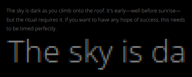
I missed your link to the default Ink settings project. While others have said that the font is too thin and too dark (it’s quite bad, to be honest), it’s also important to bring attention to the filter that is applied to all font rendering in the browser.

image

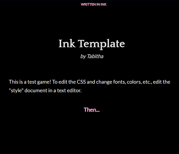
Notice the orange and blue hues that are applied to “enhance” the font’s readability. Very thin fonts are actually worse for this so you have to be careful. (Tabitha’s screenshot has this effect, as well.)

Adventuron (an online parser engine) features built-in retro pixel fonts that are actually worse off for this filter. The graphics are up-scaled with sharp pixels, but the fonts have that orange/blue fuzziness to them that doesn’t match the clean pixel aesthetic.

Oddly enough, intfiction doesn’t display this warm/cold filter with the Arial font it renders in the dark theme. I’m not sure why. Maybe someone can shed some light on that.

1 Like

The one basic rule of thumb I’ve heard: avoid using pure black #000000 or pure white #FFFFFF for the background or text. Nudge them both at least a smidge inward toward gray. This can reduce the haloing effect.

Retracting my suggestion because apparently:

4 Likes

blue and orange fuzziness is a retro-style feature, but one must have seen live an apple ][ with colour monitor for understanding this…

Best regards from Italy,
dott. Piergiorgio.

1 Like

avoid using pure black #000000 or pure white #FFFFFF for the background or text

That’s propaganda from the war on contrast!

tl:dr; Design for full contrast and give users a knob to turn it down if they prefer. Also, your monitor’s backlight is probably too bright for ambient conditions.

Many graphic designers avoid high contrast for aesthetics, but reducing contrast almost always reduces readability and increases eye strain. Guidelines for accessibility promote minimum contrast levels for text, but I’ve not seen any that suggest there should be an upper bound. (The guidelines were determined based on old standards for out-of-date display technologies and studies exploring the the thresholds of perceptible differences rather than ones focused on reading ease, speed, comfort, etc.)

The most expensive books use the blackest ink on the whitest paper.
The most popular e-ink readers are the ones that have brighter backgrounds to provide higher contrast with the black text. The most desired television displays have blacker blacks.

There is a condition that makes high contrast text nearly impossible to read, but it is extremely rare. To make text legible for people with that condition, you’d have to reduce the contrast so much that the text would be nearly impossible for anyone without the condition to read it.

Text is extremely hard to render well on any sort of video display because the shapes are nuanced and the scale of details are about the size of a single pixel. Typefaces used to be “hinted” so that letterforms would be subtly adjusted to render well on the pixel grid. But typographers didn’t like the compromise and UI designers wanted consistent zoom levels, so hinting was all-but-abandoned on the web and in modern interfaces, leaving us reliant on higher pixel density, antialiasing, and subpixel rendering to make text legible.
Sacrificing contrast reduces the working range for antialiasing and subpixel rendering, making them slightly less effective. Even if your colors meet whatever contrast threshold you’re shooting for, antialiasing will obliterate the contrast of thin-stroked fonts

Dark modes are popular, in part, because our monitors are usually too bright for the ambient lighting conditions. We’re literally staring directly at lightbulbs, so anything that causes glare–like a smudge on your lenses or a hint of cataracts–can obscure letters and words and other fine details. (Paper, on the other had, automatically adjusts to the ambient lighting conditions.)

Dark modes are also good at hiding floaters.

And they look cool.

My plea:

  • Use full contrast, and give the user a knob to turn it down if they desire.
  • Default to slightly larger text than you’re inclined to use so the subpixel rendering isn’t as crucial to correctly rendering the letterforms.
  • Avoid very thin-stroked fonts.
  • Don’t make lines too wide. Something in the ballpark of 70 characters wide is a reasonable guideline.
6 Likes

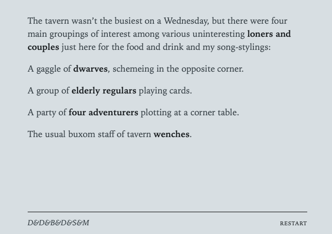
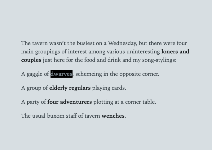
I’ve retracted my absolutely foolish thought to avoid pure black and white, but here’s the update for the light color scheme. It’s probably too subtle, but I prefer that links don’t serve as eye-caltrops in the prose-flow - sort of how George Bernard Shaw refused to use apostrophes unless omitting one would cause confusion.

Screenshot 2024-12-02 at 7.59.32 PM
Screenshot 2024-12-02 at 8.13.57 PM

5 Likes

On the prose in Hanon’s screenshot:
The last word has so many nuances, at least from wikitionary, but in the context of the PC perspective “my song-stylings”) is interesting because rhymes with benches, and a song on wenches and benches in a tavern can be interesting from a bard PC perspective… scribbling notes

Best regards from Italy,
dott. Piergiorgio.

2 Likes

This is a very reasonable caveat with the contrast knob. I like that.

The reason most web design people suggest “slightly dulling” the palette is because most users are not technical enough to adjust their monitors, plus adjust their video card settings. Most users actually benefit from web designers meeting people halfway on the issue. (Some developers overcompensate, and I can see that as a problem.)

Anecdotal Experience (might be boring)

For example, with every new device, I visit this website and adjust the video settings. That’s too much to ask of the average user. I’ve probably adjusted 30 to 40 monitors in my life time and no factory settings were ideal. Most have a store display default, which works great for grabbing a customer’s attention, but fails miserably under extended usage conditions. My last computer monitor for work was purchased 6 months ago and it too needed some TLC. The default settings have definitely been getting better though. Long gone are the old days of “new-fangled” LCDs.

It’s like when you suggested making fonts just slightly bigger; why do that? People can adjust the font-size themselves. Why assume that they need it bigger? Because we can’t assume they’ve optimized readability on their own so we kind of meet them halfway. We just nudge it a bit in the right direction; which is what background and foreground adjustment should be, a slight nudge. Very subtle… and then anti-aliasing concerns are still acceptable.

I understand and agree where you’re coming from. I just disagree with putting contrast concerns to the user entirely. If no contrast knob exists, I’d error on the side of very subtle palette adjustment from pure black and pure white.

However, I want to make a contrast knob for all my future IF projects now. I’ll make the design with pure black and pure white… with the default knob setting turned just a bit so the user can turn it off, if they desire. Thank you for the suggestion! :slight_smile:

@HanonO

I’ve been playing with links that don’t look quite like links, but still look like links… er, you know what I mean. :nerd_face:

I’ve found great success with underlines, but a very light version of the prose colour.

https://developer.mozilla.org/en-US/docs/Web/CSS/text-decoration

https://developer.mozilla.org/en-US/docs/Web/CSS/text-underline-position

With the text-underline-position, use from-font and in most cases it’s way better. Also, you can use sub-pixel thicknesses, like 1.5px, for example.

For the underline colour, use opacity/alpha values with another hex value on the end. Like, #00000033 for a semi-opaque black. (Or shorten it to #0003, if the digits match up for each RGBA value.)

Make the underline very subtle (like barely there) and I think you’ll really like the result. This should give you a little bit more flexibility with the font styling, as well. :slight_smile:

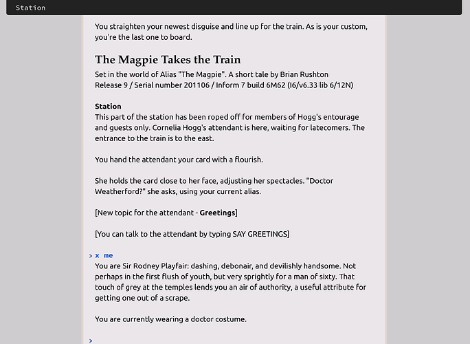
My preferred technique, visible throughout my I7 doc web remix is:

a { text-decoration: none; border-bottom: dotted .14rem; }
1 Like

100% true.

There is a condition that makes high contrast text nearly impossible to read

A little lower contrast definitely makes it less tiring and headache-inducing for me to read text on-screen. Maybe due to doubling from astigmatism being less apparent? I don’t know. I get the same kind of headaches from driving in the city at night.

I remember in the early days of the web, every browser gave you the option of applying your own CSS (most likely version 1). The paradigm was, there’s a load of information out there and I know how I like to see it.

Today we have a different challenge. It’s the range of screen sizes. Every user has multiple devices, from a smartphone to a monitor to a wall-sized TV. Resolutions are different. Viewing distances vary. Font availability has an impact. That’s now too much complexity for a consumer to manage, so it’s left for the author to wrestle with.

The major problem is that it affects word flow. How long should a paragraph be? Anything from 15 words on a phone to 160 on a big screen.

I’d say dark/light themes are great for signalling day/night cycles. The real challenge is in crafting media queries so that the text is presented in a way which suits the terminal device.

1 Like

It is a challenge for sure. Physical dimensions and pixel density of the screen is not always easy to calculate. However, that’s why the context of my statement was that all IF works should allow the user to customize many reasonable aesthetic aspects themselves… for the very reason that we can only assume so much before we assume too much. :upside_down_face:

Edit: Screen size, pixel density, environmental lighting, screen brightness, viewing distance, visual accuity. Did I miss anything?! :wink:

1 Like

(post deleted by author)

(I had a minor threading disaster. I previously posted:)

Colour blindness?

1 Like

And it is a good idea to avoid using pure white as your background. Black on pure white makes it harder for people with dyslexia. Just slightly off-white is preferable.

British Dyslexia Association Dyslexia-friendly style guide:

Use dark coloured text on a light (not white) background.

Optimal Colors to Improve Readability for People with Dyslexia

only 13.64% of the participants with dyslexia chose black text on white background. […] the color pair which was the fastest to read by the participants with dyslexia was black & creme

4 Likes

Ironically, this page has a pure white background :smiley: The text is #222 though, so not quite pure black.

Personally speaking, as a dyslexic, I hate low-contrast pages, off-white backgrounds, and especially dark modes — which just goes to show how important some level of user control is, there are no hard and fast rules.

1 Like

No one’s recommending low-contrast! And, yes, the study I quoted indicated that almost 1 in 7 people with dyslexia did state a preference for a white background. Thus, for maximum benefit to the greatest number, I would recommend black (or vanishingly close to it) text on a pale background (I said “off-white” above but pale warm colors like a light peach or rose are good, too) with a dark mode provided if system settings indicate a preference for it. And, as @HAL9000 said way above, supporting both light and dark modes well basically obliges you to use a variable-weight font.

And as I say regularly in discussions like this test your contrast with APCA, the new scheme from the WCAG 3.0 draft guidelines. The scheme in WCAG 2.0 flunks some contrast pairs that aren’t bad, it considers a lot of combos great that are terrible, and it scarcely accounts for font size and weight, and it doesn’t acknowledge that just inverting a light-mode theme makes text look much bolder. APCA considers font size and weight as well as foreground and background translucency and is much, much better. (In professional contexts you should make sure you also pass the WCAG 2.0 Level AA standards 'cause that’s de facto the modern standard for accessibility.)

5 Likes

There’s been a fairly recent push for new colour palette algorithms. oklab() and oklch() have been supported in major browsers since 2023.

Though the exact science behind it eludes me, I believe it has to do with perceivable colours. Like, for example, my perception of the colours between red and magenta are very poor compared to other ranges. I think it has to do with how our eyes evolved living in “the big room” outside. The hues in nature are much different than that of what an LED monitor produces.