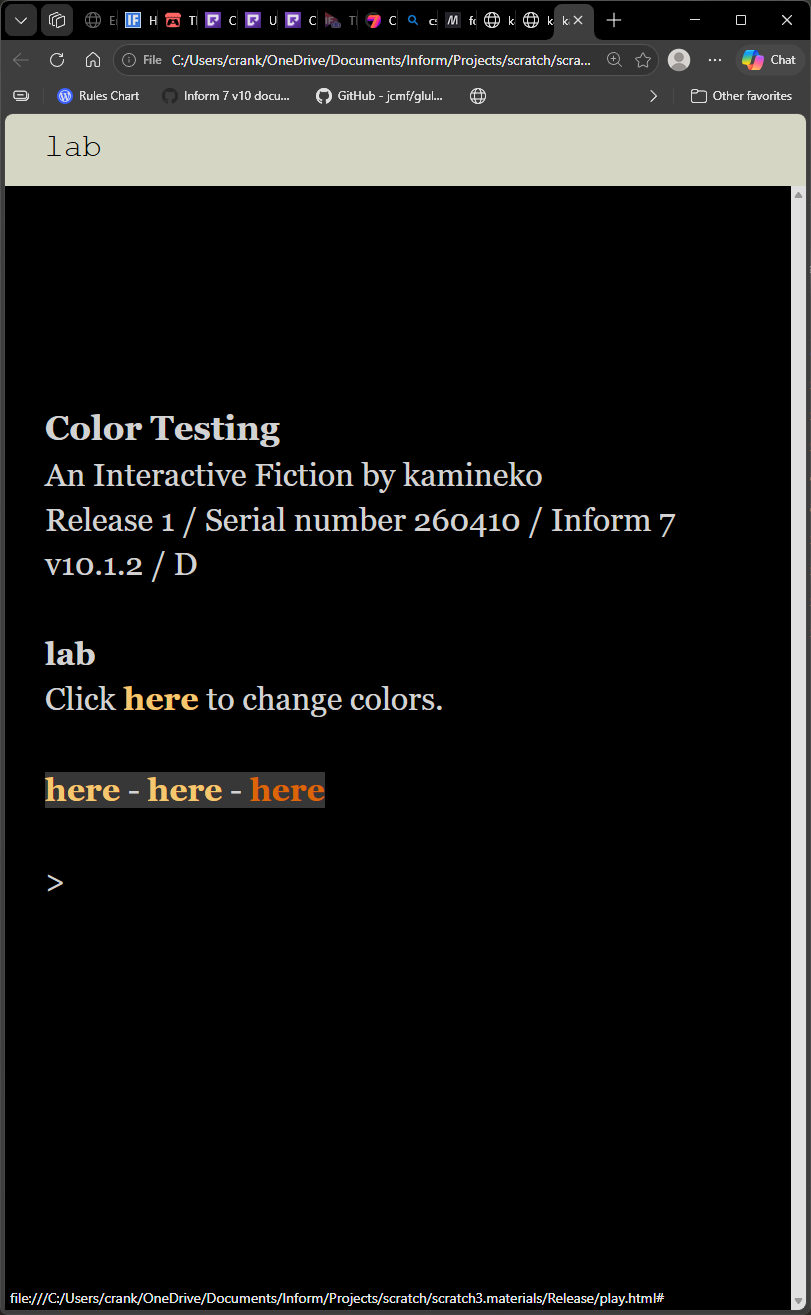
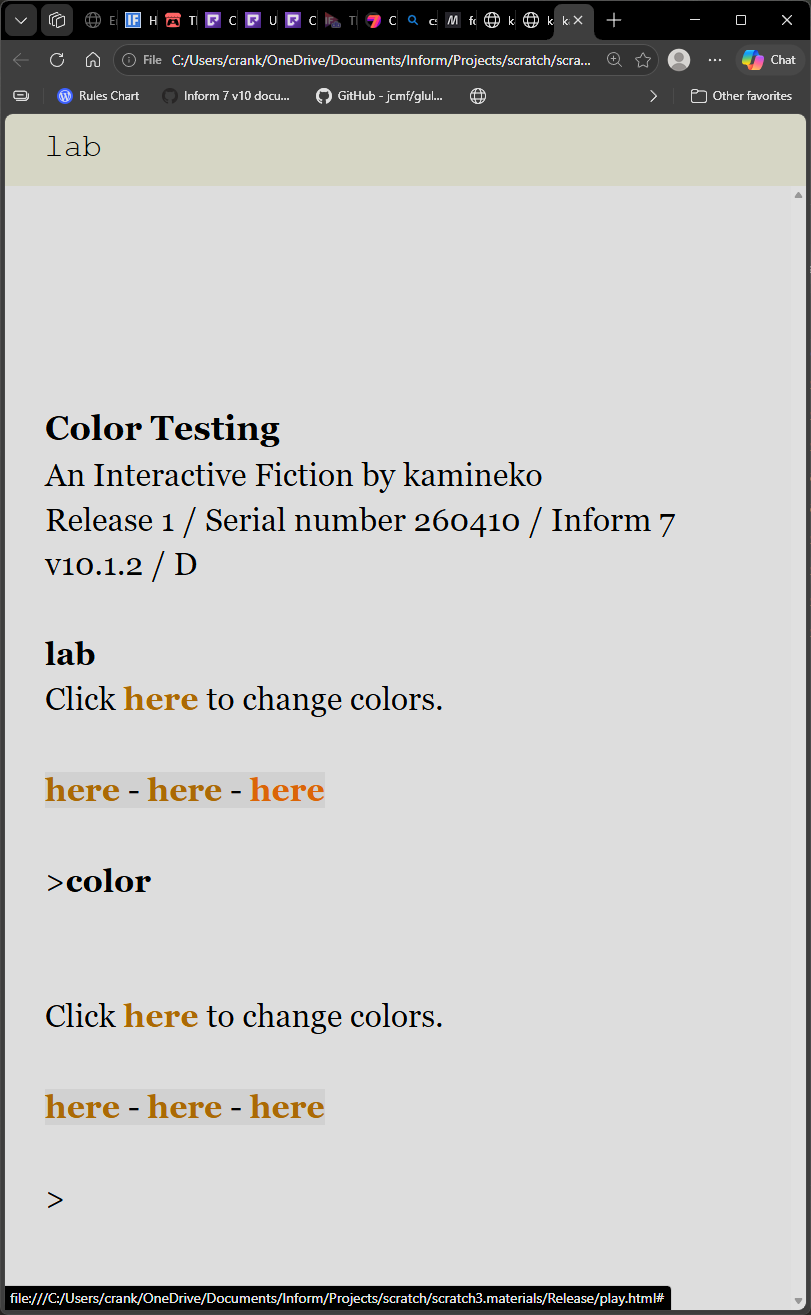
When you bundle a Dialog game up into a website (that is, when you use the Å-machine web interpreter), it has a default color scheme built in. Authors can change this as they like, but I want to provide a good default.
In that default, the background is #000 (night) or #eee (day), and text is #ccc or #000 (respectively). So far so good.
But, links are currently displayed as #875 (normally) or #aa8 (when hovered), and I’ve been informed that this doesn’t have enough contrast for the standard accessibility guidelines. So that’s not ideal!
I’d like to replace these with new colors that:
Look nice (not too garish) against both #ccc-on-#000 and #000-on-#eee
Have reasonable contrast against both #000 and #eee
The normal (non-hovered) link color needs a lot of contrast; the hovered one can have less contrast. It’s possible to use different link colors in light and dark mode, though it would be nice to keep them the same if that’s feasible.
On my own, I could easily meet the second requirement. But my color vision is limited and I’ve been known to pick really garish colors before—and a contrast checker can’t help with that.
So I come to the community! If you have ideas for good link colors, please post them here. If we can come to a consensus on some good ones, I’ll incorporate them into the next Å-machine release.
Unhelpfully, there isn’t one! The interpreter just assumes that users have their browser’s default font size configured to something comfortable for them. (For me, that’s 16pt.) It likewise doesn’t specify a font weight, only a family.
That could be changed in the future, but I figure users know better than developers what’s best for them. (There is an option in the interpreter to double the font size, by setting it to 2em, but that just doubles whatever the user’s default is rather than setting it to a specific value.)
After looking at the default link colors used by Twine and playing around with them some, I found two shades of cornflower blue that, to me, have reasonably good contrast in both dark and light modes: #324fa6 for regular links and #4362c0 for hovered links. There’s not a huge difference between the regular and hovered links, but I was trying to make sure it still contrasted against #eee.
PR is up! Now body styles will be included both before and after the default CSS variables are set. I didn’t realize these variables were fixed at the point of setting instead of at the point of use. (That is, if I set --link: var(--theme-dark);, it sets --link to the value of --theme-darkat the time of definition, not at the time when someone eventually invokes --link. Thus, body styles need to be considered both before the defaults (so they can set things like --theme-dark) and after the defaults (so they can set things like --link).)
This has basically nothing to do with this thread, but it explains why you won’t be able to replicate my results if you have the main-branch version of aambundle.
I am not an accessibility expert, and I don’t have a great eye for color. Contrast requirements (APCA) depend on font--size and font-weight, so I used 16px (normal) as a baseline
Since I’m not great at color, I just used the current earthtone as a starting point.
light mode link: #9d6101
dark mode link: #e2b865
hover: #c95c03
These colors at 400px actually fall just under the guideline at 16px, but I wanted to avoid a stark contrast that would make them blend in with normal text. I think that’s probably fine, but pushing the font-weight of links to bold makes everything meets/exceeds at 16px.
(style class @melisande)
	--accent-dark: \#324fa6;
	--accent-light: \#4362c0;

(style class @drewcook)
	--night-link: \#e2b865;
	--day-link: \#9d6101;
	--accent-light: \#c95c03;

(program entry point)
	(body style @drewcook)
	Normal text (link) link more (link) link normal text.
Currently, links use --accent-dark and --accent-light. You can override that for day or night mode with more specific properties; specific beats general. If we end up adopting three colors for links, though, I’ll probably make them --accent-dark, --accent-medium, and --accent-light, to suggest that they should be variations on one hue.
I’d be tempted to swap the hovered and not hovered colours if you’re using those (@Melisande’s). The hovered one reads fine to me on both backgrounds but the non-hovered is slightly hard to make out in dark mode.
I’d love to help with this one, but as it happens, I’m totally blind, with no vision to speak of. However, what I can do is to recommend you look over the World Wide Web Consortium’s Web Content Accessibility Guidelines, or WCAG, version 3.0. You can find them here.
Absolutely, a standards-based approach is important. All the advice I’ve given is based on APCA (advanced perceptual contrast algorithm), which is currently in beta. It is a candidate for WCAG version 3, and it is the best way to anticipate WCAG 3 compliance.
(so far as I know)
So when I say things like “this is sufficient contrast” or “this would exceed or comply if we increased font-weight,” I’m basing those things on feedback from an APCA contrast checker. The question of contrast at a specific font-size and font-weight is determined programmatically. I can’t actually verify contrast by sight alone, so I rely on tools like this one for guidance.
I should have provided this background in my initial post. I’ve mentioned APCA a lot over the past couple of weeks and I just spaced it out.
The dark mode one looks good. The light mode one seems wrong? Do link colors push towards the normal text color (white/black respectively) or away? I don’t remember anymore.