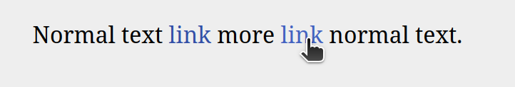
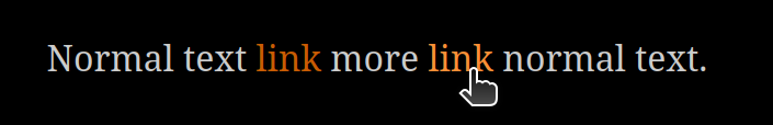
I think as long as something perceptible happens on hover, it doesn’t really matter what it is - you’re probably not reading the text of the link any more at that point anyway.
Although if I’m reading this page correctly, WCAG says that hovered links should have some additional indicator such as underline, rather than relying on colour alone.
Based on this, I’m going to add an underline on hover as well. But I think color plus underline is the best way to go, to stick closer to the original behavior.
Green? Magenta? If you want to propose some hex codes of your own, go for it!
1: Melisande’s Cornflower Blue
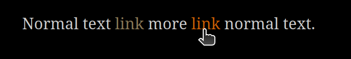
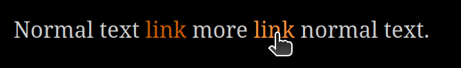
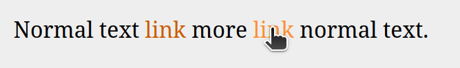
2: Drew Cook’s Ochre
3: Hidnook’s Orange
4: Something Else?
0voters
Unlike with the various Dialog polls, there’s no real problem with changing this later. It’s only a default—authors can override it however they want—and changing it in the next release won’t break anyone’s code. So go wild with it, and if users run into problems, we’ll find out and fix it!
I don’t think it’s possible to get a full 4.5:1 contrast ratio against both the light and dark backgrounds, but I was able to revise my colors so that the darker shade of cornflower blue has at least a 4:1 ratio against both backgrounds (according to this contrast checker). The new versions are #496bd1 for accent-dark and #7e97ff for accent-light. My vote for “something else” is in favor of these.
It’s also possible to have different link colors in day and night mode; Drew’s option uses that. I’ve been trying to keep the number of colors small to make it easier on authors who want to customize things, but elegance shouldn’t get in the way of accessibility.
I have done recent work in this space, including adherence to both WCAG and the more realistic APCA model. You can use the same hue against both backgrounds, but I’m skeptical it can be of the same luminosity. There are only a few hues for which that works IIRC.
I’ll weigh in more properly once I’m at my computer.
Oops, ran out of time for the day. Will continue tomorrow. Before I had to do other things I asked a language model to throw together an illustration of valid link colours for either background (or both). Oklch Link Colour Ranges · APCA
It defaults to the standard “body text contrast” requirement of Lc > 60, and at that, there is no overlap between the link colours that are valid for light backgrounds and those that are valid for dark backgrounds.
Dropping down to Lc > 45, there is a thin band of link colours that are valid across both backgrounds, for all hues. Unfortunately, this means that if we want to stick to one colour for both backgrounds, brightening or darkening the colour on hover will lead to a link colour that no longer satisfies the contrast requirement! Messing with its saturation is still possible.
(In fact, the body text colour on the dark background sits right in the contrast-legal spectrum of link colours, and limits the potential for brightness changes on hover there too.)
((The reason it is still important for hover links to be distinguished, even if most readers have stopped reading them by the point they hover, is that users who navigate by keyboard might still be reading links that are in a “hover” state.))
The way this is currently handled, there are two colors specified by the author (or left to the defaults: --accent-dark for normal links and --accent-light for hovered links.
Based on this writeup, this should perhaps be changed to three colors: --accent-dark for unhovered day links, --accent-medfor hovered day links and unhovered night links, and --accent-light for hovered night links.
Right now, “Hidnook’s Orange” is leading the poll by a longshot. Would you be willing to add a third color to that pair that fits the hue but is suitably visible in both day and night modes?
I just realised there may need to be 2×2 variables for link colours anyway, i.e. dark normal, dark hover, light normal, light hover. If there’s not, people who override “dark” and “light” to be closer together won’t be able to find a single pair of normal×hover link colours that work with both backgrounds, even if such a pair exists for the default background.
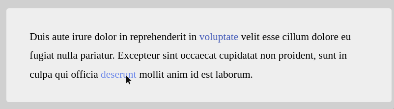
My vote goes to a blueish hue for links, because of its historical association with links. I would prefer a colour that is not too strongly saturated, to avoid distracting from the reading experience. I think there’s a large risk in picking a colour that is too strong because in small-scale test images the disruption to the reading experience is not noticeable.
I played around a bit with a different version of the colour space exploration tool from before: Oklch Link Colour Explorer · APCA (click on any colour in the colour space box to generate a quick preview of that colour for links)
I would pick something along the lines of
oklch(0.50 0.15 270) (#435ab8) for the link colour against light backgrounds. (Lc > 60 against background, Lc > 15 against text colour)
oklch(0.75 0.10 270) (#95abee) for the link colour against dark backgrounds. (Lc > 60 against background, Lc > 15 against text colour)
oklch(0.65 0.15 270) (#6c88ea) for the hover colour against both backgrounds. (Lc > 45 against backgrounds, Lc > 15 against text colours)
Oh yes, the intent with this system is that authors can override at whatever level of specificity they want. They can set --accent-dark and --accent-light (the overall theme accent colors, used for links among other things), or they can set --link and --link-hover (the colors used for links), or they can set --day-link, --day-link-hover, --night-link, and --night-link-hover (which will change with the user’s theme choice).
I just want the broadest system, the one using theme and accent colors, to require defining as few colors as possible. That’s meant to be the simplest, easiest-to-understand version of the system.
Based on this poll, I’m going to be putting “Hidnook’s Orange” into the next release of the interpreter. That way we can see how it works in a real-world situation and see what issues come up.
Since I can’t really judge colors for myself, I don’t have a way to go beyond “this is what the consensus on the forum thinks is good”. But this isn’t meant to be the final word on this topic: it’s very easy to change this later, so I want to get something out there and get feedback on it, to refine things for the future.