Colour as an element of IF design

In another thread, I realised I made unusual assumptions about the usage of colour in IF

Posts for context

So I suppose what I’m wondering is, what’s the most prevalent view about the usage of colour in IF?

Is it an extra channel of communication for the work? Is it a means of imitating the pages of a book or the screen of a monochrome terminal? Is it a way of signalling genre through (apparently) associated colours?

4 Likes

I try to pick things that fit the game, but genre is a decent part of that. A sci-fi or horror game is more likely to use cool colors than a fantasy or historical one.

For Wise-Woman’s Dog I tried to pick earth tones; Miss Gosling, colors suggesting an old paperback novel; Death on the Stormrider, brass and leather for the steampunk feel.

3 Likes

I never really thought of it as color signaling genre, but I have tended to use more muted colors in fantasy works and brighter colors for modern-day settings.

4 Likes

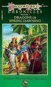
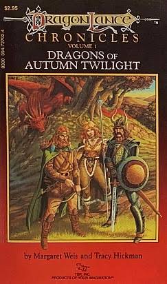
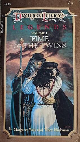
I always thought Dragonlance in particular followed that color theming with their book covers.

1 Like

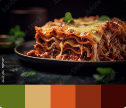
Maybe it’s because my visual imagination is nearly nonexistent, but my color schemes are literal as hell. How to Make Eggplant Lasagna has the color scheme of a lasagna. Every day I get emails has the color scheme of Outlook/Windows 11. Die Another Day is red because blood and Something Blue is blue because… well, obviously. Winter-Over’s color scheme is picked from the cover image. It’s all kind of stupid, but, well, nobody’s ever complained.

4 Likes

Not specific to IF, but for accessibility reasons it’s usually recommended to not communicate information only/primarily through colour (though it can be useful as a redundant channel to bring further attention to something that is also communicated in some other manner).

5 Likes

Nothin’ wrong with that.

4 Likes

Many games have leaned into red for damage, and green for healing over the decades, but red green is a common trouble area for color blindness as well. Now it’s become more common to see healing coded white or blue, and damage as black.

1 Like

That makes sense. In general, lightness/darkness is much better for communicating information than hue; even setting colour blindness aside, it just stands out better visually (light/dark contrast is much stronger than contrast between opposite hues at the same level of lightness).

EDIT: also, lightness and hue can overlap/conflict somewhat; yellow is perceived as “lighter” than red in some sense, for example.

4 Likes

@DemonApologist’s works stand out to me as having really nice colour palettes that fit the mood of the story. The gradients in Radiance Inviolate as the story moved from night to dawn to day was great.

6 Likes

Yellow seeming lighter/brighter than red makes sense when you consider that, from a light mixing perspective, yellow is what you get by mixing the brightest red with the brightest green… similiar goes for cyan and magenta.

Though, white for healing and black for damage feels 8-bit old to me… After all, the classic White Mage/Black Mage dichotomy has White Mages as healers and black mages as offensive spell casters… Though perhaps that isn’t very common outside RPGs that follow a variant of the fighter, wizard, cleric, rogue party structure.

Yellow also looks brighter than magenta, though

Colours are an interesting topic. But as mentioned above, colour should not be the sole differentiator. When I created my One King game featuring a Barbarian in Twine for Spring Thing 2024, I wanted to colour code my links to indicate the type of link:

Colour Function Reasoning
Yellow Navigation Think “Yellow Brick Road”
Blue Investigation / Examination Blue is often associated with Intelligence / Magic
Red Action (e.g. attacking a monster) Red is often associated with Aggression / Health

I also wanted to support light / dark mode. However I could not get a consistent colour scheme defined (I tried several), which would show up as distinctive in the browser emulations, so in the end I dropped the idea of colour coding links.

3 Likes

I definitely choose colour schemes to fit the tone and subject of my games, but then I spend more time than is strictly necessary on visual layout. I also have themes for series, all the Mouse Train games are brown, for example.

Zenith is about climbing a tower into the sky, so it starts off slightly muddy and gets more and more blue and pale as you go up (it also has clouds).

The Green is about malignant encroaching plantwork, so it’s green and confined.

A Mouse Speaks to Death is about meeting Death at the end of your life in the dark, so it’s mostly near black and white.

Ghost Hunt is about finding a spooky ghost in a dark room, so it’s black and purple.

The only one that breaks that sot of trend is Moldy Dick, because it’s a bad game jam entry. It’s set in a hot and burning desert badland, so it’s cool blue-grey with a constant animated rain effect in the background.

4 Likes

I would think color plays (or can play) the same role in IF that it does in any other type of game or literature. Color is used to convey genre, tone, etc, in all other media with visual elements, so why not IF? Not every IF has use for color, of course. But I see it as just one more facet that’s available for expressive purposes, if it serves the author’s intent.

There are certainly associations between genre and color (especially apparent in movie posters, for example). I would think all of those color/genre links could potentially transfer over into IF. Of course, subverting those expectations can be interesting, too (like using pastel colors in a horror game for ironic contrast?). And not every game slots neatly into a genre, or wants to lean into the cliches associated with it.

I put a lot of consideration into the color schemes for my games, and it can be an important part of the overall experience. (Although perception of color is never essential to gameplay, and I try to follow best practices for web accessibility. This is a handy tool, BTW, for checking that the light/dark contrast for your text and background meet accessibility standards.)

Fantasy Opera: Mischief at the Masquerade is set in a fantasy version of 17th century Italy, and specifically an opera house. The colors were inspired by photographs of modern recreations of Baroque opera sets. The game uses an antique-looking cream color for its “white,” with an ochre brown background and teal highlights. I don’t know if this indicates a fantasy genre, per se, but definitely suggests the historical setting.

The Secrets of Sylvan Gardens, being a romantic, garden-themed fantasy story, has a palette of soft earthy greens accented with shades of floral purples. I also used changing dark/light schemes to indicate night and day, which play a structural and thematic role in the game.

The Path of Totality is also a nature-themed fantasy game, but the landscape is a bit harsher and colder, a bit more rugged, taking place in a quasi-British Isles wilderness setting (as opposed to Sylvan Gardens’ quasi-Mediterranean garden setting). So I opted for cool, muted greens, with a complementary beige. There are complementary color schemes for night scenes, as well.

Anyway, that’s far more information than probably anyone wanted to know :sweat_smile: But there’s a bit of my thought process as someone who probably has stronger-than-average feelings about color as an expressive tool in IF.
7 Likes

I think that anything that is part of the game is part of the game. That goes for cover image, presentation of the game itself, the blurb, etc. If it releases as part of the game, it’s relevant. Color is no different.

This is consistent with my Infocom criticism.

My color choices are not terribly imaginative or figurative. For Repeat the Ending, I chose an orange-on-dark scheme because orange is thematically significant throughout the game. I chose light purple-dark purple for Marbles and D because a) it reminded me of a grue and b) Marbles has a bit of a regal bearing. I can’t say why the colors in Portrait with Wolf are what they are, but I spent a lot of time with it and the results are what felt best.

I suppose in this way the vague associative nature of PWW makes its colors more thematically significant than those in my other games.

I do check contrast for legibility, as that only seems considerate.

5 Likes

In my parser IF I don’t use colouring, I think that a parser IF player is entitled to his/her/hey colour preferences set in the 'terp. (Personally, I prefer yellow character on blue background)

On CYOA IF, mainly web-based (twine), a past debate shows that I have experimented with color themes as visualisation of the passage of time, pink dawn, light blue day, orange afternoon, very dark blue night.

On damage/healing visuals and daltonism (I use this term for all variants of color-blindness) I noticed that recent major RPG implement a color-blindness setting in the options, and perhaps this is the best solution, based on alternate palettes.

Best regards from Italy,
dott. Piergiorgio.

2 Likes

I’m struggling with this for my WIP; I was interested in color coding sections of dialogue with character specific colors; But I have six characters, and I’m having troubles finding six colors that are distinct from one another, provide good contrast against the background, and don’t look ugly, and allow for accessibiity by players who don’t see color the same as I do. And I haven’t even started to think about a color pallette for dark mode (which I don’t favor, but I know other people do.)

2 Likes

Have you considered different fonts instead? Or some sort of differently patterned borders (maybe only the left border)?

3 Likes

Found this neat tool for making custom borders

2 Likes