What theme are you using for the intfiction forum?

So many themes to choose, which one do you use? Light mode or dark mode?

  • One of the Light Themes
  • One of the Dark Themes
0 voters

(Edit: adding a poll seems like a fun idea but judging by the comments I think darker themes are used mostly)

  • I wonder if different themes have different way the site acts, for example with the brutalist theme right now I can’t find the post button for this topic. (Edit: The button is there but can’t be seen unless selected.)
  • But the button is here now after selecting the air theme.
2 Likes

Dracula, a dark mode one, is my choice.

3 Likes

Dark - I find it calming and restful.

2 Likes

Dark as well. Otherwise screen is too bright!

3 Likes

Exactly the same.

2 Likes

dark, ofc

3 Likes

Dracula.

3 Likes

@r01nx you should make a poll in the OG post :joy:

4 Likes

I use the default theme. Dark themes give me eyestrain.

1 Like

I just use the default theme, too. Didn’t bother with the others. This one’s good enough.

1 Like

I use light mode for all apps. Same reaction as EJoyce – dark mode gives me eyestrain.

I haven’t explored the forum themes beyond the default. There’s some things about the default I don’t like (rows of tiny user icons are meaningless to me) but it hasn’t been a big enough deal to go looking for alternatives.

2 Likes

Though when I think about it, Dark mode isn’t perfect for me, either. Really the contrast between black and white is too high. I prefer something like my Gargoyle config (I’m embarrassed to admit it took me more than an hour to set up), which isn’t EXACTLY like any of the presets (which makes sense, gargoyle uses hex codes for colors).

7 Likes

Exactly like me.

1 Like

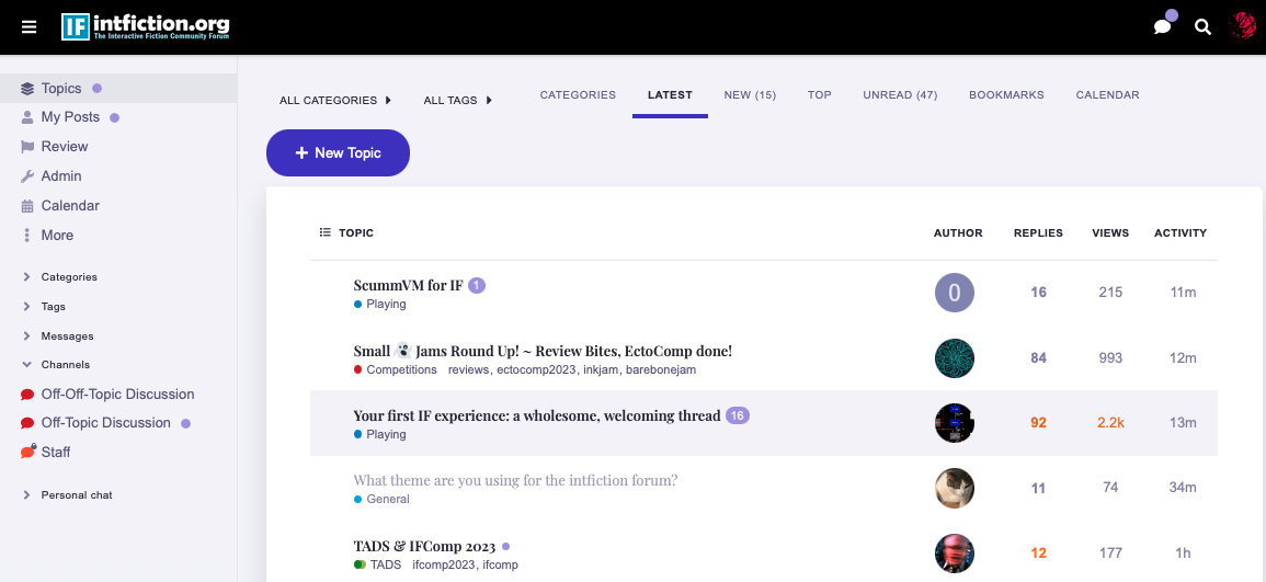
Dannii actually made a routine that tells us which themes are being used:

Number of users Theme name
148 IntFiction
91 Dark
17 Dracula
9 Vincent
8 Graceful
8 Screen Reader
6 Minima
4 SoBlue
4 Essential
3 zeronoise
2 Geometric
2 Hibiscus
2 FKB Pro
2 Ghost
2 Air
1 Modest
1 Brutalist

I myself am a dark user for most of my personal desktops and apps since I spend like 8 hours a day working on a remote desktop where I can’t change it from black text on brightest white.

Certain themes have slightly different functionality and might conceal or show different elements such as lines of avatars for each posts. Many themes will change this, such as “Essential” shows one avatar on the right and makes them into squares.

Zeronoise does this as well, and includes a serif font, it also is designed to feature the headline attachments and photos more like a blog layout for the first post.

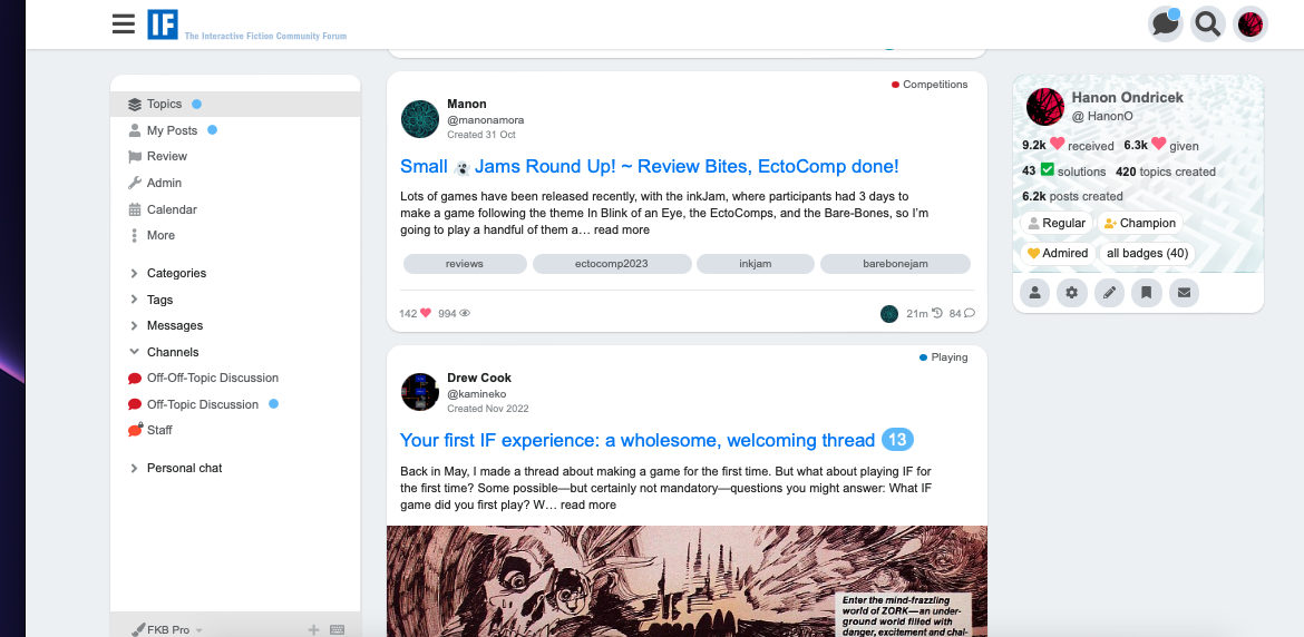
FKB Pro is good for people who like to skim, showing a preview of the text and images in the first post, kind of like Threads or the Site Formerly Known as Twitter and shows your stats on the main page if you like to min/max.

The IntFiction theme is mostly the Discourse default setting with our specific color choices to match the logo. Sometimes different themes may have colors that don’t work with the default choices if there’s not a color scheme built in and included with it, such as why Brutalist and FKB Pro has white text on a white background on occasion like in the header. I could probably fix some of that but it’s mostly gloss and not functional, however the Reply button in Brutalist I will look at.

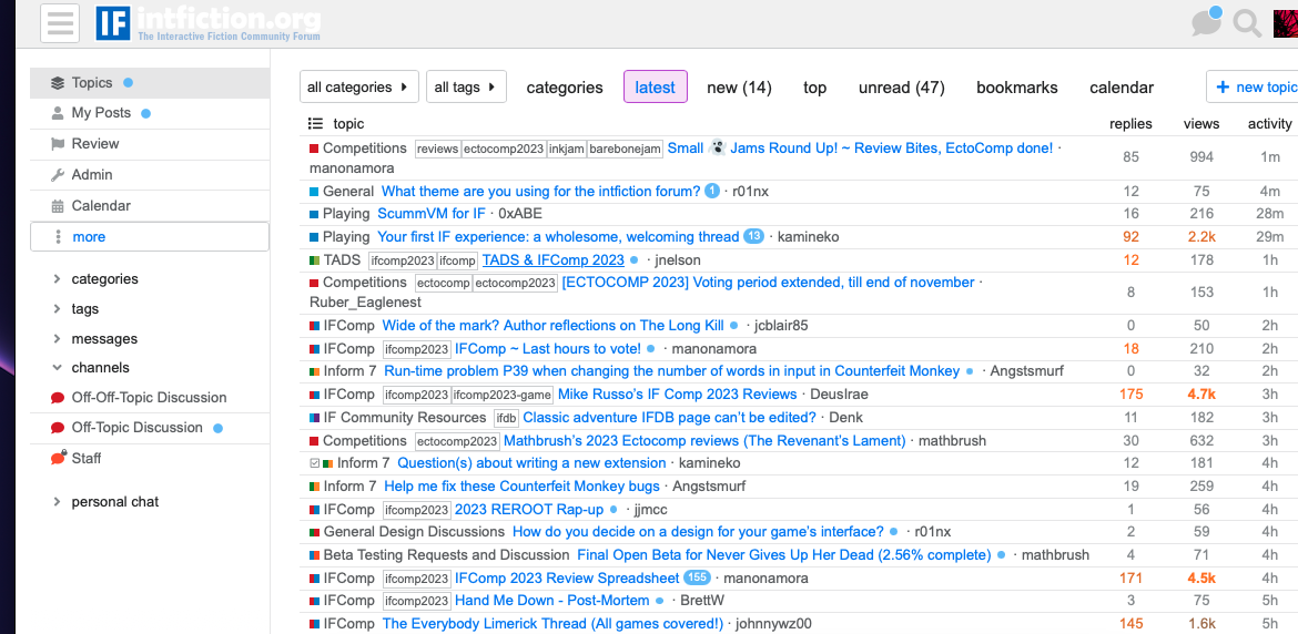
Brutalist is the most “nothing but the text and data” theme with no avatars on the topic screen, and nearly everything is clickable as a filter.

Functionality depends less on the theme which is mostly cosmetic (though some themes have things like a built-in dark/light toggle) and by the plugins that change functionality that we download and enable. Things like the spoiler blur or code text and “click to copy” are customizations from Discourse Meta that can be chosen.

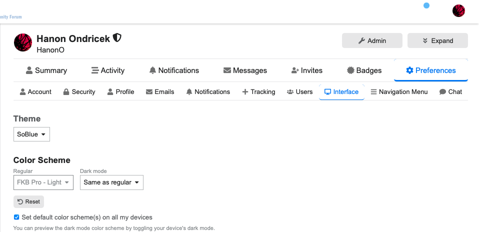
My personal favorite theme now is “SoBlue” which is a dark theme that isn’t just black.

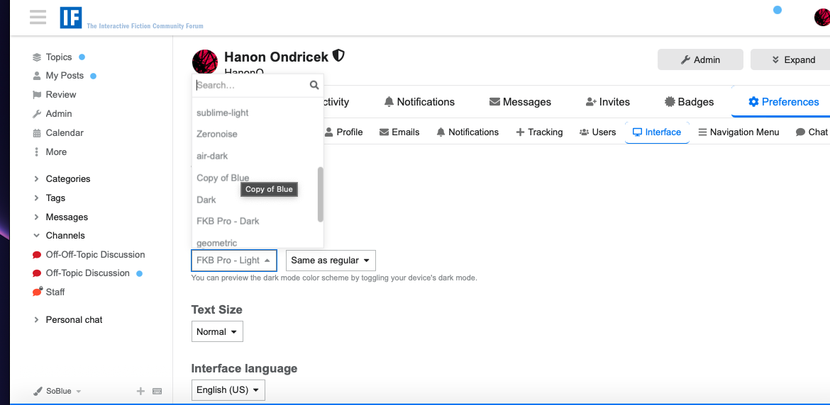
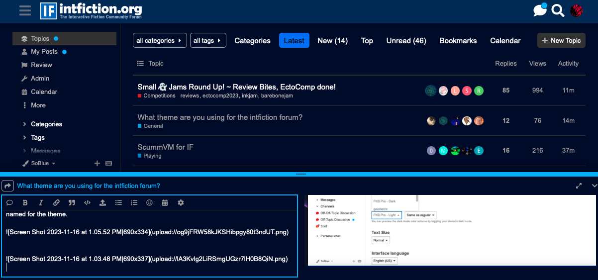
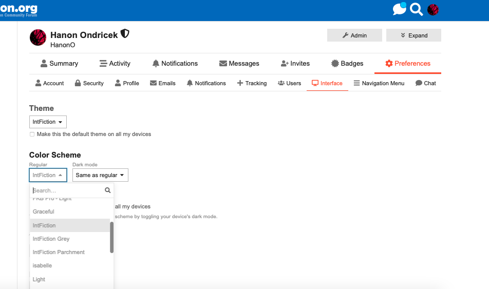
Be aware that sometimes picking from the Theme chooser will neglect to change the color scheme. If you notice in my interface preferences, I chose “So Blue” but it kept the FKB-Pro color scheme. If you notice weirdness, check in profile>preferences and select a different color scheme or the one named for the theme.
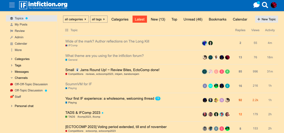
Now it’s blue!

I realize there’s not a good compromise between light and dark specifically for the background color. I’ll work on that!

10 Likes

The dark side has cookies.

And cake. :birthday:

5 Likes

So based on this discussion I’ve made two new color schemes.

IntFiction Parchment
IntFiction Grey

If you just want the background toned down from white.

You might need to refresh your browser, then go to Profile>Preferences>Interface and select either one. Remember it’s a color scheme and not a theme.

Don’t forget to scroll to the bottom and hit save. If you ever see weirdness like white text on white, toggling the color scheme may fix this.

You can try different color schemes with other themes, though sometimes the results may vary. Certain colors are specified by the theme and override the chosen color scheme.

Many themes include a default that should correct weirdness if you choose the “Theme Default” choice at the top.

10 Likes

IntFiction Grey actually works really well with Brutalist:

4 Likes

Be aware also: Hibiscus is a low-use theme we tweaked specifically at request of users who found like-count distracting so it mostly hides post likes.

You’ll still see the heart button to click, it just won’t show the number of likes unless you hover.

3 Likes

I used to tinker a lot with my Gargoyle theme settings for years. Eventually I have chosen Lectrote Gray Slate and copied the color values from it into my config.

Edit: Heh, I remembered the name of the theme I copied from wrong.

2 Likes

Hey, I’m glad you liked that one!

And thanks for the theme overview, Hanon. I may take a further look. (Or I may not, as IntFiction is clearly working for me.)

4 Likes