Visual Elements in Parser Games

Audio-visual elements (colors, fonts, sounds, images, hyperlinks, animations, and even external media) are an opportunity for authors of parser games to craft unique game experiences. They aren’t necessarily “extra.” In fact, such features can be core to a creator’s vision. It has been this way since the very beginning.

When Dave Lebling added ASCII art depicting a Zorkmid coin to Zork II, he wasn’t having a fun retro moment, he was working with some of the most advanced game technology available.

       -------------------------- 
      /      Gold Zorkmid        \ 
     /  T e n   T h o u s a n d   \ 
    /        Z O R K M I D S       \ 
   /                                \ 
  /        !!!!!!!!!!!!!!!!!!        \ 
 /        !!!!!          !!!!!        \ 
!           !!!  ^^  ^^  !!!           ! 
!           !!!  OO  OO  !!!           ! 
! In Frobs  !!!    <<    !!!  We Trust ! 
!            !! (______) !!            ! 
!             !          !             ! 
!             !__________!             ! 
 \                                    / 
  \     -- Lord Dimwit Flathead --   / 
   \     -- Beloved of Zorkers --   / 
    \                              / 
     \       * 722 G.U.E. *       / 
      \                          / 
       -------------------------- 

When Mark Blank assembled the supplemental materials for Deadline, those were essential to experiencing the game.

When Infocom upgraded its C64 interpreter from the familiar blue-on-blue scheme to white on gray, it was electrifying! They even added a “click” sound effect that accompanied each keystroke!


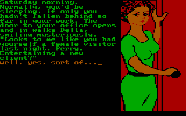
Beyond Infocom, of course, a great many publishers used images and sound in their games, including Telarium, Magnetic Scrolls, and Melbourne House (The Hobbit).

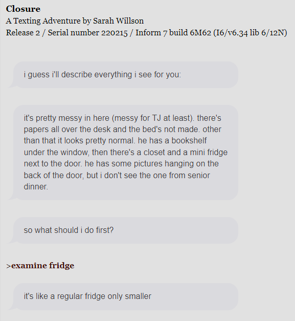
Which is all to say: visual elements are not an extraneous thing that evolved with web technology. They have always been a part of parser game history, and they remain so well into this century. Well-regarded works like The Wise-Woman’s Dog, Closure, Counterfeit Monkey, Hadean Lands, and Ryan Veeder’s Authentic Fly Fishing make effective use of visual elements.

What is the purpose of this thread? Working from the perspective established (audio-visual elements have been a part of parser IF for nearly as long as IF has been around), I have a few topics of interest that maybe we could discuss.

  1. What are some audio-visual elements that have worked for you in parser games?
  2. What are some as-yet undeveloped audio-visual features that could improve parser gameplay?
  3. What audio-visual elements might appeal to new players (terminal screens can be daunting)?

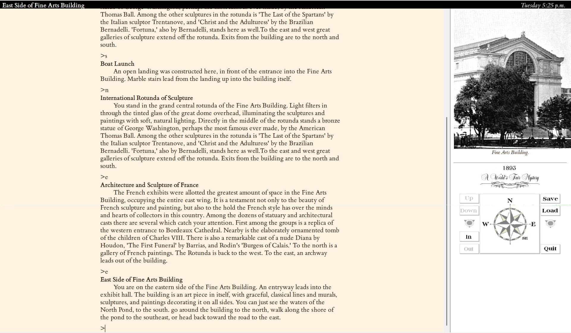
Just to start, I will answer one of the questions above. I made a mini-map for my next game because I was so impressed with the one in Familiar Problems, and I like releasing web games because I can guarantee that the images will scale (there are so many interpreters out there).

I welcome other random thoughts about visual elements in parser games, just so long as you don’t post to say you don’t care about audio-visual elements. This really isn’t a thread about not caring about things.

let’s discuss IF!

13 Likes

For question 1, I’ve recently enjoyed Ryan Veeder’s cinematic opening elements in his games, where the title screen has timing/animated elements (I think they’re animated?). Similarly, I like the way both he and Photopia handle changing background colors in different locations.

I also like ASCII art in games like Winter Wonderland (beautiful snow) and Blue Chairs (disorganized text to represent a drug-induced haze).

I love love love the boxed quotations in Curses and they’re something I wish I could implement in my games. I hate how Glulx forces them to the top of the screen. I completely understand the reasoning (to give flexibility to windows, they had to make a rule that windows can’t overlap) but…

Question 2 - What could be added?

It’s super easy to edit Quixe to let boxed quotations actually overlap the text, you just change one line of CSS (the one that tells the DIV containing the quotation to remain flush to the top of the screen). A Template (like a simplified version of bisquixe) could probably automatically add that feature, but I’d love it if that option to have an unmoored text box were added to baseline Quixe/Parchment (maybe it’s already in Parchment?)

5 Likes

I think audio has been seriously underutilised as of yet. Sure, I understand why (I mean, even I turn off the audio in games whenever I can), but when games do it properly, I love it. The fly buzzing in Babyface gave me serious shivers because the sound has been put through a compressor and made so that it feels like it’s hovering above your ear, and as I type this a shiver went down my spine thinking of it, I kid you not. It’s why in the 2024 IFComp I put the prize of a rock song for the chosen author’s game: I wanted to see more appreciation of music in games.

I was also going to mention this one. It created a really chaotic feeling, but without the coherent blue text at the same time, I don’t think it would be half as effective for me. Something about it helps show the situation clearer. It also makes you immediately realise that the game knows what it is doing rather than it just being a bug or something.

3 Likes

Pedantry comes from love: That was created for the Bank section of MIT Zork. The image was copied into the Zork 2 source code, but commented out, presumably because they couldn’t afford the bytes for it.

9 Likes

Probably to nobody’s surprise, I’m a big fan of maps built into the game. Sometimes I enjoy mapping, but sometimes it just becomes a chore, and having the game do it for me is much more convenient than hooking up my transcript to Trizbort. Especially if you can click the map to navigate to a specific room—to me, typing in all the compass directions to move back and forth across the map is not the fun part of a parser game.

Another feature that I think has a lot of potential is the “suggestion bar” that I’ve been putting above the prompt in games from Miss Gosling onward. The key feature is that it appears right above the prompt, but disappears once you enter something: there’s only ever one suggestion bar on screen at a time. Otherwise it would clutter up the transcript and history.

7 Likes

@AmandaB 's Of Their Shadows Deep (of course).

3 Likes

I love the photos in 1893: A World’s Fair Mystery. It also has a compass which visually shows possible exits, very useful.

5 Likes

I’ve been playing IF for about 40 years and still have not given up on authoring some parser-based game someday. When I do consider putting any game together I often think about how Zork I,II, and III eventually started adding features into the Zork Zero and Beyond Zork era. I recently showed these games to a friend (yo look at this game I played when I was eight!) and their first comment was that the first attempts add adding graphics just made it harder to read.

One thing I’ve thought about a very long time is, when I play what I still call a “text-adventure” just how MUCH text do I want? Pure text? Map? Few images? I realized that when games stuck to pure text I would get much more immersed where pictures would only distract. That is not to say there are not some BEAUTIFULLY illustrated IF out there, but I got to thinking about Photopia and its use of color. The color never seemed do distract but rather add to the feeling of the story (“distract” means that it takes away from the focus.)

As I’ve already mentioned, I have been experimenting applying CSS directly into web players to create a “mood” on any particular scene in an IF. I found some things could nearly be jump scares, that ANY form of moving text on the screen made me wanna vom, and that vignettes could create interesting effects while not breaking that reading flow.

When there is a constant presence of a visual, like many visual novels, I can enjoy that. But playing a text game where your imagination is fueling it, then you find some cheese and its hyperRealisticCheese.jpg that suddenly appears.

Don’t break the flow.

Made this an experimental example trying to push the limits of not distracting the reader: Interactive Fiction — Source & Game

5 Likes

Great point! I love the boxes, going all the way back to Trinity. I wonder if they’ll be back in Inform 11. It would be great to have them back.

I think that’s true! I think there’s a tricky design problem with making the music reactive based on in-game events, but I think that’s as much an opportunity as it is a challenge.

Doh. I remembered this exactly backwards. In Zork II, not in MIT Zork. Thanks for correcting the record!

That’s a great touch, and a way we can make acclimation easier for players new to the medium (and help experienced ones, too!).

I love that one! Very strong example.

A good case of form complementing function. Current Inform does not support these windows, but I hear they are coming back in Inform 11. I hope some authors explore the possibilities!

That’s a valid point, ineffective visual elements can drag a work down. I personally had no trouble with Beyond Zork but find Zork Zero pretty hard to look at.

3 Likes

I’ve enjoyed the location graphics in a lot of Adventuron games—The Familiar comes to mind, for example. They can really contribute a lot to the atmosphere.

But I admit that when there are audiovisual/styling elements in an Inform game, I often don’t experience them because I’m playing in an interpreter so I can read in a color scheme that doesn’t give me a headache. The idea that you should ideally let people at least select from a light mode and a dark mode seems to be catching on in choice games while being largely absent in styled parser games, but Twine has an API for it and default Ink and Choicescript come with it built in, whereas I don’t know if Vorple makes it easy to do.

(Adventuron games can only be played in the browser so I just have to make do with Stylebot, which is kind of a pain but does at least mean that I’m not missing out on additional multimedia stuff like I often am with the download version of an Inform game.)

3 Likes

This is a good/important point. I don’t have light/dark modes in my previous games, but I am adding them to some near-future releases (as well as to the next game). I hadn’t given the matter any real thought until I helped screen for SGS, and that made the question more real for me.

My take is that ownership of visual presentation implies responsibility for player accessibility and comfort, and this is something that I can better develop in my own work.

4 Likes

This was the big thing on my mind while going through the thread! As a player I really enjoy games that include these things (I was happy to see Closure in the initial examples as that was one I especially loved), but as an author I’m a little discouraged by how complicated it can be to implement those visual/multimedia elements and ensure they’re actually accessible to players. The inconsistency of experiences between different interpreters feels like a major issue.

I’ll also shout-out @FLACRabbit’s works for great sound design and handy visual aids, e.g. A Smörgåsbord of Pain!

5 Likes

This question is exactly what I came here this morning to post about, so I hope you’ll forgive me while I rant. What I’m looking for is a parser game development system that will produce visual output that is as flexible and beautiful as what one can rather routinely achieve in Twine.

Currently, there isn’t one. Not even close.

I’ve been looking at Inform with Vorple. Vorple has a few nice widgets, but I couldn’t even get the page to turn green when I used the code given in the Extension. The idea of producing a bounding box for the text, a box with its own nicely textured background, along with a left-side toolbar and a few dropdown menus – fahgeddaboudit.

The TADS WebUI might possibly be able to do something of the sort, but (a) it’s poorly documented, (b) the T3 engine hasn’t been updated in 13 years, and (c) you’d have to knuckle down and learn javascript and css. There are no tools the author can use (as in Twine) to facilitate the process.

So that’s my wish list, in a nutshell. Only one item on the list. Audio-visual features? All of them.

The command prompt interface was state o’ the art in the 1970s. Today it’s a creaking relic. However (big however): Twine doesn’t have a world model. A world model and free-form command input from the user are, in my view, absolutely essential for any sort of sophisticated interactive fiction. Even with author-defined variables and logic structures, Twine is incapable of managing anything even remotely as sophisticated as a world model.

What’s worse, the community of parser-based developers is way too small for us to have any hope that the system I’m dreaming of may be unleashed. I’d love to be proved wrong, but I’m going to say right now, it will never happen. We have a choice between a terribly obsolete command prompt interface with a very slick world model running under the hood, or a beautiful delivery system that can’t do anything even remotely cool in the story interaction department.

[redacted by Mod - you can make your point without disparaging choice mechanics] Okay. I understand why you feel you need to take that position. I’ll save the disparagement for my own blog.

In fact, I’ve edited the paragraph that follows to remove some disparagement that you missed.

There are reasons, which I won’t belabor here, why branching hypertext just plain doesn’t work for me. I need a parser. I need a world model. And I would assert that as a whole, the parser author community needs the 21st century user experience that Twine can deliver. That is all.

5 Likes

I’d agree, though I’ll admit I was just excited because when I played it I had just started on my current WIP and wanted to have pictures and the sort and was like “You can do this in ZIL???” So was reasonably excited.

I’ll admit, thinking about it now, that I haven’t got a light mode vs dark mode in my WIP. I think it would be difficult to work into it, but not impossible… I’ll have to add it to the list of to-add features!

2 Likes

While I’m a huge fan of parsers and believe they can do amazing things not found anywhere else in the storytelling landscape, I feel a need to defend Twine and other choice/hyperlink formats here. I think there’s plenty of room for those different interaction styles to coexist and even enrich each other! I also find that some stories or games are just better suited to a given style.

But more on-topic, I do strongly share your wish of making multimedia more accessible to parser authors!

7 Likes

Yeah, imo Dialog is taking a step in the right direction there (it structures your output into nested divs and spans, with CSS classes and such)…but it still can’t do anything beyond divs, spans, and links. No drop-down menus and such. Also no JavaScript unless you build it into the interpreter yourself.

3 Likes

Yeah, ultimately Twine is capable of creating very compelling experiences, and the desire to marry a built-in world model to visual elements doesn’t argue against that.

I have sometimes wished that I could create a pure choice-based game with Inform. Portrait with Wolf is a gesture in that direction, and in fact I have a hyperlink version of it half-finished, but redoing the “post-game” content would require radical changes.

3 Likes

Does Inform have an Extension that lets the author create numbered choices? I know TADS can do that. If so, what you need to do is disable all of the default verbs, leaving only numbered choices. It still wouldn’t look pretty, though, and some of the tricks you can do with Twine, such as revealing more text within an already displayed paragraph, wouldn’t work.

3 Likes

I would agree. Twine is just a different interaction style – as is a piece of fiction printed in a conventional manner and bound between the covers of a book. My issues with hypertext narrative are mainly practical, and have to do with the nature of narrative. If someone wants to repackage the entirety of Tristram Shandy as a Twine file, that would be terrific!

What’s bugging me is not that hypertext fiction exists, but rather that parser-based stories don’t give the author the option of producing a game that looks like it was written in the 21st century.

5 Likes

A number of games switch the background color to help orient players when there’s a sudden change of location or character; Erstwhile and The Van der Nagel Papyrus come to mind.

Six has cute illustrations and makes clever use of audio panning in one puzzle.

I second @Ally’s recommendation of A Smörgåsbord of Pain. The multimedia effects throughout the game work seamlessly with the text to set the mood, and the dynamic music in the finale is very helpful for navigating the large map.

4 Likes