I invite you to my alternative IF forum: http://intfic.boards.net/
1 Like
Compared to phpBB, proboards, vbulletin etc, it is unstructured. Categories, unread, etc are all obfuscated and lost in a messy UI.
1 Like
I think this is what makes the front page look so busy. The eye doesn’t know where to go and it’s a little bit more than the brain can comfortably process. From UI design perspective, I’ve been told that seven is the maximum number of menu choices humans can comfortably deal with. More than that and you should look into chunking things into sub-menus. I realize the left and right panes are intended as two chunks, but it doesn’t really scan that way to the eye due to the styling. The snowy whiteness of Discourse makes it like trying to pick out two polar bears in a snowstorm.
If you are looking to ease the transition, I would suggest just displaying the categories on the default home page and getting rid of latest.
I also suggest adding a "Getting Started with The Forum’ category. This would be a read-only category with the code of conduct and tips for getting the most out of Discourse.
Possibly you could pin some of the getting started topics on the right pane, but again I would be concerned about making the page look busy. If you do that, I would suggest somehow shading the background and trying to make them look like square post it notes rather than skinny rectangles so that they’re easily distinguished from the category list.
“Latest” is the only place where you can even remote hope to see unread posts. Removing that means our ability to get a list of new posts drops from ~50% to nearly 0%.
What do folks think of the Glowforge forum look? It’s pretty appealing to me and I wonder if it would be easy to install as an optional theme.
(I realized I’m staff and in theory could do this myself, but in practice I am afraid of breaking things if I try to mess around with site innards in any way.)
1 Like
Themes are easy to install if the theme creator makes it available. I searched all over for the glowforge one, but I would guess they customized it themselves.
If anyone wants to try their hand at creating a Discourse theme, there are tools and instructions at the meta-forum. If the theme is stored on a GitHub page, all we need to do to install it is paste in the URL.
Except there is a latest tab button, that is one click away, in the tab bar at the top. Also, if you like latest the best, you can set that to your home page. See my other post in this topic for the settings that work best for me.
@bikibird is correct. Don’t forget you can set the default front page view in your profile individually.

The page gets very simple, especially if you do this with the Minima theme.

That’s a lovely design. Amazing how a simple change in font color makes a big difference.
Never mind. I misunderstood what you were saying.
1 Like
Aw, shoot. Maybe I will write the Glowforge people and see if they can share their Discourse theme.
2 Likes
Indeed, I’d be quite sad to see the “latest” page go away. It seems like the most useful one of the views, and the closest to the way the old site acted.
I think before the two views were somewhat merged into one. From the category view I could see if there were new posts in that category. They were marked and floated to the top when you entered the category. That is what I miss the most. I had favorite categories that I would check often, and got emails when things changed. Now it is more disjointed… too many emails is one problem (maybe that will settle), the other is the latest screen has no focus. There are many topics I am interested in, but a handful that are the most important. An “infinite list” in latest posts makes it harder to see what used to be easy to see. Just my 2 cents.
Edit to add: Maybe if the latest list could be broken up by category it would be easier.
If you go to a category, you get a list of “topics with latest posts” for that category. I think that’s pretty much the same as the old forum. Or does the category list not show if each one has new topics? I thought it did, but I just read everything so now I can’t tell.
1 Like
Like @JoshGrams said, you can click a topic to see latest in that category floated to the top. Also you’ll notice that topics in any list you’ve exhausted are “dimmed” in dark gray text, while those you haven’t read completely are darker black (or lighter white in a dark theme) and that seems to be separate from your tracking/watching prefs.
I don’t know if this behavior is consistent for other people, but I noticed that the “topics you may also be interested in” section at the bottom when a topic ends seems to push anything unread at me, so it is making the effort to guide you to new material.
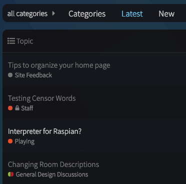
In this image, the Raspian topic is not one I’m tracking, but it is highlighted on the Latest page (I’ve already read the two above it which were updated more recently)
Default Latest view
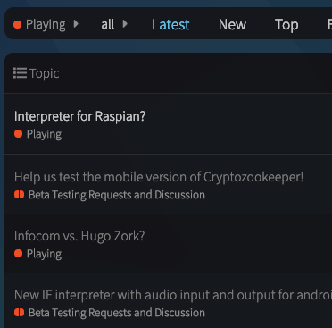
In “Playing” this post is at the top because it’s “latest” in the category
Category view
That wasn’t what I meant. I was talking about the categories view, which is a two pane view. The left pane shows the categories and the right pane show the latest posts. I was talking about going down to one pane on the categories page.
There is a separate latest view available on the tab bar. I’m not suggesting getting rid of that.
The selectable “categories” view in your preferences defaults currently to the two-column list. Are you saying you just want it to show categories without the latest list - cause we can do that.
I’ll set it that way so we can take a look. I suppose that’s the most clearly like the original forum, and people will have to click to see Latest unless they set that as their default.
I suppose this is a matter of taste. Now, without two columns in the main page, I need to make an extra click 
Long life to twin columns! Dead to monopolistic single one!
1 Like
If only there were some way to avoid that tyrannical extra click! like setting your default home page to “latest” in preferences

2 Likes
As I said in a previous post, the two column view doesn’t scan well. I think this accounts in part for some of the knee jerk negativity from the phpBB fans. That could either be addressed through different styling or by going down to one column on that view. I’m agnostic as to which is better.
Since members can easily change their home page to a different view, I think the concentration should be on designing a default home page that would be appealing to non-members. What would entice them to join the conversation?
At the risk of repeating myself, the glow forge example given by @matt_weiner is really appealing. If the theme isn’t available in its entirety, perhaps there are things that can be learned from it and incorporated.