Like @JoshGrams said, you can click a topic to see latest in that category floated to the top. Also you’ll notice that topics in any list you’ve exhausted are “dimmed” in dark gray text, while those you haven’t read completely are darker black (or lighter white in a dark theme) and that seems to be separate from your tracking/watching prefs.
I don’t know if this behavior is consistent for other people, but I noticed that the “topics you may also be interested in” section at the bottom when a topic ends seems to push anything unread at me, so it is making the effort to guide you to new material.
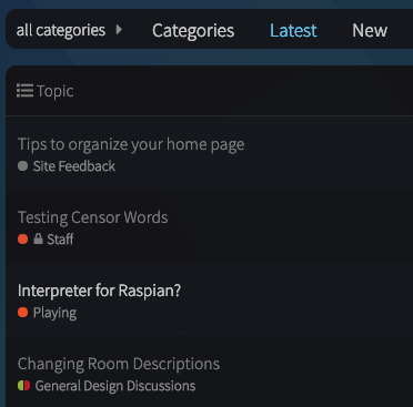
In this image, the Raspian topic is not one I’m tracking, but it is highlighted on the Latest page (I’ve already read the two above it which were updated more recently)
Default Latest view
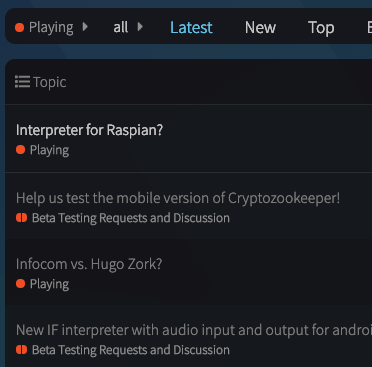
In “Playing” this post is at the top because it’s “latest” in the category
That wasn’t what I meant. I was talking about the categories view, which is a two pane view. The left pane shows the categories and the right pane show the latest posts. I was talking about going down to one pane on the categories page.
There is a separate latest view available on the tab bar. I’m not suggesting getting rid of that.
The selectable “categories” view in your preferences defaults currently to the two-column list. Are you saying you just want it to show categories without the latest list - cause we can do that.
I’ll set it that way so we can take a look. I suppose that’s the most clearly like the original forum, and people will have to click to see Latest unless they set that as their default.
As I said in a previous post, the two column view doesn’t scan well. I think this accounts in part for some of the knee jerk negativity from the phpBB fans. That could either be addressed through different styling or by going down to one column on that view. I’m agnostic as to which is better.
Since members can easily change their home page to a different view, I think the concentration should be on designing a default home page that would be appealing to non-members. What would entice them to join the conversation?
At the risk of repeating myself, the glow forge example given by @matt_weiner is really appealing. If the theme isn’t available in its entirety, perhaps there are things that can be learned from it and incorporated.
As I posted before, we’re more than happy to consider user-contributions. If you’d enjoy the forum to look a certain way, build us a theme! Unfortunately the dual-column setting is top level, and I’m unsure if a theme could override it and add that column back in or take it out - but I don’t know all the magic behind CSS.
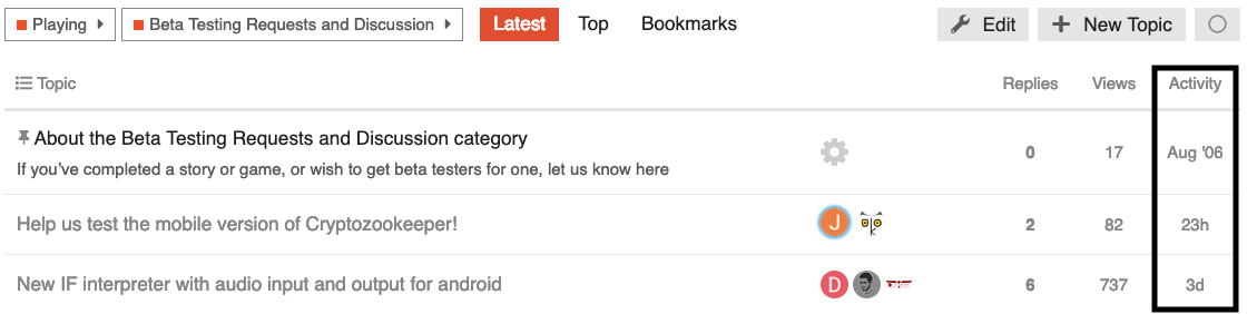
Ok, looks like you’ve updated to the one column view (for now?) Is there anyway to add time/date of last post in each category and possibly subcategory. That way folks can tell at a glance whether it’s worth their while to click through to the latest list.
FWIW I sent a note to the glowforge people and got an automated message to the effect that they have three days’ backup responding to queries–I’m guessing that, quite rightly, my question about their Discourse page is going to go allll the way to the back of the line behind their actual customers.
Something else I just noticed that might have an easy fix… In the category “Inform Extensions” I would sort by author name to bring them all together. As an example, I am trying to learn/test all of the Vorple extensions now (they are COOL!) and before I would just sort by author and scroll to the (now grouped) @Juhana Leinonen extensions.
Small point, but it made reading and learning before posting the same question for the 37th time easier. Especially when looking at related extensions. Now I don’t see a way to sort in that manner.
A bit better. But returns more than needed. Try running that same search with Emily Short to see what I mean. A usable solution… but a true “Sort by Author” would be better. Especially when it is someone who is a prolific poster.
Edit to add: I did find a way to refine the search that is better. Still, old habits die hard. And having everything in front of me grouped worked for me. I could also scroll up and down looking at other extensions that might be referenced, or might be in conflict with… etc.
We still have the same Extensions category with a topic titled by extension name and each author’s name as before…and you can always @ authorusername if they have an account here. If you know how the experience would be improved by creating hundreds of extension-author name tags separate from their username on the board and the Inform Extensions category, though, I’m all ears.