The IFComp map thread has me wondering. What are user preferences, likes, and dislikes when it comes to maps? Hand-drawn, trizbort, or some other diagramming tech? Do aesthetics matter, or is utility the only important thing? I like hand-drawn maps, but probably lack the skill to do one of my own. I have a trizbort map of Repeat the Ending that I will publish with the next release, but I’m wondering if it will change or evolve before then.
Please share your thoughts and preferences regarding IF maps provided by authors or third parties.
One thing I’ve learned from Stormrider is that a bent line on a Trizbort map immediately conveys to players that they have to go north one way but east the other way, in a way that an angled or curved door on a deck plan very much does not.
Yeah, that makes sense. I think the parser idiom has a deeply rooted assumption regarding grid-based geography, and I imagine that leading players away from that would be difficult.
I think that a linear (not curved) topology is also expected. I had the hardest time with the map for Starcross. I just never really got the hang of it (loved it all the same, of course).
I go in for utility but I have fun making it look nice–well, at least nice for me. I just like assigning different colors to different regions.
My games aren’t super realistic so a hand-drawn map would defeat the purpose.
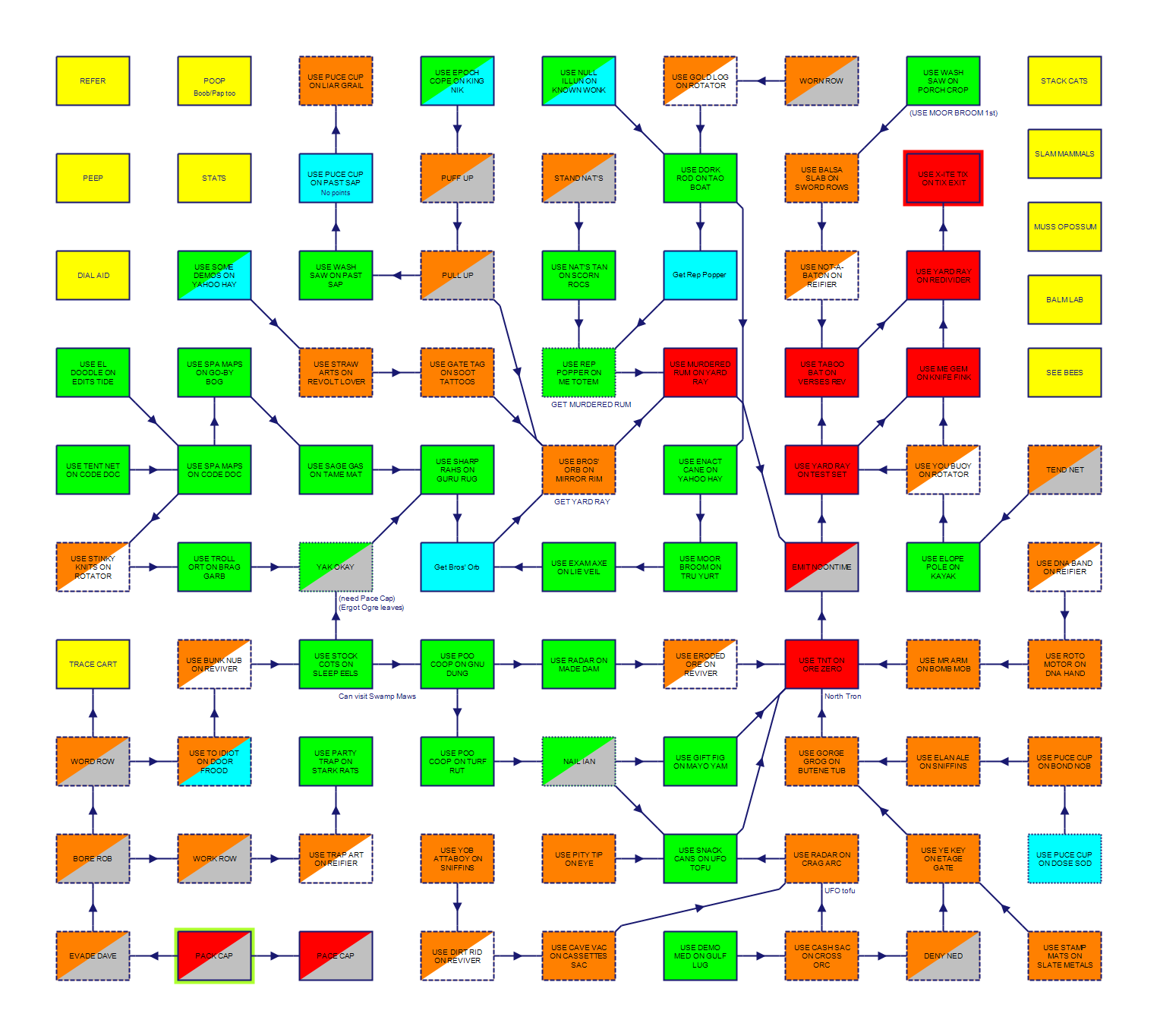
I’ve been interested into how people translate Twine passages to maps that are intuitive. But it occurs to me I’ve sort of tried it myself, with puzzles. I wanted to see which flowed into which for Ailihphilia. I attached both the flow map and the game map to show how (relatively) big the flow map was.
In the case of the flow map, I like having something someone can open in Trizbort if they want so they can delete rooms, and I also have a “block this room” feature where people can delete a room. I mean, they can edit a PNG in mspaint, but with trizbort you just highlight and delete. So I like the functionality, but then again, my stories are not very deep.
I prefer a technically correct map over a beatiful one. I actually don’t know what a flow map is. I prefer an optional map ready at hand (for example as extra-download) over self-drawing.
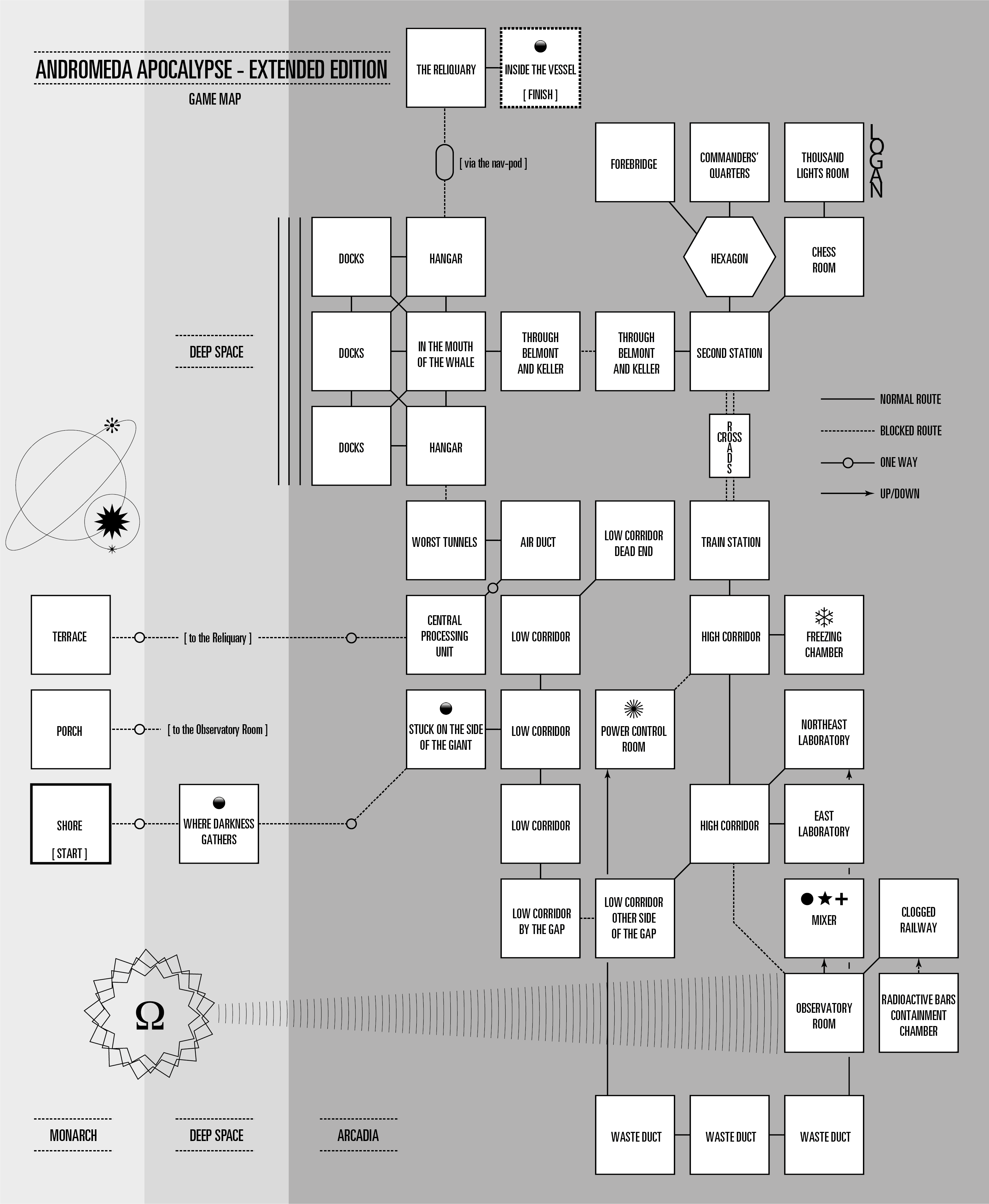
I like the look. The strata dividing the world and the small graphical touches really add a lot in terms of appearance. It’s also very clean. Very appealing visually, yet practical.
I like maps that feel authentic to the game. Sure, it can still be a diagram map, but a little artistic flair is needed. Otherwise, I feel like I’m looking at a PowerPoint slideshow presentation. You don’t need to do much either. A nice colour palette and font can do wonders.
If the map is not crafted in some manner to compliment the game’s theme, it’s a missed opportunity and can potentially detract from the quality of the game. A map should enhance the gaming experience.
I am currently working on a map feature for my interpreter. It’s not an automapper - but rather an automatic map revealer. It should work for any Inform or Infocom game once a map is created for the game (a process of creating a special image file and collecting some metadata). It reveals the map as you proceed through the game, drawing connections between rooms by default or only when they are used, selectable by the player. It allows maps of any style without affecting functionality and can show the current location on the map with an indicator that can vary in appearance by location.
I made it for my own use, but will likely include it with my latest interpreter whenever I get around to releasing it publicly, if there’s any interest.
A clarification: I said Inform, but my interpeter is z-machine only, not Glulx.
I have some DinA4 notebooks where I draw maps, write hints, notes, step walkthroughs, etc by hand. I like to draw on physic paper with coloured pencils. Some of them looks like pieces of art.
I do similar, but when it gets too complicated, I stop and think “Aww man this sucks”. So I prefer help (be it walkthru, invisi-clues or a ready-drawn map…)
I find aesthetically thematic maps nice, but not essential—any map that makes clear how areas connect to each other works for me! (Also, I only just learned of Trizbort, and I’m very happy it exists.)
Daniel, I noted and grokked the curved detail, but I’m really an exception in our community on reading ship blueprints… so I agree that is a detail whose can easily pass unnoticed.
I don’t know if you mean maps that are shared with users, or maps used in development (that may or may not be shared later).
For the latter, I used Trizbort for According to Cain, and it worked well for me. For my latest WIP, I thought I’d give the Mac’s built-in Freeform a try, and it’s working out. (Side bonus: It automatically syncs between my devices, so I can edit it anywhere, even on my phone.) It’s definitely not designed specifically for IF maps, but has enough flexibility that it can be used for it.
EDIT: Regarding the aesthetics of maps, I should add that if one did want to share the map, Freeform has a lot of flexibility—someone with more visual taste than myself could probably make it look presentation quality, with some effort.
Honestly not trying to shill for Apple! This was an experiment, and it’s working out okay so far.
…Woah, I feel like the only one who prefers maps that have more accurate topography vs a Trizbort-style map… I really loved the map in Quisbourne, as it showed the flow of the terrain and such.
Wondering if maybe my choice for a map for I Am Prey is another indicator of my gamedev origins lol.
There’s absolutely nothing wrong with a Trizbort map, by the way, but when I found the community I had assumed it was more of a tradition/habitual thing than a preference. This is absolutely fascinating to learn…! I suppose a Trizbort-style line-node map conveys more immediate navigation info.
I grew up in a time in which… what should I call it? Incremental world traversal was usually not possible. Instead, everything lurched from chunk to chunk. The dominant IF map paradigm for my youth was the shapes-and-connectors model. It’s what was in the magazines as well as in purchased hints/maps. Some artists (professional and amateur) added nice artistic embellishments. Sadly, Infocom abandoned that practice very early on.
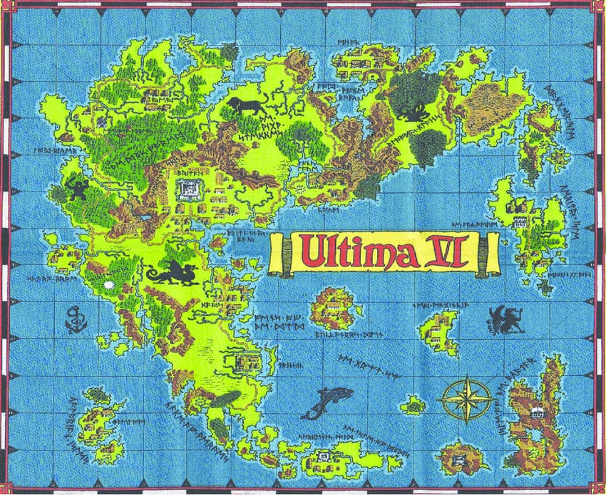
Early RPGs were mapped on square grids, so across genres there was a lot of emphasis on geometric accuracy. Things loosened up over time. Ultima IV, for instance, had a very nice cloth map that did not seek the same levels of geometric precision.
Later, games would often include floor plan maps that required conversion to geometric layout. For instance, Stationfall’s feelie map could be used to make deductions about the world of the game, but did not provide explicit navigation information.
Since RTE is about old parser games (among other things), I always assumed a geometric map would be best. I’d love to embellish it in some way, though, just as the best maps of the period did.
Pretty mysterious, right? Then you would play the game, and get to a place like the Megaliths, and the room description would just say: ‘The Megaliths’, plus maybe about four other words.
My review explains the reasons for the incredible tech-cramping of the game. I would say Island of Secrets, and the other one in this series, Mystery of Silver Mountain, have about the highest map richness versus sparse text content ratios that I’ve seen. The content was in the maps and illustrations in the book, and the illustrations were sly and would half-hide little details they wanted you to find, guess the names of and type.