I’m looking for testing and feeback for another web feelie I’ve been working on. This one is a hint map.
Specifically it’s intended to emulate the experience of interacting with the physical, fold-out maps that came with the old InvisiClues booklets.
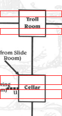
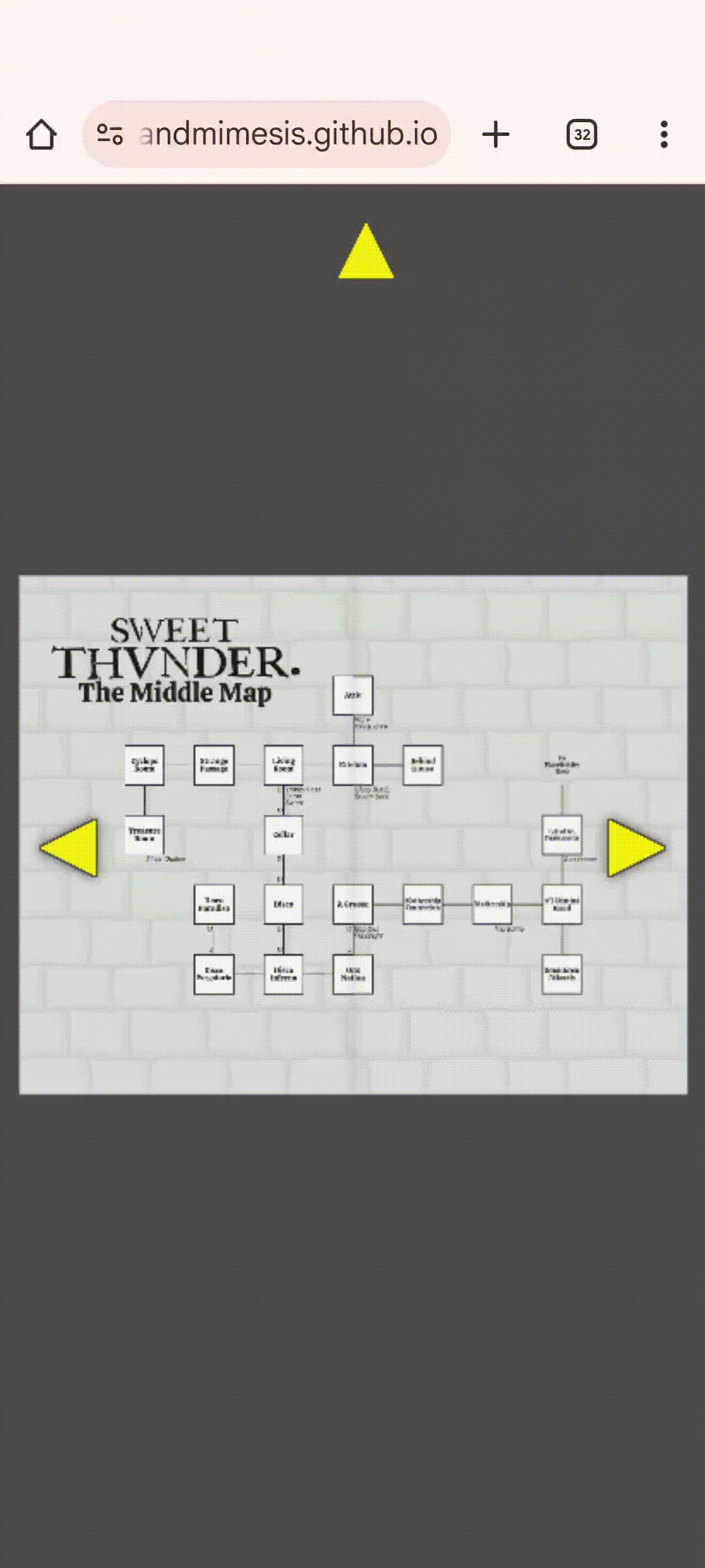
The actual content is all placeholder (the two little maps are mostly just Zork-themed doodles, and the big map is a random procgen map using Zork room and object names as placeholders). So there’s nothing interesting there to test/evaluate.
What I’m concerned about is:
Is navigation intuitive enough that it can be figured out without adding explicit instructions?
Are the maps legible/usable for their intended purpose? That is, can you pan/zoom/whatever them easily enough to use them as you would if you were actually trying to extract game-relevant information from them?
Does everything look “right”? By default centered, transitions smooth and “logical”, is everything responsive, &c.
Just general feedback on usability/look and feel (not counting the fact that it’s all placeholder content).
In terms of the content of the feelie it’s pretty minimal, but as it turns out it required a lot more fussing around to get navigation working in a cross-browser/device way.
Fun! It felt intuitive. I wish the page would open/close fully before centering; having both happen at once feels off and is a little glitchy. The text is a little blurry, even at the default size (not zoomed in)…can you make it vectors? The two-line room names are off-center.
I appreciate the feedback. And I want to take a moment to repeat that I do appreciate it and I’m not just saying that, because I’m about to spend a bunch of time talking about the design considerations and technical compromises that lead to most of those things being the way they are.
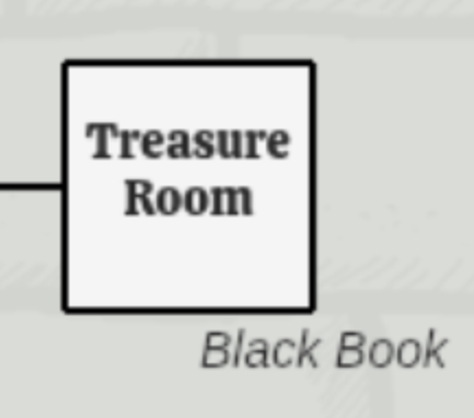
The labels’ vertical spacing being slightly offset above the vertical centerline is something that’s taken from the original Infocom designs. Here’s an example where each room has a red box the size of its top padding which is copied below the bottom of the text:
That’s not saying it’s “right”, but it is intentional.
The text not being perfectly sharp is essentially a technical limitation. The map images are PNGs. I could render them to SVG, but that opens up a bunch of browser compatibility problems (SVG text rendering on chrome is basically just fully broken, for example). Rendering the maps in the browser (instead of just displaying images of them) also has substantial performance implications. I want the widget to be usable without requiring WebGL rendering, and that means accepting some concessions in render quality. My thinking here is that the “plain” maps will separately be available in higher-res versions, and that’s probably what most players are going to actually use. Once again the “fancy” web feelie version of the thing is basically just there to try to recreate the feel of interacting with a physical thing, rather than being the most practical way of accessing the actual content. If that makes sense.
As for the animations, the original version worked sorta the way you’re describing, although it re-positioned the camera to accommodate the destination framing before starting the page-turn (so opening the front cover would zoom out to fit two pages side-by-side before starting the page-turn animation). I agree that doing both animations at the same time looks less crisp that doing the animations separately, but if each animation takes the same amount of time then it starts to feel like page-turns are too slow and it gets annoying, and if the animations are shortened the page-turn effect eventually just loses all of its weight as a visual effect.
I think the lesson here is that it’s just not a very good UI/UX design from a usability standpoint…that is, it’s really not a very efficient/convenient way to present the information it presents.
I might try futzing around with maybe changing the easing on the zooms/pans to see if they “feel” better (like if the zoom eased in faster or the page turn eased in slower), particularly if everyone else dislikes the existing animations.
I just pushed a minor tweak to the camera easing. In particular it checks to see if the framing has been manually tweaked (by panning or zooming gestures) and if so re-centers the camera before starting the page-turn animation.
Let me know if that helps the “feel” of the page-turns for you.
You know that thing where if you read or type a single word too many times it starts looking like nonsense? I’ve been staring at this interface and doing miniscule tweaks to it for so long it’s getting impossible for me to actually see it anymore.
If it has to be raster graphics for technical reasons, I would appreciate at least upping the resolution; I use a high-res display with a fairly high zoom level, and reading blurry text is not very pleasant.
The text is also rather higher inside the room box than in your Infocom demonstration:
Just pushed an update. Only the “middle” map (the one you see after opening the front cover) is updated.
I think this approach is probably unworkable; the page is now over 6 MB and it would only get worse with “real” maps.
Now I’m thinking, scrap the whole thing. If it’s got to be that big anyway, either abandon the idea or rework it as a “real” 3D widget (that is, render the maps as textures on a 3d mesh instead of faking it with PNGs and CSS).
Cool. I should be able to reuse most of the navigation code, but I think I need to completely scrap and replace the way the maps are currently rendered.
Not sure how long that’s going to take, but I’ll bump the thread when I have a new rev up.
Navigation is mostly identical to the (updated) old version except for some tweaks to mousewheel zoom. The map rendering is now done in the browser instead of being loaded as PNGs. This means you’ll probably get a brief loading screen as the maps are created, but they’re rendered at 2x the scale of the old static PNGs, so they should be less blurry when zoomed.
The placeholder image on the cover (the red and white round thing) hasn’t been redone, so it’ll probably look blurry when zoomed but I don’t care about that. The legend on the big map is also mostly blank, and I don’t care about that. Both are just placeholders and will be completely redone for the real feelie, so I’m not going to burn more time prettying them up for this test.
What I do care about (in addition to the stuff outlined in the OP) is:
Are all rooms properly grid-aligned
Are room labels properly centered and, importantly, do they not overlap or intersect with the border of the square for the room
Are room connections properly aligned, without any overlaps or gaps
Are exit labels (the occasional U and D labels) placed so they don’t intersect or overlap with the room borders or exit lines
Are object lists placed properly (below and right of center of the room they’re in), and if they would overlap with an exit line, is there a border around the text so that there’s no visual overlap
This additional stuff wants checking because now it’s all done on the fly instead of being baked into static map images.
As always, the OS and browser versions are useful if you’re willing to share them.
Vastly improved, from my perspective! My only quibble now is that the items look larger than the room names, which feels odd. (I’m guessing they’re the same point size but the room name font looks smaller visually?)
The nominal font size is the same, although in the case of room names they can be shrunk to fit the square, which never happens for object names. The most dramatic examples of the room label scaling are “Mothership” and “Funkenstein” on the “Middle Map”.
I just pushed a little update to start object names just slightly smaller than room names by default. The auto-scaling of room names means that some will still end up smaller than the object font size but most of the room names should now be visually larger than the objects.
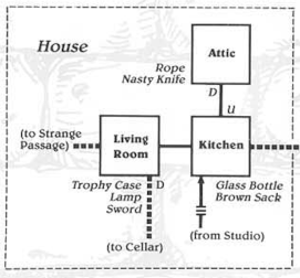
The starting point of using the same font size was again taken from the historical InvisiClues map for Zork I. Although staring at it more the layout is actually all over the place. Like here’s an example that shows the relative font sizes. But take a look at the positioning of “Living Room”. It’s off-center both vertically (slightly below the centerline) and horizontally (offset slightly to the right). “Kitchen” and “Attic” are slightly offset above centerline (which seems to have been the designer’s general preference, which I originally attempted to copy), but “Kitchen” is horizontally centered while “Attic” is offset to the right.
And of course there’s no consistency in the positioning of objects or the U/D exit labels. The whole thing feels a lot more bespoke than my version, with a lot of unusual individual room shapes (the Round Room is a circle, the Dome Room is rounded on top, the Maintenance Room is L-shaped, and so on) and the rooms aren’t consistently placed on a regular grid.
When you turn to either the first page or last page, the page starts zooming in just before the page-turn animation finishes. I find this really disconcerting as it makes it somehow look like three different things are happening (when actually it’s just turn, turn-and-zoom, zoom).
The turning and zooming actions in those particular cases should be strictly serial, as the tweens are chained (that is, when one animation is finished that calls the method that starts the next one). Or do you mean the extra zoom that re-centers the page when the view has been manually zoomed or panned?
In any case, I’ve put up a couple alternate versions with slightly different easing methods:
Alternative 1 which does the zoom and pan at the same time as the page turn. This is kinda the opposite of what you were commenting on…instead of making the actions more discretely separate it completely combines them. But I think it also makes it feel less like multiple discrete actions. I don’t know if it might be more disconcerting to people sensitive to screen motion, though.
This version does still do a separate re-centering animation if the page has been manually zoomed or panned, and that does end up feeling, I think, like a discrete, separate step. But I think that’s preferable to the alternative, which is…
Alternative 2 which is the same as the above only it doesn’t re-center if the page has been panned or zoomed. This generally doesn’t look too bad (to my eyes) with the “horizontal” motions…opening or closing the front or back covers…but is off-putting when folding or unfolding the “big” map.
EDIT: The “Alternative 1” link now goes to the same place as the link in the OP (so it isn’t an alternative anymore).
I definitely prefer the look of the original in general (when the page turn and zoom take place at the same time it’s harder to parse it visually as a page turning). But I’m certain I can see a couple of frames where it’s started to zoom but the page turn animation hasn’t completely finished.
Here’s what I’m seeing. You can see the zoom takes place about three-quarters of the way through the page turn, and it’s pretty much finished zooming by the time the page turn animation finishes.
(Quality is a bit choppy because I had to convert it to GIF to upload it here, but you can still see the overlap between the tweens.)
The sorta visual click that happens at the end there is because the camera pan appears to be slightly out of sync with the zoom.
All the animations use easing, which means they don’t happen at constant rates, which makes it a little harder to pick out what’s going on. But there’s two separate page closing animations: the first is the righthand page shrinking, and the second is the back cover expanding to cover the lefthand page. The camera movement and the second animation are both triggered by the completion of the first animation.
The camera movement is two separate bits: zooming and panning. The zoom is fine, but the pan has a weird hitch at the end. Which it shouldn’t.
I’ll take a look at it later and bump if I come up with anything.