The title looks great! That said, I’m having trouble reading the byline - maybe bump the font size up a few points?
1 Like
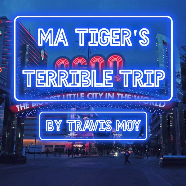
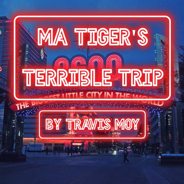
I really like the image and the lettering. My only confusion is my eye is first drawn to the word RENO - which is centered in the biggest and clearest font and most eye-catching color and is not the title of the game.
Your title should be the main focus if there’s other lettering in the image. You’ve spaced everything so it’s all readable at 100% brightness and that doesn’t guide they eye on a quick glance. Your title is not in a prominent “third” of the image. The rest of the lettering is good for context, but should be scenery and needn’t be so … readable.
One possibility is move your title down to the center to obscure and overlap the word “Reno” (also center the byline and make it bigger) and then darken or blur or blow-out (somehow) the background image (apply a gradient fadeout at the bottom or vignette around your title) so the scenery is de-emphasized or hazy in the background.
Make me work to pick out “Reno - the biggest little city…” after I’ve read the title.
Depending where your image is shown, the website may be hard-limiting the size of the cover art as thumbnails. You might want to reformat it as a square or almost-square - you’ve got an image that’s twice as wide as it is high, so at 300x300, it’s got to compress the vertical proportionally to display your entire image width without distorting it.
5 Likes
Thanks, that’s super helpful! Also thanks to everybody else who commented.
6 Likes
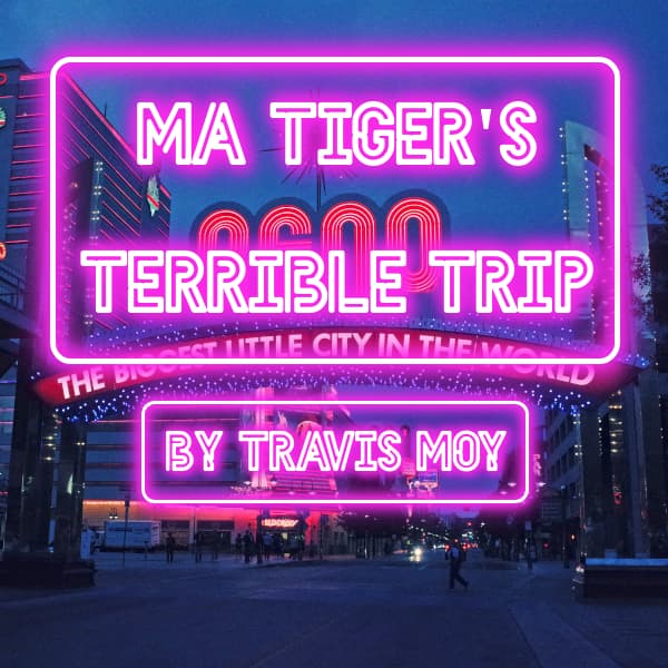
All right, here’s my second attempt, in blue, red, and pink.
I think I like red most. I tried orange again but it seemed harder to read, for whatever reason.
2 Likes
-
Red
-
Purple
-
Blue
It is better with the Reno Sign being clearly not part of the title. That was a good suggestion by @HanonO .
1 Like
I like the pink one best. It pops, and it looks more like a real neon color does. But I like the others nearly as well.
I hate to be picky this close to the deadline, and it’s not a huge thing, but the red letters behind the “terrible” are a little distracting. I’d almost like this better with just the blue background.
2 Likes
I agree, my one suggestion is scootch “Ma Tiger’s” down together with “Terrible Trip” so there’s less gap and obscure “Reno” completely - on any of the colors.
In my mind, blue implies melancholy comedy, red suggests knockabout farce maybe a bit more serious, pink/purple hints there might be some sexy involved - though that’s very subjective to me!
1 Like
I think they all look great!
1 Like
I preferred the layout of the original, but with the title slightly larger. You’ve now got a clash of text on text, which is never a good thing. Any of the three new colours is an improvement over the original. If forced to pick one, I think I’d go with the magenta, as the blue blends into the sky and the red blends into the aforementioned text in the signs. The magenta has better contrast all round.
Not sure if this helps or is a bit “done already” but if anyone wants to use my Infocom-inspired grey box covers then go for it. Use these as templates…
3 Likes
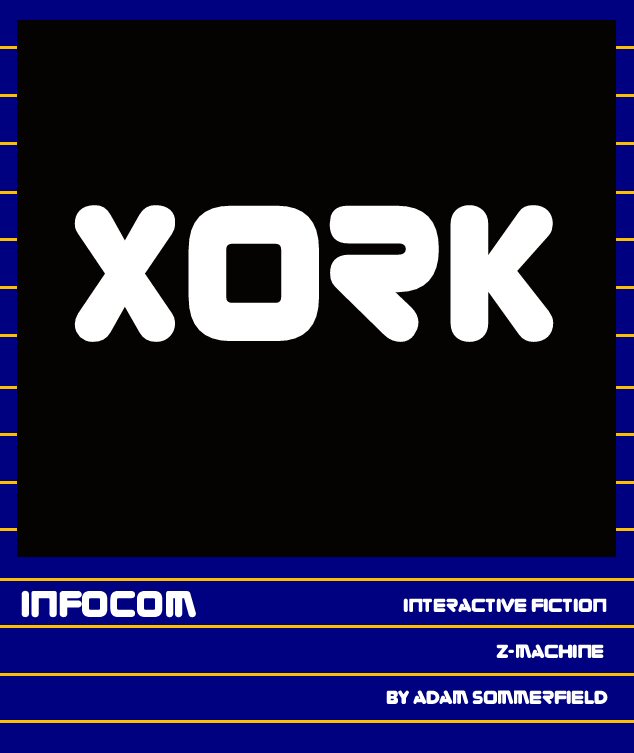
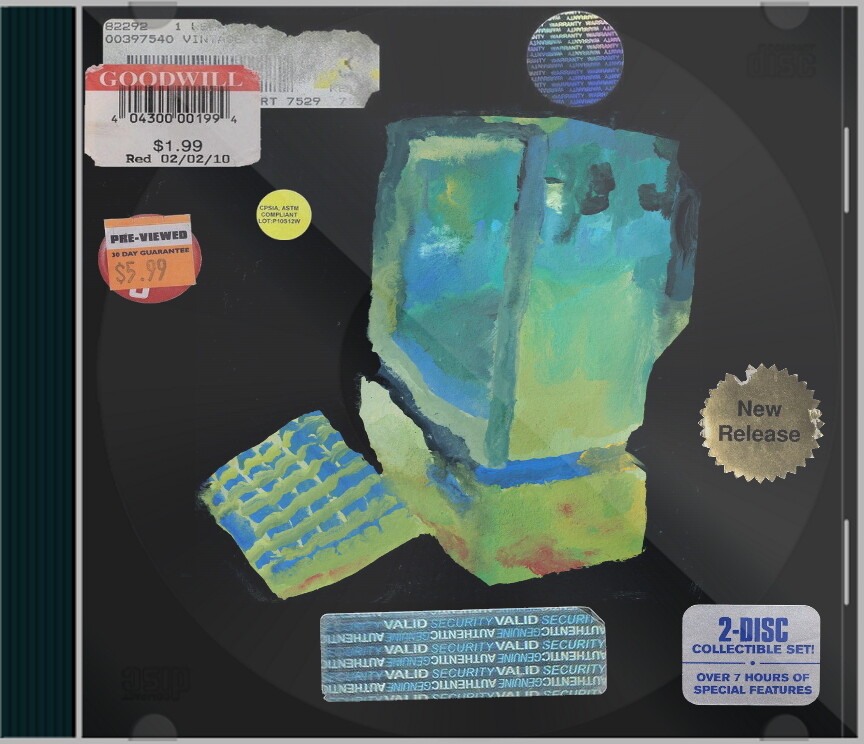
I love the idea of creative digital facsimiles of physical media! I made one for my game using a bunch of transparent sticker PNGs I found online ![]()
8 Likes
Is that done in the Zorque font or something else?
(Also hope things are going well for you. Been thinking about you, for whatever it’s worth from an internet rando.)
1 Like
Yes that’s the font!
And thanks for asking, I’d say that this year is better than last year but not without some major challenges (and it’s only March!) - it was definitely the right decision to hand over the reigns for ParserComp.
5 Likes
Meeee tooooo! Yours looks great!
4 Likes
I’ve drawn, redrawn, trashed, and started over several times here. I’m not getting anywhere and I need some feedback. I had this part (blurb, cover, etc.) fleshed out, but misjudged the time I would need to finish.
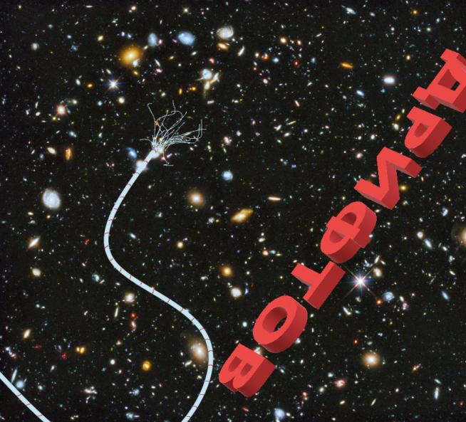
So, I removed a section of that game and reframed it and completely rewrote it as it’s own game. Then I slid the unfinished remainder to ParserComp in my head, which is all fine and well. The problem is the existing cover art doesn’t fit anymore. This is my current iteration, and I’m very unhappy about it (working title: Adrift):
Very open to suggestions. (Current iteration of blurb)
(Just putting the blurb here to help paint a better picture overall)
They always go on about the stars, stunning vistas spanning the heavens. Celestial tapestry…
You see nothing but a pitch black void and the sun before you, ceaslessly constricting your pupils. You don’t know how to turn away, let alone get home.
It figures you’re going to die in space and you won’t even see the stars…
2 Likes
Do you feel comfortable sharing some major images or themes from the game? Perhaps then it might be easier to suggest how to make it work better. I like the cover you have, but if it doesn’t work with the game anymore, best to redo it.
I’m sorry, I did not explain myself well. That is the redo. The original cover and blurb were shelved. Both the blurb and cover shown here have been reworked to match the new, shorter, game, but I’m simply not happy with it.
The Title is the word Adrift in Russian drifting across the title screen with your broken tether line snaking out in front of you. Survival/character study of a very unhappy (almost) cosmonaut in an unenviable position. Hope that helps and thank you for responding.
Well, I like it. I figured the cyrillic was for “adrift” (yay me). I think the red lettering is striking, and I definitely get the “things gone wrong in space” vibe from it. Why are you so unhappy with it?
3 Likes
It feels amateurish to me as well as simultaneously too vague yet also too big of a tip off that the main character is a Russian (almost) cosmonaut. The background is the Hubble Deep Field (Creative Commons), which isn’t really logical given a starfield would make more sense, not a field of galaxies billions of lightyears away, but star fields come off as bland and visually uninteresting when I try plugging them in.
Edit:(afk, brb)
1 Like