Given your blurb, maybe a sun in a field of black, with the broken cord snaking across? I really like the cyrillic, and personally I don’t think it’s too spoiler-y to hint at who the character is.
But I don’t think this is bad at all.
2 Likes
I agree that I really like it! I’m going to put out a dissenting opinion on the Cyrillic though - since it’s both non-English and upside down it doesn’t immediately register as a title to me and not just as part of the image, if that makes sense. I would either use English text or rotate it so the text is still askew but closer to right side up.
3 Likes
I like the cord. I like the idea of the letters upside down and “adrift” but I wouldn’t guess the title from this - I would think it was a foreign-language game.
My only improvement would be to pick a less busy background because it could be misinterpreted as a trendy glitter-black lacquer diner table and the cord lying on it.
The blurb talks about empty space and not seeing stars, so either a more minimalistic star field or just plain black possibly with one white dot as a very distant sun would be very effective with the cord.
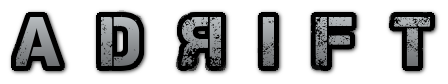
An option instead of Cyrillic - just the word ADRIFT with the R backwards? Maybe spaced out? Maybe embossed on a beaten up metal plate with one screw floating?
A D Я I F T
4 Likes
Agree on this, or at least, like, a translation.
Thanks to everybody for their advice on my cover art! I’m gonna just shrug and pick the pink one because I’m all out of time and energy for working on cover art. Also, having the Reno sign in is non-negotiable, even if the art would be better with it gone.
Now I just need a blurb.
4 Likes
@AmandaB @Encorm @HanonO @MoyTW
Thanks for all of the feedback. I’m going to take it all and come back with a second attempt. Thank you!
Yet you use Hubble Deep Space, filled with colourful galaxies.
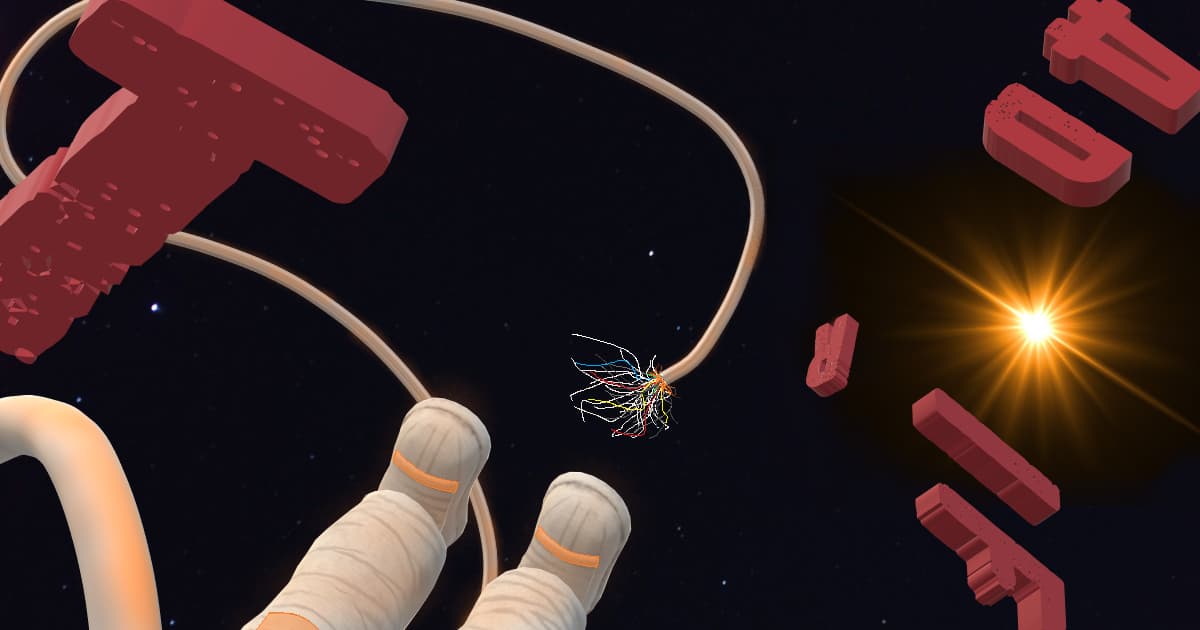
I like the cyrillic lettering and the loose tether. Maybe an actual black background with a blazing sun (with sunspots?) to the left of the lettering?
2 Likes
@AmandaB @Encorm @HanonO @MoyTW @rovarsson
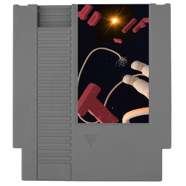
Alright, second attempt. I went with English, but hunted for a Soviet-y feeling font. Axed Deep Field; not a pure black background, but mostly starless. Gave the tether more depth and layers. Added the sun, but kept it properly distanced. Left ADRIFT flipped and backwards, but also broke it up into the foreground and background, with the T up in our faces. Added some Spacesuit feet on the bottom. Added more texture to the tether break.
Constructive criticism or call it done? What do you think?
8 Likes
This looks fantastic!
4 Likes
I love it! The feet are a great addition, and the background works much better. I think you’ve got a winner. And it will look great as a thumbnail, I think.
5 Likes
The updated image is really good!
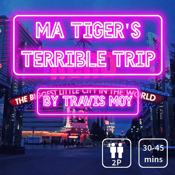
Anyways, here’s my new cover. @pinkunz made the very good suggestion to push the fact that it’s multiplayer onto the cover and it made too much sense to ignore
so
here we are. i am trapped in an endless loop of image editing. life…is nothing but pain and GIMP and more pain and more GIMP
Okay, that’s actually a lie, I did most of this by CSS, but there was some GIMP involved, up until I got fed up with GIMP and installed Pinta GRRRRRRR.
Anyways, it was a great suggestion, does this do a good job of warning the player that, yes, you do need another person to play this? The thing I’m trying to avoid is somebody starting to play the game and being confused as to why it’s asking them to host or join.
7 Likes
Yes, I think that 2p icon is very clear, and I’m really dumb about that stuff.
ETA: There’s also the smaller print below the blurb, so with it on the cover and in the small print, I should hope no one would get confused.
1 Like
It is very clear, and it is my favorite one yet. A+
1 Like
Keeper.
1 Like
Small question:
How does it look when it’s cropped into a square?
1 Like
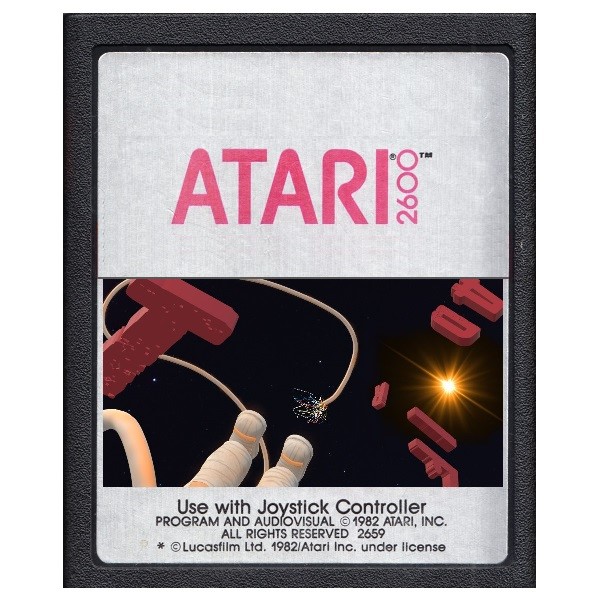
try it at4 600px wide. I decided to change mine for the small version.
1 Like
It doesn’t squish well, so I tried these two on a whim for the 600x600 pixel thumbnails. No particular reason why:
Which or neither?
Nevermind. Both are copyrighted. The shape of the cartridge itself is copyrighted. Back to the drawing board…
2 Likes
I do like this orientation better (disregarding the cartridge) as it gives the player a bit more context where to start reading the title!
4 Likes
Yep. I was thinking the same thing. Plus it emphasizes the perspective of the distant sun and the sense of motion of the astronaut and the T away from the rest of the letters.
4 Likes
@pinkunz : The cover art turned out great. You didn’t even have to squeeze it!
Adrift is second in line on my playlist. Looking forward to it.
3 Likes