Spring Thing Cover Art Help Thread

Not sure if this helps or is a bit “done already” but if anyone wants to use my Infocom-inspired grey box covers then go for it. Use these as templates…

3 Likes

I love the idea of creative digital facsimiles of physical media! I made one for my game using a bunch of transparent sticker PNGs I found online :slight_smile:

8 Likes

Is that done in the Zorque font or something else?

(Also hope things are going well for you. Been thinking about you, for whatever it’s worth from an internet rando.)

1 Like

Yes that’s the font!

And thanks for asking, I’d say that this year is better than last year but not without some major challenges (and it’s only March!) - it was definitely the right decision to hand over the reigns for ParserComp.

5 Likes

Meeee tooooo! Yours looks great!

hiding this because it's not Spring Thing and it was for an adult speed-jam

Screen Shot 2022-03-29 at 2.35.04 PM

4 Likes

I’ve drawn, redrawn, trashed, and started over several times here. I’m not getting anywhere and I need some feedback. I had this part (blurb, cover, etc.) fleshed out, but misjudged the time I would need to finish.

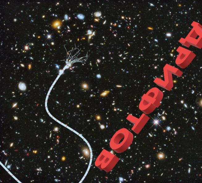
So, I removed a section of that game and reframed it and completely rewrote it as it’s own game. Then I slid the unfinished remainder to ParserComp in my head, which is all fine and well. The problem is the existing cover art doesn’t fit anymore. This is my current iteration, and I’m very unhappy about it (working title: Adrift):

Very open to suggestions. (Current iteration of blurb)

(Just putting the blurb here to help paint a better picture overall)

They always go on about the stars, stunning vistas spanning the heavens. Celestial tapestry…

You see nothing but a pitch black void and the sun before you, ceaslessly constricting your pupils. You don’t know how to turn away, let alone get home.

It figures you’re going to die in space and you won’t even see the stars…

2 Likes

Do you feel comfortable sharing some major images or themes from the game? Perhaps then it might be easier to suggest how to make it work better. I like the cover you have, but if it doesn’t work with the game anymore, best to redo it.

I’m sorry, I did not explain myself well. That is the redo. The original cover and blurb were shelved. Both the blurb and cover shown here have been reworked to match the new, shorter, game, but I’m simply not happy with it.

The Title is the word Adrift in Russian drifting across the title screen with your broken tether line snaking out in front of you. Survival/character study of a very unhappy (almost) cosmonaut in an unenviable position. Hope that helps and thank you for responding.

Well, I like it. I figured the cyrillic was for “adrift” (yay me). I think the red lettering is striking, and I definitely get the “things gone wrong in space” vibe from it. Why are you so unhappy with it?

3 Likes

It feels amateurish to me as well as simultaneously too vague yet also too big of a tip off that the main character is a Russian (almost) cosmonaut. The background is the Hubble Deep Field (Creative Commons), which isn’t really logical given a starfield would make more sense, not a field of galaxies billions of lightyears away, but star fields come off as bland and visually uninteresting when I try plugging them in.

Edit:(afk, brb)

1 Like

Given your blurb, maybe a sun in a field of black, with the broken cord snaking across? I really like the cyrillic, and personally I don’t think it’s too spoiler-y to hint at who the character is.
But I don’t think this is bad at all.

2 Likes

I agree that I really like it! I’m going to put out a dissenting opinion on the Cyrillic though - since it’s both non-English and upside down it doesn’t immediately register as a title to me and not just as part of the image, if that makes sense. I would either use English text or rotate it so the text is still askew but closer to right side up.

3 Likes

I like the cord. I like the idea of the letters upside down and “adrift” but I wouldn’t guess the title from this - I would think it was a foreign-language game.

My only improvement would be to pick a less busy background because it could be misinterpreted as a trendy glitter-black lacquer diner table and the cord lying on it.

The blurb talks about empty space and not seeing stars, so either a more minimalistic star field or just plain black possibly with one white dot as a very distant sun would be very effective with the cord.

An option instead of Cyrillic - just the word ADRIFT with the R backwards? Maybe spaced out? Maybe embossed on a beaten up metal plate with one screw floating?

A D Я I F T
cooltext407639703027344

4 Likes

Agree on this, or at least, like, a translation.

Thanks to everybody for their advice on my cover art! I’m gonna just shrug and pick the pink one because I’m all out of time and energy for working on cover art. Also, having the Reno sign in is non-negotiable, even if the art would be better with it gone.

Now I just need a blurb.

4 Likes

@AmandaB @Encorm @HanonO @MoyTW

Thanks for all of the feedback. I’m going to take it all and come back with a second attempt. Thank you!

Yet you use Hubble Deep Space, filled with colourful galaxies.

I like the cyrillic lettering and the loose tether. Maybe an actual black background with a blazing sun (with sunspots?) to the left of the lettering?

2 Likes

@AmandaB @Encorm @HanonO @MoyTW @rovarsson

Alright, second attempt. I went with English, but hunted for a Soviet-y feeling font. Axed Deep Field; not a pure black background, but mostly starless. Gave the tether more depth and layers. Added the sun, but kept it properly distanced. Left ADRIFT flipped and backwards, but also broke it up into the foreground and background, with the T up in our faces. Added some Spacesuit feet on the bottom. Added more texture to the tether break.

Constructive criticism or call it done? What do you think?

8 Likes

This looks fantastic!

4 Likes

I love it! The feet are a great addition, and the background works much better. I think you’ve got a winner. And it will look great as a thumbnail, I think.

5 Likes

The updated image is really good!

Anyways, here’s my new cover. @pinkunz made the very good suggestion to push the fact that it’s multiplayer onto the cover and it made too much sense to ignore

so

here we are. i am trapped in an endless loop of image editing. life…is nothing but pain and GIMP and more pain and more GIMP

Okay, that’s actually a lie, I did most of this by CSS, but there was some GIMP involved, up until I got fed up with GIMP and installed Pinta GRRRRRRR.

Anyways, it was a great suggestion, does this do a good job of warning the player that, yes, you do need another person to play this? The thing I’m trying to avoid is somebody starting to play the game and being confused as to why it’s asking them to host or join.

7 Likes