As has been noted earlier in this thread, just upscaling that icon is just ugly, but out of the suggestions in this thread, the one based on the favicon and approved by Merk is the best one. (I don’t think it’s perfect, but it’s decent.) That one is also the closest anyone has come to a consensus on the matter.
Looks like somewhere in the last 11 hours, a new logo has finally arrived.  (Only took 18+ months from the original proposal) I missed the fanfare as I was in the air for most of that time. Now, to see how long before the knockers arrive.
…but why was it turned into a gif? (And even one with an unoptimised palette!) It is no longer 1995, you know.
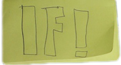
Well I’ll be damned, it actually happened! But why did they use Joey’s hand written one? I kinda thought that was just a light hearted bit of irony on the fact that the new logo was taking ages to come along.
Am I missing something? I’m still seeing the tent…
What tent?
The tent that I also see in the upper left of the page.
Hit your browser’s refresh button. You have the old image in your cache.
Thank you!
Did the old logo have a tent? Damn, I’ve forgotten how it looks like already! 

I guess this discussion can be slightly less hypothetical now.
Well, all in all it’s good to see that something has actually happened. It seems that most had given up hope of any sort of logo change at this stage.
Am I the only one thinking, “Well, it’s nice they finally changed the old logo, but the new one is kinda meh?”
Ok, refreshed, thanks! I’m guessing it’s a joke… Right? Because Joey was clearly joking when he posted it, and… Hmm.
Now that Spring Thing is over, maybe it is time for a “Quest for the Logo” IF Contest. The author of the winning game gets to choose the final logo. Should it be Speed-IF?
Let’s come up with some required elements. For starters:
- A tent.
- Yellow Post-It notes.
The new logo is perfect let’s move on.
I actually do think that could work as a logo, if a little more care was taken with it. So here it is, in the same size, but with better colours and an alpha channel to make the edge look a bit better:
Wait, are we enacting an utterly horrible solution in the hope that it’ll break people out of their inertia and spur them to come up with better solutions? Because that’s kind of a touchy subject right now for those of us resident in the US
[eta joke-disambiguation smiley)
“We” haven’t enacted anything. Mike made a decision. (Unless someone else got admin access that I don’t know about.)