Isn’t it about time we got a nice Int Fiction logo rather than the default phpbb one?
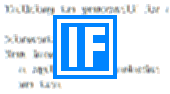
5 minutes and an online GIF creator later… tada! I used the original image, so the gradient should line up perfectly. Hypothetically, anyway.
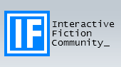
I rather like that! 
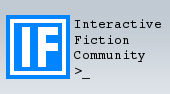
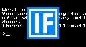
Surely a blinking cursor cries out to be bookended with a >
Yah. I think it’d be nice if the blinking cursor (complete with a greater-than) is moved below to its own line, and I think making the IF gold rather than blue might help it pop more (using the same gold the site already uses for contrast, or some kind of two-tone).
Speaking as a person who uses computers, I vote against any use of a blinking cursor that isn’t an actual input cursor. Fake blinkies in GIFs are bad.
(Yes, I hate that collection of smileys to the left of where I’m typing.)
A little more work - no more blinky, and with a few color choices. The blink is easy enough to add, if the majority likes it; I think somehow it just doesn’t look the same without it.
We re-named the Seattle IF group blog to the Seattle Interactive Fiction blog on the off-chance that if a Google search dropped someone onto it cold, they could get an immediate idea of what the blog’s about via its title. “If” is a word, and it’s a bit unfortunate that that’s what interactive fiction abbreviates to. However, I’m still of the opinion we shouldn’t use acronyms for everything. This is partly a (my) reaction to the increase of technology in everyday lives, and technology seems to love naming things with acronyms rather than actual words.
I agree with zarf about having blinking things incessantly blinking in my peripheral vision. Websites with banner ads on the side that continually animate irritate me to no end. They fatigue my attention.
Also: I like blue gradient.
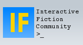
Personally I like the blink. I mean, it’s not a huge blink is it? Also it will be off the top of the screen for a fair amount of the time. And my vote would be for the first one, it looks more classic.
I’m fine with or without the blink, though I understand it can drive some people batty.
Now I’m torn on the gold; not sure what I think about that anymore. Hmm. Maybe white-box-gold-effs or vice-versa? I dunno. I still worry about the white getting lost, but the gold seems a bit brutal.
Anyway, fine work overall and whatever you settle on will definitely be a step up from the phpbb thing
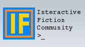
I like the third and don’t like the second – something about the gold border on the blue makes my eyes water.
Personally, I like the first and third ones… as long as the favicon is the white IF, the top one matches; but, if I were to stray from the favicon completely, I might do a white-on-black (or green-on-green) IF, in ye-old-console font.
I experimented with the colors a bit and didn’t get anything better than those, but YMMV.
I dislike the blink. In my opinion, the first one of the revised batch is the best option presented.
Isn’t text in the logo redundant, as the name of the forum is to the right? (If you’re replacing the header completely, I think another format of the image would be suitable.)
Please no! I’m not here for nostalgia - in fact, as I’m in my early thirties, I’m too young for that. The first computer games I played were graphical. A green console font would signal that IF is something outdated, to which I object.
Yes. Also remember that there are two designs available for this forum. The one I use looks like this:

Hearty agreement with Trumgottist.
–Erik
I’d forgotten about the second layout… with that in mind, I may re-design those to use transparency, rather than a matching gradient. Does the site allow for PNG files? (The first and third have transparency)
Heh, I’m younger than you, but the first computer games I played were in orange-and-black… still, I understand the point. Here’s a couple more tries:
If we didn’t use the IF logo, what would be better suited? For me, nothing says interactive fiction better than this:

Ditto. Give the retro a rest.
It’s like… getting jabbed in the eyeballs. Twice.
I know one other forum uses that layout (Adrift’s? Quest’s? It was linked to when the comp began.) but it looks busy to me. I much prefer the muted forum appearance. I believe it helps concentrate one’s focus on the words in the forum, rather than on the garishly strong colors and cutesy icons.
Er, the original design actually uses more colors and more obnoxious gradients, doesn’t it? Home page: Two gradients, horizontal and vertical, in the table of contents, plus wholly unnecessary double whammy of background color and vertical rule on the right-hand columns. A whole mess of tables at the bottom of the page to handle what the alternate design does in a couple short lines of standard text. And the header: not content with just a type mark (phpBB), we also have an obscenely foreshortened circus tent, three shades of orange, and a weird wee willy of an exclamation mark… The title is not centered; it floats off to the right of where it ought to be… All very distracting, at least if you stop to look at it. The only thing that could be said to be more busy about the alternate design is that the sections on the main page are separated by thin bits of white space, whereas the original design has them rammed together in a single table. Icon design: hm, the standard design looks like Office 95, the alternate like some latter-day flavor of Linux–neither one is very pretty. The alternate design at least has the advantage of using rounded corners, which I find easier on the eyes, and undoubtedly a more pleasant header. (Also a more functional header: there’s a search box, so you can search w/o going to a dedicated search page.)
Still, neither design is very pretty, and none of the things I’ve mentioned actually explain why I switched to the alternate–the reason I did that, if I remember right, is that the type and colors of the alternate design are better on small mobile screens. Better, though, would be a page that’s actually designed for mobiles.
–Erik
The skins for each design are held separately, so there’s no reason a different image couldn’t be used for each design, if required.
I like the first one and the third one. For preference, I’d go with the first one; it’s minimalist, which I like.