Those of you who make choice-based games and include main menus, how do you design them? Where do you put the title in relation to the buttons? Which buttons do you include (i.e. Play/Begin/New Game, Load, Settings, Content Warnings, Credits, etc), and in what order do you put them?
Personally, I’ve historically always gone for a great big title at the top and left everything as inline text below it. For speed IF, it tends to be game instructions, then content warnings, then “play”. Otherwise, the design tends to vary depending on the project.
Title

New Game/Load
Settings
(if needed) More Info/How to play
CW - Credits
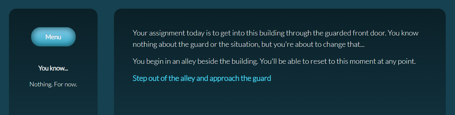
In a sidebar menu during the game:
[if sidebar visible]Title + Author

Player Info
Inventory/Notes
Other stuff (How to play, Achievements, etc...)

[WIP/Demo] Bug Report link

Credits
Settings
Saves
Restart
For title screens, I like getting as funky with the design and layout as my CSS skills will let me, but generally I’ll have the title somewhere near the top centre third in a big display font, with these links/buttons below: Play; Load (if there’s a save file); Settings; Credits. I usually put content warnings in a passage before the game content starts, so once a player hits start, they’re taken to the CWs.
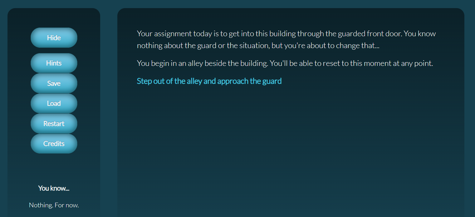
My stuff tends to be very prose-dense, so I like freeing up more passage space by having menu buttons hidden and come up on hover/click of an unobtrusive element. The buttons are generally Settings, Saves, Credits, Restart, in that order. If the game calls for something like a character journal/inventory, that usually goes before the rest, and I have back/forwards links bookending the whole thing.
Ink has a built-in restart/save/load menu that’s always visible, so I haven’t had to worry about it in Ink games.
Otherwise, this is what I typically do on the opening screen. Buttons I’ve used include play/start, about/credits, content warnings if applicable, “how to play” if needed, achievements if applicable. Usually “play” is the first option with the others below, but I’ve also had “play” as the last option a few times (with “about” and CWs before it).
I have the main menu options on the left and the title on the top right at the moment, though I am open to rearrangement. Currently, “Continue” goes at the top (if a game is running), then “Play”, “Load”, settings and information options and “Exit” at the bottom of the list.
Help and unlockables are considered types of information. Achievements aren’t properly implemented yet, but will go with the other unlockables. Copyright and credits go in the “About” section. I’m still determining how best to handle content warnings.