That’s my attitude, too. For example I like many books for youth/young adults. There are some really good novels and series out there.
3 Likes
Mine is a screenshot from Rain World, a game I like. Most of my avatars on various sites are Rain World screenshots. This one comes from a modded region called Coral Caves.

It’s the middle of a flooded tower, in a nice shade of blue. The top of the tower can be seen in a video here.
I have a giant collection of more Rain World screenshots to get avatars from. Huge fan of the game for its aesthetic. It has the overgrown factories and decaying industrial megastructures and everything.
9 Likes
That’s fun, my son loves Rain World and played it for weeks. It’s not really made for kids so he wasn’t able to beat it on harder modes but it looks so nice visually.
3 Likes
Have you played Playdead’s games Limbo and Inside? Lots of this aesthetic. Disappointing to see that Rain World isn’t on iOS because I like tapping to play. Using a keyboard (except to type in IF!) and controllers are generally a no for me.
4 Likes
I got my avatar from the Adventure X 2016 Kickstarter. It’s custom made in the Adventure X style and is of Bwana from The Journey Down (Great point and click game by the way). I use it pretty much everywhere!
5 Likes
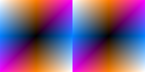
Well, if everything went well, I should now have a custom avatar generated programmatically.
Without getting into the details of the code, I modified some old C++ code I had lying around to
loop from -255 to 255 in steps of 1 for x and y.
For each pixel, the red value was set to the absolute value of the x coordinate an the blue value to the absolute value of the y coordinate, and green to the absolute value of the integer mean of x and y.
If the color channels were separate, red would be a vertical gradient from red to black and back to red, blue a blue-to-black-to-blue horizontal gradient… and I have no idea what pattern the green gradient would take… if it was just the red and blue gradients, you’d have black at the center, red at the top and bottom edge midpoints and blue at the left and right edge midpoints with magenta in the corners, but again, no idea how it looks with the green added in(though my guess would be white corners with Orange and the hue halfway between cyan and pure blue at the compass points)… and when I ran optipng on the .ppm my code outputted, it turned a 2.7 mb .ppm into a sub 4.0KB png, which makes me worried something went wrong with the conversion(grantted, the .ppm is a plain text file with 3 lines marking that it’s a color image, it’s resolution, and the levels per pixel followed by a trio of decimal numbers for each pixel, so even conversion to an uncompressed .bmp would be a significant improvement, and the image probably compresses very well, but still, the image uses the same amount of disc space as the code used to generate it)… and the forum doesn’t make it all that clear if the upload actually worked…
So, I suppose my question to anyone reading this is how the actual result compares with my expectations.
As for the why, mainly because it’s something I could actually create without assistance from another human and at least have some inkling of what the output should look like.
15 Likes
Yep, it worked! It’s black in the center, orange at north and south, magenta at northeast and southwest, blue at east and west, and white at southeast and northwest.
The green channel is a gradient going white-black-white from northwest to southeast.
EDIT: Which makes sense, because the green channel should be black where the mean of x and y is 0, which means (x + y) / 2 = 0, which means x + y = 0, which means x = y.
8 Likes
@Mewtamer
That is so much better than a plain, capital M. Your avatar is quite nice and pops distinctly making it very easy for us to see your contributions across the forums.
Objectively, it rocks! ![]()
5 Likes
Wait, my 2am math isn’t working. The mean of x and y should be zero where x = -y, which should be a line downward to the right, not upward. Right?
4 Likes
@mewtamer, adding on to Draconis’s description, their cardinal directions refer to north being at the top of the icon. All of the icons are circular.
Your icon has this cool symmetry to it that’s very eye-catching, and the longer I look at it, it seems to move.
4 Likes
@Mewtamer As the others said it looks good and has the described effect.
@climbingstars I was already suspecting that it is the main character of Journey Down.
@Draconis I can confirm that x = -y goes linear from upper left through (0,0) to the lower right. I don’t understand the rest of your math though.
4 Likes
I confess, the magenta bits are a happy accident.
And yeah, the way the .ppm format works, the pixels are defined row-by-row starting at the top row of the image and going across the rows… and since my code used a for loop from -255 to 255 for both x and y, the vertical coordinates are effectively mirrored across the x-axis… So yeah, the line y = x would normally-be ascending and the line y = -x would be descending, in the image I generated, they are flipped… Also, I think I might have inadvertantly flipped the x-axis and y-axis… I was not being super rigorous with ensuring my code would match how a computer graphing calculator with the option to color the xy-plane in terms of functions r(x,y), g(x,y), and b(x,y).
Also, by default, division in C++ is integer division when working with integer inputs. That is, the division throws away the remainder/whatever is after the decimal point. The mean of 1 and 4 is 2.5, but the integer mean of 1 and 4 is 2.
For defining the Green subpixels, I took the integer mean before taking the absolute value. since I was working with a range from -255 to 255 for both coordinates, this means anywhere wherey = -x the sum x + y would be zero, and their mean would be zero… something like x =50 and y = -49 would also result in a mean of zero. Had I taken the absolute value before taking the mean, the sum would always be positive and mean of zero would be limited to (0, 0) and permutations of (0, +/-1) and the magenta corners would turn white because it would be more of a tilted square gradient than a diagonal gradient on the green channel.
Also, had no idea the forum turned avatars into circles… the image I generated was a square 511*511… So now I’m curious how the forum handles the cropping…
Does some stuff in the Linux console.
Okay, if all went correctly, the image I uploaded should now be available at:

Mostly, I’m curious if the White and Magenta in my Avatar are as bright as the corners of the square image. If not, that would suggest the forum is just truncating, but if they are as bright as the square image, that suggest some kind of compaction of the corner bits inward… also kind of curious about the gradients along the square’s edges… Along the north-south axis, blue is held at zero and red and green increase from the center in a 2:1 ratio, so that should be a smooth gradient from black to brown to orange, the east-west axis is Red fixed at 0 while blue and green increase from center in a 2:1 ratio, so a smooth gradient from black to teal(Honestly, I’m not sure if teal more accurately refers to the hue between cyan and blue or to a dark cyan), one diagonal has all three channels in lock-step so should be a smooth grayscale and the other diagonal has green fixed at zero as blue and red increase in lockstep, so should be a smooth gradient from black to magenta… but along the white-orange-magent edgesyou have red fixed at 255, blue making a round trip, and green decreasing from the white to magenta end, and I have a hard time visualizing colors containing unequal amounts of all three primaries, similar for the White-teal-magenta edges…
Also thinking of expanding the code to generate the three separate monochrome gradients and the pairwise combinations(back when I had a working eye, I liked playing around with image manipulation software that could do things like swapping a pair of color channels or invert just one color channel). I’ll probably keep the current version for the time being though.
4 Likes
I took the liberty of copying the image from your avatar here on the forum and the image you uploaded and put them in a single image side by side. For others, the left is the forum avatar and the right is Mewtamer’s image.
They look exactly alike, and I’m picky as fuck. ![]()
Of course, the forum here crops the image with a circle, but the radial gradient looks uniform and works so well.
@Mewtamer When I copied the avatar image, it retained the full square image. The cropping must be a CSS effect.
2 Likes
HAL beat me to it. I was going to point out that the white corners might appear bright on the square image, but when it’s cropped to fit in a circle, its apparent brightness matches the other colors.
Also, have not gotten around to replying properly yet, so: My gawd, that is a pretty gradient. ![]()
2 Likes
The Inradius of a square is about 70% the circumradius and the North/south and east/west points are 100% red and 50% Green and 100% blue and 50% Green respectively, so about 75% average brightness, so it makes sense the circular cropping would kind of balance out the white and magenta at the secondary compass points… and I suppose even 70% gray is bright enough to look white in contrast to the black center.
Either way, sounds like my little experiment with coloring the plane was a huge success and works great with how the forum displays avatars… wish I could see the result… Now, how to convert the output of a sine fuction from a float in the range -1 to 1 to an integer in the range 0 to 255.
3 Likes
William Morris did many fascinating things from printmaking to early fantasy novels to inventing one of the greatest chairs of all time - the Morris chair.
3 Likes
This was a hilarious thread to browse through. My avatar is from The Matrix and is a snapshot of the face of Neo at the end when the audience gets a glimpse of how he perceives the Matrix. The film is one of my all time favorites, but more importantly, my alias “virtuadept” is shorthand for “Virtual Adept” which is from Mage: The Ascension tabletop RPG. The Virtual Adepts were a cabal of mages who originally allied with the bad guy Technocracy cabals, but they rebelled and went independent. Their specialty was altering reality much like a hacker controlling a computer system. Neo is kind of like a virtual adept in The Matrix so I felt it a fitting image tangentially related to my pseudonym.
7 Likes
Hah, I’d wondered if your handle was a Mage reference! I played a bunch of it back in the day and we have a couple other WoD folks around too - @Draconis co-authored a really fun game with a WoD vampire protagonist a few months ago.
5 Likes
I made my avatar using this Plasticine Picrew by the artist Mitch Hearn. I had started using the name wisprabbit in different places, so I made a little blobby rabbity thing in it, and then loved it so much it altered my brain chemistry forever, so now I use some version of this rabbity thing everywhere.

9 Likes
I set today my avatar which I use in various places. What’s the meaning? It is part of my work in Deluxe Paint, the painting program which I like to use and I have original box version. So apart programming I do some art-work as well. Still learning this though, but I make some nice progress.![]()
As I have full manual I like to discover and use many features of this program. And it has dozens of special effects.
The picture is from my Sokoban clone, but I’m trying to illustrate my Interactive Fiction (text-adventures) games. My Jam games are so far three: Yesternight, Wizard’s Club and Priceless Vase. I did some games earlier too. Greetings.
6 Likes