I’m experienced with both Quest and Squiffy. Authoring is my forte, but I also enjoy making my games look nice. The Quest interface is incredibly limited. That’s why I prefer squiffy because it allows me to change the style easily using CSS and JS (I’m pretty good at CSS). But then I got to wondering…
How can I make my game look AWESOME.
Like, SUPER AWESOME? What are some common techniques? Engines I can use? Tips and tricks? Any info you can share would be great!
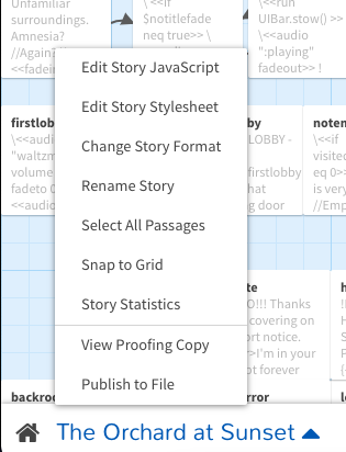
Twine can indeed be styled with CSS and people do amazing things with it. Sugarcube is a very flexible format, so is Harlowe. I think Chapbook is a bit more limited. You can add your custom styles in the Twine IDE by clicking the story name in the lower left and choosing “Edit Story Stylesheet”.
Parser games can be styled somewhat based on how you publish. If you use Inform 7 and publish with an interpreter and a website, you can style that website to some extent and host it only online it will display as a website. If you publish a gblorb file, people will play it in one of various interpreters that will not take styling into account.
I would echo @StJohnLimbo. With text, a flashy conspicuous design that may get lots of positive comments is often grating and tiring to engage with across more than the very short term. Gratuitous animation, blur effects, drop shadows, low-contrast color combos… it’s very easy to do more harm than good, and typography normally best succeeds when it’s least noticed.
Pay attention first to web typography and to standards – one should meet at least WCAG 2.1 level AA accessibility standards (the most relevant bits are around distinguishability).
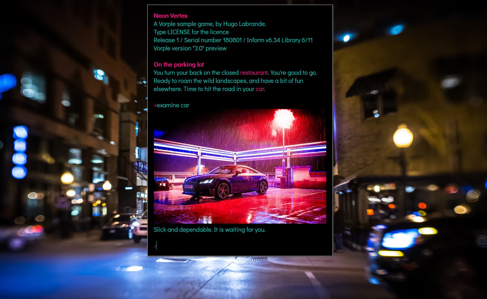
Thanks for the mention That game wasnt much more than picking a color scheme and finding free to use images and tweaking CSS!
More experiments at http://hlabrande.fr/fi/hosted/mockup/play.html (Apple II style) and Vorple (scifi with looping gif)
One example that I want to point out is the newest version of The Hitchhiker’s Guide to the Galaxy. The interface is one of the best for parser in my opinion. How would one go about making that?
I’ll second that. A pretty game does not make it a good game, but her first two games (‘Reflections’ and ‘Sentient Beings’) were not only beautiful to look at, but beautiful to play. She was inspired by the 12 wonderful Cryptex Jam 2021 games, which are also Adventuron games and beautifully done.
On the first two, the typography is otherwise handsome but the dynamic background makes trying to read it a living hellscape for me (well, not that I could actually read Spanish).
One of the web accessibility standards I referred to above is that if there’s any automatic motion lasting more than 5 seconds, user control to stop it must be offered (if it exists alongside other content on the page, that is). I’m one of the people for whom that exists, for whom its absence makes something inaccessible. Like many ADHDers, if I’m trying to read something, motion on the screen is like being hit in the face with a frying pan. If it sounds weird that I’m expressing such a strong reaction to it, I assure you I find it just as weird that there’s anyone who can stand it.
If I were told repeatedly that one of those was the greatest game ever (and assuming I could read the language…) then maybe I’d go to the bother of modifying the CSS to play it, 'cause I’m a geek and I can. Many others wouldn’t perceive that as an option.
And this is one of the reasons I think it’s worthwhile to pay attention to accessibility: when you don’t, you gratuitously lose audience.
Pretty sure that other parser based games offer customizations too.
Adventuron does goes wild with theming, which in most simple cases is easier to use than CSS, but Adventuron’s manual CSS features are fairly poor. If the theming doesn’t support a type of customisation, then it’s difficult to use CSS to theme around the edges.
“Doesn’t work offline. Editor is online, but games are compiled locally. Nothing is sent to the server”
Compiled games (as html files) are entirely playable offline (if shipped that way).
The web browser based editor is also available as an offline download here (no web connection required).
")