How do you make your coverart for your games?

I remembered there was a really nice thread up around SpringThing, where people were sharing links to resources that they used to make their own coverart and pitched ideas for people who were a bit stuck or wanted advice on how their drafts were coming along!

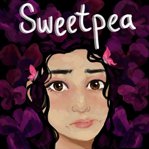
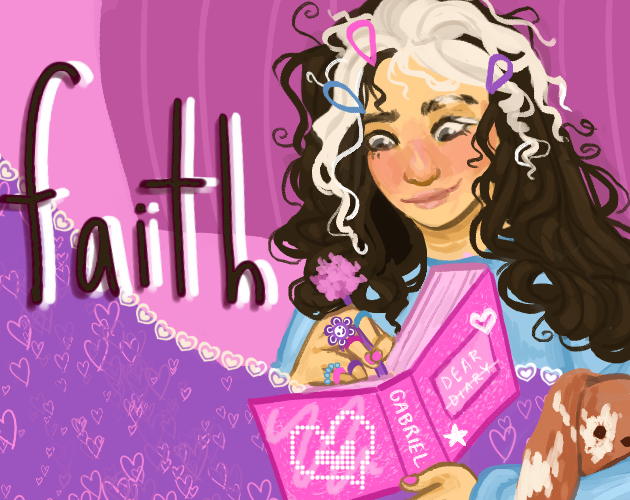
I’ve also been able to draw a lot more as of late, and while rounding up some of the covers I’ve been painting, I found it kind of funny that I mostly just draw brooding dads or their cute daughters. I know not everyone also dabbles in art, (and I definitely don’t in graphic design, my typography is kind of a mess, haha!) and I’m curious how other people put together their covers, whether they do paint them, collage them, use photographed elements, etc!

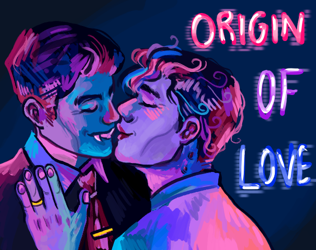
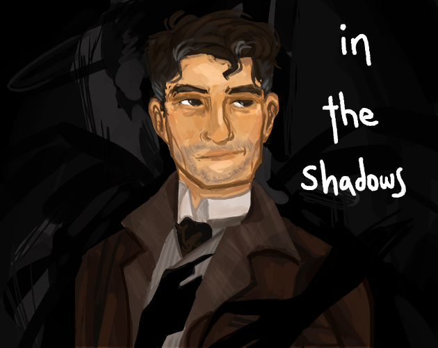
I’ll share the covers I’ve done: (most of these are for works in progress!)


faith
origin of love
in the shadows cover

19 Likes

Those are incredible @sophia! You’re clearly very talented.

I’m a self-employed motion graphic designer and 2D animator. I used to draw all the time, but gradually I’ve shifted over to making digital collages. I need Photoshop and After Effects for my work, so I have an Adobe Creative Suite subscription.

I’ve designed most of my own cover art and made a few for other people. I’m a big fan of Duncan Bowsman’s (@StringWizard’s) games so I did two for him. Lance Campbell (@lkcampbell) and I are pals too so I made one for his brilliant medieval comedy Stuff of Legend. Most recently Andrew Schultz (@aschultz) commissioned me to create a cover for the excellent Tours Roust Torus, and I’m really pleased with how that one turned out.

The full list of games I’ve designed covers for is HERE. If you’ve written a short, quirky game and you like my style, I’d love to do more. That said, I’m focused on finishing my own games at the moment so my free time is a bit limited!

15 Likes

The artwork for Alias ‘The Magpie’ and its licensed sequel The Magpie Takes the Train (by @mathbrush) were paid commissions. I used to work as an exam moderator at The Animation Workshop | VIA University College and one of my students was Mads Weidner, a very talented animator and illustrator. I thought his style would be perfect for the first Magpie game and I later asked him to design a cover for the second. You can see more of his artwork on his website.

11 Likes

I don’t do any graphic design because I don’t know how. I use idiot-proof Canva for text and minor graphics. I do know how to draw and paint and collage and take photographs, though. My first 2 covers were hand painted. For Fairest, I took photographs of a tree and a collage from magazine ads and put them together on Canva.

I love making covers. It’s like the great dessert you get after doing all the painful coding.

11 Likes

For The Exigent Seasons, I used Katherine Crowson’s VQGAN+CLIP running on a Google Collab Notebook set up by Eleiber and Abulafia and translated into English by (Twitter user?) @somewheresy to generate the cover image of the magazine; I created the magazine formatting using Canva. A second game I was involved with under pseudonym used a public-domain photo that I edited in Aseprite and MS Paint.

2 Likes

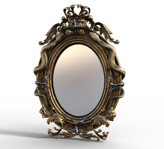
@AmandaB I found this cool fantasy mirror that reminded me of Fairest.

5 Likes

That is too cool! Exactly what the magic mirror should be!

2 Likes

I draw, and assumed my answer to this topic would be ‘I draw my covers.’ But I realise I’ve made or commissioned covers in lots of ways.

If it suits to draw the cover, I draw it, scan it, and then if it needs colour, colour in the computer. I did all the black and white ink-style drawings for Leadlight (File:Leadlight Large Cover.png - IFWiki) I had another artist, Steve Amm, add pencil sketches and a real painting.

I drew then computer-coloured the cover for Captain Piedaterre’s Blunders (Cover Art for Captain Piedaterre's Blunders)

I asked Katherine Primrose, whom I met at a game jam, to execute the cover for Six. Graphics/animation was her speciality, and she did it on computer with a graphics tablet: (File:Harriet 960 rectangle.png - IFWiki)

I photoshopped these covers for others’ games myself: Fan Interference (Cover Art for Fan Interference), Shuffling Around (File:Shuf960.png - IFWiki) and Ted Paladin and the Case of the Abandoned House (File:Ted Paladin Large Cover.png - IFWiki)

I drew in a computer (with a mouse) the cover for Andrew Schultz’s Threediopolis:
(Cover Art for Threediopolis)

For my upcoming game (Andromeda Acolytes) I had strong ideas for an image I wanted executed in a computer, but no interest in trying to do it myself. Marco Innocenti made all the Andromeda series covers before, so he did this one too. The difference this time was he had a monumentally fussy control freak constantly yelling directions over his shoulder.

-Wade

6 Likes

Very nice artwork, @sophia !

@.@

1 Like

Thank you! I usually paint portraits of characters from TTRPG campaigns me and my friends play, so it’s pretty relaxing doing cover art.

1 Like

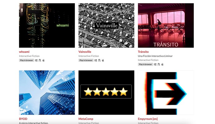
Those are very nice covers, @sophia. I can’t draw my way out of a paper bag, so I usually start with some stock photo or typographical element (exit icon and rating stars, which were actual elements in the games) and fumble with filters and effects until it looks cool.

Sometimes I’ve put a title, but others I couldn’t pick a font or a layout and I’ve just used the raw image (I find the lack of title can have a certain mystique). The cover for MetaComp looks really cheap, but I’m happy with the others.

5 Likes

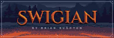
Early on, I’d take Wikicommons images and just throw them on a cover:

image
Ether original cover art
image
Swigian original cover art

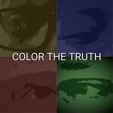
Then I went on a phase of making my own. Color the Truth was me, my son, and my ex-wife’s eyes (I think I used mine twice) with different colors. The colors correspond to the four main characters, who are associated with sadness, envy, anger and cowardice:
image

I also made Absence of Law’s image on my own:
image

I thought I did a good job with both, but I had multiple people offer to help me with cover art in the future so I guess it didn’t go that well :sweat_smile:

I made a few more covers on my own:
image
image

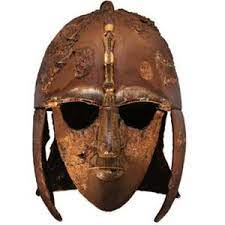
But at that point I switched over to getting help from others. I first replace my old cover art, one with Marco Innocenti’s volunteering to replace my helmet art above for Swigian:
image

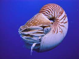
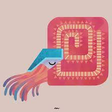
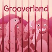
and then me paying an artist named Maudou for a replacement for the Nautilus, as well as the cover art of my next game:
image
image

JJ Guest had the art done for Magpie Takes the Train (as mentioned above) and I paid one of my high school students whose an artist to do the art for my parsercomp game coming up:

11 Likes

Back when I was a high school teacher, I paid a student artist to design my tattoo. It’s large and gorgeous and she used images of it to help her get into RISD. It was altogether awesome.

2 Likes

Usually I start with cool lettering then go from there, fussing with it until it all does what I want.

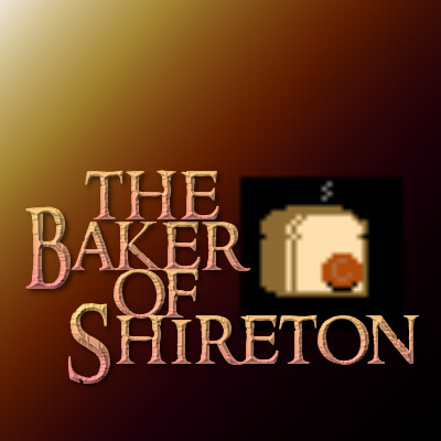
For Baker of Shireton I went “that looks like an appropriately RPG fantasy-wantasy font…” Turns out it’s called “Ringbearer” and is a literal knock off of the LOTR font. I then wanted to include an image, and I spent a lot of time creating pixel art of a loaf of bread that ties into the RPG slant of the game. The image also contains a huge clue for the most annoying puzzle in the game.

The Baker of Shireton

showimage

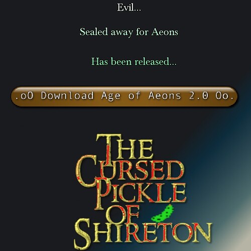
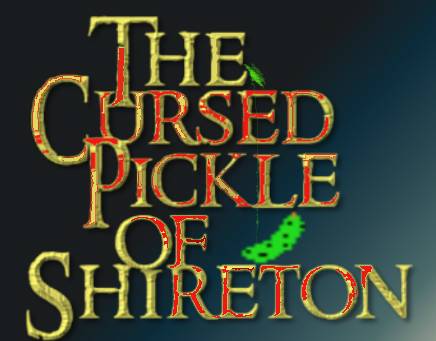
While this Comp was going on, I made a parody of my own game art in the same style in the private author forum, and it wormed its way into my brain enough that I actually made a sequel. Originally it was just the lettering and the pickle, then upon game release I made a version with a download button. My other update was to make people pronounce the game title correctly it needed a thing over the è, so I updated the image to suggest it in pickle slime.

The Cursed Pickle of Shireton

6IccFK

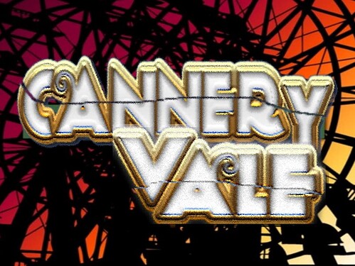
Cannery Vale was originally this:

Old Cannery Vale

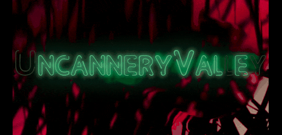
I found vector art of a Ferris wheel and doubled it as a background to suggest parallel universes, but I and other people I showed it to grew to hate the lettering. Since there was a lot about rearranging words and letters, I came up with the idea of a neon sign with dodgy malfunctioning letters that could spell out different words.

Sort of what the CV logo looked like before the final

Screen Shot 2022-06-20 at 5.59.18 PM

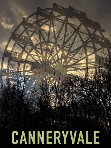
Two days before the comp opened, I was goofing with a photo I took at the lake and came up with the final thing that felt so right I had to change it.

Cannery Vale

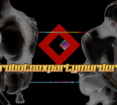
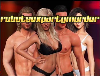
robotsexpartymurder went through a hundred variations. Originally it was lettering and a line of static. Then I googled “sexy robots” and found stock images and made them a little less typical by changing the color scheme and positioning and cropping them so they faced away because art. I had designed a fictional logo for the Cardinal Corporation, and had commissioned DAZ3D art of all my four character androids and due to the Orwellian surveillance thing I considered making the cardinal logo with all four character eyes peering through. That didn’t work, so I settled for one.

RSPM final logo

showimage-2

I did also make one that was a bit racier with the androids but ultimately decided to just use it on the itch website to draw in all the people looking for pron. (They were likely disappointed; there are no nude or pornographic images in the game.)

(androids in swimsuits)

Screen Shot 2022-06-20 at 5.45.03 PM

6 Likes

You are a braver man than I!

My process for making cover art is to dread it and procrastinate for months, because I know it’s super important for drawing people in and getting them to take a chance on your game but I have no visual design sense at all and even when it comes to figuring out a basic idea I’m usually at sea and second-guessing myself, much less having the skills to actually make something, then I beg my wife to bail me out and she does. So far it’s worked great!

3 Likes

I have found that making cover art is “working on the game” without actually “working on the game”.

3 Likes

Oh, I get that. For Eleusinian Miseries, I spent an inordinate amount of time towards the end trying to massage the opening poem closer to a dactylic hexameter meter (what Homer used), because getting that right was clearly so important to the player experience.

6 Likes

Yeah, I remember almost quitting when it was a syllable off. Then I decided to give the game another chance.

I liked it, but still…
That missed meter…

2 Likes

Those poets really botched the job of decimalisation, because a poem is measured in meters and feet.

8 Likes

First, thanks for this topic, because it finally pushed me to organize all the cover art for my games in one place. I think just browsing it every so often (even once a week) helps, and I should have done so before.

Cover art is something I procrastinate and only really attack once major bugs seem fixed. I have to admit I just slapped stuff together with stick figures for some of my works, and I really, really want to upgrade those. I’m proud of the works themselves (Problems Compound, Ailihphilia, Very Vile Fairy File) but I don’t want to link to the cover art! Topics like this remind me that new cover art alone would be a reason for a re-release.

I was really happy with @severedhand’s cover art for 3(!) IFComp entries in a row. Especially since one was about baseball and I remember insisting on a detail or two that might’ve made his eyes roll. And the whole game product was rushed. But I really liked it, and it gave me a late boost. I do however think his cover art for Shuffling Around and Threediopolis were a great example of me asking for an idea and having to say, okay, I have a max of 3 or 4 important details I want the reader to see. Certainly his questions helped me figure what I needed. Even something like making sure an image or font set was public domain helped. Being able to go back to these images has been surprisingly helpful, and it reminds me of questions he had and I can ask myself.

@J_J_Guest is the only other person I asked do cover art and I was also very pleased with the results!

Having some insight into their process helped me think–and probably will help me think going forward–about what I really wanted to do. So if he has the time and motivation, and you are wondering if you should ask, and he is open to offers, I recommend it.

As for my own cover art, I had people tell me my stick figures can be a riot sometimes, but I’d like to go for a subtler less flippant kind of humor. I think having nice cover art in place lets me sort out a few additional details, and that was the case for my collaborations.

Too often it seems like I whip up cover art at the last minute, but I think it’s best if I have something–anything, even a rough draft or notes on what I want–a month in advance. I’m not above taking vector art or whatever. With A Roiling Original I think @HanonO suggested the font, and the cover captures an early puzzle that isn’t very spoilery, as hopefully it’s not too tough.

So I think bouncing cover art off others is really helpful!

I’m pleased with my recent efforts at cover art, while recognizing they’re not earthshaking. Fivebyfivia was just some hand-written nonsense until I had the idea to kind of anthropomorphise chess pieces, and I do like the result. I was able to find a perspective checkerboard which I re-colored with MSPaint(!) … I put it into a monochrome bitmap, then I cut/pasted simple shadow drawings of a king, queen and rook onto the board. So I think I got that retro feel without “ha ha ha I wasn’t trying” vibes. Fourbyfouria, I found vector art and using fills was not bad. For Walking Into It, I was upset nothing popped up, but then I figured something with a week left in IFComp, and I was pleased with how the cover blended into the game. Then for my two EctoComp games, I found some good stock images and textures which made me happy. With Weary Eerie Way it was a blimp, and I did some original drawing, but I had fun putting Psyops Yo together, with the gradient, and the autoshapes for the un-suns.

So I’ve gotten to feel comfortable with vector drawings or free stock images/textures. And I feel I can reel them off. But I know they’re limited!

I want to move to actually drawing my own stuff for good, as I want to do more drawing in general. And while my favorite bits of my games are the weird stuff where hopefully it’s a bit odd to picture something and I wouldn’t want to restrict the player’s imagination, I still want to get across good cover art to make a good first impression. That’s something I’ve fought with in general–I’m suspicious of people who are all first impressions and nothing else, but I want to give people a reason to give my stuff a chance. You want to underpromise and overperform in general. But you can’t be a blank slate.
6 Likes