Cover art terrified me with the two competition games I released. I mean really terrified me!
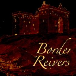
For Border Reivers for IF Comp I found a very old out of copyright drawing of Hermitage Castle where the game is set. And then tried colour inverting and other processing in GraphicConverter on my Mac. That produced a gloomy atmospheric night time view which I was happy with. Then I added letters on top. Here it is:
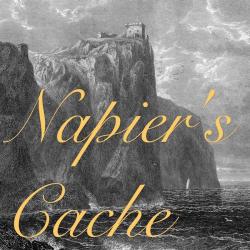
For Napier’s Cache for IntroComp and SpringThing I found a 19th century drawing of the sea around Fast Castle, the setting, then cropped that and added lettering.
But yup, cover art is the stuff of nightmares for me
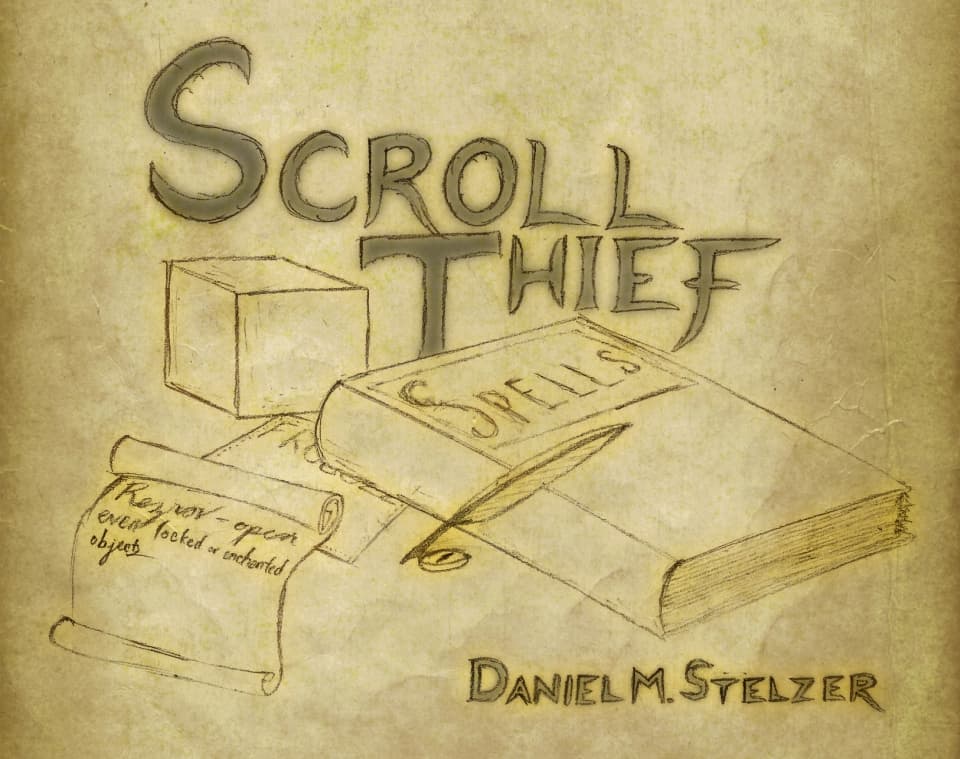
My answer is pretty boring. For Scroll Thief, I drew it on paper, scanned it in, and did some digital post-processing to make the text more visible at a small size.
Looking back at it, I think if I were doing it again now, I’d try to match the color palette better when doing the digital processing. I don’t know why I made the text so “cold” when the rest of the image is so “warm”.
For the title in the game, Hanon was one of my first testers, and he sent it in along with a (very good) suggestion to spice up the opening sequence.
I don’t have any ability to make my own art for my upcoming IFComp game. But today I just got permission from Tom Wham (artist and game maker from the 70s 'til now, who contributed some artwork to the AD&D First Edition Monster Manual among other things) to use some of his artwork for my cover. So I’m both excited and relieved.