Continuing the discussion from Glk extension proposal: CSS:
(because I’ve got a rant in me)
It’s subtle, because I think part of the magic of Glk is the push and pull between player control and author control, including the interpreter overriding authorial intent for the player’s benefit.
I think a lot of authors don’t think at all about dark mode support, for example. When authors do attempt to set a foreground color, many authors implicitly assume that the background color will be whatever their favorite interpreter’s default color is. For example, authors will set a dark red foreground color, assuming the background will be white. And when authors do get a bug report from a player whose default background is dark, (“I can’t read your dark red text on my dark background”) authors generally try to hard-code the background, forcing it to be white, ignoring the player’s preference for dark mode. That forces players who insist on dark mode to set a preference in their interpreter to ignore all author colors. Best of all is to prompt the user at startup to choose a color scheme, but that’s annoying.
It would be better, in this example, for authors to have only partial control over the color scheme. Here’s my light-mode color scheme, here’s my dark-mode color scheme, let the interpreter decide which one to use (automatically, based on the player’s system settings, with overrides in the interpreter’s Settings menu).
Or, to your point about layout, what about mobile support? Authors who assume control of layout typically assume that the player has a large landscape window. Those assumptions often fail wildly on mobile.
For example, Marbles, D, and the Sinister Spotlight is buggy on mobile. It’s hard to even click on the invisible <input> to type 1 to get started. Once you do get started, the multi-line status line is scrolled off the screen when the keyboard is visible; if you do scroll up to the status line, it’s still trying to print the title of the game in the center, but it can only squeeze in a few letters, Ma here, Sinist there; it looks buggy.
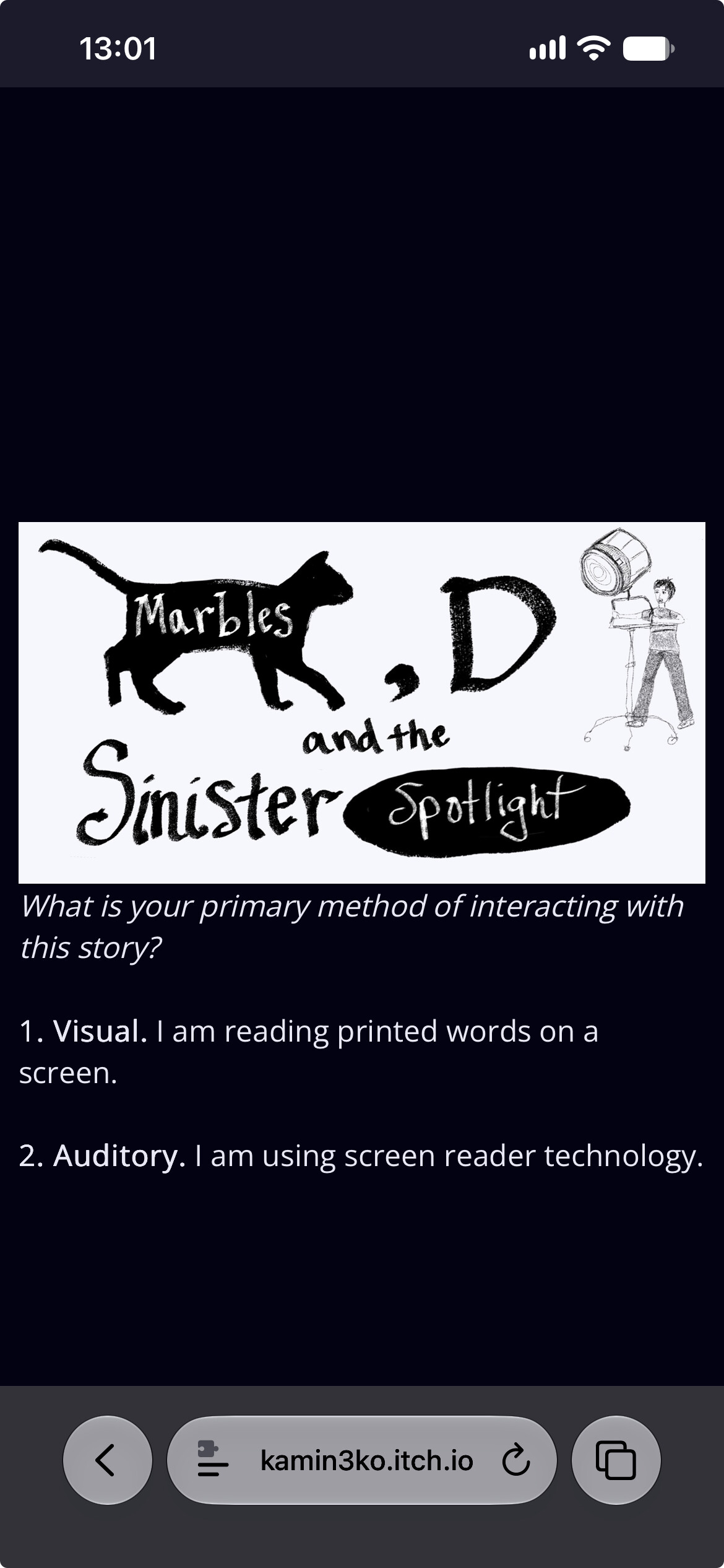
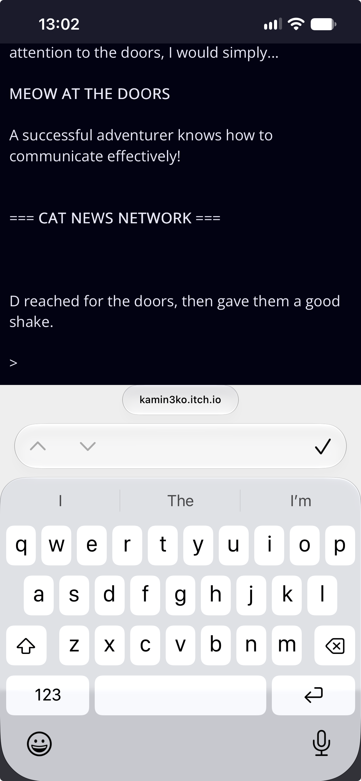

When I see that sort of thing, I think of how much better it would be if Glk had a richer API, offering the author less control over layout. Look at a typical Quest game, like Whitefield Academy of Witchcraft. Marbles is using a text grid to build its own “Places and Objects” window.
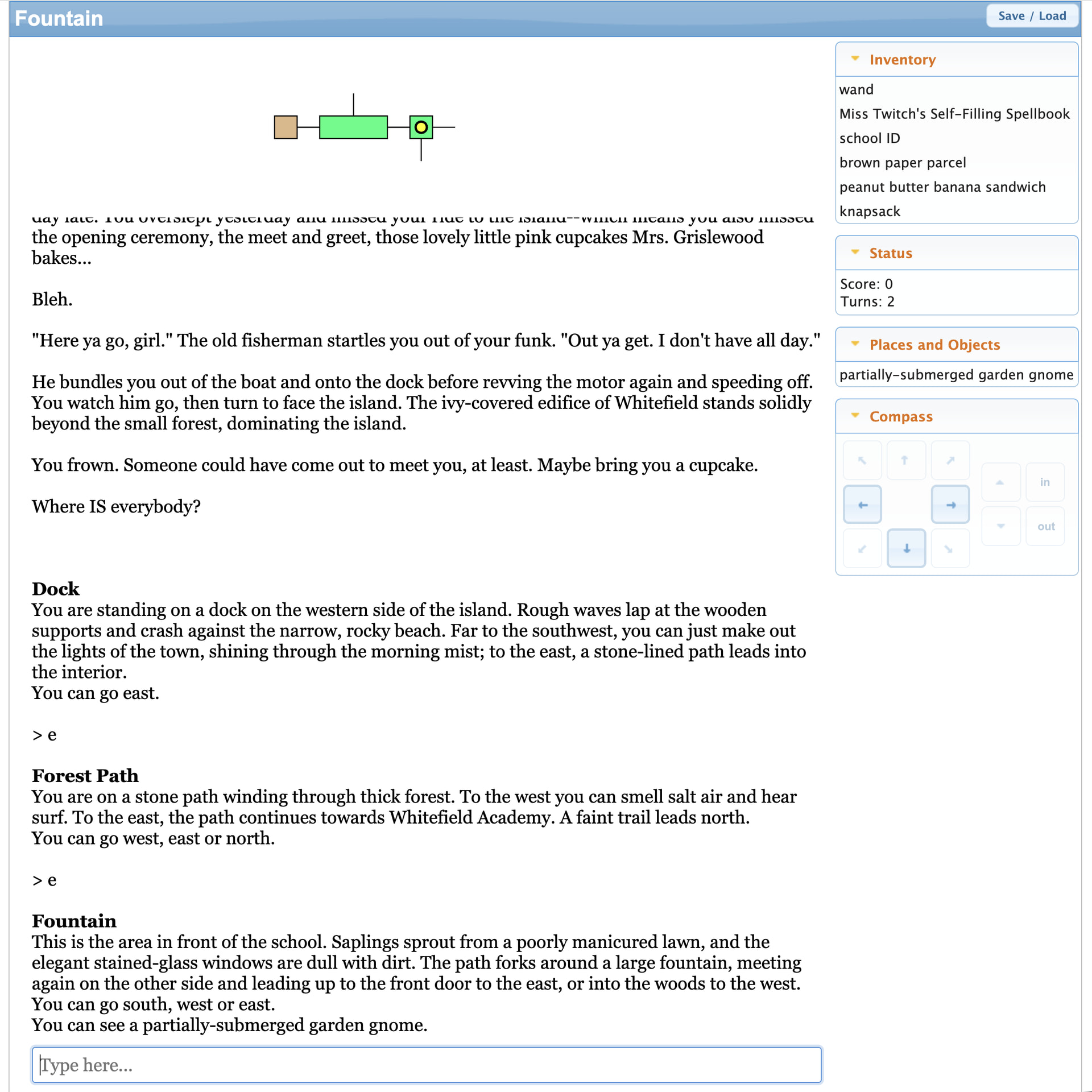
But what if Glk had an API for that? What if the author provided a list of named lists that the interpreter could show however it needed to? Maybe on landscape screens, Locations and Important Landmarks would each appear in their own sidepane window, like Quest. On mobile screens, perhaps they’d appear as horizontally scrolling lists, pinned to the top of the screen. Since the interpreter would decide where to put the UI, there could be settings for the player to control how to show it, or even to hide the UI, if the user doesn’t want to see it.
A text grid gave you absolute control over the position of the Locations and Landmarks UI, but I claim that it would have worked even better if you had less control.
And what about that invisible <input>? As long as the author is in full control of the style of the <input>, the interpreter can’t intervene to help. But, on mobile, the standard UI for chat-based transcripts is to add a separate <input> bar at the bottom of the screen, in its own pane. (That would make it obvious where to tap in order to press any key.) If the author is in full control, the interpreter can’t intervene to add an <input> bar.
I’ve been thinking about this a lot for my proposed Glk Mapping API. The Adrift runner has a complicated tool bar to allow players to hide/show the map, to let it float around as an OS window, or to pin it to the main window (to the top, to the right, to the left, or to the bottom).
I don’t think Adrift’s UI for this is very good, but the idea of letting the player decide where the map belongs (or whether to show the map at all) is just right.
Adrift also has a player-configurable graphics window, normally used for a visual depiction of the current room. We can let the author decide whether that image belongs in the main scrolling text-buffer window or in a pinned window pane, but putting that in the player’s control allows them to decide whether to show it or hide it, or whether to include it in the text, or in a floating OS window, or to pin it to the window.
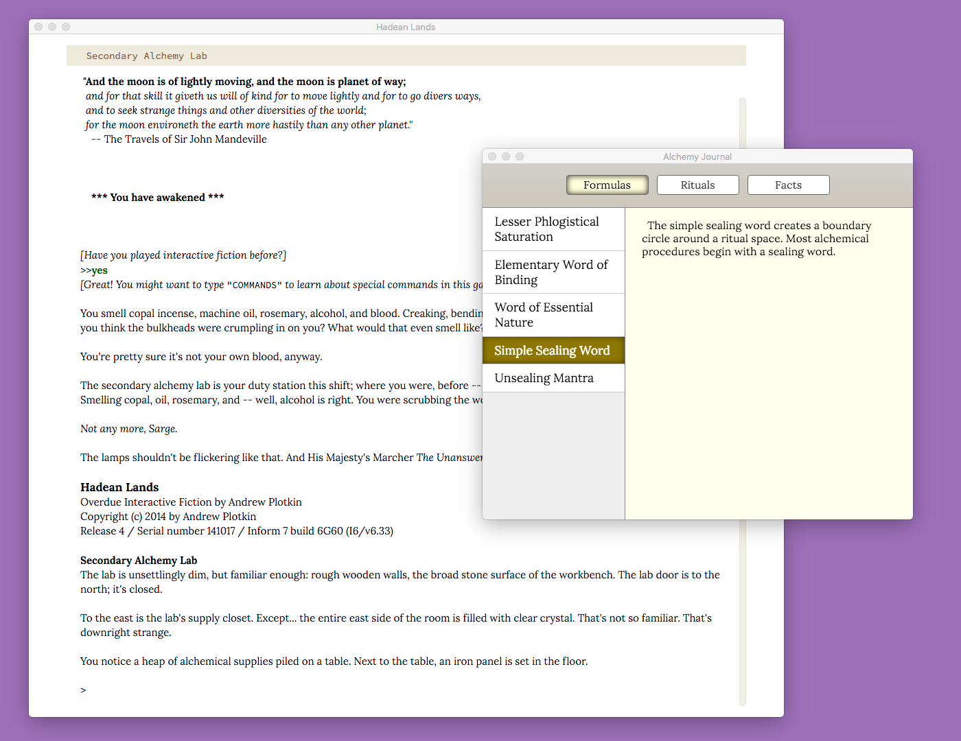
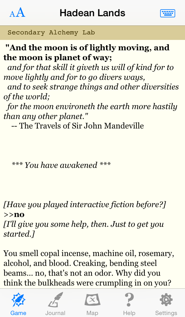
Long term, my goal is to make APIs in Glk that would make it possible to implement a UI like the Hadean Lands Journal, in a way that “just works” on mobile.
Why does the GUIDE in Repeat the Ending use a keyboard-driven menu system? What if Glk had its own menu API for help/hints, that rendered with a UI that you could click on, with a back button, with larger tap targets on mobile?
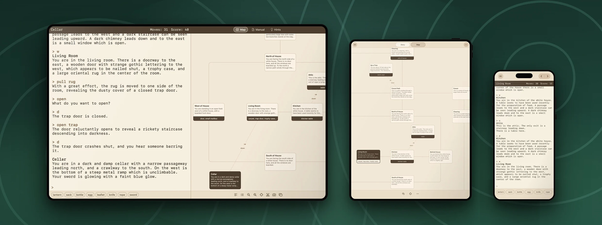
Look at Cairn. It’s not attempting to reproduce the original author’s vision for Zork’s UI. The Apple II version didn’t have an inventory pane, a tabbed UI for the map/manual/hints. Seizing control away from the author is where Cairn adds value.