There’s a poll I made on IFDB 8 years ago about games with best cover art:
A lot of the top votes are for games that were newish when the poll came out. I’d love to see what people’s opinions are now, years later.
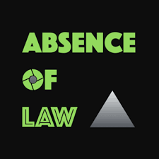
I’ve been thinking about it because I’d like to update the cover art for some of my older games, including Absence of Law (I remember when it came out several people offered to help me with future cover art, so I figure it must have been pretty bad):
The poll is helpful because, while taste is subjective, I think there is a ‘sweet spot’ when it comes to readability of text and clutterd-ness of design. Cover art is generally seen in pretty small sizes and I’ve noticed that most of the cover art in the current poll only has one or two characters in it (I presume because more would be hard to see from far away).
Does anyone have any strong opinions on cover art, especially for things that you find annoying (like too-small text)? Either way, I’d love more votes in the poll!
Thanks for the prompt! I’ve added quite a few votes just now, including for a number of games newly voted for in the poll.
I find it really helpful scanning down the images in the poll, which are teeny weeny sized, but quickly show up recurring patterns of clarity of design for me and also impact.
I think the best cover art should work both large and small, and should have a simple uncluttered design, that reflects enough of the game, and clear text if included. Which, with the correct combination, should mean it has maximum impact.
As an author when entering competitions producing cover art has been my biggest challenge. But it’s really helpful to pause and think about what works well, and learn from that. Thanks!
All of my cover-art-related intuition comes from itch.io, where the cover art is much larger and more prominent than the associated textual information.
Frankly, with the teeny-tiny thumbnails on IFDB, next to comparatively large printed titles, I’d question the wisdom of attempting to include text in the cover image at all.
But also, in the Itch context a major part of what I look for in cover art is a sense of the visual style of the game, and it bothers me if I feel like the cover art is “lying” about what the game looks like. But in the IF context, where many games completely lack any visual identity whatsoever, I’m not even really sure what I expect the cover art to convey.
EDIT: I guess it’s a bit of an unfair comparison, because most of the images on IFDB were not created for IFDB, but still, when browsing the site I can’t help but feel like the majority of the thumbnails are fundamentally not suited to being displayed at such a small size, to the point of seeming basically useless in this particular setting.
I broadly agree with this for practicality. It’s now the case we’re besieged with small squares of art in all our cyberlives, so cutting through with these simple techniques is hard to argue with.
To argue with it, I guess I’d say as soon as your game name is long, it’s not going to be legible. At that point you could go with a legible wordless design that’s small (I did this for Ghosterington Night which technically has different cover art that you only see if you play it. What’s on IFDB is what Steam would call something like ‘the mini square icon’),
or you say ‘To hell with your rules!’ and make a cover that’s designed to be enjoyed at normal (i.e non-postage-stamp) size. Then live with the small version of it, or again, make an alternate thumbnail cover, whether similar or different.
Sometimes if your full sized cover with text in it is halfway-working, or a bit soft, when shrunk, it’s worth testing if a small amount of sharpening of the small version can improve legibility. Pretty sure I did this on the small version of Captain Piedaterre’s… artwork and small version of Leadlight. The latter’s font is not meant to be super legible at small size, but the art is a high contrast image which cuts through.
There should be some place where your cover art looks good, whether the small or the large. Since we’re not shifting tons of units, we’ve got the luxury of not having to subject ourselves to tiny cybersquare world if we really don’t want to.
Anything I find annoying would tend to be typical nitpicks by graphic designers. A design that’s thoughtless re: the game (usually only verifiable in retrospect, like @averyhiebert was saying about ‘lying’), has no concept, or text that’s dragging too much on other elements, or ill-proportionedness, or it’s too crowded, or is just not engaging or appealing or is ugly for no good reason, or becoms a 100% illegible splat in small form.
One that always bugged me as “Close to being a good composition, but…” is Savoir-Faire - Details. For me, that’s a classic overcrowding, where it looks like if anything moved a centimetre, especially the central picture of an orange, all that stuff would be bumped off the poor woman’s head.
Tangential, but I kind of wish IFDB had the option to upload separate full-size versions and thumbnail-size versions of your cover art. I used to work for a small press that sold books on independent ebook-store websites when those were a thing; a lot of those sites had that feature, and we weren’t just resizing the same cover art that was in the file or on the main page, we were actually creating separate thumbnail versions that might be cropped differently or simplified in some way and almost always had bigger text relative to the size of the graphic. Different things look best at different sizes, and I don’t necessarily want to design the art that’s going to be seen on the main page for the purposes of being seen at postage-stamp size in polls and searches, but it does somewhat bother me that a lot of my stuff doesn’t read well at the latter size.
Every once in a while, cover art gets redone. I’m pretty sure Varicella used to have different cover art. If the poll is eight years old, I’m not sure if the votes are for the old art or the new art.
I saw that as well. I’m sure the votes were for the old art, which was a woman in a straight jacket inside a padded cell, as the new art is AI-generated and one of the people who voted for it is Emily Short, who hasn’t been active on IFDB for about a decade (except for things like the poll votes).
I have little connection rught now so I haven’t read everything, but I would say I like stuff that is clear what game it is from a glance. I don’t mind Absence of Law’s cover! It gives a clear design and style immediately. It might be simple but it’s recongisable.
I think Never Gives Up Her Dead has incredible cover art. It’s incredible and gives such a mood while not feeling like the text clashes with the art.
I definitely agree, the old Varicella art is better IMO.