I’ve been having trouble using jpgs or pngs, in that when I get them down to the size that Inform accepts and will display in the game, the quality of the picture is poor and at times blurry.
Any way around this?
I’ve been having trouble using jpgs or pngs, in that when I get them down to the size that Inform accepts and will display in the game, the quality of the picture is poor and at times blurry.
Any way around this?
At present, local interpreters aren’t great at this. Not all interpreters behave the same way, so a general suggestion is to have a height or width of 700 or so pixels (~700 pixels should be the longer side). I’ve been doing this for a while, and it’s fine, though a higher resolution image scaled to fit would be nice. I believe that’s coming, but I’m not sure when.
TLDR; try a width of 700-720 pixels for a wide image. Try a height of 700 pixels for a tall image.
This is a game in Lectrote displaying a 700 x 525 image.
Web releases scale very well, but it’s a complex process getting there. If you end up trying that out, I can help.
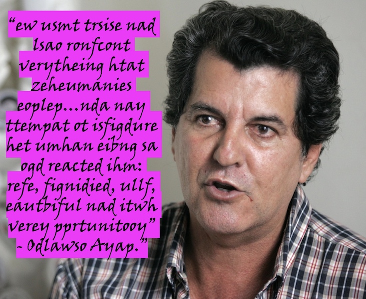
That picture looks sharp! Nothing like mine are turning out.
Is it possible that my MacOS version of Inform is 1.68 (1.68.1) is the problem? Is there a way to update, that you know of?
The latest downloads are here. If you aren’t on version 10 (compiler version–this prints as part of the opening banner text)) yet, that change might or might not matter. Or it might cause problems. It won’t break your project, though.
Release Inform 10.1.2 · ganelson/inform
Is that the picture? I can put it in a project and see how it looks.
I don’t know if this affects anything, but in your image program are you cropping the photo down or shrinking the entire image? I know if you blow up an image you can start seeing blur if there’s not enough resolution in the image. It’s possible shrinking may cause similar effects.
It’s possible re-sizing the image in settings might do a better job than manually grabbing a corner and adjusting it. Selecting a standard image size (like if it suggests 768x960 instead of an arbitrary width of 700) may get you a better result on the monitor than a randomly-selected width and aspect ratio.
Maybe check your original source-image resolution and see if you can start with a higher-res image. There may be settings in your graphics program to preserve resolution during re-sizes. Also make sure when you export you’re saving at a high-enough quality. PNG should have less loss than a low-quality jpg.
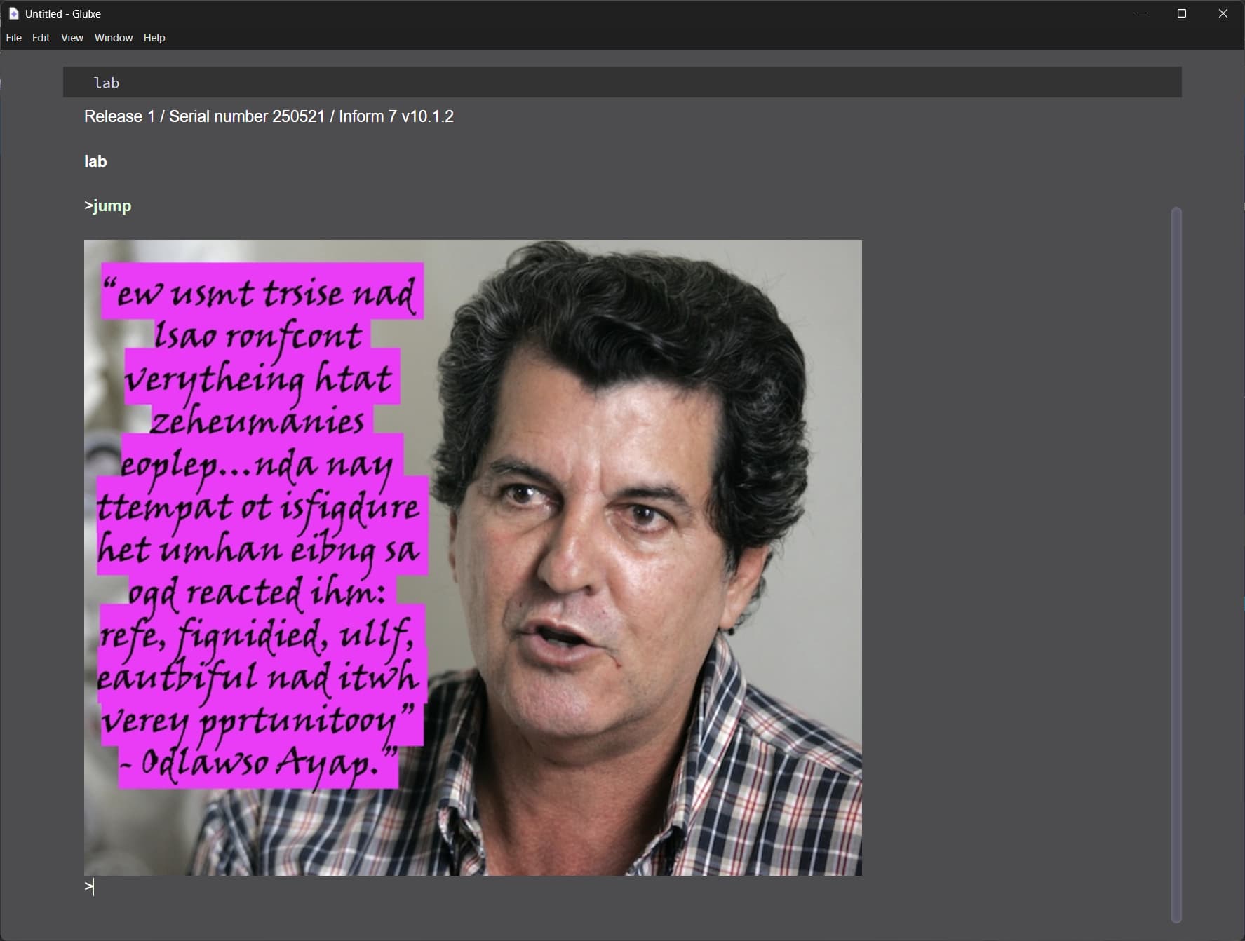
Here’s what I’ve got.
Inform 7 v10.1.2
lab is a room.

figure forum is the file "Paya1.jpg".

instead of jumping:
	display figure forum.
story.gblorb (760.3 KB)
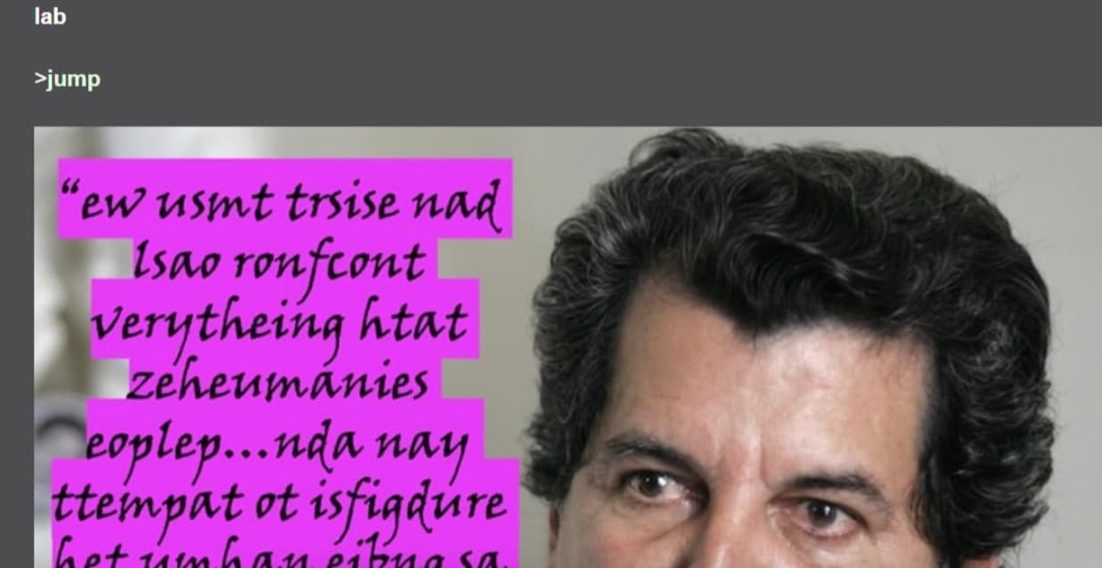
That looks good to me if I click the image and “over zoom” it.
Sometimes it takes experimentation. Often when I use sounds I find from “CD-Quality” I can lower the bit-rate of music by half to save space and increase loading time without any noticeable deterioration. Certain clips can go lower - sometimes short non-melodic sound-effects are fine at very low quality like a classic 16 bit game, but it will affect the quality of a longer music clip.
I think it’s good, too. So perhaps it’s compiler version? I don’t think there’s any way to intervene or otherwise configure images while adding them to a project.
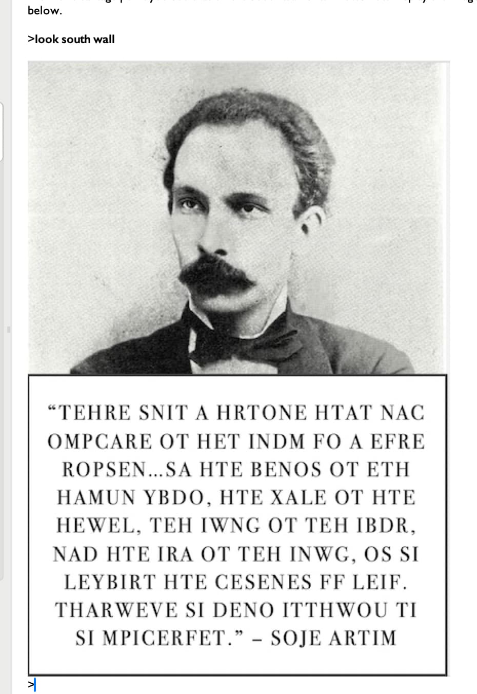
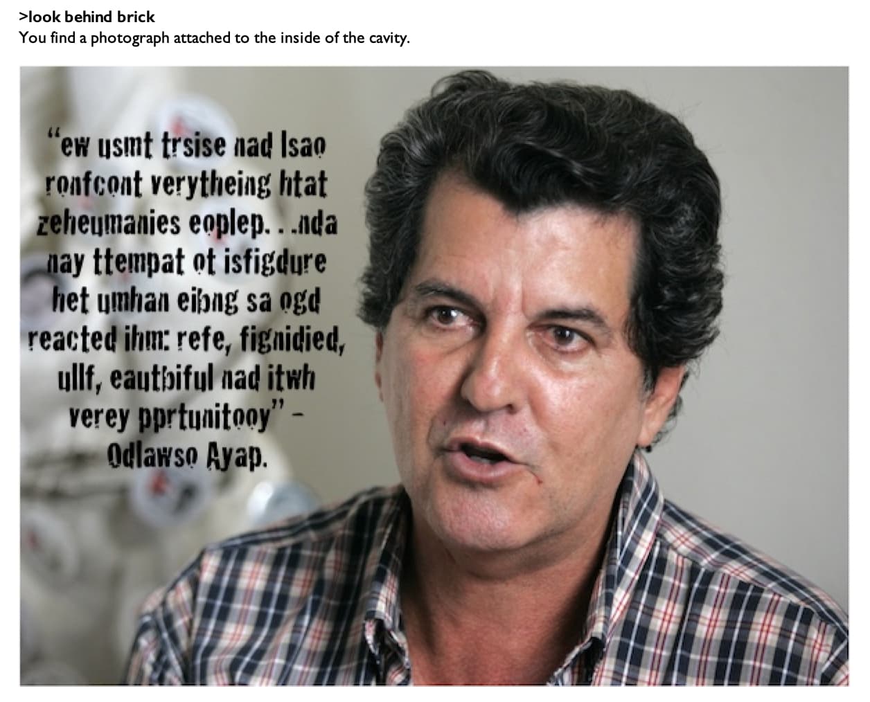
Yeah, the fuzziness of the words is the thing that’s bugging me. ![]()
Ah! That is probably more down to the text, then, and not the image itself. How are you adding that?
Definitely size the image before adding text to it. Resizing sharp text can be very noticeable.
On Power Point. It looks good until I get it down to around 600 x 600.
With regard to Hanon’s suggestion, when are you adding the text? The best practice would be to add it to the image once you’ve sized it, since font scaling can be weird.
If that’s not getting you anywhere, I can take a look at the slide.
That makes total sense! Why didn’t I think of that???
I think so… the font looks deliberately distressed, so it looks rough by design. But it’s definitely lacking the sharp jaggies of the earlier screenshot
Thank you for your help. Hopefully the players won’t get as bent out of shape as I did on the state of the text. ![]()
Note that the image you posted has visible JPEG artefacts around the letters. This might be because the screengrab is saved as a low-quality JPEG (or because it is enlarged by the web browser/forum software), but if they are also visible in-game, it might be worth it to redo the image as a higher quality JPEG, or a PNG, which will have a larger file size but no artefacts.
Is there a good shareware photo program you can recommend. I think Preview has some problems with text, from what I read on online.