Game description:
”Wirefly is a text-based multiplayer space game where you join a crew, explore a living star map, and survive through trade, combat, and cunning decisions.”
search above description ^ or ask me about it!
Thanks!
Game description:
”Wirefly is a text-based multiplayer space game where you join a crew, explore a living star map, and survive through trade, combat, and cunning decisions.”
search above description ^ or ask me about it!
Thanks!
A link (or something resembling one) would probably help you get reviews.
New users can’t post links by default but it only takes a little bit of poking around the forum and it lets you.
Thanks. That makes sense!
Here’s a link: https://codeelf.com/games/wirefly/
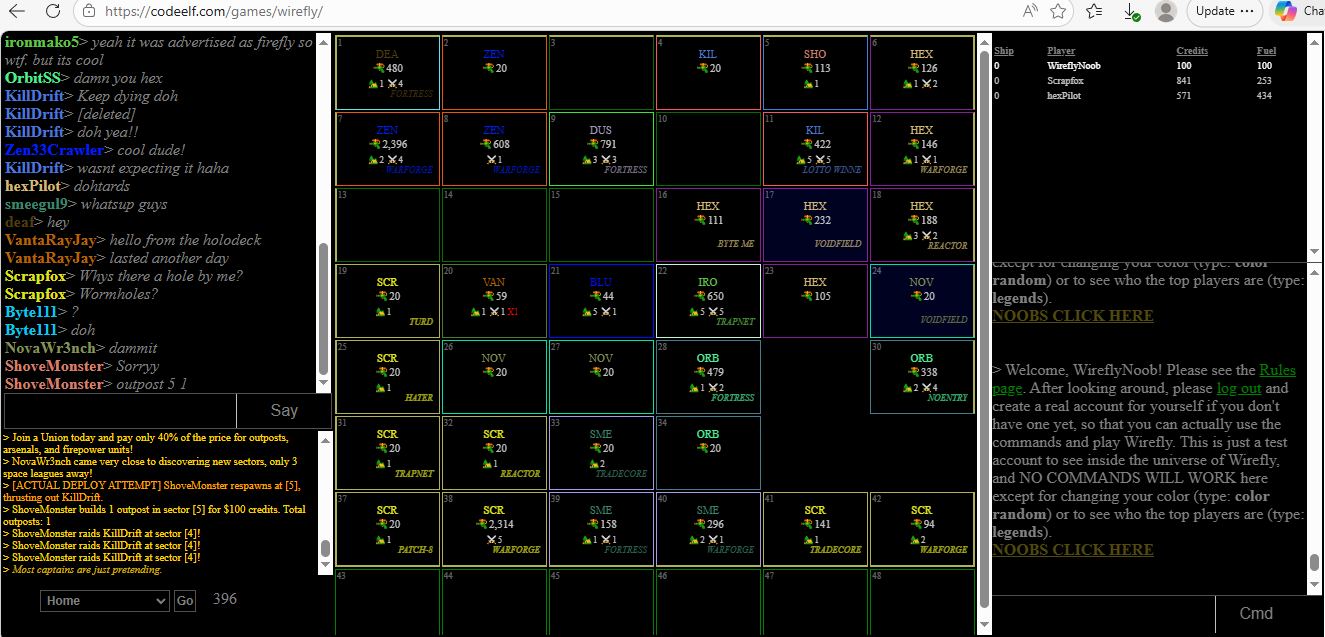
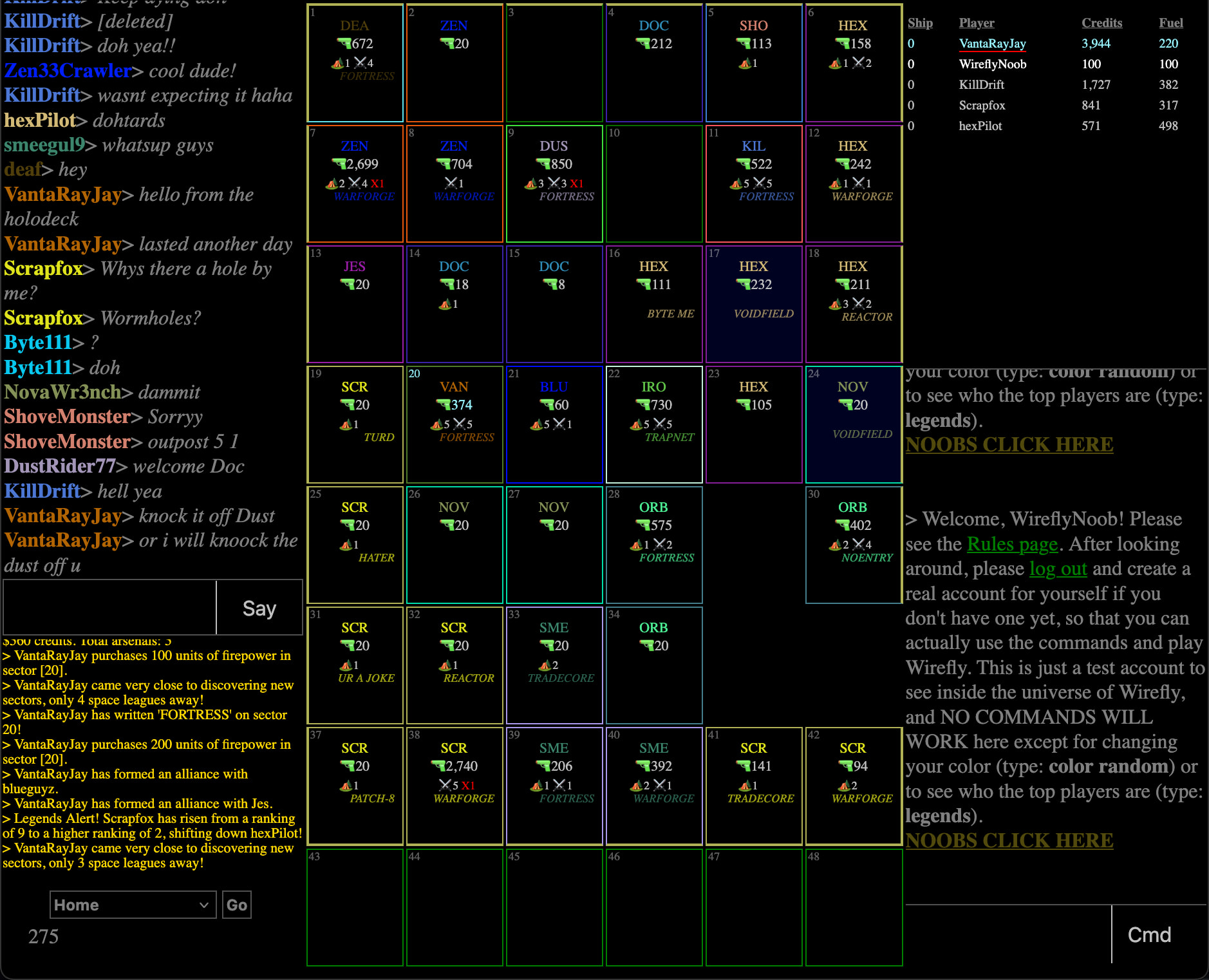
Well, I was intrigued enough by the basic idea to click through. I took the lurker path and this is the first thing shown to me.
This is a really overwhelming amount of information, and colors, and text, and icons, to drop a user into without explanation. It’s too much, and it doesn’t motivate me to learn more. This threw me right out, so I have nothing to say about the gameplay, but I can offer a few suggestions about the user interface. I think that the best thing you could do at this point is focus on a tutorial that gently guides a user into the game, explaining one piece of the UI at a time.
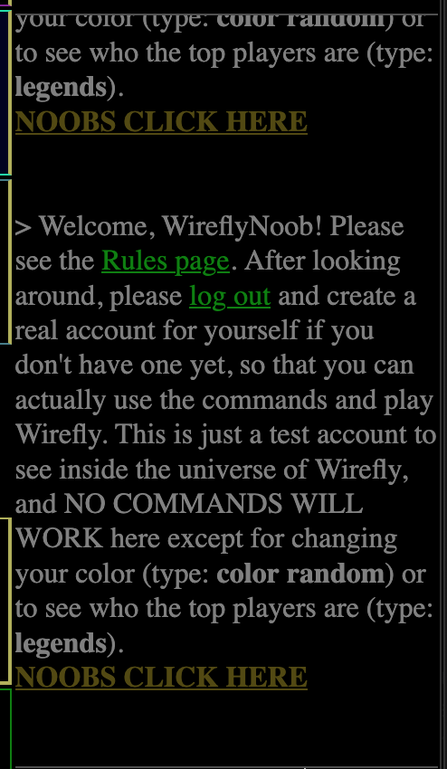
It seems like three out of the four scrolling text fields are already overflowing when a user arrives, which adds to the overwhelming nature of the page. Eventually I spotted the “noobs click here” text. When I scrolled that very long text area, I found that it’s repeating one paragraph 60 times.
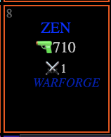
A lot of the dark font colors, small font sizes, and small icons in the grid are basically illegible. This particular box is the worst offender. Using more contrasting colors and larger text and icons would be helpful. BTW are these meant to be buttons? They look like they should be clickable, but they’re not, so that added to my confusion.
I think you’d also benefit from some section headers. If I’m parsing the page right, it looks like there are five main blocks: the big central grid and four scrolling text areas. Each block should have some kind of a title bar to tell users what it is. Since the page is so busy, it might also be nice to let users drag-to-resize the boxes, and/or add a click-to-collapse/expand each one individually.
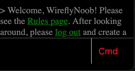
It’s odd and confusing that the “Say” and “Cmd” buttons highlight when a user hovers over the text fields above them. If they’re buttons, they should only highlight when a user hovers directly over them.
Best wishes, and good luck!
WOW! Thank you so much for taking the time to go through all of these points and offer some constructive criticism! 5 stars!
I have been told before that it’s all a little confusing/overwhelming, but because I’m so close to the game as its creator, I thought it made sense enough. But now that you’ve gone through all of these different areas of the game and explained exactly what is wrong, it makes my job much, much easier because I know exactly what I need to do to start fixing these problems. So, thank you again very much!
As I have the time, I plan to go through all of your suggestions, and address each one with a fix. Some of them will be easier to fix than others, but I can see the value in fixing these problems now.
If you ever decide to make an account and play one day, let me know, and I will grant you mod privileges. There are not too many players at the moment, but in the future, and with your helpful ideas to fix the game, it could grow more over time.
Thank you again!!!
Oh, I forgot to mention this, and not sure if you saw this or not, but there is an actual Rules page that explains everything in more depth. But perhaps it wasn’t clear enough when just dropping into the game for the first time (I will assume that it was not clear).
Anyway, here is the Rules page: Wirefly Rules
This topic was automatically closed 30 days after the last reply. New replies are no longer allowed.