I’ve viewed screenshots of this interface on color-blindness simulation websites and it seems the links are differentiated sufficiently with contrast level, but please let me know if the general purple text is too dark, especially if you have any degree of inherent color-blindness issues.

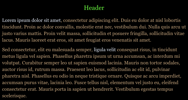
I have normal vision (with glasses), and the first one is uncomfortably dim for me. The purple text, I mean.
The second is pretty much okay. I still wouldn’t want to read a lot of text this way, but that’s how I react to all dark-background text displays, regardless of contrast level.
3 Likes
You know, I read something a while ago about how using pure black for text is harder to read than dark grey; something about too high of contrast can cause strain. I’ll try to find it.
Edit: here’s one link: https://ux.stackexchange.com/questions/23965/is-there-a-problem-with-using-black-text-on-white-backgrounds
1 Like
Yeah, Astrid had recommended that on Twitter.
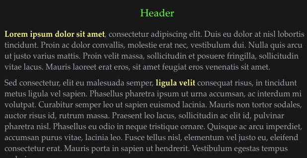
Here’s my current favorite: I bumped the black up slightly, changed font to Palatino, and have links in bold. On the colorblind simulator it’s very highly discernable even in monochrome. And I don’t actually hate this aesthetic!
I realized that I always tend to favor “dark” or “night” modes for websites, and even here comparing my image to what Discourse calls “dark mode” is still even several points lighter than my background. I think the gray-ish text will start disappearing if the bg is any brighter though.
The good thing is AXMA can bump the text two sizes bigger from this in the main settings.
2 Likes
I have low vision. I frequently use screen enhancement via Zoomtext. I can pretty much manipulate colors as I please and on a given day a different combination may work better.
This third option works best. I definitely have to enlarge the text in some manner.
Thank you.
1 Like