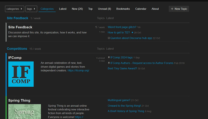
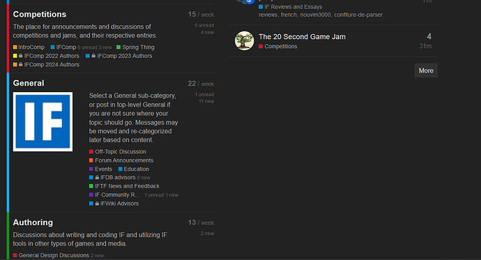
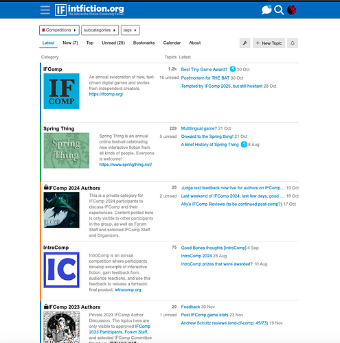
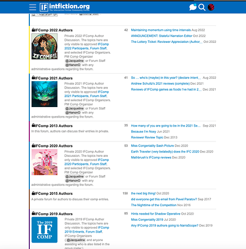
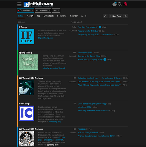
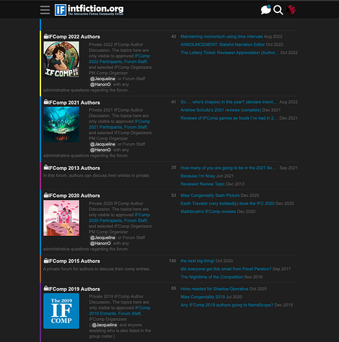
I’m playing around. Is this on mobile or a desktop? You might wand to refresh. If it totally sucks I’ll put it back.
Desktop!
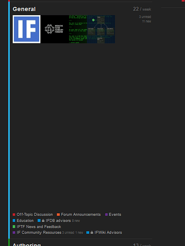
There’s an insane amount of space there ![]()
Oh and now it’s applied to the Playing category too
With the same amount of space between the images and the next links.
What are you trying to do?
Apparently ruin the experience for everyone.
![]()
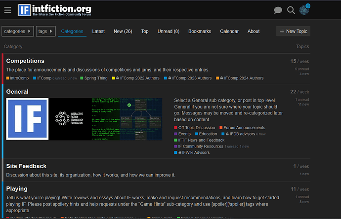
So it displays weird if the category page has both a banner for the category and lists topics for each category. When I turned the topic view off it looks better.
So people can see the differences between each state.
Note: this way does display categories previously muted however.
I tried it with featured topics in boxes, let me know if that’s also the worst.
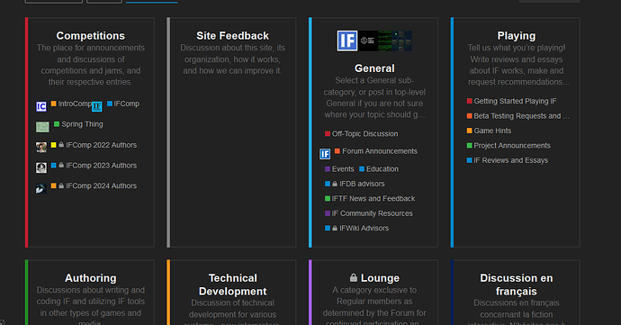
So the weird thing is If I display subcategories, it looks fine. If I display main categories there are those weird gaps. I’m playing with settings to see if I can make it work.
Okay, so I think I’ve got the views cleaned up. I believe the initial image I threw onto the general category was too wide and that goofed up everything.
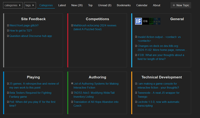
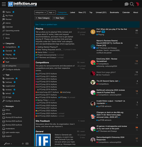
If you browse by Category, it should show main categories and then the five latest a whole bunch of board-wide latest topics on the right. The category list is sorted by most recent post.
If you click a category that has sub-categories, you’ll see each subcategory and it will show the latest topics in each subcategory to the right. If there’s a lot of categories, scroll down to see the posts in the top level of the Category.
I fixed several categories that were not set to display latest topics in this fashion.
I never browse by category view so that is likely why I missed some stuff. Hopefully this makes it consistent and mostly like it was before.
This is how it currently looks for me.
Sidenote: is it possible to have more than 5 posts listed in the second column on the main page?
Cause I’m not even at the end of the page, and there’s a lot of empty pace there.
That is the next thing I’m trying to find.
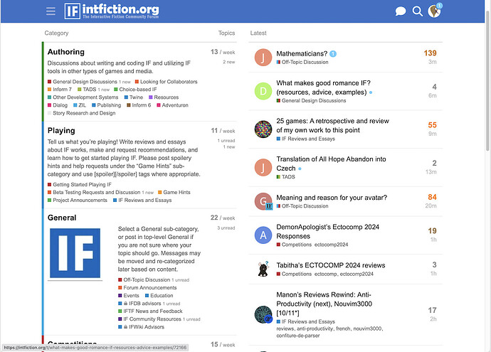
I think I’ve finally got it sorted.
My work here is done. Surely nobody will need help for months and months and I can go hibernate for the winter. ![]()
Success!
![]()
Gotta say, this still looks pretty weird and wastes some vertical space.
I suppose my point here is that “general” image has no informational content at all. It should be no larger than the the one in the header bar, and floated so that text wraps around it.
I thoroughly agree.
The reason I kept that is I like that inside the General Category inserting that image also pulled the “About this category” text so there could be a description of the category. But it looks like a pea under all the stacked mattresses in Category view. I’m guilty of disregarding how the categories look because I set my homepage to Latest and live over there.
At one point I was like “Each category needs a cool image” but no they don’t. Where it does work well is for sub-categories.
Darkside
