I found this video to be a great introduction to the merits of typography.
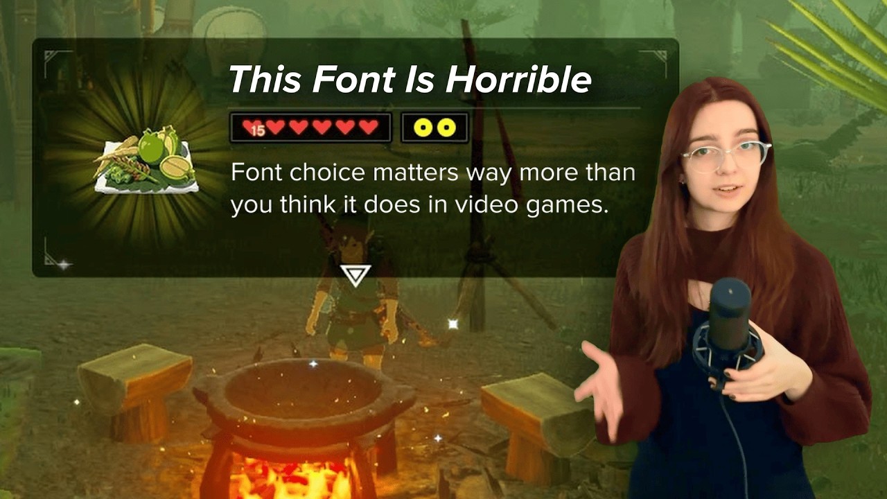
Interactive fiction is about text. Typography doesn’t require strong artistic skills, just some care and concern about readability comfort levels (for main content) and expressing an appropriate vibe for your game’s theme and setting (for the headers/titles).
There are way too many font websites that offer free commercial and personal use fonts, so grabbing a font is trivial. However, the one annoying thing about fonts is having to install them first and then compare different font styles in your authoring tools. That’s why I recommend using a font viewer program, like NexusFont. You can type out what words you want to see (like the title of your game) and scroll down to view that text in all the font styles you have quickly. Another great feature is that you can point your font viewer to a folder of downloaded font files (that aren’t installed) and still see your text rendered in those fonts before you commit to installing one. You’ll eventually build a solid library of fonts that you can easily return to and quickly pick the best one for the job.