Two Separate Scrollable Columns in Harlowe

Twine Version: 2.5.1
Story Format: Harlowe

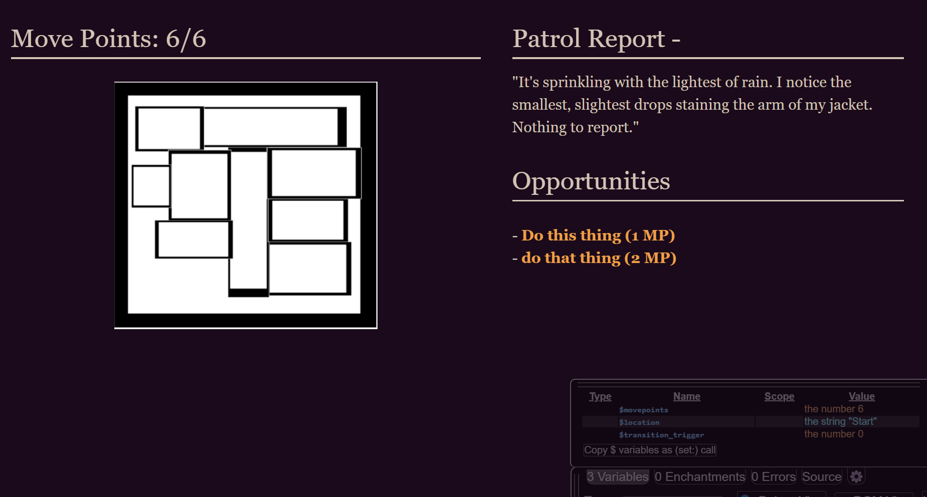
Hi there! I’m trying to create a layout for my game in which there are two columns, and you can scroll in both independently (here’s an example of the kind of thing I’m talking about.). I’m using CSS to create these two columns, rather than Harlowe’s built-in column feature, because it allows for more flexibility with spacing and arrangement.

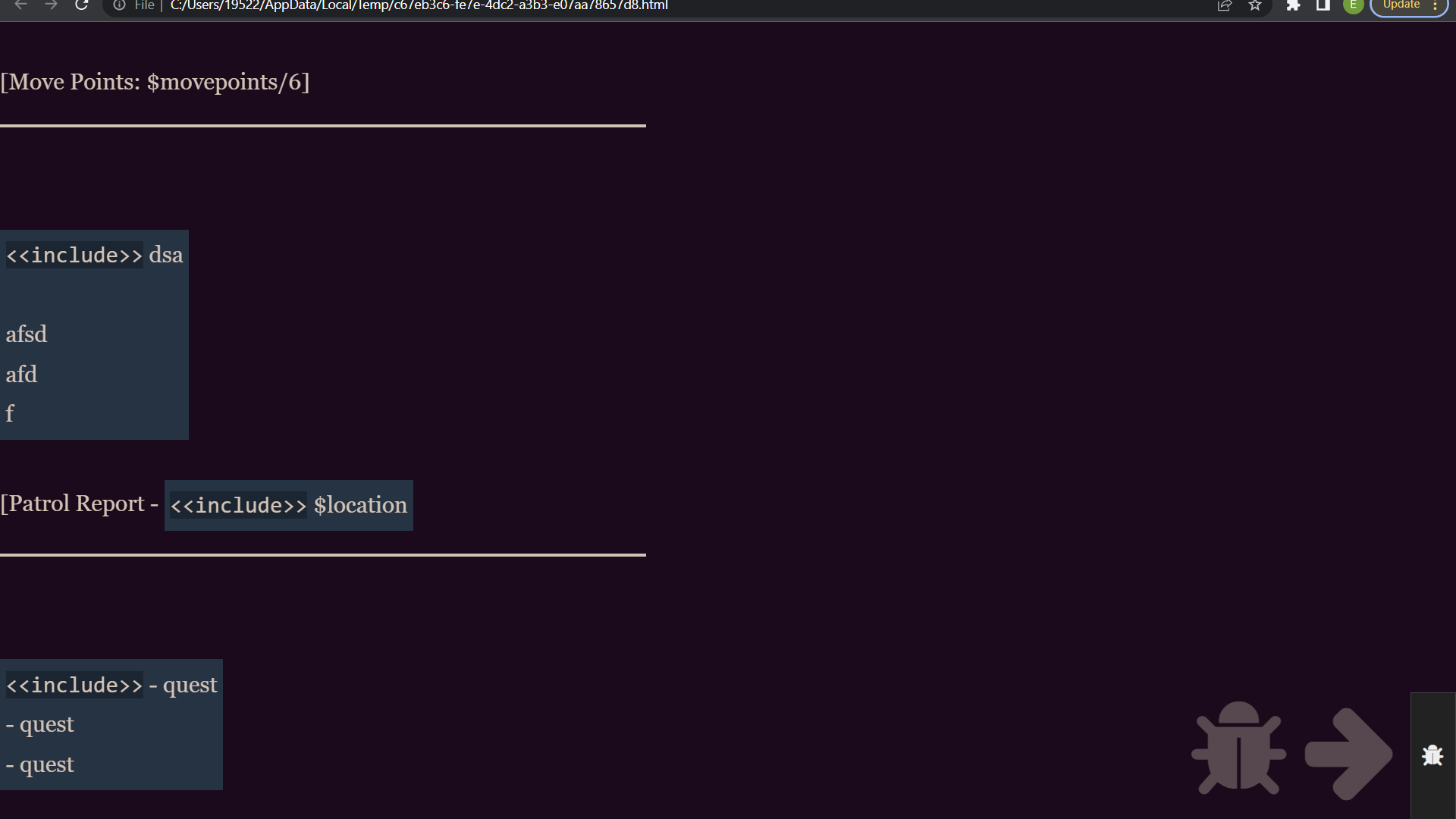
I’ve implemented the two columns successfully. However, no matter what I try, I can’t get them to scroll independently of each other. There’s plenty of advice out there about how to implement independent scrolling columns in regular CSS, but I can’t seem to apply any of that advice to Twine. Whatever I try, it just breaks. For example, the overflow: scroll feature should in theory make the left column scrollable: but instead, Twine just defaults to scrolling down the entire page, rather than just the left column.

I’m also a complete novice to CSS, so there may be some obvious solution I’m missing here. I’m going to dump the entirety of the stylesheet here, in case other parts of my code have screwed something up.

The code for the columns is at the bottom (.leftcolumn and .rightcolumn).

tw-story {
  color: #d6c3b4;
  background-color: #1c091b;
}

tw-link:active, .enchantment-link:active {color: #F2784B}

tw-link, .visited {color: #FF9D3D}

tw-link:hover, .enchantment-link:hover {color: #EB657A}

hr
{
  height: 3px;
  background-color: #d6c3b4;
  border: none;
}


#box
{
float: right;
width: 300px;
padding: 10px;
border: solid;
border-width: 5px;
border-radius: 10px;
}

tw-icon[title="Undo"], tw-icon[title="Redo"] {
    display: none;
}

*
{
margin: 0;
padding: 0;
white-space: normal;
}

tw-story
{
width: 1920px;
padding: 0px;
margin-top: 0px;
}

tw-passage
{
width: 1024px;
margin: 25px;
padding: 25px;
}

#box
{
float: right;
width: 300px;
padding: 10px;
border: solid;
border-width: 5px;
border-radius: 10px;
}

#content
{
float: left;
width: 1500px;
}

.leftcolumn {
    float: left;
    width: 750px;
    margin-right: 50px;
}

.rightcolumn {
    margin-left: 750px;
    width: 675px;

}

#align-center {
text-align: center;
}

You didn’t supply an example of the HTML element structure that the “current” Passage is generating, nor an example of that Passage’s content, so we don’t know what your CSS example is being applied to.

I will base my explanation & sample code on a Passage with content like the following…

{
<div id="container">
	<div id="leftcolumn">
		<p>1. Lorem ipsum dolor sit amet consectetur adipisicing elit. Iure, voluptas explicabo distinctio pariatur nihil esse ipsum dolores ratione neque facilis labore doloremque ullam fugit? Aspernatur reprehenderit neque nam dolore maxime.</p>
		<p>2. Lorem ipsum dolor sit amet consectetur adipisicing elit. Iure, voluptas explicabo distinctio pariatur nihil esse ipsum dolores ratione neque facilis labore doloremque ullam fugit? Aspernatur reprehenderit neque nam dolore maxime.</p>
		<p>3. Lorem ipsum dolor sit amet consectetur adipisicing elit. Iure, voluptas explicabo distinctio pariatur nihil esse ipsum dolores ratione neque facilis labore doloremque ullam fugit? Aspernatur reprehenderit neque nam dolore maxime.</p>
	</div>
	<div id="rightcolumn">
		<p>1. Lorem ipsum dolor sit amet consectetur adipisicing elit. Iure, voluptas explicabo distinctio pariatur nihil esse ipsum dolores ratione neque facilis labore doloremque ullam fugit? Aspernatur reprehenderit neque nam dolore maxime.</p>
		<p>2. Lorem ipsum dolor sit amet consectetur adipisicing elit. Iure, voluptas explicabo distinctio pariatur nihil esse ipsum dolores ratione neque facilis labore doloremque ullam fugit? Aspernatur reprehenderit neque nam dolore maxime.</p>
	</div>
</div>
}

note: Your CSS example removes all the default margins & padding added by Harlowe, so I added the following CSS to the top of my own to achieve a similar result.

* {
	margin: 0;
	padding: 0;
	white-space: normal;
}
@media (min-width: 576px) {
	tw-story {
		padding: 0;
	}
}

1: Disable the scroll functionality of the page, the element, and the element.

html, tw-story, tw-passage {
	max-height: 100vh;
	overflow: hidden;
}

2: Setup the #container element as a 2 column grid that fills the height of the web-browser’s view-port.

#container {
	display: grid;
	grid-template-columns: 1fr 1fr;
	max-height: 100vh;
}

note: An article about using the Grid layout can be found here on CSS Tricks.

3: Setup the maximum height of both columns and enable vertical scrolling as needed.

#leftcolumn, #rightcolumn {
	max-height: 100vh;
	overflow-y: auto;
}

Now when the vertical height of the view-port is reduced to being less than what is needed to display a column’s content a scroll-bar will be enabled in that column.

3 Likes

Thanks so much for your help Greyelf! The code is working and I think I understand what’s going on. I appreciate you taking the time to help me.

Hi Greyelf,

Thanks again for answering your earlier question. Unfortunately, I’m going to have to follow up.

After learning more about some of the issues with audio in Harlowe, I decided to port my project to Sugarcube. Unfortunately, I can’t figure out how to implement the grid layout that you provided here works in that story engine (even after doing research and reading that article you sent). When using the grid layout, the grids won’t sort into separate columns as they would in Harlowe. They just stack on top of each other, no matter what I try.

I’ve also tried using div to create columns and encountered the same issue.

Am I missing something obvious here? Here’s the CSS I’m using in Sugarcube, as well as screenshots of my project in Sugarcube and Harlowe. The Harlowe screenshot shows the layout I’m looking to recreate in SC. (I’d dump the contents of the passage in SC as well, but it seems like the HTML content, like the div’s, aren’t showing up on this website when I dump it into the blockquote).

html, #story, #passages {
max-height: 100vh;
overflow: hidden;
margin: 0;
}

#container {
display: grid;
grid-template-columns: 50% 50%;
max-height: 100vh;

}

#leftcolumn {
grid-row: 1
}

#rightcolumn {
grid-row: 2
}


I’m currently not at a machine with access to Twine but…

If you look at the HTML section of the SugarCube 2.x documentation you will see that the #passags <div> contains a child <div> element with a CSS class named passage

<div id="story" role="main">
	<div id="passages">
		<div class="passage …" id="…" data-passage="…">
			<!-- The active (present) passage content -->
		</div>
	</div>
</div>

…but your above “force the story area elements to vertically fill the entire height of the viewport” CSS rule does not include that child element in its #html, #story, #passages CSS selector.

Try changing the above CSS selector to…

#html, #story, #passages, .passage {
max-height: 100vh;
overflow: hidden;
margin: 0;
}
1 Like

Thanks for the reply, Greyelf. I’ve just tested out the code with the added .passage. I’m having the same issue of the columns stacking on top of each other; everything looks identical to the image I posted above.

I’ve now had a chance to test your new CSS within a SugarCube 2.x based project that had a Passage containing a HTML structure like the following…

<<nobr>>
<div id="container">
	<div id="leftcolumn">
		<p>1. ...multiple lines of textural content...</p>
		<p>2. ...multiple lines of textural content...</p>
		<p>3. ...multiple lines of textural content...</p>
	</div>
	<div id="rightcolumn">
		<p>1. ...multiple lines of textural content...</p>
		<p>2. ...multiple lines of textural content...</p>
	</div>
</div>
<</nobr>>

The following of your rules contains two potential issues…

  1. It needs the .passage CSS class added to the CSS selector.
  2. The margin: 0; setting will remove the default margin-left of the #story ID’ed element, and that left margin is used to create the left blank area that the Left Sidebar is displayed on top of. So unless you are removing the Left Sidebar from your project, or want it to obscure the left edge of the Passage’s content, then I suggest removing that margin: 0; from that CSS rule.

eg. Change that rule to the following…

#html, #story, #passages, .passage {
	max-height: 100vh;
	overflow: auto;
}

There are two reasons why the contents of your #leftcolumn & #rightcolumn ID’ed elements are appearing as rows:

1: You assigned both of them a grid-row property value…

…and instructed #leftcolumn to be in row 1 and #rightcolumn to be in row 2, so the web-browser did what you told it to do.
note: both of those grid-row property assignments are missing a semi-colon at the end of them.

2: You removed the following CSS rule…

…which is needed vertically size each of the two columns, and to allow them to scroll independently.

The following is a SugarCube variation of my original Harlowe solution…

#html, #story, #passages, .passage {
	max-height: 100vh;
	overflow: auto;
}

#container {
	display: grid;
	grid-template-columns: 50% 50%;
	max-height: 100vh;
}

#leftcolumn, #rightcolumn {
	max-height: 100vh;
	overflow-y: auto;
}

…with the grid-template-columns property changed to use percentages (50%) column widths instead of the fr unit based ones I used in the Harlowe example.

1 Like