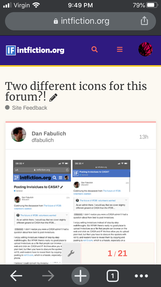
I’m not seeing the Serif one…
(I mean, I can see it in your screenshot, but not on my own screen. Perhaps it’s only in the mobile version of the site?)
I’m not seeing the Serif one…
(I mean, I can see it in your screenshot, but not on my own screen. Perhaps it’s only in the mobile version of the site?)
Yes, I agree, it’s mobile only.
Ah, yeah, it’s on my list of things to get to. Eventually…
I’m actually working on it right now. I think the issue was the words disappeared in the png due to an alpha background.
Yeah, now that you mention it, it also seems weird that the “intfiction.org” text is black on iPhone and white on desktop.
@Dannii - do you have the current mobile logo saved? I created a new one with a solid background that I think will work for mobile.
I made a correction, let me know if anything catches fire, bleeds, or explodes.
The only thing I notice is I didn’t get the square icon sized exactly the same, so it loses the “magic” of the icon remaining and the forum name changing to the thread title when scrolling (it swaps from a wide banner to just a square logo on the left and dynamically inserts the title), but it doesn’t bother me personally. I think when we set everything up initially we were just happy to get graphics working and called it “fine for now”.
Thanks! The icon seems to be the same size to me on my iPhone.
Let me know if there is anything I can do to help. So the mobile version cannot show pngs with a transparent background, is that correct?
Oh, it can. The browser version is transparent so the banner will match any theme’s background.
On mobile originally there was an issue that the banner was white lettering with a transparent background which was usually also white, so it wasn’t readable. That’s why the lettering was black, but a couple of changes got made and we ended up using the original mobile version with the serifs and let it go cause it was working “well enough.”
The main reason we needed a separate mobile logo was that the “The Interactive Fiction Community Forum” subtitle text was too small to read on mobile, so better to just not have it.
Discourse also now lets you set a separate dark mode logo to be used in dark themes.
That is fine, of course. What would it look like with a black background in the dark theme?
It would look like a black background in the light theme. ![]()
Kidding aside, there is code to have alternate art for the official dark theme, but we have multiple other themes installed that don’t switch the art.
I kind of like the blue and gravitate to darker themes, but if it bugs people enough, we can certainly take a look at it. Right now it’s not interfering with the forum operation, but the thing @dfabulich pointed out was totally a cursèd “can’t unsee” thing.
[EDIT] ohhhhHHH. Because I’m in a dark theme, I didn’t realize the graphic you gave me had an opaque black background, I’m sorry @Angstsmurf! I’ll try it.
I still think there is some confusion here. The graphic does have a transparent background, so it should be white on blue in the light theme (because that theme has a header with a blue background) and white on black in the dark theme. If that doesn’t work or if you prefer it the way it is, it is no big deal.
Okay, thank you @Angstsmurf, I apologize for misunderstanding. I think I’ve got it corrected now - if you refresh the page it should be consistent white lettering on mobile with a transparent background.
I have a couple thousand tabs open (not hyperbole) so I can’t see the icon anyway.