They work, but they’re not a huge improvement than the original IMO.
Do you not like the two lines of text?
They work, but they’re not a huge improvement than the original IMO.
Do you not like the two lines of text?
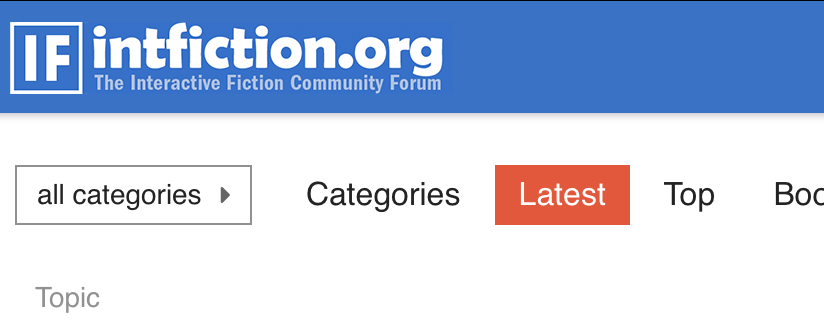
The suggestion in the old thread was that black and white text in the same banner looked “cluttered”.
I actually put one of these as the email digest banner.
Fair enough!
Well my only concern is that if we just have the full name at a larger size the logo will be far too wide. It only works as it is now because it’s a smaller font size than the domain name part of the logo. But I wouldn’t want only the full forum name at it’s current size either…
I saw the black-text version is set as the mobile banner which is a good idea.
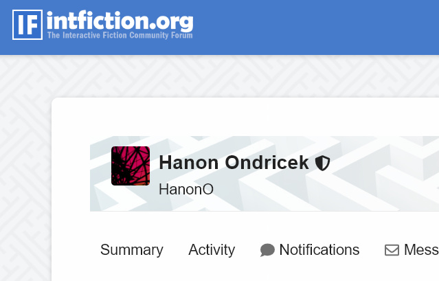
I agree that it feels a bit cluttered as it is right now, but it would probably work if the “intfiction.org” text was slightly larger and the “The Interactive Fiction Community” slightly smaller and with different colours, perhaps more like in the subject banner I see at the top right now, but with “intfiction.org” in white at the top and “The Interactive Fiction Community” darker below:
I can definitely try something like this. But… another day. 
Dannii is probably real tired - he was up “all night” for us in the US working on this, although in his time zone it was daytime!
Yeah, sorry if this came off as another complaint. All in all, I really like the new forum.
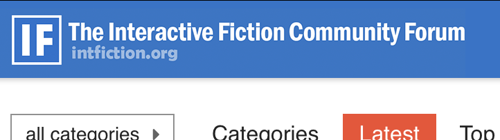
Just one last mock-up. In general, I think it is harder to make something look good with this much text.
EDIT: Or perhaps rather like this:
I like them both, but adding the word “Forum” at the end reduces that line so small that it’s almost superfluous.
The font is a little…whimsical. 
Well, it definitely has more personality than mine. I quite like it.
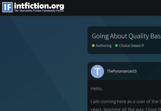
Recommend against using black on the dark blue header background. It’s very hard to read, especially when the image appears at just 39px high. A much-lightened version of the blue would be an option that doesn’t introduce any new tonalities but will both show up well against the background and be distinct from the white text.
I guess the big question is do we want the “I” to have serifs or not!
Light blue could work well Erik, thanks for the suggestion.
I don’t have any strong opinion on the serifs. The main reason that I changed the IF logo in my mock-ups was that I thought the original looked stretched vertically. When I tried to improve that, I had trouble getting the I and the spacing around it to look right, so I ended up removing the serifs altogether. Perhaps it would look nicer with a thicker border or thinner letters.
It is stretched currently… the CSS is making it less wide by 1 pixel I think.
I think it looks better without the serifs, but either way thanks for all the hard work setting the new forum up. 
Right, here is another attempt at a banner png, this time with transparent background so that it works with the dark theme as well:
This is how it would look in place:
The obvious problem is that the small text is still just a bit too small. I think this is just too much text crammed into too small a space. Something like this might look better:
That would make the image wider, however (unless we cut the “Forum”), and I guess we are stuck with the current size?