Dear fans of interactive fictions,
I’m currently exploring Twine and Sugarcube, and I’m trying to change the appearance of a listbox area. I’ve found a problem I can’t solve despite an internet search. I’m pretty sure the problem already has been addressed, though, don’t hesitate to link the answer, maybe I did not find it because I’m not searching with the right words.
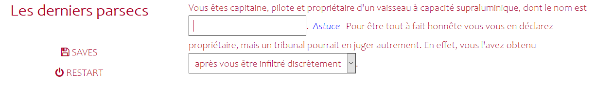
Here’s what I get:
Right there all sounds good.
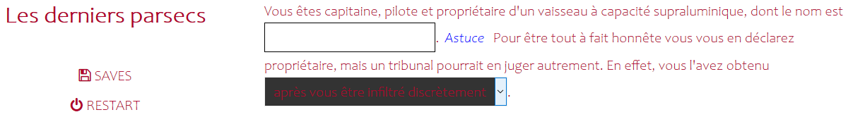
However when I hover my mouse on the listbox area here’s what I get:
Of course I want to change the listbox area background color to something lighter.
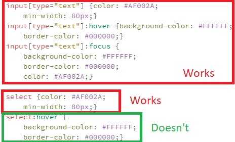
I’m using css to modify. ‘Select’ object does something good while there’s no hovering, and I’ve tried to use the same styling I used for text areas, but there’s seem to be no ‘select:hover’ recognised object..
Does someone know what i’m looking for? (And does this someone be kind enough to share?)
note: Please don’t use screen shot images when suppling code examples, doing so forces those that want to test your code to have to manually type those examples into their own test projects and that can result in them testing code that is different to your own. Instead use the toolbar’s Preformatted Text </> option and copy-n-paste the actual code into your comment.
It appears you have used custom CSS to alter the default White-on-Black colour scheme to a Red-on-White one, which is likely why you still have White-on-Black defaults hanging around.
If you want such a colour scheme then I suggest using SugarCube’s Bleached stylesheet as a starting point, and then change its default Black text colour to the Red text colour you want.
A link to the Bleached style sheet can also be found on the main page of the SugarCube 2.x site.
1 Like
Thank you Greyelf. You’ve taken the time to understand my problem and offer a way to solve it, something I really appreciate.
I take note save screens are less helpful than preformatted text. As a matter of fact I didn’t expect someone to try what I already deemed as not working, but I now realize people may want to tweak the original code before replying to queries.
I notice you didn’t directly answer my question, it probably means it’s a roadblock, or at least that what it takes to solve the problem is really complex. However you offered a way to turn the roadblock, so you did help me, many thanks.
I apologise that I wasn’t clear enough in my previous comment.
note: Make a backup of your existing custom CSS before doing the following, so you can use it later as a guide later when updating the SugarCube Bleach colour scheme to look more like your existing custom styling.
1: Replace the existing custom CSS in your project’s Story Stylesteet area with the contents of the CSS file contained within the Bleach ZIP file. This will result in your project changing from the default White-on-Black colour scheme to a Black-on-White one.
2: Search through the above CSS for each color: #111; line and replace the default Black #111 value with your custom Red #AF002A; value, there should be nine occurrences you need to replace. This should result in all the existing Black text now being Red, including the items within a dropdown.
eg. you would change the color: #111; line in the following body rule from…
body {
	color: #111;
	background-color: #fff;
}
…to…
body {
	color: #AF002A;
	background-color: #fff;
}
3: Preview the final result of all those Black to Red changes, and update anything else that needs changing based on the contents of your backup!
2 Likes
Just wanted to add some info regarding specifically the select:hover aspect: it seems that “[t]he <select> element is notoriously difficult to style productively with CSS” in general, apparently because elements of HTML Forms were treated differently than other HTML elements (historically, “browsers relied on the underlying operating system to manage and render form controls”).
“Some elements can’t be styled thoroughly using CSS. These include:
[…]
Elements involved in creating dropdown widgets, including <select>, <option>, <optgroup> and <datalist>.”
(Quoting from the Mozilla Web Developer Docs at <select>: The HTML Select element - HTML: HyperText Markup Language | MDN and Styling web forms - Learn web development | MDN).
From a cursory look on the web, I think the alternative would be to construct your own element “by hand”, as in this link (or include a third-party solution), or, relatedly, implement a CSS dropdown which doesn’t need extra JS code as described at CSS Dropdowns or at Solved with CSS! Dropdown Menus | CSS-Tricks.
But I don’t know how well or how easily one could integrate these into Twine/Sugarcube.
So, I agree with Greyelf’s suggestion to tweak the “Bleached” CSS, which should result in a dropdown box/select that fits more-or-less into your colour scheme and is well readable.
1 Like
Thank you Greyelf and StJohnLimbo. You are very helpful!
Edit-
The bleacher css is awesome for people who wish for a white background. I looked into it and it gave me the exact coding I needed instead of my failed try of select:focus and select:hover.
select {color: #AF002A;
	min-width: 80px;}
select:not(:disabled):focus {background-color: #FFFFFF;
	border-color: #000000;}
select:not(:disabled):hover {background-color: #FFFFFF;
	border-color: #000000;}
select:not(:disabled):focus allows to choose appearance when the box is the active element, while select:not(:disabled):hover allows to choose appearance when the mouse hovers over the box.
It seems neither /…/ nor </>…</> do what I had expected.
In the forum software? The </> refers to the button in the toolbar, as Greyelf mentioned; here’s a screenshot:

That toolbar button will insert backticks (`), which will preserve the formatting of any text/code enclosed by them, so that it looks like this:
select {color: #AF002A;
min-width: 80px;}
select:not(:disabled):focus {background-color: #FFFFFF;
border-color: #000000;}
select:not(:disabled):hover {background-color: #FFFFFF;
border-color: #000000;}
It’s a bit confusing, but the </> symbol is not meant to represent a tag which allows you to include preformatted code following it (that role is played by the backticks instead). The symbol is rather intended to represent a tag which is allowed to occur inside of the preformatted text (because the backticks allow such tags, as in markup languages etc., to be displayed, otherwise the forum software would eat them). (At least I assume that’s what led to the decision to use </> for the button’s label.)
1 Like
Thank you! I failed to read correctly what Greyelf wrote.
1 Like
You’re welcome! 
And no worries, many people overlook that button at first, it’s easy to miss.