Twine Version: 2.5.1
Story Format: Harlowe 3.3.3
This seems like a rather basic question, but I cant find anything on this. I want my text to all have a slight outline of white to improve readability. Is this possible?
Twine Version: 2.5.1
Story Format: Harlowe 3.3.3
This seems like a rather basic question, but I cant find anything on this. I want my text to all have a slight outline of white to improve readability. Is this possible?
This was a great question because CSS actually lacks a spread value for almost all of its shadow features. So I played around and found that a combination of filters can achieve a nice look.
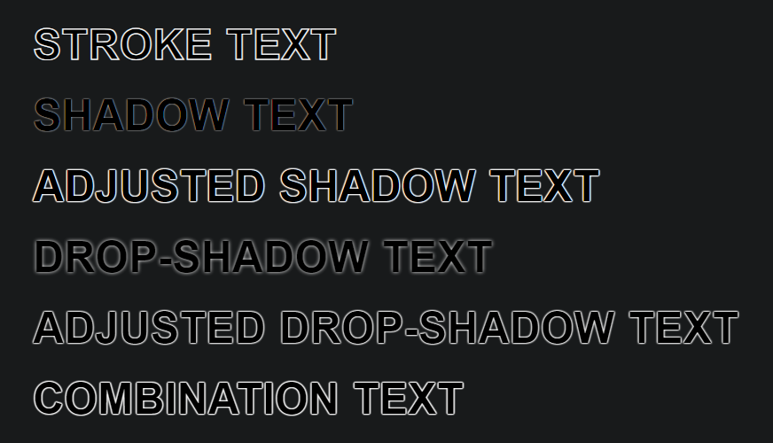
The code that generates the text above is as follows:
<style>
p {
	font-family: sans-serif;
	font-size: 2rem;
	font-weight: bold;
	color: black;
}
.stroke {
	-webkit-text-stroke: 1px white;
}
.text-shadow {
	text-shadow: 0 0 2px white;
}
.text-shadow-multiple {
	text-shadow: 0 0 2px white, 0 0 2px white, 0 0 2px white, 0 0 2px white, 0 0 2px white, 0 0 2px white, 0 0 2px white, 0 0 2px white;
}
.drop-shadow {
	filter: drop-shadow(0 0 2px white);
}
.drop-shadow-multiple {
	filter: drop-shadow(0 0 1px white) drop-shadow(0 0 0.5px white) drop-shadow(0 0 0.5px white);
}
.combination {
	text-shadow: 0 0 2px white, 0 0 2px white, 0 0 2px white, 0 0 2px white;
	filter: drop-shadow(0 0 0.5px white);
}
</style>
<p class="stroke">STROKE TEXT</p>
<p class="text-shadow">SHADOW TEXT</p>
<p class="text-shadow-multiple">ADJUSTED SHADOW TEXT</p>
<p class="drop-shadow">DROP-SHADOW TEXT</p>
<p class="drop-shadow-multiple">ADJUSTED DROP-SHADOW TEXT</p>
<p class="combination">COMBINATION TEXT</p>
If you view the screenshot at full size, you’ll notice that the text-stroke property applies a line drawn over top of the text. This is not good if you have small text because the stroke will cover the text entirely and it’ll be completely white. We want the outline to be behind the text ideally.
Windows (and other OSes) like to automatically use text enhancement filters to make text pop. You can’t shut this off due to accessibility reasons. Hints of blue and orange sub-pixels are used, but using multiple text-shadow properties makes this hue business a bit more noticeable. Again, not ideal. The single text-shadow text looks absolutely terrible to me.
Using multiple drop-shadow filters is tricky because it blurs the previous blur and the effect compounds instead of adds. You can use decimal values for pixel blurs, but I think that might be a bit tricky to pull off well. Still, there might be a good combination to discover from that.
In the end, I tried a combination of the text-shadow property and drop-shadow filters. I found the result pleasing within my first few attempts. You might have to tweak it a bit depending on the font and size of text you are using, but I hope I’ve put you on the right path.
Let us know if this helps… and have fun! 
Edit: I also found this interesting technique using pseudo elements, but it’s a lot more complicated to implement, but who knows?
https://www.petercarrero.com/examples/stroke/
Another Edit: With smaller text, you might not like it if the outlines touch each other too much. Again, I’m not sure of the font and size you’re trying to deal with. However, you can use 3 other CSS properties to help with readability:
Note: Only variable-weight fonts support "wght", but that allows you to tweak the thickness of the font being drawn. It’s amazing for fine-tuning readability. I use variable-weight fonts as much as possible; Google Fonts is a great source for those.
Holy hell! This was so helpful, thank you so much! I’ve tweaked it to perfection, and now have a nice shiny outline around my words. Thanks again for taking the time to do this! 
Glad I could help!
One last thing I forgot to mention is that the text-stroke property can be used as a poor man’s font weight. Use a decimal value of px and the same colour as the text (or background) and you can fake a thicker (or thinner) font. This would require a bit more testing across different browsers and devices though, but used in conjunction with the spacing letter/word properties, it can transform certain fonts from being average to being amazing.
There’s a lot of care and attention that can be given to the legibility of fonts that most authors overlook.