Styling Inform 7 Games

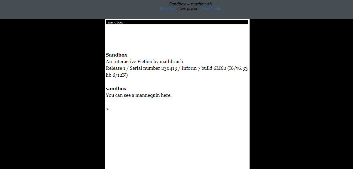
Given the recent discussion of unstyled Twine games, I realized I haven’t really styled any of my Inform websites—I’ve just used whatever default style Inform produces. So over the past couple days I spent a while hacking at templates and stylesheets to see what was involved in making my own style.

Here’s the result: Styled.zip (5.5 KB) Unzip this into your Inform templates folder (for me it’s ~/Inform/Templates), and you can now release with a “Styled” website. By default, this will make a few changes to the “play online” page (leaving all the others untouched). It’ll switch that page to Zarf’s one-column template, add the interpreter version number to the footer, patch over a bug with the scroll bar, and add a “dark mode” switch at the top. Which is an improvement in and of itself, in my opinion!

If you want to customize it further, though, crack open the file custom.css. This is what sets all the colors and fonts used by the game. By default, it has these settings:

/* Default Parchment style */
--light-fg: #222;
--light-bg: #fff;
--light-input: #0b4c8e;
--light-body-fg: #000;
--light-body-bg: #fff;
--light-header: #eee;

/* Based on GarGlk's Slate Darker theme */
--dark-fg: #e7e8e9;
--dark-bg: #232629;
--dark-input: #74abff;
--dark-body-fg: #fff;
--dark-body-bg: #000;
--dark-header: #464d53;

--normal-font: Georgia, "AsyncGlk Serif", serif;
--mono-font: "Lucida Console", "Lucida Sans Typewriter", "DejaVu Sans Mono", monospace;

--header-size: 72px;
--footer-size: 24px;
--game-width: 600px;

That’s the foreground, background, and input colors for dark mode and light mode (plus the body foreground, body background, and body header colors for the scaffolding of the website), the normal and monospaced fonts, and the size of the header, footer, and game window. You can modify these to your liking to give your game its own feel, without having to dig into the full CSS of the page as a whole.

As an example, I swapped the red and blue channels of these colors to produce an “ECTOCOMP” template, with warmer colors and dark mode as a default: ECTOCOMP.zip (5.5 KB). And see it in action.

It’s very possible I’m behind the times, and everyone who wants to style their games has already been doing it. But I’m not very good at CSS, so having this template will definitely help me make my games look a bit more distinctive when played online, instead of always being serif black-on-white.
14 Likes

Note also that the Parchment template does support Glk text styles (and the Glulx Text Effects extension), though the Quixe template does not.

You can also directly set GlkOte’s CSS variables. All the options are in this first file, while the two Parchment themes follow:

3 Likes

Yep, that’s pretty much what this does: it sets --glkote-buffer-bg and --glkote-grid-bg and --glkote-grid-buffer-reverse-fg and so on to either --dark-bg or --light-bg depending on style. I just wanted to cut down the number of variables needed, since my main use case is just tweaking the foreground and background colors all at once.

But of course there are a lot more parameters you can tweak if you feel like it!

2 Likes

Nice, Daniel. (I’d missed this thread when it was new.) I’ve found it surprising how few custom website templates people have made public. Offhand I can name just one other, Iridium.

2 Likes

After reading about website templates today, I tried this and Iridium out.

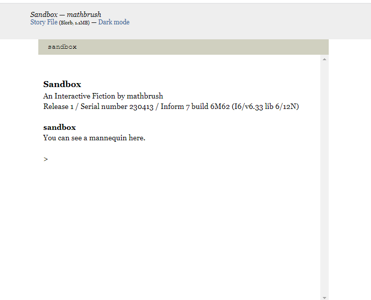
I had one difficulty: just using a “Styled” interpreter with no other changes, I get this:

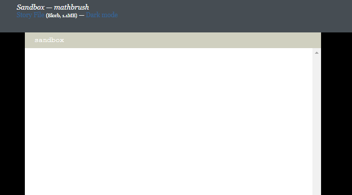
but clicking on dark mode gives me this:

i.e. the text disappears. When I type I can see my typed words in black, but not the previous text.

Looking at your ectocomp in-action template, I see the colors change smoothly. Does this behavior happen for you? (a barebones Styled game having white on white text), or is it a problem with my computer?

Odd, it says it’s a “dark mode” theme but that’s not dark at all. Random know-nothing-about-this-stab: Is your computer theme/color scheme perhaps overriding application coloring? I’ve noticed that happens since my Mac is set to prefer dark mode - I get some wild combinations in the I7 IDE.

1 Like

Do you see the same results with Daniel’s live example with Engima ?

1 Like

No, that one is perfect, light mode and dark mode transition seamlessly back and forth between dark-on-light and light-on-dark.

Are you using Quixe or Parchment? Dark mode probably only works with Parchment.

1 Like

Quixe! I’ll try changing to Parchment.

This is what I get now. No transition in the middle column, just the outside:

(compiling to use z-code and using the Styled website)

Hmm. I put this template together at the last minute for ECTOCOMP, so it didn’t get the stress-testing it may have deserved. Could you post your basic game so I can poke at it? (Just zip up the whole release folder.)

1 Like

Definitely! Just stepped east from the computer for a while for something but I’ll post it right when I get back.

I think templates are great and didn’t know about them until today, so your template is wonderful. I appreciate trouble shooting help, and I’d like to try and get a whole collection of templates from different people (kind of like our forum themes).

3 Likes

Okay, here it is:

Release.zip (474.8 KB)

1 Like

I just went to use this template, but I’m having the same issue with the dark mode switching! Brian/Daniel, did either of you ever figure out what was up?

1 Like

I don’t think I ever did get it running, unfortunately :frowning:

1 Like

Hm, damn. When I get I7 set up again I’ll poke at it again.

1 Like

Reading through this thread, I had to chuckle when mathbrush “stepped east from the computer”… I’m going to start saying things like “put dishes in sink” in real life and see what happens. I’m going east now.