And maybe an option like “press space to toggle links on/off” instead of having to hold some modifier, too.
1 Like
Yes, so the default would be to hide the hyperlinks so that the text read normally, without the visual “noise” of the links messing up the initial reading.
Either holding down the modifier key, or touching the text once would reveal all the hitherto hidden links. Clicking on one of those links (either by mouse or by fingertap) would open that link, but all the links would revert to being hidden. (If the player was still on the same page because the link had just added another paragraph, I don’t think it would be a problem: most people would be able to recall that say, Mr. Proctor, the tree and the mysterious stone had all shown up as links, and could directly click on them, although they could still use the mod key or touch to confirm if they wanted.)
Hitting the spacebar would permanently toggle links as visible/hidden. What about mobile/touchscreen users? Two-finger tap to bring up the alt-menu on any link and select “keep links visible”? I don’t know enough about the different capabilities of iPhone, Android etc. to guess what would be simple to implement and what would be impossible.
1 Like
I feel like this discussion has moved into a shaky design area.
You’re imagining that a player would read the text as text, then use the modifer to highlight links. But why do you think a player would do that?
You’re making the player do extra work to see what’s going on in the interface. I’d say a lot of people would keep the highlights visible all the time. Does the game play well that way? If the answer is no, are you going to try to prevent the player from doing it? If yes, why not make it the default and avoid this whole swamp?
The underlying assumption seems to be that finding links is tedious but it’s also the core action of gameplay. All this messing around with highlights feels like trying to paper over that problem.
4 Likes
I think this originally started because people dislike having the answers given to them about which items in the story are important and which aren’t. They miss scouring the text and examining every noun. But to me, that’s just unnecessary busy work.
When I see a room description in a parser game, you better believe I examine every noun, and then every noun in the examine description, until I run out of things to examine. Hypertext is just streamlining that by making them clickable links. The sense of discovery and exploration is from reading the description, not monotonously scouring the text for objects. Not to me anyway.
Whenever a point-and-click adventure game lets me toggle on highlighted objects in the room, I do it for the same reason. Nobody enjoys pixel hunting unless it’s a hidden object game.
2 Likes
Has Texture been mentioned? The words that can be interacted with are not highlighted until a verb has been grabbed at the bottom. I think it works really well with this system of draggable verbs.
But for regular hypertext IF, it may not work as well.
(We’re going a bit off the original topic, aren’t we?)
Ah, I missed that. The design issue I was thinking of is that links are distracting in the same way that footnotes are. You want to go see what it’s referring to right now and it breaks the flow of whatever you’re reading. So if you have a piece of text a player might prefer to digest without distractions…
I guess putting all your choices in a menu after the text also sort of addresses this issue, and lets players skip the body text and read only the choices without having to muck around with extra controls. ![]()
1 Like
That’s kind of an issue with the player, not the system though. I don’t think I’ve ever heard anyone discuss a method of preventing parser IF players from examing objects in a room before they’ve finished reading the text. It’s just up to the player to show a little self-restraint.
2 Likes
The thing is that a block of hypertext is doing two things. Firstly it’s giving the player the story readthrough, and then, after that, it’s giving the player the navigation interface – the links. My own personal experience of reading hypertext is that it’s fine for technical reference (where having a list of sub-references visible as I’m reading it is useful) but fails as a story delivery medium because the links mess UP the rhythm of the prose. I’m distracted from appreciating the story because the navigation interface keeps butting in.
Sure, I don’t doubt that many other people would elect to keep the links visible all the time – that’s their choice. But at present I don’t have the choice of suppressing the visual elements that I find distracting, except by styling links to be indistinguishable from the ordinary text. Doing that introduces the (to me) unacceptable cost of turning the game text into a pixel hunt.
2 Likes
I guess we’re just going to have to agree to disagree on this one, because I don’t see how a couple colored words makes something fail as a story telling medium. I will agree that some (like default Harlowe format of Twine) present the links in a really jarring way though. That’s what CSS is for.
Edit: Decided to remove my example because I’m sure nobody cares about my stupid game. ![]()
1 Like
I can only report on my own idiosyncrasies here, but: For me, since the command prompt is at the bottom of the text, I tend to read through the text that has printed before I type my command. (And sometimes I get snarled because by the time I type the command, I don’t have all the text inside anymore.) But since links are often in the text, I go straight to the link and may not completely absorb the text as something to read.
I’m not saying people need to design around that, and maybe as you say that’s an issue with me rather than with the medium, but I do see why some people might want the links to be recessed a bit so they would be more encouraged into a read-everything-first-then-find-the-link sort of loop.
Jay Nabonne’s Spondre actually pulls off “you can click on any and every word in the text” and it’s a fascinating experiment created in Quest. Some of it is probably default random responses, but otherwise clicking an interesting word pulls up potential interactions.
1 Like
Fair enough. Different people find different things annoying to different degrees. For example I find the conventions of opera intrusive to the point of ruining my enjoyment, but obviously all those opera fans don’t! Thanks for an enjoyable discussion.
1 Like
Thanks for the good read, guys! I used to have thoughts on this as well a few years ago, but I haven’t really refreshed my ideas on it in a while.
Like zarf, I also thought that hiding the clickable words would be more detrimental than not – but then I thought about the contrastive effect of seeing a passage unmarked and then marked, sort of like addressing player expectations not just temporally (which is text’s default mode), but also sort of spatially; or having the effect of a reread through the lens of the now-visible interaction hotspots, with the author thinking of a way to play around with the esthetic effects of that.
I can see how it would make slightly longer passages possible for a reader like me, who likes his static fiction long and his interactive fiction in short bursts of text. There doesn’t even have to be a dedicated button for it. In Twine, a custom macro from @Chapel’s excellent set allows for addding onto a passage with a click anywhere on the screen (or a random keypress), which could immediately change the styling of a word or attach a number of choices underneath the passage.
On that not, I remember, from my previous musings, how I used to be unhappy with the wording of choices themselves, and how often it partook of parser in terms of simply combining a player action with a rewording (or a straight-up repeat) of something from the text. Choices, I thought, could be made to give additional information on elements not mentioned in the passage, either teasingly offering a preview of what’s to come, or as a slight extension of the story relevant to the particular choice, a bit of an in-between passage, like what Failbetter do with theis. I also remember that Jon Ingold, in 2013 I think, wrote how the set of available choices themselves could provide an overarching effect when taken in together – which could also be played around with, presenting a couple of similar choices and one qualitatively different, or other kinds of combinations.
All of this is sort of adjacent to another thing that I’ve been thinking about: I believe that, like in any genre, there are certain prose-writing constraints and allowances particular only to hyperlink/choice-based text. How long? How many focal points? What kind of style? What kind of salient information? Does any one of you have thoughts on this?
3 Likes
This is basically copied from a comment that I decided to edit out earlier, but I have a style that I’m toying around with that is appealing to me. I’m hoping to release a proof of concept soon to see if others agree that it’s enjoyable.
Anyway, the way I like to do my links and choices is I try to make the links as muted as possible while still being visible (colored to be only slightly darker/lighter than the story text). All actions a player can do are listed below as clearly defined choices. Links in the blocks of text are examine only. If you can interact with an object, that choice will be listed after its description on the examine screen. I think this looks pretty good and is intuitive.
There’s nothing more aggravating to me than when there’s a link for “apple” in the story text, and you’re like “What kind of action will I do with the apple? Look at it? Eat it? Throw it? Squash it?” and then you click on it, and it’s like “Of course! I bludgeon my puppy with it. I should have totally known that was the outcome.”
Stuff like that isn’t artsy; it’s annoying. I think actions should be written out so you know what will happen.
5 Likes
Yes, I think it might even be worth spelling out to the reader/pc the conventions that the piece has adopted, so that it’s an explicit contract between the author and the player. Hopefully the player will then trust the author sufficiently that they won’t feel compelled to lawnmower all the links just in case new information has popped up.
2 Likes
~heh~ I “hear” this too sometimes when I read. If you’re a reader or a writer who cares about scansion, yeah it messes you up. (Unless maybe you can work it into your scansion… hmmm…)
This helps. Also, keeping the links in the text to the bottom paragraph of a passage. I’m always confused when a random noun in the first paragraph is clickable, then three paragraphs of straight prose, then the final paragraph with two or three links. I’m confused, and it like eats up my short-term memory keeping in mind a choice scrolled off the screen.
One point in favor of non-parser works I’ve noticed this week is that a link-based system (either in-prose links or the bottom menu of choices kind), are very mobile-friendly since the keyboard doesn’t eat up half the screen. Quixe keeps that keyboard showing at all times. With one exception of a very long passage, where it’ll pop the second the bottom gets close to the prompt. Please, Quixe, wait until I touch the command prompt’s line to pop a keyboard. It’s hard enough to scroll back re-reading my compass direction inputs so I can retrace my steps without doing so in an itty-bitty window.
Are there any works that use a 2-touch or 3-touch bottom menu? Like, a menu showing 5 verbs, then an immediate second window showing 5 nouns, then a 3rd showing a few ‘second nouns’, which combined give the combinatorial explosion of most parser games without the actual keyboard?
3 Likes
this is also a hugely common complaint from players with zero experience in IF. the general effect is analysis paralysis, not illumination, adornment, or elevation. i think that’s a lot of why, even for twines that did include a lot of intertextual links (whose scansion gets even weirder on screen readers, just imagine it saying LINK or BUTTON instead of the visual interference), there was a pretty solid correlation between relative page Y and the “physicality” or “agency” of the choice. same goes for link position in a sentence. first or middle word, probably flavor, last word, more likely an “active” choice. as i’m sure you can imagine, that works about as well for non-IF players as relying on them knowing the entire standard inform response set.
it’s also pretty clearly why, after a decade or so running the biggest commercial pure-IF company in the western market, choice of games/choicescript still does the simplest possible thing – all the choices sit outside the “body” of the text content, as clearly intentional decisions or foci.
5 Likes
If you’re curious, this is how my concept ended up turning out. Like I mentioned, actions to be performed are listed as links at the bottom and the links in the prose are only for examining (which can lead to an action to perform on the object upon examination).
This is taken from my phone. The font sizes and such are slightly different on PC.
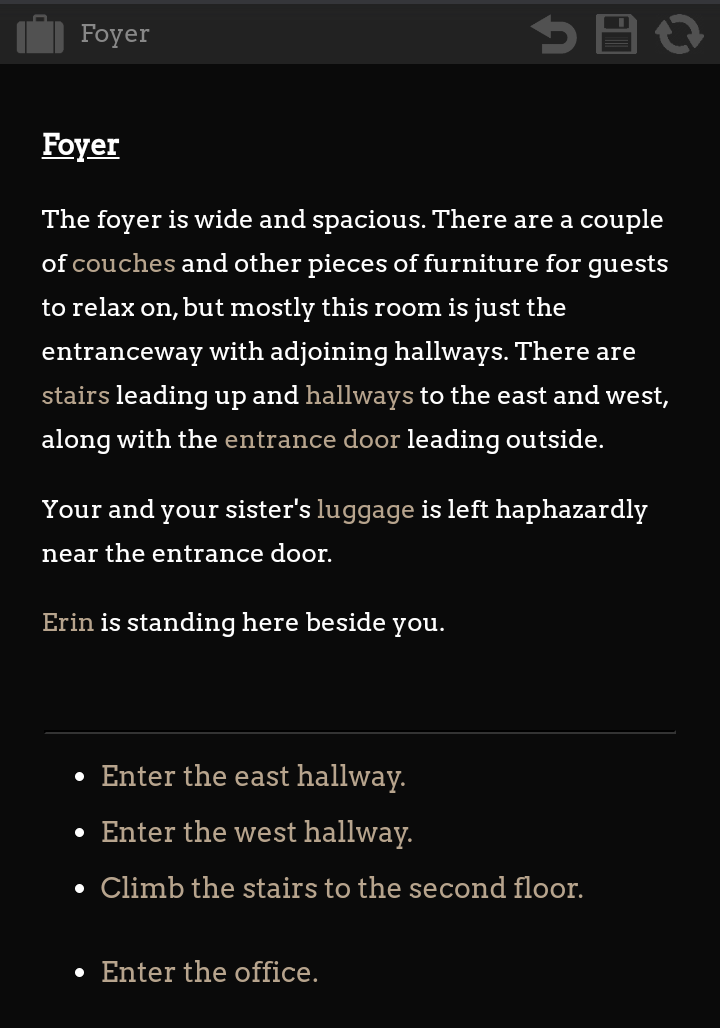
Edit: @fos1, I’m curious what you think of the link colors now. I changed them based on your comments. Are they easier to see?
5 Likes
Looks nice, and very similar to what AXMA does. I could see holding to a convention that in-line links are “examine only” with pop up windows and the bottom links are for more decisive actions, but I break that all the time.
3 Likes
Hey! Dark mode! 
A serif font, huh? Am I the only person who dislikes why so much I-F seems to love serif fonts? They look busy to me. This forum uses sans serif for body text, and it seems normal.
I still get the scansion issue. But the text is still prettier using understated sepia rather than BIG BOLD BLUE.
(Also why spend so much text describing room exits when they’re already listed in the choices?? I hate reading a paragraph of room exit descriptions. Which you’re not doing here, but a comp entry had a room with like seven exits, and my eyeballs just melted.)
Do you have a link to the game? I’ll give it a whirl. Seems like the lines will be too close together for fat fingers on mobile.
I do like the horizonal line, and the bullet points. The bullet points ensure I won’t mistake two options for one. I had that issue with another comp entry. Clicked the only link offered, but only half of it blinked color on click. I don’t even know what the other option was. (When there’s one long option, why read the whole thing? There’s no choice…)
2 Likes