In a game, the statusline goes at the very top of the screen, but I made three different ones on the same screen for comparison. What we want to display is the name of the location, the current score, and the number of moves. We want as much clarity as possible, but we also want to leave as much space as possible for long location names, and we don’t want to use two lines. On wider screens, we print out “Score” and “Moves”, but not on these narrow screens.
Which one do you prefer?
Early Infocom games all used Alt A. Is that in itself a reason to use it?
Good question. (This reply may be more information than you need, but I’ll make it verbose for the benefit of others who read the thread)
PunyInform is used to produce Z-code games, typically using Z-code version 3, 5 or 8.
For Z-code version 3, drawing the statusline is a task that is left to the Z-code interpreter, e.g. Ozmoo. The game and library can’t affect how it looks, except decide if it should show Score + Moves, or Time.
For Z-code version 5 and 8, it’s up to the game to draw the statusline. Unless the game author decides to create a custom statusline, they get the PunyInform default statusline.
Currently, Ozmoo uses Alt A for z3 games, and PunyInform uses Alt A for z5 and z8 games. Both Ozmoo and PunyInform choose different layouts depending on the screen width, but Alt A is what they both use for screens that are ~40 characters wide.
We’re considering changing both Ozmoo and PunyInform.
I vaguely recall playing ancient Infocom games on my Apple ][ clone and it was just 123/4567. If you’re not sure which is which, notice which one goes up every turn
I suppose another option is to make the display slightly adaptive depending on how long the short object description of the current room is.
123/4567 if the text is really long and fewer than three spaces remain between the two, otherwise maybe Sc:123 Mv:4567 if there’s room?
Here’s another vote for 123/4567 format. If the concern is to save as much space as possible for location names, then it seems a no-brainer.
It’s like, we know what the numbers stand for - and even if, in the beginning, we don’t… we learn really, really quickly. Having that label there all the time becomes unnecessary fast.
EDIT - This would probably not be a good idea, but usually, when there is an option between various formats, and there is a good reason for having each of them - doesn’t have to be a great reason; in this case, “clarity” versus “economy of space” - I advocate including more than one option and giving the player the ability to toggle between them.
Again, I don’t think this would be a parricularly good idea here, but it’d be remiss of me not to at least bring it up.
The concern, as always on 8-bit computers, is to strike a balance between several goals, in this case making room for long location names and at the same time showing score/moves information in a comprehensible manner.
The PunyInform default statusline routine can currently show five different layouts, depending on screen width:
Location Score: 123 Moves: 4567
Location Score: 123/4567
Location 123/4567
Location 123
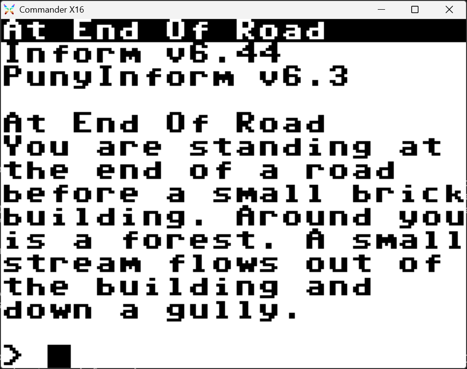
Location
Then it has other layouts, if the author has decided not to show score, or not to show moves.
Here’s PunyInform Adventure, in the glorious 20x15 screen mode of the Commander X16. In this case, the statuline routine opts for the most bare-bones statusline option.
I have to say, it’s rare that I care or cared about the number of moves. Is this just me? Was the turn count culturally bigger in the UK or European games than the USA games?
Apart from a competitive or optimisation aspect, is it just that without one, you could kid yourself the game isn’t advancing? (because the text was sparser in those days.)
Being an Apple II head from Australia, my home base in text adventures was the American ones.
Also, historically, when you won or died, your score and number of moves were deemed to be important metrics that were repeated to you then in the main text.
(Along with usually assigning you a rank based on your score)
Yeah, I betatested a game and I was like “the goalpost keeps moving!” and the author informed me that, yes, that is intended behavior, but the goalposts are not moving.
@fredrik I agree with the sentiment that using / denotes out of. Like, 4/5 doctors agree on something.
For a compact presentation, maybe try something like 123 : 4567 or 123 | 4567 and forget score and move labels. The numbers will make sense after a couple of minutes and then the player isn’t annoyed with excessive information that also wastes valuable location name space. Most arcade games stopped using SCORE: 1234567 and just put nice big numbers 1234567 for a reason: visual clutter.
Personally, I think that isn’t a bad idea giving a sixth layout to Punyinform, namely a variant of the fourth showing only the moves, considering the scoreless nature of modern IFs
the A/punyinform first layout is the more “newbie-friendly” and perhaps is worth the 25 char limit to the location’s short name.
On the ambiguity, back in the commercial IF era the norm was “RTFM” where the reading of the status line was explained; but I remember more than one commercial-era IF which the RH was Score: xxx of MAX_SCORE.
Personally, knowing how easy was to trick the VIC I (and II) into giving more than one non-scrollable line on the top, I think that was (and still is) feasible a two-line status line (that is, LH became top half and RH bottom half, or vice-versa; I suspect that with 'terp capable of this, an appropriate optional/contributed library/extension can handle the two-line status line).
Yes, I know what you mean and am intentionally misreading it to make a very minor point.
…but, no joke, it actually was the first reading my brain latched on to.
I really like your suggestions, though. Trying out several separators right now, I think “123; 4567” is the one that, personally, seems to communicate clearest to me that these are two separate things. (“123;4567” is a bit too close together to feel like different counters, and “123 ; 4567” is legible but we can shave off a character). But this is going to be subjective territory, and won’t matter much.
Here’s a thought: probably part of that RTFM is simply that there was only so much space in the game. There wasn’t much space left for stuff that could go in the manual. As time went by and storage capacity got bigger, we are now in the age of tutorials, which I think is a good thing…
…but if we’re thinking about making the storage space small again, regressing to that time, then we probably have to consider that the game should not bear the brunt of some things; they should probably, as before, be delegated to a manual. Modern sensibilities may balk, but if we’re going back to a technological constraint, it’s inevitable that, as a result, we go back to the solutions that the constraints forced us to.
Any day now, we’ll be having games with descriptions in their feelies, a la Moonmist.
PunyInform already has an option for this, which can in fact be rendered in three or four different ways, depending on the screen width. The five layouts I showed were just for games wanting to display score + moves.