Split-Screen vs Conventional Presentation

I think that’s because so many people bought/borrowed/stole Adams’ code/concept during that period.

This discussion does shine a spotlight on why the split-screen approach seemed like a natural evolution at the time.

Early mainframe experience: a good chance you’re playing on a teletype. Why LOOK again when you can just physically look at the printout in front of you?

Personal computer (once you’re in the PET/TRS-80/Apple II class): definitely assuming your own CRT. So of course you should get more information about the room you just revisited.

4 Likes

This is why I disagree that having the separate window breaks immersion. IRL, if you’re fortunate enough to be sighted, “looking” isn’t something you consciously have to do, it’s something you’re doing all the time. For me, having to keep LOOKing is immersion-breaking.

2 Likes

Which is one of the reasons why VERBOSE is always my first command. :slight_smile: (That, and as the discussion unfolds, it’s starting to feel like Infocom’s choice to make BRIEF the default was partially motivated by reducing load times from slow floppy drives but also partially “meh, this is how we played it” inertia.)

(although I also use VERBOSE as a nervous time-wasting free command while flailing to come up with a new idea, so.)

2 Likes

It doesn’t hurt my experience of immersion, any more than moving the mouse scroll-wheel hurts immersion. But it does require a bit of extra effort to shift my attention around the screen.

Typing “L” and reading the new text is lower-effort for me than refocusing. That’s me and my habits.

1 Like

I agree with J J, a fall back option to maintain screen reader / low vision accessibility is important.

1 Like

Part of what got me thinking about split-screen was playing IF with my nephew, who’s about to turn 9. He took to parser like a duck to water, got the whole verb-noun syntax immediately and even came up with “take all” by himself. I tried a couple of choice-based games with him, but he preferred the challenge of thinking of what command to try next. What he kept forgetting to do was type “look”. Several times he’d tell me he didn’t know what to do and he’d forgotten what was in the room with him, and I’d have to remind him. He’d also forget to check his inventory. Though he isn’t averse to typing, his favourite game is Draculaland. Checking the different windows seems second nature to him. So when I started writing a game especially for him, I thought I’d try to emulate the split-screen display. Now all I have to do is try to finish the damn thing before he hits his teens and loses all interest!

Given the mixed feelings about split-screen in this group, I’ll definitely make it optional when the time comes to release it!

3 Likes

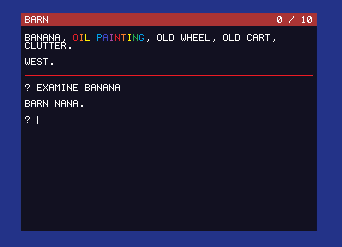
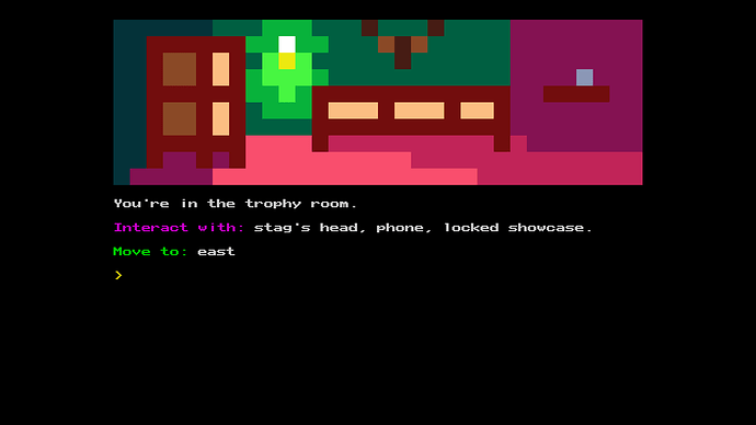
Adventuron has a “split screen” mode, in the form of

redescribe = auto_beta

In your theme you also have to set a scroll lock:

layout = H G D O X LOCK

By doing this, Adventuron update the exit and object list automatically, and keeps them on screen at all times. It’s important if using this for the location description to be brief, and the object list should be horizontally listed, not vertically listed (one per line).

1 Like

Well, the notion that there’s a single UI that will suit everyone is a fantasy. Really, what we want is a display that’s flexible enough that the player can adjust it to suit their own preferences.

So as well as “Classic Infocom” style, e.g. those with screen readers could select “single window” which even dispenses with the header bar (printing it in the main window each turn.)

Or those playing on a phone (where screen real estate is even scarcer) could split the output into screens on different tabs. So you’d have the “actions” tab, (the old main window) which reports the results of actions, the “room descriptions” tab (and why shouldn’t the player be able to scroll back through all the visited rooms? This would let them scroll back and check stuff: “Yeah, the statue in the library is the archchancellor’s nephew, not the actual dude himself!”) and inventory in another tab, and so on.

I don’t see a problem with “stateful” images or descriptions not updating to match the game’s current state: the scrollback represents the player’s memory of what they’ve encountered so far. (Like an in-game notebook you don’t have to implement.)

But having said all that, I’m definitely the flea standing on the shoulders of giants, here. I’m happy when I get to increase the text size without having to diddle with config files!

1 Like

My theory is that the UI reflects the style of game. You’re going to want an “old-school” game to look like an old school game!

In other words, i agree there’s no universal UI for all games, but i see it as a game design choice, not a player choice.

1 Like

As an example of the “live output”, the MUD game company play.net offers a few MUDs like Gemstone IV and DragonRealms. They provide both a web client and a downloadable Java client. (The web client is much flashier.) In both clients, they have the “look” command output the room description to a window just above your log (like if you were to add the entire description to a text adventure status bar instead of just the room title). It updates in real time so it changes when people enter or exit the room. It’s really helpful in a MUD where the contents of the room get lost in a flood of user interaction. It might not be as useful for a single player game but it’s still pretty nice.

This reminds me of the time when I was working a support chat for phone CSR agents. I answered someone’s question with a lengthy block of text, to which they replied “What?”.

I just copied and pasted the same text again without thinking about it! :rofl:

1 Like

Certainly I’d agree that the default UI is a design choice whose purpose is to best present what the player has been led to expect by the advertising. So the blurb might say something like “Zork Lives!” and the default presentation shows the player the classic Infocom style.

But that’s a whole other thing from saying “not a player choice” which I take to mean “user preferences have no place in UI design.”

I know: I’m exaggerating your position to make a point, but not strawmanning it, I hope.

It’s easiest to make the counter argument when it affects disability: so locking players to, say, a poorly chosen palette might mean the game is inaccessible to people who are color blind. Or requiring that all panels be displayed at all times means that the text size can’t be altered – thereby locking out players whose eyesight isn’t 20/20.

But I believe that player preferences below the level of exclusionary disability are valid too. Maybe it’s because I’m left handed, so I notice when programs assume I’m using the mouse with my right hand and use keybinding modifiers predominantly from the left hand side of the keyboard.

It’s even worse with physical technology, of course: I’ve lost count of the amount of time I’ve spent with my big honker crushed against the back of a camera because it’s designed for you look through the viewfinder with your right eye. But software is able to be more flexible and accommodating, if we let it, and we shouldn’t wilfully discard that.

We authors are naturally controlling beasts: we had an idea, and we’ve put in a lot of graft – time, energy, skull sweat and even money – to realize that notion and communicate it to other people. We don’t want players mucking it up!

It can be hard to let go and allow players to participate in their own entertainment. :smiley:

So I agree: the theme of a game, its style, and its UI are interrelated. It’s a good idea to spend time specifically thinking about that (as we’re doing here.) But in my opinion it’s a bad idea to rigidly enforce it.

2 Likes

The UI design is not a player choice, but the customisation is.

For sure, you need to offer color and theme choices, also font style and size as well. Then there are things like sound level etc.

Certain other aspects such as left-handed accommodation are often part of the OS, so your app needs to pick that up or otherwise use OS services to get input that’s been adjusted for this.

I’ve also been closely watching text-to-speech. Years ago it was terrible, but today things are sounding better. Of course, it’s still rather robotic, but good enough to be a screen reader for the sight impaired. It also turns out, it can be significantly improved with a bit of effort at authoring time.

My text uses extended markdown to make it look nice (extended so you can add bits of html as well, albeit rather clunky), but i realised it might be possible to unify markdown with SSML, so that markdown text can be both converted to HTML and SSML. I’ve found this works, but SSML needs a bit extra, but it’s an interesting idea.

3 Likes

I’d say that you have to design your game for split screen or conversational or both.

But it’s not something that can be switched between easily without doing some tweaks to the flow of the text.

I designed TWO ( http://adventuron.itch.io/two ) from the outset to be a “split-screen” design (I describe it as “auto refesh” in adventuron - with optional scroll locking).

One of the design features of “auto refresh” style games is that you don’t need a location description at all if you don’t want one beyond one or two words. That was the design conceit I suppose.

TWO has dynamic object lists and directions. As the direction list automatically updates as the game progresses, I didn’t need to write messages like “You open the door.”, or “the entrance to the cave opens”. I just change the state, and the exit list or object list changes. Occasionally I can print out a single message prior to a state change, but in the case of TWO, even this message was just two words.

It depends what type of game you are designing, but if it’s primarily a puzzle based game, I find it a lot easier to write and play in the object-list style.

Everything that is a relevant noun is in the list, if something changes, it is added to the list, if an new exit appears, it is added to the list, if an exit disappears it is taken from the list. No more scanning 150 words for nouns, the nouns are generally in a short list of typically less than 10 words.

If I were to change a game like two into a conversational type adventure, it would be barren and stark. Rather than just list things that you can interact with, I’d need much more additional text to place them in the scene. For puzzle-fests, I find the split screen to be much much less taxing to play.

Cut scenes can provide background and exposition. Graphics too have a role.

A jam entrant recently impressed me:

I think you could certainly re-write the game in the conversational style, but it was DESIGNED to be realtime refreshed rather than conversational.

Giving the player the choice to switch to a mode that the game wasn’t designed to support is like giving a car owner the option to switch their under seat heating to 70 Celsius. Configurability is wonderful, but you should never allow configuration to break the underlying design and flow.

Going back to over here, players can configure the game with things like

PEN #0F0, PAPER #000, THEME 1 - 5, *NORMAL, but it doesn’t change the fact that the game was designed to have a realtime object and exit list.

1 Like

I must respectfully disagree.

Granted, by changing the interface away from the one the game was designed for, the player may experience problems that the original UI was designed to obviate. That’s their choice.

The player will always be the best judge of their own particular circumstances. People are not all the same. They have different needs, different capabilities, different modes of enjoyment. No designer can possibly manage to anticipate all those variations.

By denying players the ability to reconfigure the UI because it would “break the underlying design and flow”, the game designer is guilty, in my opinion, of arrogance. They’re saying “my way or the highway.” They’re saying that people whose needs, tastes or preferences differ from their own are unworthy of consideration.

The cry of despots everywhere and throughout history has been that they’re doing this for our own good; that they know better than we; that they only want to prevent us from making mistakes: from messing up The Plan.

Don’t be that designer.

It’s true that you can never embrace everyone. There does come a point where you have to say “well, if you don’t like (some core aspect of the game, e.g. the genre) then you’re not my target audience.” That’s maintaining project focus.

It’s true too that in commercial products, adding in such choice costs money and development time, and the budget simply may not be able to stand the strain.

But the decision to shut down choice should be a position assumed with reluctance, at the end of the process, not an eagerly embraced starting position and go-to attitude.

2 Likes

If the choice breaks the game then it’s a choice in name only as it leads to a dead end.

You’re getting pretty close to invoking Godwin there.

A change in UI does change the experience of a text adventure. Just like watching a film on a phone (instead of a cinema screen), a book on an e-reader, or a great painting as a postcard from a giftshop gives a different experience to what the original creator intended… I would argue that in a text adventure, a change in UI (or interface) could disrupt an author’s vision more than any of those other examples. The way you write is often heavily influenced by the UI that you’re writing form.

Considering accessibility by the widest range of players is really important; particularly giving access to games for differently abled people. However, equal access won’t always equate to equal experiences, or equal delivery of the artist’s vision, simply because the game flow of a text adventure is intrinsically linked to its user-interface.

It is important that discussions like this highlight the ways in which devices such as screen readers work, and how UI decisions can block their effectiveness, so authors can make informed design choices.

2 Likes

Agreed. I was just arguing against the “you get my perfect vision or you get nothing” approach.

Adventuron,

The BARN NANA display presentation is very nice. I believe the young students I am targeting would enjoy the colors and options.

Thank you

2 Likes

Well, presumably if you were going to release a game that offered a choice of display mode, you’d first make sure that it worked well in both.

Certainly. IF has reached a stage where authors are once again experimenting with the presentation of games. We’ve got graphics heavy, retro-looking systems like Adventuron, User interface libraries like Vorple for Inform, Twine games that incorporate Bitsy scenes — all of which take us further away from pure text and potentially raise accessibility issues. There’s never been a better time to have this discussion.

2 Likes