Twine Version: 2.3.2
Story Format: Sugarcube 2.28.2
I am currently designing a UI for use in a bit of an adventure game. It is mostly dependent on the <> function. However, the problem I face is that the buttons in this case must maintain a specific shape, namely square. But for this to work for screens other than my own, they must also be able to scale to different sizes. I have found no way of accomplishing this without also deforming the button itself so that it is no longer square.
I do also have a secondary problem of the button placement. In this instance, I need to place it in the lower-left corner of a UI bar I have created. The only way I have found to do this is with the “margin” property. Unfortunately, “margin” does not appear to scale to the available space when it comes to vertical size, so if the button would land outside the available space, it just adds a scrollbar, rather than adapting the margin-space.
Unfortunately, you need to put code like that inside of a “preformatted text” marker for it to be displayed properly in this forum (select the text and click the </> button).
Anyways, for buttons that will always be square, first put this in your Stylesheet section:
This unfortunately did not solve the problem. I was already able to make the buttons square. The issue I was having was that if I also wanted the buttons to scale according to the available screen-size, they would deform (becoming rectangular, etc.) as the aspect-ratio was not necessarily the same.
With my limited knowledge of Sugarcube, it would seem that the best solution would be to somehow lock the width of the button to the height of the button, so that the two always remain the same. Then have the height scale off of the available space. However, I have no idea how i’d do that, as it’d require one of the variables to be dependent on percentage, whilst the other would be dependent on px.
I’m having troubles understanding exactly what it is you need without being able to see the UI bar that you’re talking about, since I don’t know what it looks like or how it scales.
Could you make a simple example project showing what it looks like?
I have attached an example of my current working code. In the example provided, please ignore the text of the passage as it is not the issue at hand in this instance.
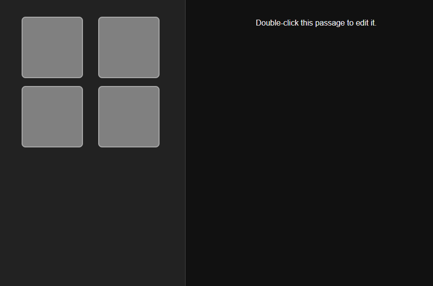
But alongside the project I can also illustrate the problem with screenshots. This first one shows what the sidebar in question looks like with an aspect ratio identical to my own.
Which is all fine and good.
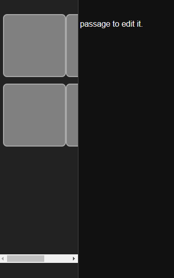
But this next one shows what it looks like with an aspect ratio that has a much smaller width, as compared to my own. Or if the game is in a window that is then resized to be narrower. The buttons thus “phase” outside of the bounds of the sidebar, putting down a scroller instead of shrinking the buttons to an appropriate size.
In theory, this could be solved by making the sidebar a static size, instead of a percentage-size of the screen. However, this still runs into the issue of making the actual text window absolutely tiny on small screens. Which isn’t exactly ideal.
/* Create the Left UI Bar. */
var leftUiBar = $('<div id="left-ui-bar"></div>').insertAfter("#ui-bar");
var leftBody = leftUiBar.append('<div id="left-ui-bar-body"></div>');
UIBar.destroy();

/* Automatically show the contents of the StoryLeftSidebar passage in the right-ui-bar-body element. */
postrender["Display Left Sidebar Contents"] = function (content, taskName) {
	setPageElement('left-ui-bar-body', 'StoryLeftSidebar');
};
And in your “StoryLeftSidebar” passage you’d add a “nobr” tag and then put: