Ello99
September 4, 2023, 3:44pm
1
Twine Version:
Hi,
I tried inserting:
tw-passage <style> img {
  max-width: 100%;
  max-height: 100%;
}
Into my stylesheet and it has made no difference to the image scaling on mobile.
 <style> img {
  max-width: 100%;
  max-height: 100%;
}
above images directly into a passage but when I play-tested it removed everything from the passage except the background.
Is anyone able to tell me what I’m doing wrong or offer a solution please?
1 Like
EJoyce
September 4, 2023, 4:46pm
2
I think you don’t need <style> there, and I also think you need to set one of your dimensions to auto. For example, using the testing functionality here:
W3Schools offers free online tutorials, references and exercises in all the major languages of the web. Covering popular subjects like HTML, CSS, JavaScript, Python, SQL, Java, and many, many more.
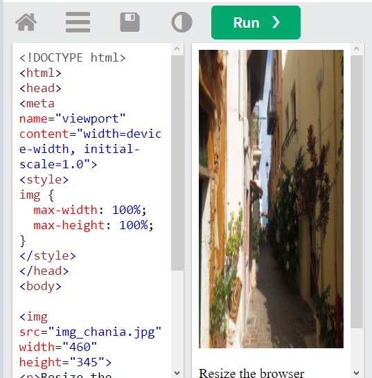
When I set both max-width and max-height to 100% like you have here, the scaled-down image looked like this:
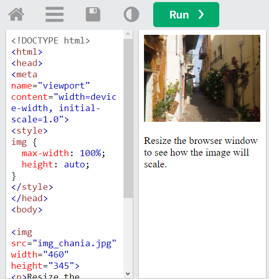
But when I replaced max-height with height and set it to auto, it scaled properly:
4 Likes
Hituro
September 4, 2023, 11:15pm
3
As @EJoyce said, you shouldn’t have <style> in those styles, that’s an HTML element, not a CSS selector.
That said, all you probably need is a max-width:
tw-passage img { max-width: 100%; }
Images automatically retain their aspect ratios (unless you specify otherwise), so the height of the image will scale appropriately.
2 Likes
Ello99
September 5, 2023, 12:43pm
4
Thank you both very much - it’s now working perfectly!