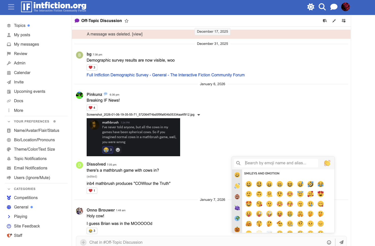
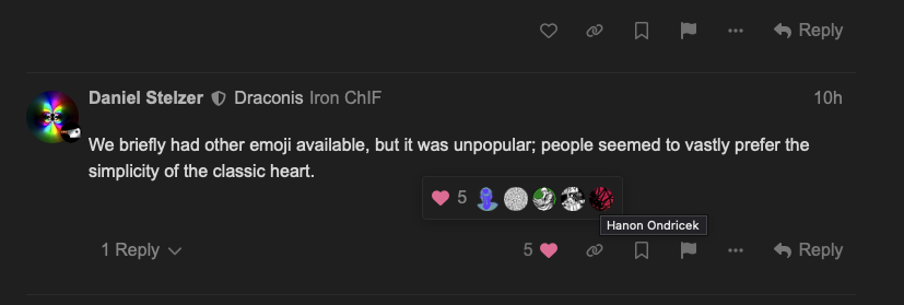
I’ll be honest, I thought I was on Dracula theme, but it turns out it was Geometric all along, lol. Yeah, I do enjoy playing with the new site choices. (And glad we don’t have the different options for like and stuff anymore. I prefer just plain heart.)
tbh I didn’t realise that there were different options for like outside of the heart until you mentioned it just now (but at the same time, I barely use the forum’s reaction features so that could be why)
Unless I’m very much mistaken, the UI for viewing who has liked a post has changed on mobile. It used to just pop up an extra row of user avatars underneath the post in question, and tapping one of them gave a popup telling you who it was. Now the row of avatars appears as a modal and tapping one of them takes you off the page you’re in completely and onto the user’s profile. Is there an option to change it back?
Apparently there’s a plugin that restores the original behaviour, but I’m not clear if this is something that can only be changed forum-wide or whether it can be done on a per-user basis?
On mobile it used to be very similar to what it does on desktop: you tap the number and a row of icons pops up inline, then if you don’t recognise any of them, you tap it and the little user profile card pops up. Tapping off the card dismisses it and you can tap on another icon immediately if you wanted to check more than one.
Now on mobile, you tap the number next to the heart and the row of icons appears in a modal overlay at the bottom of the screen. If you tap one of them, instead of the card version of the profile popping up over the current page, it navigates away from the current page completely and takes you to the user’s profile, and you have to use the back button and wait for the page to reload to get back to what you were doing.
Also, the old inline version showed all of the people who liked a post. The new version is limited to something like 16 people. You can see this in the responses to the post about the IFComp GenAI rule change.
I didn’t much care having a wider range of emoji available anyway, but a big part of the reason I really disliked that change was because it did this same thing to the “who liked your post” view. This thread mentions that the behaviour we’re seeing now was always what happened with the Reactions plugin enabled, but the latest update changed it so that viewing likes with the Reactions plugin turned off now uses the same interface.
This isn’t a feature I’m enjoying… Is anyone else experiencing that when you click into a topic you’ve read before it opens to the top rather than where you’re up to?
I saw it happen for a short time right after the update but then it went back to normal. Maybe it was taking some time re-reading everyone’s message pointers?