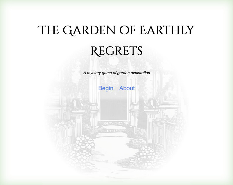
I’ve just released a playable version of Garden of Earthly Delights, my Lindenbaum 2022 entry, on Itch.
Garden is a text-based mystery game, set in … a garden (you probably guessed this). Influenced heavily by The Draughtsman’s Contract, and a weekend spent staying at Chilling Castle in Northumberland. This version has some added areas compared to the Lindenbaum version (and some bug fixes), as well as illustrations throughout.
I welcome any feedback, but if you want to tell me it’s too short, I’ll point out that the original context requirement limited both the number of sections, and the number of words
To be fair I think the default is just whatever is the browser’s default sans serif font is. I think my default is DejaVu Sans which is very similar to Arial…I’m not sure how much it varies by browser and OS.
Specifically the default sans font makes the text a bit narrow and condenses it a bit too much IMO…“chaffinches” in one of your passages is an example of this where ffi are very close together. That’s just one word where it’s really noticeable, but on the whole Arial-like fonts are denser than some other fonts, and in my opinion less readable.
Obviously the default font is not the worst choice since it’s popular, but there are a lot of options.
Lots of other games use the default font, but I mentioned the possibility of changing it in your case because you went to the trouble of using special fonts for the title, etc.
Very fair. I changed the body font in the next game I did (which I just posted here).
Sugarcube does have a custom font list for the body – Helmet,Freesans,sans-serif — but it doesn’t supply it or include it in the file, so I suspect no one ever really sees it.
Lacking those, you will indeed get your default sans-serif font. For me that was Helvetica, and it looked fine, so I probably didn’t think so hard about a custom font.
For sure…like I said, it’s very well designed overall.
If you’re interested in other Sugarcube design, there was a very nice-looking game in 2021’s If Comp called Goat Game by @kathrynli that might give you some inspiration.
It took some doing since I’m a twine/sugarcube noob, but I was able to pull in a custom google font that the browser can also source with that html trickery.
Yes, that’s how the title font on this is done (and all the fonts in the next game). It’s not so much that I couldn’t have added a custom font, it’s just that Helvetica looked nice and I didn’t think about it
One thing I have noticed is a lot of Google fonts look like Helvetica but with subliminal variations. Sometimes just a teensy change can make it feel custom. But I get you; if it ain’t broke, don’t fix it.
Or more that I didn’t notice that it was potentially broken. Had I realised that it was basically just defaulting to the user’s sans-serif I might have changed it.